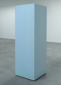
John McCracken, installation view of small sculpture, 1966-1975; materials: lacquer or polyester resin, fiberglass, and plywood.
On my recent trip into NYC I saw two marvelous shows––
John McCracken at David Zwirner, and
Anne Truitt at Matthew Marks––that seemed in lively conversation with each other. The McCracken show was an overview of work from 1963-2011, the year of his death; the Anne Truitt exhibition was limited to her work from the 1970s. In each show I saw an artist working with the expressive qualities of color using pared down geometric form, and making objects of perfect and simple beauty; not simple in their execution, as the surfaces required painstaking preparation, but in their form. I had never seen McCracken's work before (how had I missed it?) and found myself thrilled by its lush color; the glossy surfaces, instead of being cold and off putting are engaging and sensuous. I especially loved how the works looked in juxtaposition with one another, each shape and color adding interest to the one beside it. The small sculpture displayed in one room absolutely delighted me, a festival of color, and of light, as reflections played over the surfaces.

John McCracken, Blue Block in Three Parts, 1966; Think Pink, 1967; Theta-Two, 1965; with Nightbird.
I feel that even the larger works gain in relationship to each other as each color asserts itself. The gallery had several framed drawings and notes in which McCracken wrote about his ideas about color. This one from 1965 states:
Radiant, Jewel-like color.
It's color I'm after. Try to visualize these things in color. Clear, marvelous color. This is the vision I've had from a long time ago but keep forgetting.
And from 1966:
I think of color as being the structural material I use to build the forms I am interested in. The fact that in another sense I use plywood, fiberglass and lacquer as structural materials is of less importance. I have found that a certain range of mainly primary and secondary colors and a certain combination of color intensity and transparency and surface finish provide me with the expressive means I want, at least for the present.
John McCracken, Six Columns, 2006; polyester resin, fiberglass, and plywood in 6 parts; variable sizes, 92-94 in. tall.
The color black is, in our culture, often associated with death, so this installation of six large columns has something of the funerary monument about it. At the same time, though, the monumentality of the columns is belied by their reflective surfaces which shift in color and shape as one walks around them; their solid structure becomes a palimpsest, with new experiences overlaying earlier ones; a clear shape can seem insubstantial as it reflects white walls.
John McCracken, Minnesota, 1989 and RA, 1991
I really enjoyed photographing the installation of the works, seeing how their colors and shapes created a vivid energy from one to another.
John McCracken, Minnesota and On Stream, 1998
Here is
Minnesota seen from a different angle, and how unlike it seems to the view above. It's relationship to two blue pieces changes the quality of the green.
John McCracken, M87, 1988, and Nightbird, 1992, with Green Plank, 1968, and Untitled, 1967
M87 is another black work, having multi-faceted sides that create stepped and changing reflections; it's almost like looking at a moving cubist painting. Its essential verticality contrasts with the long horizontal of
Nightbird.
John McCracken, Zephyr, 1992; 9 x 96 x 13 1/2 in.
This work seems so simple, triangles on the ends with a parallelogram in the center, but its shapes create radically different viewing experiences from different angles. I am short, so saw the work at this angle, but if you look at the gallery's photo on its
website, the piece seems entirely different. The McCracken show was a succession of perceptual discoveries.
Anne Truitt, installation view with Grant, 1974; Landfall, 1970; and Jaunt, 1977.
Anne Truitt has a similar love of color to McCracken, color that sings clearly from her simple forms, often columnar. Her surfaces have an elegant restraint to them, made of layers of acrylic paint, sanded and smoothed between each layer. Each piece has a solitary poetic presence, very different from the more voluble glossy works of McCracken.
Anne Truitt, Landfall, 1970; acrylic on wood, 73 3/8 x 23 7/8 x 24 in.
The three columns in the show were banded by different colors at their bottom edges, here a very subtle color change to a darker blue and then a blue-green. The band adds weight, and in contrast, the rest of the column rises, full of light.
Anne Truitt, detail of Grant; acrylic on wood, 7 1/2 x 144 x 9 1/2 in.
The show included two very long floor pieces,
Grant a delicate balance of a yellow and a violet.
Anne Truitt, Morning Child, 1973; acrylic on wood, 72 x 12 x 12 in.; with 24 Aug '70; acrylic and graphite on paper, 23 x 29 in.
The column
Morning Child, with its intense blue, has a very different character than
Grant. It is a narrow exclamation, a celebration of blueness.
Anne Truitt, Echo, 1973; acrylic on canvas, 48 x 144 in.
There were several paintings in the show, three of which were large expanses of color, allowing a sinking in to a boundless space. I am showing a detail of
Echo because I love the careful color choices of surrounding band and field; the cooler pink band makes the central field that much richer.
Anne Truitt, Arundell XXVII, 1975; acrylic and graphite on canvas, 20 3/4 x 21 1/4 in.
In her
Arundell series, Truitt uses the most minimal of means––a slight shift from one white to another, a light line of graphite––to create a mysterious, meditative space, one that asks for a quiet attentiveness. It was wonderful to see how differently Truitt and McCracken approached their material, in some ways so similar yet yielding emotionally different results, each deeply satisfying.


