March 31, 2014

New Potato Prints


Untitled 54, ink and egg tempera on Gampi smooth paper, 10 3/4 x 7 1/2 in.


In the past few years I've been a pushover for art influences: they've gotten me started on entirely new bodies of work. It began four years ago with seeing the exhibition of the Hours of Catherine of Cleves at the Morgan Library. In the blog post I wrote about the show, link above, I wrote "After seeing this beautiful show, I am thinking about pulling out [the] pieces of parchment [that I had in my flat files]" Well, I did pull them out, did paint on them, and fell in love with the material; I gave up painting on panel and began small, book-sized paintings on parchment. After being excited by the possibilities of printmaking at a print show at MoMA in 2012, Print/Out, I began to make prints using cardboard plates, and then potato prints. A couple of weeks ago, the show I saw at Pace Gallery, "Mingei are you here?", which I wrote about here, inspired me to think of new ways to approach my potato prints. The works of James Lee Byars and Lee Ufan prodded me in new directions: drawings by Byars of simple shapes floating in an expanse of Japanese paper made me think of doing something similar. 


Untitled 54 detail


Byars sometimes worked with gold colored sculpture so I added gold paint to two of my prints.


Untitled 55, ink and egg tempera on Akatosashi paper; 2 panels, each 7 1/2 x 18 in.


This piece of mine is an out and out homage/theft of the long, narrow drawing by Byars, here shown with Japanese peasant objects:


Untitled 55 detail


I painted a thin gold line around the shapes stamped using a potato dipped in ink.


Untitled 56, ink on Akatosashi paper; 4 panels, each 14 3/8 x 11 1/2 in.


Here is another empty piece. I added a small curve at the bottom right, as a way to say "yes, I know there's all this empty space....". Honestly, I don't know if this works or is silly, but I had to try. 


Untitled 56 detail


When you are looking at the actual print, you are more aware of the variation and incident in the color and transparency of the ink, so it gives a bit more weight to the image.


Untitled 57, ink on Twinrocker paper; 4 panels, each ca. 5 1/2 x 14 in. 


I was thinking of Japanese screens while making 57. Last year there was a beautiful show at the Met about the Rinpa aesthetic in Japanese art, which I wrote about here. Seeing that show also influenced my potato prints and it was there that I began to think more about how careful placement of shapes can animate empty spaces.


Untitled 58, ink on Twinrocker paper, 21 3/4 x 14 1/8 in. 


These soft, curving, organic shapes were inspired by two works by Lee Ufan in the exhibition at Pace; they are nothing like his work, but I was trying to emulate his spirit, as in the curving, calligraphic forms in the painting on the right:


Untitled 58 detail


For me, so much of the character of the prints resides in the paper surface and in the irregular way the ink sits on that surface, its transparencies and shifts of color. I feel very grateful to be able to see art that inspires me and pushes me toward new ways of seeing.


March 30, 2014

Spicy Indian Potatoes, "Batata Bhaji"


I've remarked before on this blog, probably several times, that I love potatoes every which way: boiled, fried, mashed, baked, roasted, in soups and stews. I enjoy making simple, flavorful recipes, made even better using my home-grown potatoes. Skillet recipes are great, such as Pan Roasted Potatoes with Anchovies from Marcella Hazan, or Southwest Potatoes from Mark Bittman. This simple Indian recipe uses two pots, one to boil the potatoes and a pan for frying them, and it is put together very quickly. The recipe comes from the book The Art of Indian Cooking by Monica Dutt; the book is out of print, rare, and expensive, although just a little paperback. Many years ago I ordered a box of paperback cookbooks and this may be my favorite of the dozen or so books that arrived. Indian recipes can be very daunting, but in this book they are simplified and easy to manage. For the potatoes I used a waxy potato, French Fingerling, which I grow every summer and are delicious boiled. I still have some in my root cellar, along with Carola, a potato similar to Yukon Gold, but better.


2 Tbs vegetable oil
1/4 teas mustard seed
1 onion, chopped
4 cooked potatoes, diced  (I would estimate about 1 1/2 lbs of potatoes)
1/4 teas turmeric
1 fresh or canned (I used a frozen red one from last summer) green chili pepper, sliced, seeds removed. Use less chili if you don't want too spicy a dish.
1/2 teas salt

  • Heat vegetable oil over medium heat and fry the mustard seed until they begin to crackle. 
  • Add the onion, fry until soft, around 5 minutes.
  • Add the rest of the ingredients, mix well, cover, and cook on low flame for about 10 minutes. 

The author points out that these potatoes are served with puris, or as a filling for dosas. I think that they are wonderful as a side dish or main dish with another vegetable accompanying them; this week I had them with sweet and sour red cabbage. Serves 4.
Enjoy!


March 28, 2014

Pat Steir and Harvey Quaytman: The Seductions of Surface


Pat Steir, Colors Without Names, 2013; oil on canvas, 132 x 132 in. 


In the small room facing the entrance to Cheim & Read Gallery, light pours in through a skylight, illuminating the painting hanging below, giving it a religious aura. It is the first painting you see in the beautiful exhibition by Pat Steir, up until March 29. I have to admit that until I walked up to the paintings and became immersed in their gorgeous surfaces, I felt that I had no way into them; maybe because of their size, or perhaps their initial impression of emptiness.


Pat Steir, Colors Without Names detail


But oh! once I paid close attention to the richness of incident on the painting surfaces I was entranced. In the pouring of paint, layer on layer, deep and rich worlds open.


Pat Steir, Colors Without Names detail


There is a sense of time, of natural forces building, hiding, and revealing. The shining pigments catch light and remind me of the use of gold in Medieval painting.


Pat Steir, Naples Yellow and Mica, 2013; oil on canvas, 132 x 132 in. 


Many of Steir's paintings appear to be diptychs, as she divides the canvas into two different colors/surfaces. They create a different kind of space, deep and light-filled against one denser and closer to the surface.


Naples Yellow and Mica detail of left side of painting


Naples Yellow and Mica detail of right side of painting


Although so much of the surface is created by the qualities of paint, the artist is masterly at controlling its results.


Pat Steir, Black, Blue, Silver and Gold, 2013; oil on canvas, 132 x 132 in. 


Steir doesn't settle for a set range of color and value, but works from light to dark, warm to cool. Black appears as night seen through veils.


Black, Blue, Silver and Gold detail


The veils are made up of many thin layers of color.


Black, Blue, Silver and Gold detail

Then there are splashes of gold, like light sparks thrown from a fire. I am so glad I took the time to pay close attention to these paintings; once they rewarded me with their engaging details, they spoke of space, light, time, and of the spirit.


Harvey Quaytman, Spector, 1990; acrylic and glass on canvas, 46 x 46 in. 


Harvey Quaytman's paintings, which I've long loved for their minimalist sensibility, seem far from those of Pat Steir. But when I saw a beautiful retrospective exhibition at McKee Gallery, up until March 29, I couldn't help but think of their relationship: both artists have a love affair with the surfaces of their paintings, which go far beyond simply paint on canvas. Quaytman's austere clarity is only part of his work....


Spector detail


.....because his surfaces have an almost romantic voluptuousness within tightly controlled edges. The materials he adds to his paint creates surfaces that shine, have irregular textures, seem to be stuff of the earth itself.


Harvey Quaytman, Voyager, 1991; acrylic on canvas, 60 x 90 in.


A perfect balance of dark and light, with a red bar extending into the white expanse, held by the forms at the left.


Voyager detail


It's not until we see the detail of layers and varied textures that the painting achieves its full complexity. Each color-shape is considered carefully, with its own texture, each juicy and full of feeling.
(I apologize for the too-light photo; Blogger is again color correcting my images)


Harvey Quaytman, Pyrite Hallway, 1988; acrylic and rust on canvas, 29 x 29 in.


Here Quaytman plays with balance and imbalance, symmetrical and not. The red rust (how does one collect rust to use in a painting?) glows.


Pyrite Hallway detail


I love looking at the surfaces of these paintings, so complex and satisfying. Like those of Pat Steir, Harvey Quaytman's surfaces are more than just paint; they are like geological processes, a hymn to the earth and to life.


March 26, 2014

New Hooked Wool Drawings


2014 #4, hand dyed wool and egg tempera on linen, 15 x 12 in.


I finished a new group of hooked wool drawings, three out of four of which had a mind of their own. I began by the decision to do two pieces in my all-over format and two with the image centered on the linen. With #4 I had originally planned to hook wool in the right hand side of the circle, using green wool similar to the paint color. But once I had painted it and hooked in the dark line, the piece seemed to be telling me that an additional element wasn't needed, so I left my initial idea behind.


2014 #5, hand dyed wool and egg tempera on linen, 15 x 12 in.


A funny thing happened with this piece; actually two funny things: first of all, the squarish shape at the top was supposed to be a square, but oddly came out more like a trapezoid. Then I made a dumb mistake: I had planned that the pink color surround that squarish shape, but when I had finished the whole thing I realized––amazing that I didn't see it before––that I'd left the top triangle blank. So then my choice was to try to match the pink or repaint it; leave it blank, or paint it a dark color, closer to the color of the hooked rectangle. What started out as a very sedate, classical composition, got a bit shaken up. 


2014 #5 detail


Here's a detail of paint and wool and linen. I'm not sure that this irregular composition is successful, but it was interesting to go off on an unexpected tangent.


2014 #6, hand dyed wool and egg tempera on linen, 14 x 16 in.


I thought I'd try some subtle color in the hooked portion of this piece instead of a more usual intense color. (Blogger is showing this too dark, something that's happened before. #7 is also too dark) This is another instance where I'm not sure that what I've done works because the light wool color may be too close in value and hue to the linen.


2014 #7, hand dyed wool and egg tempera on linen, 14 1/2 x 14 1/2 in. 


Here is another instance of a drawing going its own way: I used a compass to draw the circle, but somehow it ended up squished into an odd shape. The drawing thumbed its nose at me: regular forms? hah! Should I have accepted the drawing's demands or just tossed it? My tendency these days with my work other than paintings on parchment––which do demand a level of perfection––is to accept the irregular and imperfect for the quirky energy they bring.


March 25, 2014

In a Too-Long Winter, Searching for Beauty


I have to admit to being very cranky lately with the never-ending cold and wind, and the deep snow still covering the ground. I have felt fed up with winter photographs; I want to start documenting the awakenings of spring, but unfortunately will have to be patient. Today, when I noticed the little bit of ice hanging from a honeysuckle vine, looking like a perfect tiny boot, I was amused and cheered; so I was determined to find other moments of interest, even of beauty, in a winter that has overstayed its welcome. 


Ice hovers in delicate lacy patterns above the granite steps.


Sometimes a fragile shape seems a sculpted map of a strange continent. 


Light-filled ice and heavy granite sparkling with sun-catching water share a similar texture, while divided by a deep dark.


The ice has been acted on by sun and wind and water dropping from the roof; the resulting forms are varied and complex.


Sometimes small shapes rise up within a sheltered hollow.


A form as long and thin as a needle is somehow formed and somehow survives the changing weather.


Layers of ice-covered snow, like a fluffy crinoline, glisten in the half light. All these incidents are small and easily overlooked, so I'm happy that the little icy boot encouraged me to take some delight in the lingering winter.


March 23, 2014

Mingei: Tradition and Craft; Simplicity and the Everyday


The Industrial Revolution was a mammoth force in the 19th century world, upending people's lives and aesthetics; the assumption that everything in use was handmade was no longer true. In the late 19th century the Arts and Crafts movement was a stand against the industrially produced. In a similar way the Mingei movement in 1920s Japan was an attempt to preserve folk traditions and anonymous crafts which were beautiful in their useful simplicity. There is a thrilling show currently at Pace Gallery, curated by Nicolas Trembley, titled "Mingei are you here?", which attempts to spread a wide net of influence for the movement; Trembley gathers in work that is a stretch to conceive of in this particular context, but the work is all so wonderful to see and the relationships shown in the installation are so interesting, that I will not complain much about it.


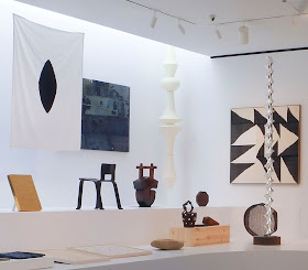
Banner by Mai-Thu Perret, 2007; chair by Charlotte Perriand, 1953; unknown maker, kettle hook hanger, 19th century; in the corner an Isamu Noguchi lantern, 1966; textile by Brent Wadden, 2014; 
sculpture by Hiroshi Sugimoto, 2006; baskets by unknown makers.  


The eclectic installation of so many disparate objects encourages us to see relationships between their forms. The points in the black form of the banner relate to the irregular triangles in the textile; the curves of the plywood chair are not too different from those of the traditional kettle hook hanger.


In the foreground, a Noguchi sculpture, 1975-80; then baskets by unknown makers


I love seeing the juxtaposition of the Noguchi lantern, light-filled and of light materials––mulberry bark paper, bamboo, wire––and the shining Sugimoto sculpture of aluminum and iron. They both have an ethereal quality and call to mind Constantin Brancusi's Endless Column.


On the table, a Noguchi sculpture, 1981; chair by Charlotte Perriand, 1950; ceramics by various 20th century makers, and one 17th century bottle (see below). 


The concept of Mingei––an abbreviation of min-shuteki kogei, meaning "folkcrafts"––was developed by the philosopher Soetsu Yanagi in 1925, I learned from the exhibition catalog essay by Yuko Kikuchi. Trembley, the curator, lists several of Yanagi's essential aspects of Mingei:
one must value what is "useful, honest with regard to its intended use, authentic, safe, modest, durable", as opposed to that which is "luxurious, expensive, subjected to the whims of fashion, vulgar, frivolous, or amoral". 

We can see that the objects in the show have a marvelous directness, and the contemporary works sit comfortably alongside those more ancient.


Unknown maker, Sake Bottle, 17th century (also seen in group photo above)


This bottle is so beautiful in shape and surface, so it is easy to understand how work like this could be an inspiration for later artists.


Unknown maker, leather fireman's coat, early 19th c.; unknown maker, sake bowl, 19th c; Brent Wadden weaving, 2014. 


The patterns of the fireman's coat are so strong and elegant, with circular forms centered above the rectangular. Its warm color converses with the small bowl sitting at its left.


Unknown maker, Ainu Attush robe, late 19th c. 


Here is another beautiful garment, this by the Ainu people of northern Japan, made of elm bark. 


Josef Albers, Astatic, woodcut, 1944


There were Josef Albers woodcuts in the show, which I'd never seen before. (I apologize for the reflection.) Dramatic for such a modest size, they use the wood grain as part of the composition, which flows and turns in its simple geometries. Trembley notes that Albers was interested in traditional wood engravings and Native American textiles when he was teaching at Black Mountain College. Of course there is a tradition of stunning woodcuts in Japan, but there is the same in Europe, for instance those of Albrecht Dürer. This is one instance of curatorial overreach, as Albers had no relationship with Mingei.


A drawing by James Lee Byars, c. 1959; in front: unknown makers, sake bags, early 20th c.; unknown maker, farmer's rain cape, early 20th c. 


What I am most grateful for in seeing this exhibition were the moments of inspiration that I felt when seeing the work by James Lee Byars: two works in ink on Japanese paper, one of which you see above. In this long, narrow piece, with two forms nestling at its center, there is an animation of emptiness, such as in the Japanese Rinpa aesthetic, which I wrote about here. The drawing gave me ideas for my potato prints....


On the wall, 2 oils on canvas by Lee Ufan: Dialogue, 2007 and With Winds, 1989; Butterfly Stool by Sori Yanagi, 1954; Sgrafo Modern porcelain, designed by Peter Müller, c. 1960-80.


....as did seeing the work of Lee Ufan, which I hadn't known before this. His work is so minimal, yet so deep in feeling; the direct fluid touch or simply made forms echo within the heart. There is a beautiful conversation between his work and the graceful Butterfly Stool, by the son of the originator of Mingei. Although the installation might have been noisy with so much work on view, these moments of quiet relationships, and the invitation to think about emptiness and simplicity and perfect functionality made the show one of endless pleasures.