October 12, 2011

A New Painting: "Black Belts"

Black Belts, egg tempera on calfskin parchment, 6 x 7 1/4 inches.


While I was working on this painting I had some decisions to make as to the level of naturalistic detail I would include, which is part of the "grappling" with the realism/abstraction issue I wrote about in this post. The objects that I paint are generally covered with textural details: rust and variegated color, and the wear and tear of hard use. Over the past year or so I've been leaving out most of this surface detail, wanting to emphasize the form and structure of the painting. Bits of rust can also add a nostalgic aura which I certainly want to avoid.


The long thin rectangle at the top of the painting went through a lot of changes, from blues to greens, before I settled on this color. I simplified what had been a band of grass in the background into a flat form, though it still reads as behind the yellow and black. This image has a lot more illusionistic space, from back to front, than many of my works.


Red Swoop, 2010, egg tempera on calfskin parchment, 6 5/8 x 5 inches.


Here is a different solution to the grass problem, in a painting made over a year ago. The grass, naturalistically depicted, plays off against the more abstract red forms. I like it, but I definitely wouldn't paint it that way now. I realize that there's a certain warmth and appeal with a more realistic image, but I'm now on a different course.

October 11, 2011

Today's Garden Chores, with a Recipe for Pan Roasted Potatoes with Anchovies


Today is probably the last in a string of remarkable fall days, mild and golden, with clear skies and a peaceful stillness only accentuated by the hum of insects. They have been perfect days for working on outdoor chores: I've been cutting back perennials and have mowed the lawn for the last time before winter. Because rains are forecast to begin tomorrow, I decided to work in the vegetable garden today, digging potatoes and planting garlic and tulips. I never know how good my potato crop is until I've unearthed them from their hills; I fork the soil and reach in to find the tubers, the buried treasure, under a pretty cover of Johnny Jump Ups, aka weeds, which took advantage of my laziness in the late summer garden. The potatoes above are French Fingerlings, a waxy potato, delicious any way, but the best boiled potato I've ever eaten.


Looking up past the gathering of potatoes, the greens of brussels sprouts, leeks and kale, to the brilliant line of trees at the edge of the woods, I feel surrounded by delight.


While the potatoes were drying a bit before storing them in the root cellar, I planted a row of garlic from this years crop. Each clove will become a full bulb by mid-summer next year. I have to admit that I still find growth quite miraculous when I stop and think about it: those little seeds becoming large plants; single celled creatures becoming complex organisms.


When the row of garlic was planted and mulched with hay, I put several varieties of tulips in the ground alongside them so I'll have cut flowers next spring. I treat myself each fall to fresh bulbs, favorite varieties and new ones.


I eat a lot of potatoes, in soups and stews, roasted, baked, mashed, and boiled. My crop this year was a bit meager because of the dry spell we had in July, but I'll have several months of eating my own crop. And one of my favorite potato dishes is this one from Marcella Hazan, another easy and delicious recipe from her Essentials of Classic Italian Cooking. The anchovies are not a strong presence here (though I use more because I like them so much), but just add a rich flavor to the potatoes.

1 1/2 lbs waxy boiling potatoes (I use Carolas, which are not waxy, because I love their flavor and don't mind if they break up while cooking)
2 flat anchovy fillets (I use more, maybe 5 or 6)
3 Tbs extra virgin olive oil
2 Tbs butter
freshly ground black pepper
salt
1 teas chopped garlic
3 Tbs chopped parsley

  1. Peel potatoes and cut into 1/4 inch slices. Soak in a bowl of cold water for 15 minutes, then drain and pat dry.
  2. Use a saute pan that will hold all the potatoes in about a 1 1/2 inch high layer. Chop the anchovies into a paste and put them in the pan with the olive oil and butter; with the heat very low, mash them into a paste.
  3. Add the potatoes and a few grindings of pepper; turn them a few times to coat them. Turn heat to medium, cover, and cook for about 8 minutes, turning occasionally. Uncover and continue cooking for another 15-20 or so minutes until the potatoes are tender and have a light brown crust.
  4. Taste for salt, then add the garlic and parsley and turn several times. Serve hot.
4 servings (Hazan has this at 6 servings; for me, eating this as the main meal event, it makes 2 servings.)

October 10, 2011

At the Met: Pattern

Jar (Guan), China, Neolithic period, ca. 2650-2350 B.C.; earthenware with painted decoration.


I try to go the the Metropolitan Museum of Art each time I go to NYC because I enjoy it so much. Even after visits over many years I feel as though I'm discovering new things. Taking photographs helps me see even more, pay attention to more. Sometimes I come up with a theme to focus on while I'm in the museum, but for this trip I had decided beforehand to go on a treasure hunt for pattern, since I was using it in my recent textile work. Although not alone in this – crows line their nests with shiny objects – our species has decorated the most common of objects for centuries. I'm very drawn to the simple, dramatic forms of ancient pottery, and this example, with irregular circles on the upper part of the jar, is very engaging. The small handles repeat the circles, while the narrow neck contrasts with a web of crossed lines.


Vase; late Roman, found in La Guierce, central France; made 250-300 AD; copper alloy with champlevé enamel.


Another beautiful container, with a much more complex design. I love the way the curved forms are closed in the lines of red and green, open in the blue. The shapes draw our eye upward as they become smaller toward the neck of the vase.


Section of a marble mosaic bathhouse floor; Byzantine, from Antioch, Roman Syria (now Antakya, Turkey); 537-387 AD.


I love this pattern of a floor mosaic, less for its floral motif than for the way the lines of tesserae radiate outward and create interlocking arcs.


Infant's Sleeping Mat, probably I-Kirbati people, Kiribati, a Pacific Island; late 19th-early 20th century; pandanus leaves.


Surrounding repeating diamonds are delicate horizontal lines of black with bands of verticals. I love the way they meet at the center in a one-above-the-other weaving pattern. You can see that each center is a little different; whether this was deliberate or inadvertent doesn't matter to my enjoyment in seeing the variations.


Mask: Butterfly, Burkina Faso in Africa, Boni village, Bwa peoples; 19th -20th century; wood, paint.


The swooping triangles of the tips of the wings and central ears(?) are repeated over and over in a bold red and black. I can imagine that when used, a face behind that central square, a figure dancing, the mask would truly appear to fly.


Embroidered Patchwork Panel; China, late Yuan-early Ming, ca. 14th century; silk and gilt paper.


In the Korea gallery at the museum was a small show of patchwork, in which different pieces of fabric are sewn together to make the design. This ancient piece from China has repeating squares of color put together randomly, but the jump from one color to another creates a sense of rhythm nonetheless. The squares are embroidered with intricate designs, with details repeating from one square to another, making a very elegant textile.


Miniature Dress, Peru, Inca, 12th - 13th century; feathers on cotton.


There were two fantastic little feathered dresses in the show, each 10 or 12 inches high. Brightly colored bird feathers were prized in ancient Peru and were used to decorate clothing and textiles. The miniatures might have been used in religious ceremonies. I love the alternating bands of color and the way the feathers are cut into stepped shapes. Imagine having a dress like this!


Patchwork Wrapping Cloth (detail), Korea, ca. 1950-80; silk.


This was not the most interesting of the three Korean patchwork textiles on display, but what I liked about this detail was the careful piecing of the floral motif, the raised edge along each petal, the tiny gathering of fabric at their centers. I can look at it as quite sentimental because of its sweet candy colors, but there are those spots of dark, and I love the repeating curved diamond shapes that are background, yet push themselves forward. It's a beautifully crafted piece of work, and along with others in this post, have me scribbling ideas for my own textiles.


I've written quite a few blog posts on collections at the Met. Here are links to previous posts:
Tang Dynasty Ceramics
Some Portraits
Ivories
Flowers at the Met: Thinking of Spring
Sensuous Greek and Roman Sculpture
Relief Sculpture
Medieval Mourners
Buddhist Sculpture
Animals from Ancient Iran
Ancient Egypt, and Iran
Chinese Porcelain
The Greek and Roman Study Collection

October 8, 2011

A New Textile: "Triangles and Bars"

Triangles and Bars, hand dyed wool on linen, 10 x 10 inches.


Repetitive patterns have been used in the decorative arts for centuries, for pottery, textiles, and floor and wall decorations. While I was working on my last piece, Weave, I thought I'd do another design that paid homage to that tradition, which here, in Triangles and Bars, is based on a photo I saw online of medieval Italian church floor tiles. At first I thought I'd emphasize the repeat by making the shapes smaller and having more of them in the composition, but then felt, after staring at sketches for a while, that large and simple would be more effective. The colors that I dyed are nothing like ancient tiles, but quite intense and jazzy. The first time I dyed the yellow, I realized it was too light a color to stand up to the brilliant blue, so I put it back in the pot and deepened the color; now I think its light warmth balances the cool dark blue fairly well.


The hooking direction follows the outlines of the shapes, running along the bars and around the triangles, with the yellow hooking running perpendicular to the bars. I like the way my eye bounces around the shapes. I've enjoyed exploring how pattern creates a different kind of space, lively and rhythmic.

October 6, 2011

Realism and Abstraction

Untitled, 1969 or 1970; oil on canvas; 20 x 24 inches.


Lying in bed in my parent's house in Brooklyn, I was facing this very old painting of mine, done during my first year of graduate school. Suddenly, I had the realization that forty years later I've come back around to grappling with the same issue of reconciling realism and abstraction. After many intervening years when architectural and landscape space tipped the scales more toward realism, my paintings are moving back closer to where they were when I first began, though I hope less awkwardly. A couple of months ago I wrote a blog post called "Do We Have an Innate Style?" which focused more on sensibility; at the time I didn't think to explore this particular avenue.


Philip Pearlstein, Female Model on Ladder, 1976; oil on canvas, 72 x 96 inches.


It's not surprising that the realism/abstraction issue was so compelling for me: I studied with Philip Pearlstein, for a short while an abstract painter, who later did figure paintings, insistently using the models as abstract forms in space. At the time, I thought of the limbs of his figures as very much like the rigorous forms of the black and white paintings of Franz Kline.


Jack Beal, Nude with Patterned Panel, 1965; oil on canvas, 70 x 76 inches.


During the 60s and early 70s, when I was in school, there was renewed interest in realist painting, which included Photorealism, a movement I've never warmed to. The Whitney Museum mounted a show called "22 Realists", which included photo-based work and that of others, such as Jack Beal, who worked perceptually. At this period in his work, Beal dramatized and abstracted space by piling objects one on another, plus he heightened color beyond naturalism. The result was a brilliant cubist cacophony of color and shape.


James Rosenquist, A Lot to Like, 1962; oil on canvas (the museum website says this painting is 93 x 104 inches, but obviously it has a lot longer proportion than that and I don't know which dimension is correct.


Rosenquist painted monumental canvases composed with disjunctive bits and pieces of imagery, all taken from advertising or other popular sources. His crisp realistic, yet simplified, style owed a lot to his training as a sign painter.


Chuck Close, Self Portrait, 1967-68; acrylic on canvas, 107 1/2 x 83 1/2 inches.


Close's early paintings were incredibly powerful realistic portraits. They played with abstraction in that they were painted with the use of a grid, transferred from a polaroid photo. He painted square by square; each part which made up the whole was a tiny abstraction.


Chuck Close, Lucas, 1986-87; oil and graphite on canvas, 100 x 84 inches (with detail).


In his later work, Close moved away from the realism of his earlier portraits and used different shapes and colors in each square of the grid, making the work look quite fanciful up close but resolving into an image once you stepped away.


Catherine Murphy, Blankets, 2006; oil on canvas, 58 x 84 inches.


Murphy is a contemporary of mine who for many years has wittily composed paintings that nod to the giants of abstraction while maintaining her exacting perceptual realist style. How could I not see Barnett Newman's "zips" in this painting? Instead of a flat plane, Murphy gives us a glimpse back into deep space with two figures on another, yellow, blanket. There are some of us in love with images of the world who have yet a deep and abiding passion for non-objective and abstract painting; we go about bringing these loves together each in our own way.

October 5, 2011

A Walk in the Woods: Jeweled Paths


There is a brief time, after leaves begin to fall and before they turn brown, when the ground beneath my feet is more brightly colored than the space above me. As I walk along, the balance of color changes, more red here, more yellow there, and in some areas, the browns of later fall spotted by a bits of color.


The golden warmth of the path beckons like a Yellow Brick Road under still green leaves. A delicate rustling sound accompanies me as I shuffle the dry leaves, and there is the very special scent of autumn in the woods. I feel as though I've walked into a kitchen – a cool one – where something unique is being prepared, using pungent spices, familiar from years past, but available only for a short while, and no place else.


October 4, 2011

Serra


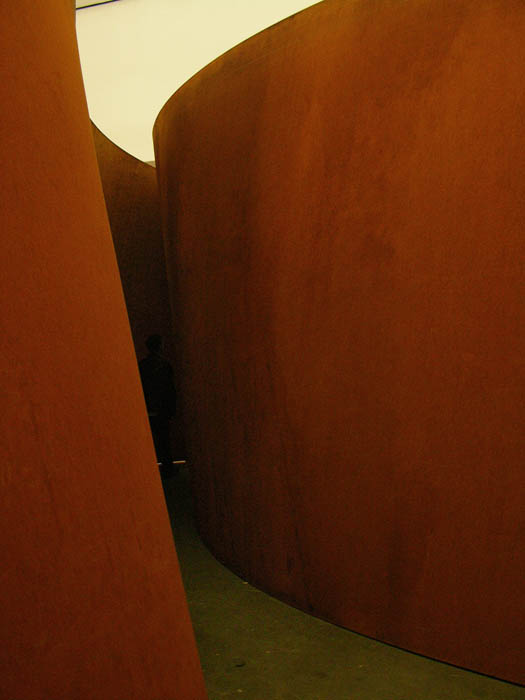
While walking through the dramatic, richly colored spaces of Richard Serra's monumental new work at Gagosian Gallery, I wondered how it was that my feeling about his work had made a complete about face over thirty years.


Where now I see beautiful forms moving through space in subtle and distinctive ways, making me aware of each shift and tilt of the curving plane, thirty years ago I saw bullying, aggressive, threatening sculpture. I knew of the deadly accident during the installation of one of Serra's sculptures in 1971, and a later one that hurt workers and damaged a building. When the Tilted Arc controversy erupted in 1981, I sided with the workers who felt disturbed by the huge piece of steel slicing across their plaza. Serra's work made me angry: it was too big, too frightening to be near; it was a brutal exercise of male power.


But now, for me these overhead photos of the current work on view – Junction on the left, and Cycle – show the sculpture as fluid and organic, even lyrical; I see grace, not threat.


I think that simple familiarity has made me more comfortable with the sculpture, and that installers know how to handle it so there are no more terrible accidents. The bending and tilting of the huge sheets of steel are now an invitation to explore a new kind of physicality, to move through light and color.


Surrounded by high, gorgeously colored steel walls, I walk into constantly shifting space, opening and closing, not feeling diminished by the overwhelming size of it all, but enriched instead. My body engages in a relationship with the changing walls, which, in their movement, feel physically alive and in conversation with me.


The surfaces of the rusted steel are varied and lush, full of details that engage the eye.


I also think that Serra's continuing involvement with curved forms, beginning with the Torqued Ellipse of 1998, shown at the MoMA retrospective of his work, has appealed to my sensibility; they are rigorously formal works, yet at the same time are a poetry of grandeur, of light, and of space.


October 3, 2011

Green Brooklyn: Texture


On my walks to and from the subway in Brooklyn, I began noticing the variety of plantings in the small yards in front of large houses. There were many different hedges, some the usual privet, but also all sorts of conifers. I loved the one above, with its small cones at the center of sprays of needles, little faces ringed by linear ruffs.


Two kinds of plants intermingle, rounded leaves punctuated by the lines of needles. The hedges were often raised above ground level, planted in brick structures, creating orderly built gardens which offered their details to my eye as I walked past.


The creamy white edges of this variegated holly emphasize the spiky shapes of the leaves, dramatically forbidding with the sharply pointed arcs.


I was surprised to see the tropical-looking yucca growing in a small square of garden along the sidewalk. What I most loved about the plant are the delicate strings floating off the tough pointed leaves, writing elaborate letters in air.


And even in Brooklyn there is lichen. I love seeing the surface of a city tree covered with the cool green texture of this hardy little algae/fungus hybrid. It reminds me of my Vermont walks, and makes me appreciate yet again the resilience of life.

October 2, 2011

Eyes in the Subway


Whether walking down the street, sitting in the subway, standing in an elevator, it is standard practice for a New Yorker to avoid looking into the eyes of a stranger. But in the Chambers Street subway station, artists Andrew Ginzel and Kristin Jones have created Oculus (1998) a marvel of a work consisting of 301 mosaic eyes, embedded in the walls of the station corridors. I know I've seen these before, but for some reason yesterday they entered my conscious sight with a startled bang.


Walking along, I saw eyes alone and in pairs, and in different architectural surroundings. Each eye was obviously unique in shape and color, the eye of a particular individual, which made me pay attention and notice their differences. In the link above it is explained that Jones and Ginzel photographed the 301 individuals, making these abbreviated portraits.


The images were translated into beautifully colored, rough stone mosaics by Rinaldo Piras. Mosaic is a perfect medium for the difficult life the art leads underground. There's an active art program in the New York City subways, and you can see an overview here.


A surprising view through a decorative fence at two eyes high on a wall might lead me to start thinking about the all-seeing eyes of the Thought Police, but the humanity and specific personality of each eye tells me something different.


Instead what I see are portraits, individuals saying "look at me, understand me; I am the person across from you in the subway car you daren't look at; I am you."

September 27, 2011

Rosh Hashanah: Happy New Year!


Tomorrow I am heading to New York City for a few days to spend the holiday of Rosh Hashanah with my family; I will also see art and friends. I would like to wish my Jewish friends a wonderful New Year, and to all my friends a time of peace and prosperity and joy.
See you next week.

September 26, 2011

A New Painting: "Overlap"

Overlap, egg tempera on calfskin parchment, 6 x 7 1/4 inches.


When I began to work on this painting I had something like a minor fit of anger towards it: "No, no, I don't want to deal with this, with this level of detail." I planned to set it aside, wipe it out, and began a very lively discussion on facebook about abandoning work that you've begun, which you can see here if you're interested.


The work started well enough: I liked the composition, the overlap of curving forms with minimal color. I always start my paintings with a very loose underpainting, and develop the form, color, and detail from there. I have to admit that I had no idea how I was going to move forward with this painting; how in the world was I going to tackle all those lines on the hoses? I couldn't just leave them out because they're a key to the energy of the image. So, when I got back to work the next day, I first started getting the forms in the right place and correct proportion, but the thought of the detail sent me into something of a nervous breakdown. I felt like throwing the panel across the room, but instead set it aside, and began to work on something else, the painting Middle Squiggle.

One friend, on the facebook thread, commented that it sounded like I needed a day off. When I thought about this, I remembered how I had a similar feeling while cutting back a flower border: "I don't want to do this! I want to be doing something else, like painting!" A couple of days went by and when I went back out to the flower border, I was determined to enjoy what I was doing then, to accept the moment and not bemoan it. It made a huge difference in my feeling of pleasure, so once I finished Middle Squiggle, I looked again at Overlap and saw that I could complete it, if I calmed down and approached it with patience.


What I finally understood was that I had to think about light, rather than detail; light would be the essence of the painting. Once I realized that, things went more smoothly. First I painted the wall behind the hoses, putting layer upon layer of warm and cool, darker and lighter color, until the surface looked like a solid plane and had weight and a presence in space. Using some warmer color in the highlights gave an added sense of luminosity.


I was determined not to measure the lines in the hoses, but to paint them freely, eyeballing the distance between them; the most important thing was the quality of light, created by the relationships of color and value. I painted the lines in lighter paint, then painted over them, as part of the entire columnar form, again and again, changing color, making it lighter or darker, so as to get the sense of opaque and transparent light. Because egg tempera is a translucent paint which dries immediately, it lends itself beautifully to this kind of handling. I wish I'd made the image a little larger, but I'm glad I pushed through with the painting, learning something along the way.