January 15, 2012

From the Freezer, With a Recipe for Eggplant Sauce with Tomato


Last month, when I headed down to the root cellar to get some cabbage for dinner, it inspired me to write a blog post about my storage room in the cellar, which you can see here. The vegetables that keep in a cool cellar – potatoes, carrots, beets, cabbage – are only a portion of my winter eating. Onions, garlic, and winter squash are stored in an unheated spare bedroom. The largest variety of fruits and vegetables from my garden are stored in my small chest freezer, kept in the mudroom. There are the bags of greens – kale, spinach, and swiss chard – the peas, beans, broccoli, peppers, tomatoes, corn, zucchini, tomato sauce, pesto. And fruit: raspberries, blueberries, rhubarb. A frozen cornucopia, which takes a lot of work, to be sure: the picking and blanching and tray freezing and packing into bags (never mind the tending the garden). But to me it's worth it, so that I can have my own organically grown food all year long.


I also have fried eggplant in the freezer, ready for use in sauce and eggplant parmesan. I learned from my mother how to preserve eggplants this way. I fry the slices, drain them on paper towels, then pack them in a plastic box layered on sheets of waxed paper. Since eggplant is one of my favorite foods, it's a treat to have it on hand to make this delicious pasta sauce, from Marcella Hazan's Essentials of Classic Italian Cooking. The broccoli is from my garden, as are the tomato and eggplant, even the red chili pepper (I grow Early Jalapeno). I cook the broccoli by braising it with garlic in a frying pan.


I love gobs of sauce on my pasta, so use more than Hazan recommends. The recipe is very flexible as to amounts of tomato and eggplant, so feel free to emphasize what you like most.

About 1 pound eggplant
salt
vegetable oil for frying the eggplant (I use olive oil; I love the flavor of it)
3 Tbs extra virgin olive oil
1 1/2 teas. chopped garlic
2 Tbs chopped parsley (in winter I leave this out)
1 3/4 cups canned tomatoes, cut up, with their juice
chopped hot red chili pepper, to taste
1 pound pasta (thin spaghetti is recommended)

  1. Slice the eggplant, salt it and let it stand for 1/2 hour. Then drain, pat dry with paper towels, and fry in 1/2 inch hot oil until browned on both sides.
  2. Put the olive oil and garlic in a saucepan and turn on heat to medium. Cook and stir garlic until it gets lightly colored.
  3. Add tomatoes, parsley, chili pepper, and a little salt and stir. Lower heat to a gentle simmer and cook for about 20 minutes, until the oil separates.
  4. Cut the eggplant into 3/4 inch strips and add to the sauce. Cook for another 2 or 3 minutes, stirring once or twice.
  5. Taste for salt and pepper. Enjoy!

January 13, 2012

A New Textile: "Wave"

Wave, hand dyed wool on linen, 10 x 13 inches.


Most of my textile work has been inspired by the minimalist strain of modernist painting, so the images are usually made up of flat shapes. Recently though, I made a work that had illusionistic form, a piece I called Draped, which you can see here. I enjoyed working on it and liked the result, so did a few sketches for future projects using volumetric forms. Instead of focusing and refining my ideas in my textiles, I seem to be expanding them, which is fun for me. I have a varied stream of themes, little rivulets each adding their droplets: drawings, figure/ground explorations, pattern, shapes, multi-part work, and now form. In Wave, I wanted to emphasize the sinuous movement, so I used the dark blue of the background to "draw" a line along the top of the flowing form. I dip dyed the wool, which I explained in the link above, to get a range of color.


As you can see in this detail, the shift from one hue to another isn't smooth, but it is still effective, I think. If I was much fussier and more precise in the dyeing process I could have made smoother transitions; for instance, by dyeing small swatches of fabric in jars that have had gradated amounts of color added to each. But I like the rougher result; I hope it has a certain energy to it.

January 12, 2012

A Walk in the Woods: The Character of Bark


Without the complex distraction of green leafy layers, the physical facts of the trunks of trees attract my eye in winter. They stand, resolute, tall, expressing in their patterns their species and their individual history. A large sugar maple is embraced by a plastic tube, ready to collect sap in the spring, and wrapped by old barbed wire, long since overwhelmed by the sturdy growth of bark.


Some trees have their inner layers exposed in an animal's search for sustenance.


And some have patterns that might be created by disease.


The natural peeling of birch bark catches the sun in shiny curlicues, smooth and glossy alongside rough striations.


A close look at some tree trunks is like a satellite view of a vast landscape, with mountain ranges sinking into valleys.


Yesterday, when I walked through the woods, I had a sudden rush of tender feeling for the grays of winter trees; as I passed them, their spacial relationships changed, yet each remained itself, young or old, thick or thin, damaged or whole: a crowd of life, dormant. Today I was dipping in Thoreau's Journals and found this entry from January 11th, 1857, in which he eloquently describes his reasons for rambling, which touch a chord with me, (although I don't subscribe to his tendency to belittle his fellow men):
I was describing the other day my success in solitary and distant woodland walking outside the town. I do not go there to get my dinner, but to get that sustenance which dinners only preserve me to enjoy, without which dinners are a vain repetition. but how little men can help me in this! only by having a kindred experience. Of what use to tell them of my happiness?

January 10, 2012

A New Painting: "Blades"

Blades, egg tempera on calfskin parchment, 6 x 7 inches.


This painting went through more changes, more uncertainty, than is usual in my painting process, and I'm still not completely sure if it works. I usually follow the composition of my originating photograph fairly closely, but in this case I discovered that I had to leave out a couple of elements, and change the value structure of the image. When I came close to finishing the painting, I thought to myself that it would have been a good idea to take photographs at each stage so that I could illustrate my thinking, but: when I make a change it's often impulsive and I don't stop to think, "gee, I should get my camera and shoot this before I wipe it out". Zoom, it's gone, and I'm on to the next thought. So because I don't have step-by-step photos, I thought I'd show you my reference photo, something I usually hate to do because the photograph is at home on the screen, while a painting is not; a photo of a painting seen onscreen is dimished, while a photo is as fresh as the day it was shot. Also, I am not trying to reproduce a photograph; I am not a photorealist.


Here is my source material. I think you'll notice at once that I left out the sweep of rust moving down the blue-green blade; I left out the fitting on the red one. Here's something of a timeline of my decisions:
  • When I began the painting, the value of red and blue-green were much lighter. I put in the rust sweep, took it out, put it back in. The composition felt pretty uncomfortable to me.
  • I then had the thought to darken the red to the color you see now. Which meant I had to darken the blue-green for balance. That immediately gave the light area at the top left more presence and the whole composition felt more dynamic.
  • I worked for a long time on the curved area of orange rust but never felt quite comfortable with it. There was also a light band of shiny metal that I had painted along the bottom of the upper blade. When I began to work more carefully on it I started to have that oh-no feeling, that it just wasn't right.
  • I had one of my impulses and painted out the light band by painting the orange to the the edge of the blade. I breathed a sigh of relief; it looked much better.
  • But then, it looked like I didn't need the orange curve in the middle of that blue-green, so I painted it out.
  • Okay, it looks like that works. (maybe)


January 9, 2012

"Make it New": What is Originality?

Pablo Picasso, Still Life with a Bottle of Rum, 1911; oil on canvas; 24 1/8 x 19 7/8; from the Metropolitan Museum of Art website.


Is Ezra Pound's modernist injunction to "Make it new" useful? I've long wondered if the push from art school/art world to make work that is unique, original, and avant-garde, doesn't sometimes edge us toward The New at the expense of something deeper. These thoughts came to mind recently because I've been reading an excellent book on aspects of poetry – Nine Gates: Entering the Mind of Poetry, by the poet Jane Hirshfield – which is beautiful and thoughtful and deep, and whose ideas readily translate into the visual arts. I am grateful to two friends for recommending it: Deborah Barlow, painter and blogger, and Susan Jane Walp, painter. In her chapter "The Question of Originality", Hirshfield points to the origins of the word and how they express its two aspects: the idea of something innovative and of something authentic. How important are each of its aspects, and how do we get there? In a letter attributed to Mozart he writes:
When I am, as it were, completely myself, entirely alone, and of good cheer – say traveling in a carriage, or walking after a good meal, or during the night when I cannot sleep; it is on such occasions that my ideas flow best and most abundantly. Whence and how they come, I know not; nor can I force them...
When I proceed to write, the committing to paper is done quickly enough.....but why my productions take from my hand that particular form and style that makes them Mozartish, and different from the works of other composers, is probably owing to the same cause which renders my nose so large or so aquiline, or, in short, makes it Mozart's, and different from those of other people. For I really do not study or aim at originality. (my emphasis added)

Picasso, who certainly can be said to be one of the most innovative artists of the 20th century had this to say:
The artist is a receptacle of emotions come from no matter where; from the sky, the earth, a piece of paper, a passing figure, a cobweb. This is why one must not discriminate between things. There is no rank among them. One must take one's good where one finds it....
When we invented cubism, we had no intention of inventing cubism, but simply of expressing what was in us. Nobody drew up a program of action, and though our friends the poets followed our efforts attentively, they never dictated to us. The young painters of today often outline a program for themselves to follow and try to do their assignments correctly like well-behaved schoolboys.
The painter passes through states of fullness and of emptying. That is the whole secret of art. (my emphasis added)
I believe that time to be alone, time to work, and to think, time to be open to the world, are necessary in order to find our true selves in the cacophony of influences. Finding that self, the one that leads to original and unique thought, is what is so difficult: I remember being told in graduate school that it would take 10 years to find a personal expression, free from our teachers and our peers. It takes more than that; it's an ongoing project if we want to stay alive and alert and fresh in our work. Time, so that the process is natural, and not rushed, so that we don't press ourselves into a preconceived mold of newness.


Balthus, Therese Dreaming, 1938; oil on canvas; 59 x 51 inches; from the Metropolitan Museum of Art website.


If Picasso was a great innovator, the same cannot be said for Balthus, although his paintings are certainly very personal, and very unique. His work shows another aspect of originality: finding something new within a tradition; it is not at all necessary to be an iconoclast in order to express yourself. Hirshfield, who is very influenced in her writing by Buddhism, has this beautiful paragraph on finding originality, on necessary doubt, in words that touch me deeply:
Originality lives at the crossroads, at the point where world and self open to each other in transparence in the night rain. There, the plenitude of being comes and goes. Originality summons originality: a work of art that contains the mind of freedom will call forth freedom in others. But originality also asks presence – the willingness to inhabit ourselves amid the uncertain transports and sufferings that are our fate. To feel, and to question feeling; to know, and to agree to wander utterly lost in the dark, where every journey of the soul starts over.

January 6, 2012

Winter Light: On the Floor, Abstract Compositions


During winter the sun reaches into rooms, illuminating objects and stretches of floor. The depth of winter shadow alongside the bright light creates drama, ordered by the lines of wooden planks or linoleum tiles. The cast shape of a plant adds a sense of the random, while the rug plays with a soft geometry.


This hooked rug by a friend, Andy Drummond, swells against the crisp lines flowing from a chair, the whole composition a bit like the tumbled and tilted planes of cubism.


A minimal composition, as floor meets baseboard; the slight diagonals of light and shadow make the static horizontal and vertical more dynamic.


The grid of old linoleum tiles in my kitchen is a minimalist/expressionist hybrid, with bounding squares containing color variations, along with the random spots of dirt to liven things up. The curved form of a chair back adds further changes to the rigor of the composition.


A heart, straight lines, and curves; light catching on a shiny surface, reflected back in the darkness, small imperfections of dust and wear: a nice metaphor for life during these short days of winter.


Some other Winter Light posts:
Winter Light: Through Windows
Winter Light: Teacups
Winter Light: Creatures in the House
Winter Light: Knobs and Handles
Winter Light: Rounds

January 5, 2012

Pattern in Native American Art


Artist unknown, Chilkat Tlingit; Chilkat robe (naaxein), ca. 1850-80; mountain goat wool, cedar bark, native dyes.


I recently spent an inspiring afternoon at the Hood Museum of Dartmouth College; they have a very large collection of Native American art and highlights from their collection are now on view. A year ago I saw another aspect of the collection, a very fine group of ledger drawings, which I wrote about here. The show, which was guest curated by George Horse Capture, Joe Horse Capture, and Joseph Sanchez, is arranged by geographic region; the wall labels are often fascinating. Although the Hood is a small museum, this show is expansive; after seeing all the work I gave myself a more focused assignment for this blog post: the use of pattern.

The Chilkat robe, from the Northwest Coast, was the most powerful object in the show. Its repeated dramatic patterns derived from Tlingit origin legends, with depictions of animals that were important to the culture. This particular robe has a human face at center surrounded by images of a diving whale. The robes were highly prized works of art. Curator Joe Horse Capture explains:
Woven robes of this type were created by women from a pattern that was painted on a board by a man. These pattern boards were passed down through the family. This garment would have been worn by high-ranking tribal members during important events such as ceremonies and feasts....This type of technique, known as Chilkat weaving, is one of the most complex weaving techniques in the world. It might take a woman over a year to create this type of garment. Like other forms of Northwest Coast art, this weaving features a three-dimensional animal on a two-dimensional object.

Artist unknown, Woodlands/Great Lakes, Wisconsin; Container depicting the cosmological universe and, on the underside, two Thunderbirds, ca. 1800; birch bark, wood, spruce root, twine (added later).


Like the Chilkat robe above, this box has imagery that symbolizes origin legends. What looks like simple, decorative, repeating patterns of triangles and lines is actually a very complex story, handed down for centuries. The vertical triangles represent the Above World, the lower rectangles the Underwater World. From the wall label:
The two realms portrayed on this container represent a cosmic universe of immeasurable consequence, in which two powerful supernaturals, or manitous––the Thunderbird of the Above World and the Great Horned Underwater Panther of the Underwater World––hold power. They are forever engaged in a cosmic clash for dominance, a war of no retreat and no advance in a place of eternal time, space, and energy. The Thunderbird and the Underwater Panther rule over environments that are beyond the perception and immediate access of humans. As such, both maitous are sources of power for hunters, warriors, and healers, who seek their assistance through fasting and prayer.

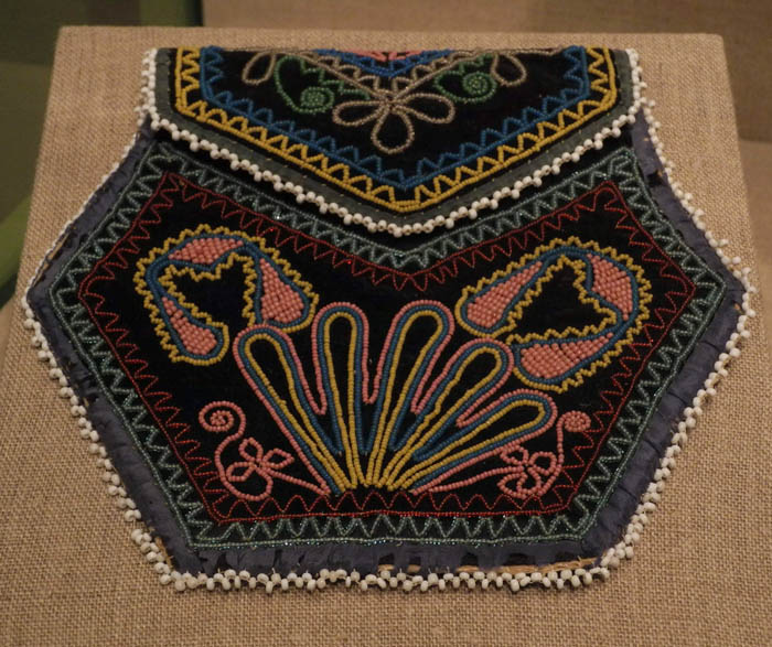
Artist unknown, Seneca, Haudenosaunee (Iroquois), New York; Bag, ca. 1830; glass beads, velvet, cotton cloth, ribbon, thread.


In another surprise for me, the design of this charmingly beaded bag has more meaning than is readily apparent to a casual viewer. Many Haudenosaunee were devout Roman Catholics, so the heart imagery, in addition to being traditional, drew inspiration from the Sacred Heart. Here the hearts are surrounded by sun symbols, a Native American spiritual expression. It is a beautifully shaped and designed piece, with refined and delicate beadwork.


Artist unknown, Apsaalooke (Crow/Absaroke); Cradle, ca. 1880; native-tanned deer or bison hide, wood, glass beads, sinew, paint, thread.


I love the way the patterns and colors at the top of this cradle are repeated in the ties below, the shapes of triangles echoed in the triangular shapes of the ties. It is a sophisticated design in a material––beads––that hadn't become a major Crow art form until after 1850. Before that, porcupine quills were used for decoration.


Artist unknown, Siksika (Blackfoot) or Assiniboine (Nakota [Yankton Sioux]); Gun case, ca 1890; native-tanned hide, glass beads, wool cloth, clay wash, thread.


In this gun case we can see similar colors and use of the triangle to the cradle above. It interested me that such a beautiful case would have been made for a gun, but of course they became very important in the survival of a tribal group. This somewhat upsetting short history of the gun and Native Americans was on the wall label, by George Horse Capture:
Long ago, when a small tribal group had a conflict with another for some reason, casualties were minimal because they were equally armed with bows and arrows, spears, and large shields. Their encounters usually consisted of shouting insults at each other, throwing rocks, and other non-lethal activities. In the early 1700s, when guns came from the east, the entire world of the Indian people changed. The weapons of the Indian people were mostly ineffectual against the gun, whose bullets could penetrate the hide shields. The tribes who established relationships with the Anglos soon had the gun and would rule the Plains. Whether on horseback or on foot, one had to carry the guns, and the Indian people soon decorated their scabbards or gun cases with their colors and tribal designs.

Artist unknown, Tsistsistas/Suhtai (Cheyenne); Girl's Dress, ca. 1930; native-tanned hide, glass beads, bone, string, sinew, thread.


It is wonderful to think of the tribal culture lasting into the 20th century, long enough to produce this hide dress decorated with elk teeth and beadwork.


Artist unknown, Lakota (Teton/Western Sioux); Child's Dress, ca. 1890; wool cloth, ribbon, dentalium shell, metal sequins, cotton cloth, thread.


This dress has the same type of design as the one above, using decorative elements to create a repeat pattern on the yoke. But this small object shows the power of trade, as the wool, ribbons, and sequins came from Europe, while the shells came from the Northwest Coast, a trade item since prehistoric times.


Artist unknown, Santo Domingo Pueblo, Dough Bowl depicting diagonally quartered paneled design with ovoids, ca. 1890; earthenware, painted with colored slips and burnished.


One of the great art forms of America are the ceramics produced by Native Americans in the Southwest. This bowl, with its unevenly rounded forms held in by the geometry of triangles, seems to express the fullness of life.


Artists Unknown, Kiowa and Apache; "Strike-a-light" pouches, ca. 1870 and 1880; leather, hide, glass beads, tin cones, tin, metal, cotton cloth, ochre, thread.


These pouches were originally made to carry tools necessary to make a fire, and when matches became widespread, they held ration cards. They both have very lively designs, and I love the use of the small tin cones as dangling elements.


Artist unknown, Mescalero Apache; Saddle Bag, ca. 1900; rawhide, native-tanned hide, wool cloth, glass beads, sinew, ink.


This patterns reminds me of paper doll cutouts, since the hide was cut away to make the design, which looks like a row of figures.


Artist unknown, Pomo; Basket, ca. 1905; sedge root, willow, bracken fern root, California valley quail crests, clamshell disc beads, string.


These final two objects are beautiful examples of basketry, made in California. The shifting patterns articulate the volumes, and make me aware of the flow of form as I follow their movement across the surface. The decorative elements of shells and feathers add a lightness to the design above, as does the handle form rising from the lid below. The abstract pattern of these works, and others in this exhibition, is strong and sure and aesthetically deeply satisfying.


Elizabeth Conrad Hickox, Karuk/Wiyot, 1872-1947, or Louise Hickox, Karuk, 1896-1967.
Basket, ca. 1925; wild grape root, myrtle sticks, hazel, maidenhair fern, yellow-dyed porcupine quills, staghorn lichen.


January 3, 2012

A New Hooked Wool Drawing

2012 #1, hand dyed wool and egg tempera on linen; 2 pieces, each ca. 20 x 8 inches.


My first drawing of the new year is a diptych, based on the idea of hanging scrolls. A couple of years ago I did a hooked textile of the same dimensions (I just now discovered this) which you can see here, so this is a thought that has stayed with me. I wanted to keep the design repetitive and simple. I stole an idea from myself, of a curved line overlapping a form (you can see another use of this here), but I believe I stole it from Sonia Delaunay, although it wasn't in my catalog from the show Color Moves at the Cooper Hewitt. I paired the tilted rectangles with circles, evenly spaced, although the lines between them confuse the intervals.

I must have been going through late year muddles, because just like with my last painting, this piece gave me some trouble. I first made a right panel that had larger circles than this one, which looked much too large alongside the rectangles. So I made another, with smaller circles, which turned out a little too small...but that's easy to fix. What wasn't so easy to fix was that the cross at the bottom was too low. You probably think: what's the problem? just pull it out and move it up. The problem is that I draw it in pencil first, in soft, dark pencil, which doesn't come off by erasing. I decided to take a chance and try washing the pencil off, gently, which worked. But the linen shrank a little, of course, even with my pulling and tugging as it dried. So the work isn't perfect, but then it never really is; there is never a straight and true edge, or precise form, which is one reason I love doing these textiles along with my much more rigorous paintings.


January 2, 2012

A Walk in the Woods: The Line Dances of Turkey Tracks


It is thought that Benjamin Franklin had wished that our national bird was the wild turkey and not the bald eagle. I too wish this were the case; the wild turkeys of my neighborhood are beautiful and silly, rotund and elegant; they are very social, hanging out in groups of young and old. They seem lumbering, pecking their way across the fields, but can take flight in a quick whirr when they feel threatened. An eagle inspires awe, a turkey smiles and laughter, at least for me, and which is better? I photographed this tom turkey a couple of winters ago, on my front lawn.


Another benefit of wild turkeys are the tracks they leave as they walk about, their three long toes marking distinctive patterns in the snow. They make beautiful sinuous lines, one footstep in front of the next.


Deer tracks, like small hearts, are shapes, while the turkey draws with line.


Here the lines curve at the top edge, a compositional decision necessitated by the turkey running into a bank.


And here the all-over dance of several turkeys, random and exuberant, contrasts with the heavy certainty of a truck tire, lightened by its graceful, symmetrical treads. It's a perfect image of human manufacture and wild life.

December 30, 2011

Happy New Year! in Masereel's "The City"


When I walked into the studio to find inspiration in my art books for a New Year's post, I noticed my copy of Frans Masereel's The City, a dramatic wordless novel in 100 woodcut images, published in 1925. What a glorious image of fireworks to start the new year!


Masereel's portrait of the city is one we would recognize today, with the intense bustle of rush hour...


to the long lines of workers laboring at their desks...


the hard physical labor to build the city's structures...


and the manual labor to make its factory goods.


The city that Masereel so vividly depicted was one of work and play, drudgery and debauchery, love and violence. And, like today, the rich strongly contrasted with the poor.


There was intimacy; there were large crowds celebrating or protesting; there was lonely despair.


I wish all of you a year full of peace and prosperity and the beauty of the world around us, from the grandeur of starry skies to the tiny things that touch us. And I also hope, as Masereel did, that the world becomes a better place.