January 15, 2013

A New Painting, a New Idea, for the New Year


Untitled (Red, Blue, Yellow), egg tempera on calfskin parchment, 7 3/4 x 5 5/8 in.


A couple of weeks ago I had a curious brain wave; I had just done some sketches for new textiles (see below) and for some reason found them so compelling that I thought I'd try painting a similar motif: "ribbons", or flowing, curving, long thin shapes. I took out various pieces of wool left over from my textile projects––I save it all and have 3 shelves full––and played with colors and shapes. I think that part of what excited me so much was the idea of working with a greater range of color than my machines afford me, and having the ability to move things around at will, like a real still life painter. 


Untitled, detail


My paintings of agricultural equipment have always had a subtext for me; in addition to their formal qualities, there was always the meaning of farming in today's world. But this work, and others to follow  are more purely formal, about color, and gracefulness, and tensions across surfaces, and light, and weight. I don't know if this first painting in a new format is all that successful, but I don't care. I do know that as I work at something, it does get better over time, and I have quite a few ideas I'd like to pursue. At first I thought I'd give up working on the machinery images altogether, but as I looked over the studies I have, I was able to choose several that still seemed strong and compelling. They have wide ranging compositions that I could never find in a studio still life; so, I will do both. And why not, since I seem to be doing a little of nearly everything these days, except for sculpture. 


Here are the sketches for textiles that got me so excited. There was something about the forms that just pleased me. 


I put my three most recent works together to see how they related to each other; I think they're a bit like first cousins. For me the big difference is the light, with the two machine paintings painted in sunlight and the ribbons in a subdued light, but I can work with more cast shadows in future. The ribbons take some getting used to for me; the curled forms are so different, and I'm not sure of their emotional presence. But as I wrote above, I'm going to push on with them.


And I'm going to have some other fun: I began to think about shapes I could add to the still lives, so went out and bought some dowels, and some Play-Doh; along with potato and cardboard prints, it's a return to childhood. I can mold shapes that I might need (ah, maybe this counts as sculpture!) and smell that unique scent that takes me back years and years to youthful play.


January 13, 2013

Grasses and Snow


On a recent morning, I looked out my bedroom window and noticed how beautiful the dried golden grasses looked against the snow. When I took my camera out to explore them, my mind was full of the compositional ideas of Japanese Rinpa art with its form and emptiness, which I recently wrote about here. The grasses were graceful notes upon the whiteness, from a simple mark, alone, to lines of arching stems.


Snow as empty ground, as of plain or gilded paper, with the traceries of fluid marks above. 


Pale gold stems arc and reach, as though to animate the bare snow. 


Three stems, with fine, expressive leaves, are delicate ink drawings on a fine white ground. 


Two grasses, caught under snow, make curved structures above, large and small, complex and simple, a relationship across emptiness.


January 10, 2013

New Textiles: "Portals 1 and 2", an Homage to Josef Albers


Portal 1 and 2, 2012, hand dyed wool on linen, each 9 x 12 in. 


After writing about the Josef Albers works on paper––you can read the blog post here––I felt that I wanted to make a textile freely based on his work, as an homage. I began with one, but decided to make a second piece, to have warm colors alongside the cool. 


Portal 1, 2012hand dyed wool on linen, 9 x 12 in.


Rather than use his famous "homage to the square" format, I was inspired by the earlier works of Albers that came from his visits to Mexico, his "Adobe" series (see below), which I turned into a more simple composition.


Portal 2, 2012, hand dyed wool on linen, 9 x 12 in.


I chose to divide each piece in half by cutting the loops on one side, the opposite side for each, which creates a different color because of the way the light bounces off the wool.


Portal 1, detail


In this detail, you can see how the color is affected by the cut loops. My idea to do this came from the color study for Homage to the Square below, where Albers used an area of varnish over the oil paint to see how it changed the color. The color shift is more subtle with this hooked textile, but it's there. I enjoyed making these simple statements of color, with a tip of the hat to Josef Albers. 


Josef Albers, Variant/Adobe, 1947; oil on blotting paper mounted on paper board, 17 1/4 x 24 in.


Josef Albers, Color Study for Homage to the Square, n.d.; oil on blotting paper with varnish, 13 1/4 x 12 in.


January 9, 2013

At the Met: Japanese Art, A Full Emptiness


Tawaraya Sotatsu, Waterbird in Flight, 1630s; hanging scroll, ink on paper.


There is currently a beautiful exhibition in the Asian galleries at the Metropolitan Museum of Art that will only be open through the weekend. Titled Designing Nature: The Rinpa Aesthetic in Japanese Art, it focuses on a tradition in Japanese painting and design based on the work of Ogata Korin (1658-1716), a painter from Kyoto, whose most famous work is the Eight-Planked Bridge, a stunning composition of irises across two six-paneled screens. Walking through the show, I felt elevated by the fresh, close attention to nature, and by the fluidity of the calligraphy (which I wrote about in this blog post). At the link to the exhibition above, you can read about the definition of Rinpa, including its "bold, graphic abbreviation of natural motifs", but to me it seemed simply a great collection of Japanese painting and design. For instance, the painting above was made before Korin's birth, yet has a similar drama in its composition to later works. What I found most fascinating about these works, and what I chose to focus on in my photography and in this post, is the remarkable power of the careful placement of objects within large empty spaces. The flight of the bird upwards animates both the space above and below it; our body feels air and light rising to the elegant calligraphy.


Ogata  Kenzan, Plum Tree and Hollyhocks, 1743; pair of six-panel folding screens, ink and color on gilt paper.


The gold background of folding screens brings light and depth to its varied surface. The composition of reaching branches also enlivens the screen. There is a perfect balance between line, shape, and space.


Attributed to Tosa Mitsumochi, Red and White Poppies, early 17th century; six-panel folding screen, ink and color on gilt paper.


The backgrounds never feel simply left over, even with a work such as this, with carefully rendered poppies on a gold field. The angle of the flowers, their openness or density, the way some sit above a geometrically patterned wall, all create a conversation with those seemingly bare spaces that fills them with feeling.


Flowering Plants and Vegetables of the Four Seasons, early 18th century; pair of six-panel folding screens, ink and light color on gilt paper.


The natural world is shown here with great refinement and delicacy, and the empty spaces become illusions of actual space: a clump of grasses rising out of a river, a vine in front of concealing mists.


Box of Five Trays with Crabs and Waves, 17th century; gold maki-e on black lacquer


A similar aesthetic of simple drama, of forms within a largely empty space, is also found in some of the stunning objects made in Japan, such as this lacquer box. Elegant curves of waves contrast with spiky crabs' legs, all floating on a depth of black.


Spring and Autumn Trees and Grasses by a Stream, second half of 17th century; pair of six-panel folding screens; ink, color, gold, and silver on paper. 


Curving forms of tree trunks and masses of leaves rise above a ground bare of all but a few thin stems of grasses or flowers. I love this part of the screen which balances a lower emptiness with all the forms at its top.


Suzuki Kiitsu, Irises and Stream, mid 19th century; hanging scroll, ink and color on silk.


Similar to the hanging scroll above, this painting uses a dramatic placement of form at the bottom of a long rectangle; it is even more daring in that there is nothing above to pull our eye upward. But still it works....how? How does the artist manage with such simple means to create enough energy to fill the blank surface? 


Furuya Korin, Korin-style patterns, 1907; one of two volumes, ink on paper.


I am ending this post with a nod toward Japanese textile design. This is a book of patterns for textiles, based on Rinpa designs and intended for Kyoto kimono manufacturers. The gathering of irises at bottom, the line of the bridge leading upward to a few spears of leaves, with all the rest water, is an elegant composition.


Kimono with Pines and Mist, second quarter of 20th century; silk, hand-painted and paste-resist dyed with painted gold accents. 


I gasped when I saw this. Part of the astonishment is the drama of the kimono shape, but it is heightened by the flowing shapes of pines at the bottom and rising up the sides, floating on a rich black ground, a ground which is so present, a counterpoint to the irregular curves and subtle tones of the pines. There are so many lessons for me here: about simplicity, about balance, about careful observation of the natural world, and about how drama and excitement can come from subtle shifts of shapes in space. 


January 7, 2013

Vegetarian Black Bean Chili


During winter my appetite turns to soups and stews, and one of my favorite meals is a flavorful black bean chili, from the great Deborah Madison in her The Greens Cookbook. It is hearty and deliciously spicy, but what gives it a special flavor is a small amount of canned chilpotle chili, which are jalapeno chilies which have been smoked; the slight smoky taste is unusual and enticing. The recipe seems long, but it's quite easy, especially if you take a short cut and don't toast and grind whole spices. I do that, but the flavor probably won't suffer if you skip it and use ground cumin and chili powder. This is a very warming meal with a piece of cornbread and a dollop of sour cream.

2 cups black turtle beans, soaked overnight
1 bay leaf
4 teas cumin seeds
4 teas oregano leaves
4 teas paprika
1/2 teas cayenne
1 chili negro or ancho chili for chili powder, or 2 to 3 Tbs chili powder
3 Tbs vegetable oil
3 medium onions, diced into 1/4 inch squares
4 cloves garlic, coarsely chopped
1/2 teas salt
1 1/2 lbs ripe or canned tomatoes, peeled, seeded and chopped; juice reserved. (I use one of my full jars of home canned tomatoes, which is over 2 lbs, which is why the photo looks tomato-y.)
1 to 2 teas chopped chilpotle chili
about 1 Tbs rice wine vinegar
4 Tbs cilantro, chopped (I don't have cilantro in winter, so leave it out)
For garnish: grated muenster cheese, green chilies, creme fraiche or sour cream, sprigs of cilantro


  1. Soak beans overnight in plenty of water. Next morning, drain, put them in a large saucepan covered by a couple of inches of water, and bring to a boil; then lower the heat and let them simmer as you prepare the rest of the ingredients.
  2. Heat a small heavy skillet over medium heat. Add cumin seeds; when they begin to color, add the oregano, shaking the pan so they don't burn. When the fragrance rises, remove from heat and add the paprika. Stir and remove from the pan. Grind in a spice mill or mortar. (I have a small coffee mill dedicated to spice grinding.)
  3. If you are using the ancho or chili negro, preheat oven to 375º. Put the chili in the oven until it dries out, 3 to 5 minutes, then cool it briefly. Remove stems and seeds and grind in spice mill.
  4. Put the onions and oil in a large skillet and cook over medium heat until the onions soften. Add garlic, salt, ground spices, and chili and cook 5 minutes. Add tomatoes and their juice, and 1 teaspoon of the chilpotle chili. Simmer for 15 minutes, then add to the beans. Add water if needed to have liquid 1 inch above the beans. 
  5. Cook everything slowly until the beans are soft, an hour or longer. Add water if needed, though this should be quite thick when done. When the beans are done, taste for salt, and add more chilpotle chili if you'd like. Add the vinegar and cilantro.
  6. Serve in bowls over a spoonful of grated cheese, topped with sour cream and other garnishes if desired. 

January 6, 2013

Four New Drawings, with a Couple of Words on Sacred Geometry


 #5, 2012, egg tempera and graphite on hand-toned paper, 15 x 15 in.


When I began this series of drawings based on six circles around one that I found in a book on Islamic design, I wrote in this blog post that they seemed to be a spiritual exploration, which was totally unexpected for me. I became very curious about this feeling, so when a friend, the blogger and artist Deborah Barlow suggested that I read some Sacred Geometry, I ordered a couple of books on the subject, including Sacred Geometry: Philosophy and Practice by Robert Lawlor. I've been poking away at it, and find the subject fascinating, from very basic concepts––the Circle, which is Unity, as The Heavens, the Square as Earth, and the Triangle in its three part nature which is Heaven, Earth, and Human––to more complex ideas about the nature of reality.  Lawlor writes that:
The practice of geometry was an approach to the way in which the universe is ordered and sustained. Geometric diagrams can be contemplated as still moments revealing a continuous, timeless, universal action generally hidden from our sensory perception. Thus a seemingly common mathematical activity can become a discipline for intellectual and spiritual insight.  
By seeking the invariable relationships by which forms are governed and interconnectedwe bring ourselves into resonance with universal order. 
I've even begun to understand Plato's ideal forms, the concept of which I've long resisted.


#6, 2012, egg tempera and graphite on hand-toned paper, 15 x 15 in. 


I think that some of the uncanny feeling that I have while working on these drawings, that they are something almost beyond me, comes from their basis in the overlapping circles of six around one, the six days of creation and one of rest; any shape I find within these circles seems to have an emotional weight greater than a simple pattern. (it's also possible I'm just being silly). At any rate...this downward facing triangle has been used to represent female energy. 


#6 detail


When I began the drawing, I didn't have the intention of making the green a transparent color, but as I worked, it made sense to be able to faintly see the completion of the circles under the triangle.


#7, egg tempera and graphite on hand-toned paper, 15 x 15 in.


In #7, the translucent central circle is surrounded by opaque blue shapes in the four corners; there is an illusion of depth, of lightness and of weight.


#8, egg tempera and graphite on hand-toned paper, 15 x 15 in.


There are also smaller shapes created by the overlapping circles, thin pointed ovals that look like the petals of flowers when seen at the circles's centers. I picked out three horizontals and crossing diagonals to make this image of not-quite three primary colors––blue, yellow, orange––on blue. I continue to be amazed at the range of shapes and compositions that can be found within the same pattern of circles.


January 3, 2013

Chuck Close: Facing Reality


Self Portrait


Looking directly into the face of a painted portrait can be an uncanny experience; we relate to the humanness of it, yet it is only paint. It is understandable that Chuck Close has made the portrait the focus of his life's work; no matter what technique he uses to fashion the image, we search for its resolution into a face.


Close's recent exhibition at Pace Gallery included several oil paintings, including two suites of self portraits, new watercolor prints, and tapestries; the paintings above are about 36 inches high.


Stepping up to the painting, I could see that the image was made up of a diagonal grid (all his work is based on photographs), filled with wacky little shapes and colors.


On its most basic level, this painting insists on its abstraction; it dramatically illustrates the transformation from shape, color, mark, into a illusionistic whole. I've always admired Close's experimentations with mark making, with how we compose an image in our mind. He has used fingerprints, airbrush, and bits of handmade paper instead of paint to build an image, always using a grid, always based on a photograph. There is a sense of play along with a serious questioning of perception and representation.


Phil, 1969; synthetic polymer on canvas, 108 x 84 in. (from the Whitney museum website)


But...this show at Pace reminded me, because of the tapestry works below, how powerful Close's early works were: those unadorned, gigantic heads, confronting us with their overwhelming presence. In 1998, the Museum of Modern Art mounted a retrospective and it was then that I realized how strong and how important those older paintings were. From the use of something as dispassionate and rational as a grid comes a head both monumental and ordinary; its realism takes it beyond "art" into something more fundamental, almost magical. For all its sophistication of technique, there's a quality of an innocent eye, since the technique does not call attention to itself as in the self portraits above. 


Lucas, 2011; jacquard tapestry, 87 x 74 in.; ed 6 

I was very excited by my first viewing of Chuck Close's tapestry works, because they go back to his idea of a resolved, realistic image. They too are based on a grid. As Close explains in this interview, tapestry technique prefigured the computer, using a hole or no hole for threads up and down, like the 0 and 1 of computer code. The tapestries, made in Belgium, are based on daguerrotypes, another old technique, and use an electronic jacquard loom. You can read more here about the process from Magnolia editions, who published these works.


Lucas, detail


Click on the image to enlarge it so you can see more of the detail of the weaving. Although the image looks monochromatic, many colors were used to achieve its rich detail.


Lou, 2012, jacquard tapestry, 94 x 76 in. ed 6


I admire Close's constant stretching, endless experimentation. And I'm happy that this tapestry technique has brought him back to the unflinching representation of his earlier years. 


Lou, detail


installation shot, from Pace Gallery website


January 2, 2013

A New Painting: "Hemisphere", with Some Notes on Composition


Hemisphere, 2012, egg tempera on calfskin parchment, 7 1/4 x 5 1/2 in. 


This painting is the last I completed during 2012; there will be changes to come in the new year. In this image, I enjoyed the big bulbous form at center, the way it changed the environment of flat planes into something more tactile. The cast shadows repeat forms, creating visual rhythms. 


Each painting I do is a selection of found elements, photographed in the field and often cropped further in the computer. Sometimes I use the composition as found, but other times, as with Hemisphere, I make various adjustments as I work, trying for tensions that will settle into balance. I marked the photo source for this painting to point out the changes I made:

  • I pushed that top diagonal upwards, since I felt the downward tilt made the painting slide off to the right. The top form became something of an arrow pointing to the sphere.
  • I moved the hemisphere off a little to the left, again so the composition wouldn't be weighted to the right. Although the form is toward the left, it appears fairly centered. 
  • The bottom slight diagonal, another rightward tilt, was straightened. I also moved it down so the shape at lower right would overlap it.
  • Got rid of the hay; too real world.
  • Got rid of two little holes and a bolt; simplify.  

These compositional changes and adjustments are part of the painting process, and that's without even mentioning color, which is always different from the source, sometimes subtly, sometimes dramatically. Although the painting is "realistic", it's still a painting, a thing that represents the world, but is itself a flat object made of pigment and binder. As Magritte wrote on his painting of a pipe, The Treachery of Images: "Ceci n'est pas un pipe." (This is not a pipe.).


Hemisphere, detail

December 30, 2012

Happy New Year! With the Abundance of Spanish Still Life


Luis Melendez, Fruit in a Landscape, 1771; oil on canvas, 25 x 33 in. 


In thinking of New Year's wishes to you, dear readers, what could be better to illustrate them than with the richness of Spanish still life painting? From a watermelon bursting with juicy sweetness, pink and crisp....


Juan Fernandez, el Labrador, Vase of Flowers, 1636; oil on panel, 16 1/8 in. diameter


...to a full round vase of spring flowers, petals trembling with life and promise...


Francisco de Burgos Mantilla, Still Life with Dried Fruit, 1631; oil on canvas, 11 7/16 x 23 3/16 in. 


...to paper cornucopias of dried fruits and nuts, small pleasures that will keep through the year; all these sensuous things, of taste and sight and smell, can be symbolic of a year to come full of joy and of beauty.


Juan Sanchez Cotan, Quince, Cabbage, Melon, and Cucumber, ca. 1603; oil on canvas, 27 1/4 x 33 1/2 in. 


And in this more restrained and elegant arrangement, I think of calm and peace, and wish you both.


Francisco de Zurbaran, Still Life with Lemons, Oranges, and a Rose, 1633; oil on canvas, 24 1/2 x 43 1/8 in. (see this in high resolution on the Norton Simon museum website.)


This remarkable Zurbaran is an image of fruitfulness, with grace and balance; the bitter citrus with the sweet orange blossoms and with the rose, (and I know how many of you love your coffee!) Light washes over all, as forms emerge from darkness. May you all be similarly illumined. Happy New Year!

December 27, 2012

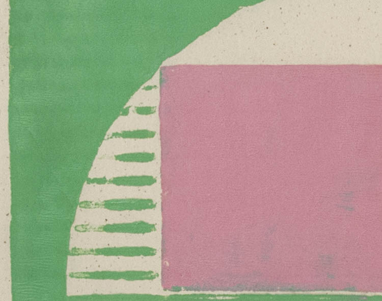
A New Cardboard Print: "Peppermint"


Peppermint, ink on Japanese paper; image size 10 x 10 in., paper size 18 x 18 in. 


I guess I was feeling a little silly when I designed this image (and it was way before Christmas). I was wondering if I could make something work using these candy colors; I'm still wondering. The print has some technical issues––green bleeding into pink, the ink viscosity a little tacky, some of the lines not properly inked––but I accept those imperfections as part of the process, even as adding character. But is the color just too unserious? 


Peppermint detail


To my readers: I've had to turn on word verification because of a recent high volume of spam; I'm sorry, but it helps.