March 12, 2013

A Fixed Point of View

Old Kingdom, Egypt, Tomb Chapel of Raemkai: West Wall, ca, 2446-2389 B.C.; limestone, paint.


I've been thinking lately––because of my foray into a different kind of still life painting––about the history of perspective's fixed point of view and how it likely strongly influences the way we see the world today. In ancient Egypt, artists used the most easily characterized aspect of the human form in depicting it: heads in profile, shoulders mainly facing front, legs again in profile. This shifting of viewpoint seems sensible and true, but also so much of its time and place. The way we see bodies has changed. 


Ambrogio Lorenzetti, Allegory of Good Government, 1338-40; fresco


In this early Renaissance fresco buildings are piled up in vigorous masses. Each building obeys its own rules as to the way it exists in space; windows recede into a distance, but without a relationship from one building to the next. This makes for a charming hodgepodge, a sense of a crowded, rambunctious space. 


Piero della Francesca, Flagellation of Christ, 1455-60; oil and tempera on panel, 23 x 32 in. 


Then came the discovery of perspective in Renaissance Italy. The world became supremely ordered, with objects receding into the distance in a measured way. Because of the camera, which has a single fixed lens, this way of seeing has become embedded in our culture, but it still does have to be taught since it's not an innate way of seeing.


Pablo Picasso, Still Life with a Bottle of Rum, 1911; oil on canvas, 24 1/8 x 19 7/8 in.


This disconnect between perspectival order and the actual way we may see the world––multiple points of view at a time, objects assuming visual importance for psychological reasons, a true visual jumble––means that perception is more complicated than the clarity of one point perspective leads us to believe. Cubism pointed towards a true aspect of seeing and understanding.


Knowing all this, I am still tied, in my painting, to a fixed, single point of view. It's become the way I see the world, the way I understand it. So, when I began painting small still life paintings using folded cloth, I continued to use a photographic reference. The reason why is what got me thinking about shifting points of view: because I wanted a frontal image, I had to look at the still life setup from directly above. As an aside, there's also the light: I photographed this in sunlight pouring through a window, which I don't have in my workspace. 


If I placed the still life on the table where I work, the point of view changes.


If I put it lower on a chair, it also changes. It changes as I move forward and back, closer to the setup and farther away from it. Years ago, when I worked directly from still life, I set up tabletop arrangements and sat a certain distance from them, creating a fixed point of view. It's almost amusing to think that this shifting is closer to the way the world really works than the supposed "realism" of a work with precise and fixed edges. The way I see, the way I paint, is a construct, not any closer to reality than a Malevich black square on a white ground.


March 11, 2013

Two New Hooked Wool Drawings: Something New Inspired by Sophie Taeuber-Arp

2013 #4, hand dyed wool and egg tempera on linen, 15 x 12 in. 


I love when seeing art inspires me to do something different; Quattrocento Italian painting got me working in egg tempera (I wrote about it here); I started painting on calfskin parchment when I saw the stunning show of the medieval manuscript The Hours of Catherine of Cleves;  I began making prints after seeing the exhibition Print/Out at the Museum of Modern Art. I've always used paint in my hooked wool drawings to color discrete shapes, but one work at MoMA's Inventing Abstraction show got me thinking about using color as background, with these two new pieces as a result. 
  

Sophie Taeuber-Arp, Untitled (Composition with Squares, Circle, Rectangles, Triangles), 1918; wool needlepoint, 24 x 24 5/8 in. 


I loved this beautiful needlepoint by Taeuber-Arp; it was my favorite textile in the show. It has a perfect balancing of shapes and color. She worked on a deep blue fabric, adding needlepoint shapes onto it. I have been so used to thinking of my light-colored linen backing as the background color; seeing this piece was an ah-hah moment: I can paint the linen, leaving its light color as shape, surrounded by a colored ground.


2013 #5, hand dyed wool and egg tempera on linen, 15 x 12 in. 


This adds a whole new world of compositional possibilities for me in this series, gives me more to think about and to play with (and it is fun). 


2013 #5 detail


Here's a detail, showing the irregularity of the paint on the linen surface.


I was concerned that these new pieces would look very out of place with previous work, but it looks like they fit in. I don't plan to give up on making central images on bare linen, but to widen my range of expression. 


March 9, 2013

Blue Shadows on Snow


This morning I awoke to what has been a rare sight the past couple of months: bright sun and blue sky. The slanting early morning sunlight played over the snow, picking up the sparkle of flakes, while grand shadow-shapes marched across the white expanse. 


Linear shadows sweep over the curved ground, and gently follow the arc of the distant pond.


Shadows of transportation.


Straight lines of cast shadows meet the curving lines of my snowshoe tracks, which encircle the berry patch. There is no better illustration of the cool color of cast shadows than early morning shadows on snow, when the blue is vividly blue and unmistakable.


Claude Monet, Haystacks (Effect of Snow and Sun), 1891; oil on canvas, 25 3/4 x 36 1/4 in. 
From the Metropolitan Museum of Art website.


It was the Impressionists who taught us to see light and color in this way, with cool cast shadows and warm reflected light. Oh, it was there in the world before they painted it, but did anyone see it before? How much do we have to know before we see?


March 7, 2013

A New Painting: "Black Across Red", and some thoughts about feeling/mood in paintings.


Black Across Red, egg tempera on calfskin parchment, 6 1/2 x 8 in.


Like the painting I completed just before this one, Facing Green, Black Across Red is mainly flat colored planes facing us, in light and in shadow. There is an addition of a black tubular shape crossing the surface, which lessens the ambiguity of scale that is part of the previous work. The solid geometry of both is similar, though, as is their mood. I began to ponder this question of feeling the past couple of days, as I've been working on my next painting, one of my folded cloth still lives, which seems to me to have a different quality from this. All my paintings are moving closer to abstraction, moving farther from a "real" source, identifiable as objects out in the world.

So, where are the differences? is mood/feeling the same as meaning? When I look at my most recent paintings, I see a forcefulness, a weighty seriousness, an almost somber quality, even with the sunlight. I have done paintings that exhibit some humor––and that little blue square in Facing Green has a little smile to it––but basically I think there is a calm toughness. Some of this, of course, comes from my precision, which pins everything down in place, and also from the severe frontality.


Untitled (Orange, Pink), egg tempera on calfskin parchment, 7 1/2 x 6 in.


But I am using the same technique, or style, in my other still life paintings, and to me they have a different mood, one approaching poignancy. While the machine images seem solidly present and invulnerable, a work like this seems tender and provisional. There is something about a folded surface that seems to evoke this feeling for me. As to how much the feeling inherent in a work determines its meaning, I think it is only a part adding to a whole; formal qualities can also shift meaning: matters of color, shape, space, composition, all play a part. And of course, each of us senses mood differently; you may completely disagree with my reading of my own work, which is fine and also interesting to me. After all, once a work goes out into the world, it is on its own, and open to interpretation. 


March 6, 2013

Richard Diebenkorn: The Subtler Colors of Ocean Park


Ocean Park #128, 1984; oil on canvas, 93 x 81 in. 


Not long ago I wrote a blog post, which you can read here, about books on my shelf which gave me color ideas for my work. Among them was the catalog Richard Diebenkorn: The Ocean Park Series, a richly illustrated book focusing on this extended series of paintings, made over a period of twenty years, from which I photographed these images. The structure of the paintings is architecturally or landscape based; Diebenkorn has spoken of being inspired by seeing landscapes from the air: "it was the combination of desert and agriculture that really turned me on...". The gorgeous blues of #128 must have come from the ocean near his Ocean Park studio in Santa Monica. 


Henri Matisse, Goldfish and Palette, 1914; oil on canvas, 57 3/4 x 44 1/4 in.,  Museum of Modern Art.


As I looked through the catalog, what came to mind over and over were the paintings of Matisse, those from his more abstract period dating around 1914, such as the one above. Diebenkorn's greens and blues also recalled Matisse for me, though I saw no reference to Matisse in the catalog. 


Ocean Park #41, 1971; oil on canvas, 100 x 81 in. 


Although his vivid colors are quite beautiful, and their harmonies interesting, I kept returning to the paintings using grayed tones, with colors that were subdued and gently relating to chromatic grays. There are wonderful, subtle shifts of hue and value as the brush plays over the surface. (click on the images to enlarge them to see more of the detail in the paint.)


Ocean Park #49, 1972; oil on canvas, 93 x 81 in. 


These are very large paintings, and though it's been a few years since I stood in front of one, I remember the pleasure of being enveloped in their space and color. In #49 the cool grays are like a large bank of fog, shifting and changing, held down by the more solid color at top.


Ocean Park #55, 1972; oil on canvas, 78 1/4 x 78 1/4 in. 


I like the soft, warm tones of this painting, melting into grays, traversed by a sharp blue.


Ocean Park #89.5, 1975; oil on canvas, 66 x 81 3/4 in. 


A sea of blue-grays underlaid with ochers end in curved forms, different from the straight line geometries of most of the Ocean Park series; their arabesques point to a different architectural tradition, or perhaps a memory of the figure. 


Ocean Park #59, 1973; oil on canvas, 93 x 81 in. 


More semi-circles appear in the expanse of black, lightening its mood, as does the "window" of green, white, and blue.


Ocean Park #133, 1985; oil on canvas, 81 x 81 in. 


I love these black paintings; they are a black that is alive and full of light. Again I think of Matisse, who had an exhibition in 1946 titled "Black is a Color"; he said "black is a force" (from Jack Flam's Matisse on Art).


Cigar Box Lid #1, 1976; oil and charcoal on wood, 5 1/2 x 5 3/4 in.


Diebenkorn also did a series of beautiful tiny paintings on cigar box lids. He has taken his sense of form and color and made it fit on an intimately sized surface.


Cigar Box Lid #6, 1979; oil on wood, 8 1/2 x 6 1/8 in. 


The small size seems to have encouraged him to play with different forms...


Cigar Box Lid #12, 1979; oil on wood, 8 7/8 x 8 in. 


...and with a minimal type of expression, still very engaging, fresh, and compelling; the simple lines have a rhythmic force on the simple grounds. 


Untitled #16, 1970; gouache and charcoal on paper, 23 1/4 x 18 3/4 in. 


The catalog has a large selection of works on paper and prints; I thought I'd show you this early drawing which I love for its directness, its overlapping welter of cool gray lines, like a forest thicket or a busy construction site. These works are full of interesting color ideas, food for thought for me in my studio.


March 5, 2013

Southwest Potatoes, from Mark Bittman


I love potatoes, cooked every which way, so when I see an interesting new recipe using potatoes, I am bound to try it. Last year I cut this recipe out of the NY Times from a "Minimalist" column by Mark Bittman. I admire Bittman's writing on food and agriculture: he supports healthy food habits in the home and on the farm. His recipes in his Minimalist column are simple and straightforward, and delicious, and this was no exception. A surprising flavor comes from browning the potatoes so that they develop a crust; in order for this to work, you have to follow his instructions not to turn them often. I used frozen corn and canned beans; I think the texture of the dish would be better with fresh corn (this is winter and I have garden corn in my freezer), and with beans cooked from dried beans (canned is so convenient). The jalapeno I used came from my garden––I have some in my freezer––and was red, so not too pungent. I used only a heaping tablespoon, but I could have used a full two tablespoons for a stronger flavor. This makes 4 to 6 servings....for me, just 4, or less if my appetite is huge.


5 Tbs olive oil, or more as needed
2 Tbs minced fresh jalapeno, or to taste
1 to 1 1/2 cups corn kernels, fresh or frozen
salt and freshly ground black pepper
2 pounds new potatoes, peeled and cut into 1 inch chunks. (I used my favorite Carola yellow potatoes, stored in my root cellar, so I cut the potatoes into smaller chunks, maybe 3/4 inch, so they'd cook through; true new potatoes will cook much more quickly.)
1/2 to 1 teas. chili powder, or to taste
1 14-oz can black beans, well drained
3/4 to 1 cup grated Cheddar or Jack cheese
1/2 cup chopped fresh cilantro for garnish


  1. Put 1 Tbs of oil in a large skillet on medium heat. When hot, add jalapeno and corn, sprinkle with salt and pepper and let sit for a moment. When corn begins to brown, shake pan to distribute for even browning. Remove corn.
  2. Add remaining oil to skillet, when hot add potatoes. (they should be in a single layer to cook properly). Cook, undisturbed, until they begin to brown around the edges and release from the pan, around 10 minutes. Continue turning only from time to time, at least 15 more minutes, to brown all sides. Do not stir often. Turn down flame if the potatoes are scorching (hmm, they got away from me and I had some burnt ones). When potatoes are tender, add chili powder, corn, and beans.
  3. Turn on broiler, move rack about 4 inches below the flame. Transfer potatoes to a baking dish and sprinkle with the cheese. Place under broiler until cheese is melted and just beginning to brown, 2 or 3 minutes. Garnish with cilantro. 

March 4, 2013

A New Textile: "Red/Yellow Ground"


Red/Yellow Ground, hand dyed wool on linen, 11 x 10 in.


This piece is the latest in my figure/ground series, which I've been adding to for a couple of years. With this series (you can see four more examples below) I am attempting to use color shapes in a way that equalizes them in a composition, so that no shape takes precedence; I hope that our eye bounces back and forth with each shape becoming figure, then background, then figure again. 


Wladyslaw Strzeminski, Architectonic Composition (1), 1926; oil on canvas, 35 7/16 x 25 3/16 in. 


My idea for the Red/Yellow Ground composition came from this painting, which is in the fantastic current show at the Museum of Modern Art, Inventing Abstraction, which I wrote about here. This painting is the first in a series by Strzeminski in which he also "intended to unify figure with ground––to erase the earlier hierarchy between a painting's compositional elements" (from the museum website). He called this Unism. It was fun to find this artist, who was trying to do exactly what I am, though I don't have a snappy name for it. I took Strzeminski's composition and turned it 45 degrees, simplifying it somewhat.


Red/Yellow Ground detail


In order to have the image work in this figure/ground way, I made a couple of rules for myself regarding the hooking technique: I would use only horizontal and vertical hooking directions, one for each color, and I would "outline" each shape with a line of hooking so that neither shape has the illusion of passing in front of or behind the other. You can see this in the detail.


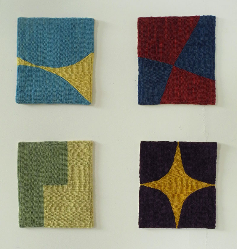
Here are four more pieces from the Figure/Ground series, completed in 2011 and 2012, hanging in the studio.


March 1, 2013

A Subtle Sign of Spring


Yesterday, moving through my field on my way home from my snow shoe in the woods, I noticed that all the weeds and grasses were rising from holes in the snow.


It was as though someone was busy digging out special places to highlight each weed with a kind of deep spotlight. 


Groups of weeds look as though they are in elegant vases.


And a broken branch appears to be striding through deep snow. 


Even thin grasses are contained within a circle of snow. I have long seen widening circles of retreating snow around the bases of tree trunks in early spring: whatever warmth there is in the air is caught by the dark bark and it melts the snow around it. But I'd never seen this phenomenon with the smallest of weeds or grasses, or at least I'd never noticed it. We've had some days of above freezing temperatures and it must have been enough for even dried plants to collect enough warmth to melt snow.


As though to illustrate Henry David Thoreau's wonderful quote from his journals, today I saw that indeed the snow was also retreating from the trees in the woods:
Many an object is not seen, though it falls within the range of our visual ray, because it does not come within the range of our intellectual ray, i.e., we are not looking for it. So, in the largest sense, we find only the world we look for.
 I am looking for, and finding, subtle hints of a changing season.


February 28, 2013

George Bellows's New York


River Rats, 1906, oil on canvas, 30 1/2 x 38 1/2 in. Image from Artist Portfolio Magazine.


George Bellows arrived in New York City in 1904 from Columbus, Ohio; he was a young man of twenty-two, come to study art with Robert Henri at the New York School of Art. The city he found, the city he painted, was energetic, changing, building, buzzing with people of all classes. The excitement in his early New York paintings is palpable, and I was very happy to see them at a recent exhibition of his work at the Metropolitan Museum of Art. The word that kept coming to my mind about these paintings was "muscular": the paint was broadly and confidently handled, a perfect pairing of technique and subject matter. Although I no longer live in NYC, I still consider myself a New Yorker; I still love sitting on the subway with all the different kinds of people, love walking the crowded streets; the sense of constant change is always there, even if the change is often unwelcome. So much of the city is about reinvention that I have a feeling of nostalgia for early New York City, and these paintings certainly satisfy that craving. In River Rats, groups of children have made their way down to the East River to swim; they are dwarfed by a monumental cliff, buildings rising above it. I look at that huge cliff and wonder where in the world that might have been, since there's nothing like that in Manhattan now. According to the blog Ephemeral New York, it might have been in the east 20s, the old Gashouse District, or Dutch Hill in the east 40s and 50s, where Tudor City now stands. 


Pennsylvania Excavation, 1907; oil on canvas, 33 7/8 x 44 in. 
(all images from Metropolitan Museum of Art website, unless noted.)


Bellows did several paintings of the construction of Pennsylvania Station, a huge undertaking at the time. In looking at his paintings, during a dark afternoon in snowy winter...


Pennsylvania Station Excavation, 1907-08; oil on canvas, 31 3/16 x 38 1/4 in. 
(from the Brooklyn Museum collection)


...or in the early evening, we get a sense of tremendous power being expended as smoke billows and fires burn, and as workers are dwarfed by the enterprise. The grand aboveground Penn Station, designed by McKim, Mead, and White, was, in its turn, sadly demolished in 1963.


Rain on the River, 1908; oil on canvas, 32 x 38 in. 


A view of Riverside Park, which was not completed until 1910, shows industry alongside the green of leisure spaces. Lusciously painted foreground rocks, feeling present and heavy from the artist's rich touch, overlook a white curve of path, white billowing locomotive smoke, the river greenish in the hazy distance. 


Blue Snow, The Battery, 1910; oil on canvas, 34 x 44 in. 


Bellows painted another of Manhattan's parks, The Battery at the lower end of Manhattan. Figures and trees are brief marks of dark paint against the white expanse of snow; here again, smoke rises, reminding us of the working aspects of the city. 


Beach at Coney Island, 1908; oil on canvas, 42 x 60 in. 


I grew up only a couple of miles from Coney Island, whose name still has an allure of beach and  amusements. What must Coney have been like in early days! Bellows gives us an idea: of crowds and brightly colored awnings, and romantic couples, all in glaring sun. 


Paddy Flannigan, 1908; oil on canvas, 30 1/4 x 25 in. 


The exhibition also contained some marvelous portraits, such as this one of a tough, insouciant street kid; Bellows has given Flannigan dignity and power that he likely did not possess in his life.


New York, 1911; oil on canvas, 42 x 60 in. 


New York City can still seem as busy, as teeming with people and vehicles, though not with work horses, as it did 100 years ago. Bellows's New York, though vanished, is still familiar.