January 13, 2014

January Thaw


If I was in any doubt that we are having a true January thaw, Blinky the cat's demand to go outdoors early this morning was a sure sign. After shying away from the door for a couple of months, he happily spent much of the day outdoors, pursuing adventure.


Although the January thaw usually arrives in late January according to the Farmer's Almanac, it seems to me that it arrives closer to the beginning of the month. The thaw is a stretch of days when the temperatures are above normal. What that often means is ice as snow melts and as precipitation falls as freezing rain. There's an icy lake on part of my lawn, with the patterns of small animals embedded in it.


Ice on the road reflects some of the light of this morning's beautiful sunrise.


From my garden you can see that a few days of warm temperatures and rain washed away much of the snow. I hope we get more snow as an insulating blanket before temperatures drop again.


A moss-covered rock greeted me as I stepped into the woods, its green intensified by the moisture of recently melted snow.


Today's most beautiful effects in the woods were the iced-over small pools, formed here and there from Saturday's pouring rain. There were layers, more dense and more clear, here showing leaves under the surface.


A thin layer of ice sent out fingers hovering above a lower layer.


Delicately patterned ice catches light in contrast to the dark water beneath, the lacy frozen water similar to the patterns of flow and of reflection. As lovely as this is, I look forward to the ground being once more blanketed in white.


January 11, 2014

A New Boxed Paintings: Lines


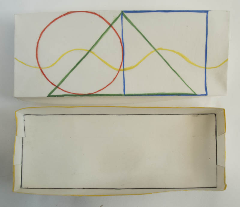
Lines, egg tempera on calfskin parchment, 2 5/8 x 6 5/8 x 3/4 in. 


Last year I started a new painting project: small boxes made of parchment, filled with tiny paintings. My first piece had the theme of Red Yellow Blue and Black and the second Black and White. They used  geometric shapes as their compositions. I thought I'd try something different with this one, using just line, straight and curved, singly or in patterns. It's made for images that are less dramatic, so they don't have quite the punch of the previous works.


Lines, top and inside box


I decided to keep the interior nearly empty of incident and have the cover show basic geometric shapes, topped by a curved line.


Lines, paintings side 1, each ca. 1 1/4 in. square


Lines, paintings side 2, each ca. 1 1/4 in. square


As I worked, I searched for different kinds of linear expression. I threw a lot of pieces away, as many as I kept. Because the parchment is translucent, each painting has a correspondence with the one on its other side, which I kept in mind as I developed each composition. (click to enlarge to see the paintings more clearly) What I learned in doing this piece is that line is harder to control than shape, but I hope it was worth the effort.


January 9, 2014

How Wonderful to be Outdoors!


It had felt like weeks since I'd been for a walk in the woods, but finally today, a day of sun and temperatures in the mid teens, mild after much miserable weather, I strapped on my snowshoes and left the house. After days and days indoors, I feel as though I'm missing a large part of my life: my attentiveness to the outside world. The first thing I noticed on the slope in front of my house were the small snow eddies formed by the wind, here with an errant seed at rest.


More tiny seeds were nestled in the track of a deer.


I loved seeing the reddish raspberry canes, dark against snow, light in front of trees. Their vertical lines cast horizontal shadows.


Also on the snowy ground, graceful sweeps of pine needles, singly or grouped.


Thawing and freezing left lacy patches of ice on a boulder.


Frosty patterns covered flattened leaves, whites over warm grays.


I don't spend my entire walk with eyes glued to the ground; when I look up I see light sparkling through evergreens, bright shadows on snow.


I noticed that the spell of warmer weather, with rain, had allowed the open collars around tree bases to form.


This tiny beech tree looked like a bouquet with its leaves gathered at the bottom and its elegant sprays of new branches.


And finally, the view of my house and barn as I step out from the woods and field. It's always a pleasure to see them from here after a happily vigorous walk. I feel refreshed, warm, more healthy even with a constantly running nose as I walk; doesn't it clear out my system? Here's hoping for more nice weather.....


January 8, 2014

Ad Reinhardt: A Protean Intelligence


Ad Reinhardt cartoon via Hyperallergic, image courtesy David Zwirner Gallery. 


It is difficult to imagine that the artist who wrote
Fine art can only be defined as exclusive, negative, absolute, and timeless. It is not practical, useful, related, applicable, or subservient to anything else.
in an essay "Twelve Rules for a New Academy" could also be a brilliant cartoonist, an insightful photographer, and a painter of famously "black" paintings. Yet Ad Reinhardt (1913-1967) is all that, and a writer of intense prose. In a recent remarkable exhibition at David Zwirner gallery, we could see the range of Reinhardt's output, his piercing intelligence, and his sharp eye. One large room was dedicated to Reinhardt's cartooning work, of which the most widely known are his art cartoons, such as the one above. Reinhardt drew from the position of a leftist and many of his cartoons appeared in leftist newspapers or magazines such as The New Masses and PM. He was intensely critical of the new art market. 


I was familiar with Reinhardt's art cartoons, more of which can be seen here on Hyperallergic. Some had the theme of "how to look" and attempted to help interested people look at art. So he wrote:
Why do artists paint? What do they mean? –– We can't do your thinking and looking for you (the way a hearst-paper does) but we'll try to help you know what you're looking at and for and so represent something yourself. 
I did not know his other cartoons, such as the one above about the human family.


I was surprised and delighted by cartoons on other subjects, such as these on love and on marriage. The first quote is from a 16th century poem by Robert Green, "The Shepherd's Wife's Song": "What lady would not love a shepherd swain?"


Then there were these whimsical little bugs.


I loved this page of sketches, precise yet lighthearted, of Italian electrical pylons in all their variety.


A page from a notebook explores Eastern religions, stating "Religion begins where theory ends."
There is an interesting video, a walk through guide by Robert Storr, the curator of the show, in which Storr talks about this room of the exhibition in depth.


The aspect of Reinhardt's work that was a complete surprise to me, and was wonderful to see, was his photography. The image above is the cover of a small catalog that the gallery provided, with an essay by Prudence Peiffer. Reinhardt traveled widely and was open to all images, from great artworks to accidental markings. He had a collection of over 12,000 slides, which he showed in organized formal groupings to friends, students, and at the Artist's Club in what he called "non-happenings".


It was fascinating to watch the slide show at the gallery, waiting to see the correspondences between images, the surprises of similar forms. I took a few photos of a part of one sequence, showing crosses, in painting...


....on an ordinary structure.....


....and on two more elegant architectural details. In the compilation of images above you can see a few more of the visual themes he explored. The slides show a mind constantly thinking and alert to the visual subtleties of the world.


image courtesy of David Zwirner


All the rich image and text of the slides and the cartoons finally lead us to the distilled paintings for which Reinhardt was famous, the seemingly black paintings of the 1960s. Thirteen of them are gathered in this one room of the gallery, skylit so you can look at them in natural light. You can't just glance at these paintings, you have to spend a long time quietly looking at them in order to see what is there. In a way, this is Reinhardt's most subversive achievement, much more than any of his barbed cartoons: he forces us to slow down, to contemplate, to have a visual experience of the highest order, one of experience and discovery; for me there was a kind of longing, a search for pure essence. In his essay [ART-AS-ART] Reinhardt wrote: 
The one standard in art is oneness and fineness, rightness and purity, abstractness and evanescence. The one thing to say about art is its breathlessness, lifelessness, deathlessness, contentlessness, formlessness, spacelessness, and timelessness. This is always the end of art.   
......These paintings and comments present no clear understanding, no precise ground plan for our labors to follow. They represent only bricks and mortar materials awaiting use in the shaping of our own individual understanding. Until that time they remain but random comments. 
You can read this essay and others here in the collection Art-as-Art: The Selected Writings of Ad Reinhardt.


Abstract Painting, 1960-66; oil on canvas, 60 x 60 in. Collection of Guggenheim Museum.


I tried to photograph some of the paintings in the show, but it was impossible; all I got was a fuzzy black square. In the photo above, you can see, faintly, the subtle shifting of color squares, but it is not at all close to the experience of standing in front of one of the paintings, whose rich dark colors emerge slowly, embedded within one "horizontal form negating one vertical form", as Reinhardt described his series. His aim of transcendence and timelessness is surely here, as is
Everything into irreducibility, unreproducibility, imperceptibility. 

January 6, 2014

Four New Drawings, the Last of 2013


#27, egg tempera and graphite on hand-toned paper, 15 x 15 in. 


I recently bought some new pigments from Kremer Pigments and thought I'd have some fun with them in this group of new drawings. For #27 I used a new color, Ultramarine Red, violet pink, for the toning of the paper. It's a beautiful cool pink, very rich in color; the manganese blue and mixed green worked well with it, I think.


#28, egg tempera and graphite on hand-toned paper, 15 x 15 in. 


Although Cadmium Yellow lemon isn't a new color for me, I did buy more of it and here mixed it with some Titanium white for the background color, then choosing Manganese Violet and Alizarin Crimson for the shapes. As I've mentioned before, I begin these drawings by drawing overlapping circles with a compass, beginning with the six around one of Islamic design, then I find shapes within the design. The drawings often surprise me in their results: here I was interested to see the yellow shape within the red ones becoming so prominent.


#29, egg tempera and graphite on hand-toned paper, 15 x 15 in. 


I treated myself to a couple of glittery pigments, one being Iron Glimmer, with which I toned the paper. It has a warm undertone, just as iron in the soil will make it reddish. The pigment is quite coarse, so would be difficult to use in most painting situations. 


#29 detail


It's not easy to photograph a glittery pigment because the effects change so much in different light and depending on where you are in relation to the work. If you click on the images to enlarge them you'll get a better sense of the surface.


#30, egg tempera and graphite on hand-toned paper, 15 x 15 in. 


This piece uses two new pigments: the paper is toned with a mixture of an earth pigment, Terra Ercolano, and Pearl Luster Colibri Gold. I then used the gold for two of the shapes. Gold, of course, has been used in Medieval painting and manuscripts, also in Islamic painting, and carries a lot of meaning with it as a rare material. I actually have some real gold, in the form of shell gold, that I sparingly used once or twice. This relatively new pigment can be used with abandon and it can be mixed with other colors. Because it does carry a meaning of the precious, I'm not sure how much I will want to use it; it's also hard to control because it changes from dark to bright depending on how light is hitting it. But then, I suppose, it removes the drawing from the realm of total control, which isn't a bad thing.


#30 detail


As in #28 above, #30 also came with a surprise: the drawn shapes within the ovals have a wonderful presence for me; they are shapes I did not notice before they were highlighted within the dark green shapes. I continue to be full of wonder at what emerges from the pattern of overlapping circles.


December 30, 2013

Happy New Year! with Gee's Bend Quilts


Lucy Mooney, Blocks and Strips work-clothes quilt, ca. 1935; cotton, denim, wool, 87 x 68 in.


As I began to ponder my offering of art for my New Year's post––I love to present work each year that has something open hearted about it (last year Frans Masereel, the year before Sonia Delaunay)––I thought of the stunning quilts made by the women of the tiny hamlet of Gee's Bend, Alabama. I still remember the thrill I felt seeing these works about 10 years ago in an exhibition at the Whitney; they seemed surprisingly modern, nothing like the traditional quilts I'd been used to seeing.


Missouri Pettway, Blocks and strips work-clothes quilt, 1942; corduroy, cotton sacking material, 
90 x 69 in.


The earliest Gee's Bend quilts took worn clothes and fabrics and re-made them into vivid works of art: practical yes, but freewheeling in color and composition; uncaring about perfection, so alive in their curves and wobbles. These quilts were collected by William Arnett and are posted on a website about them hosted by Auburn University. You can see many more quilts on the website, from which I downloaded these images. Missouri Pettway's quilt came with a story told by her daughter Arlonzia:
It was when Daddy died. I was about seventeen, eighteen. He stayed sick about eight months and passed on. Mama say, "I going to take his work clothes, shape them into a quilt to remember him, and cover up under it for love."


Lottie Mooney, "Housetop" fourblock "half logcabin" variation, ca. 1940; cotton, rayon,
88 x 73 in.


"For love". To me, all these quilts have a deep feeling of love––for color, for shape––and a sheer joy in creating.


Martha Jane Pettway, "Housetop" nine block "half logcabin" variation, ca. 1945,
72 x 72 in.


The two "Housetop" quilts above show how inventive the quilters were with color and pattern.


Lucy T. Pettway, "Snowball" (quiltmaker's name), ca. 1950; cotton, corduroy, cotton sacking material, 
83 x 85 in. 


The Pettways must be an extraordinary family, since so many by that name have quilts in this collection. Lucy Pettways "snowballs" are energetic and full of bounce, so much more than seems possible in a simple repeat pattern.


Loretta Pettway, String-pieced quilt, 1963; cotton twill and synthetic material, men's clothing,
80 x 74 in.


Sometimes the color was subtle....


Annie Mae Young, Blocks and strips, ca. 1970; cotton, polyester synthetic blends, 83 x 80 in.


....but often bold in contrast. I wonder what Mondrian would have thought of this quilt, a Southern boogie woogie.


Florine Smith, Four block strips, ca. 1975; corduroy, 68 x 81 in. 


This work is so simple yet so powerful, powerful in a joyous, heart-expanding way.


Louella Pettway, "Logcabin" four block variation, ca. 1975; corduroy, 79 x 71 in.


And the color of this...that pink and gray green! And such an marvelously idiosyncratic way of using the log cabin pattern. If you want to see the usual regularity of this quilt pattern, click this link and you'll see what an artist Louella Pettway is. 


Willie "Ma Willie" Abrams, "Roman Stripes" variation, ca. 1975; corduroy, 94 x 76 in. 


This quilt pulses with color, its bars setting up a syncopated rhythm. Looking at all these works makes me happy, which is a good way to begin a new year. I wish you all a year full of joy and love and happiness, and full of creativity, whether in making a piece of art or a meal, or in simply looking about with careful attention.