February 17, 2014

Cream of Tomato Soup: A Childhood Memory


When I was in elementary school, I went home for lunch every day. My mother would serve Campbell's Cream of Tomato soup to my sister and me often, and I loved it: the color, the taste, the consistency. Of course, now I wouldn't dream of opening a can of soup, but happily, cream of tomato soup is quite easy to make, and even more delicious with my own canned tomatoes from last summer's garden, and herbs. I found an excellent recipe in Deborah Madison's great cookbook Vegetarian Cooking for Everyone, and thought I'd share it for those of you who also might have fond memories of Campbell's soup.


2 1/2 Tbs butter
1 small onion, chopped
1 celery rib, chopped (I didn't have any celery, but did have some lovage leaves that I'd frozen last fall, so used about 1/4 cup of those, which turned out to be too much; I should have used 1-2 Tbs because it's strong tasting.....but good)
1 1/2 teas dried basil, crumbled (I used about 2 Tbs of basil mixed with olive oil, that I prepare in small packets during the summer)
pinch of ground cloves
2 Tbs flour
2 15-ounce cans diced tomatoes in puree (I used a quart of home-canned tomatoes)
pinch of baking soda (I have no idea of the purpose of this)
2 1/2 cups vegetable stock or water
1 1/2 cups milk
salt and pepper
tomato paste, if needed

  1. Melt the butter in a soup pot and add onion, celery, basil, and cloves; cook, stirring, until onions are soft, about 5 minutes.
  2. Stir in flour, then add tomatoes, baking soda, and stock. Bring to a boil, lower heat and simmer, partially covered, for 20 minutes.
  3. Let cool briefly, then puree in blender or food processor, or use an emersion blender.
  4. Return soup to pot, then add milk and salt. If too thick, add more milk or water. If soup isn't tomato-y enough, add some tomato paste. 
  5. Reheat and serve, grinding pepper into each bowl.

Enjoy this soup, lovely for a winter lunch.


February 15, 2014

Keith Sonnier: Light Lines


Lobbed Shape, 2013; neon, acrylic, enamel paint, electrical wire, and transformer, 
8' 5 3/4" x 8'5" x 14 3/4 "


It is fun to think of the same material––glass––being used for beautiful small objects, such as the Venetian glass by Carlo Scarpa which I just wrote about, and for large contemporary sculpture in the form of neon tubes. In his show at Pace Gallery, Elysian Plain + Early Works, Keith Sonnier provides as much delight as Scarpa, of a different sort. These works are open hearted and embracing, their fluid, intensely colored lines flowing in fascinating rhythms.


There are the lines of colored light, and connecting them, the thin black lines of electrical wire. The wire, the lifelines to the neon, add another kind of drawing: thin inky lines alongside the thicker tubular ones; they enliven each other. Some of the works also had painted shapes, hard to see in the photos with all that's going on in the surface reflections.


A very different kind of line, a zigzag, becomes a bar of color. The four bars play off against a central square of acrylic, with the black wires lazily connected them.


Three different curves line up at the left, separated by horizontal aluminum lines, their shapes emphasized by lines of color.
I'm sorry not to have information on all the works, but the gallery website only shows three of the pieces in the show. I think you can see though, that they are all large.


The top shape of this piece is a mirror, so has a different spacial effect than the clear acrylic: it becomes deep because of the reflection of a distant wall or ceiling. I like the sense of opening or lifting, as the blue line rises, angled, above the straight pink and yellow lines; the black lines like tender tentacles flowing.


Neon Wrapping Incandescent, 1969


I find this piece very funny: incandescent bulbs, nipples or breasts, glow brightly; they are decorated with line and squiggle.


B-O-Ba V, 1970; neon, glass, electrical wire, and transformer, 83" x 16'7" x 11"


The simplicity of this early piece is very appealing. Just two circles of glass connected by a blue diagonal: vertical, diagonal, diagonal, our eye moves across the expanse. The extra bits of color are reflections, as these works change with their environment.


Torso Trunk, 2013; neon, acrylic, aluminum, electrical wire, and transformer, 9'6" x 88" x 4 " 


Seeing the title of this piece made me realize that perhaps I wasn't so far off to be seeing a figurative quality in many of Sonnier's compositions, and not just in the "breasts" above. For instance, the second image looks a lot like a portrait to me; I hope I'm not being ridiculous in saying so.


Then there was this little "creature", a study for a sculpture. It is bulbous and funny and alive, looking ready to bounce away.


And here, another "portrait": a mask, hiding, revealing. This show made me happy: the color, the curving lights, the reflective surfaces, all combined in joy. After all, the title of the show is Elysian Plain, and Elysium is a paradise.


February 12, 2014

Hoarfrost: Capturing Light


I looked out on a white world from my bedroom window yesterday in the early morning; I could see that it was not snow brightening the landscape: branches and weeds glittered in the sun, which meant that it was hoarfrost that caused the sparkle. (click on photos to enlarge and see details more clearly)


Delicate, thin crystals of ice adhered to surfaces, gathered this way and that, enhancing the forms of weeds: the seed head of Queen Anne's lace, tightly upright....


....or spread outward. The frilly brightness is as beautiful as the summer flower.


I waited until after 9AM to go out to photograph, when the temperature went above zero. It was only 5 degrees, though, and my camera froze after about 15 minutes of shooting. So, I went indoors, let the camera warm a little, reset it, and went back outside to take these three last images. Actually, I took many more, as I always do, but these made the final cut. Here the frost makes brilliant lines along the rugosa rose canes.


An ordinary line of grass becomes radiant against the dark of a cloud.


Nannyberry buds bristle with light, waiting for their season. We all await spring, meanwhile enjoying the beauties of winter, and enduring its trials; spring will be all the more glorious because of them.


February 11, 2014

A New Painting: "Orange Rounds"


Orange Rounds, egg tempera on calfskin parchment, 8 1/4 x 7 in.


When I was working on photo studies for this painting, I had both horizontal and vertical versions. I decided on the vertical, feeling it had more tension in the cropping of the form. My big challenge with this work was the color: I painted and repainted those oranges many times; they were too light, too dark, too contrasty, not contrasty enough, too reddish, too yellowish. The top part of the painting became overworked and I had to wipe it down to the parchment and start again. But I think I got the color relationships fairly well resolved.


Orange Rounds detail


The orange forms in this piece are relatively flat, although there is a flattened cone, so I enjoyed painting this black form that is more volumetric; and that little hole in it continues the repeating rounds, with a twist.


February 10, 2014

At the Met: Carlo Scarpa's Dazzling Venetian Glass


Shaft-and-globe vase with disc foot, ca. 1932-33; white bollicine glass.
Liqueur set, ca. 1935; pale green pulegoso bollicine glass. 


There is something about beautiful objects––small things not meant for the rarified "fine art" world––that sets my heart aflutter. Perhaps it's imagining how they can be held in the hand, their forms caressed, their weight felt, that provides such intense pleasure. Currently at the Metropolitan Museum of Art is an exhibition Venetian Glass by Carlo Scarpa: The Venini Company, 1932-1947  that fulfills anyone's desire to wander among finely wrought objects, rich in color and form, inventive in technique. Carlo Scarpa was an architect and designer; as a young man in his 20s he was hired by the Venini Company as an artistic consultant; over 15 years he developed many new approaches to glassblowing. One such novel technique is a bollicine, where potassium nitrate was injected into the glass; it formed little bubbles of carbon dioxide when heated.


The bubbles in the glass add depth to the simple forms; they become mysterious presences, and even at this small size are grandly quiet.


I love the colors and shapes of this lively trio. I don't know the technique, having failed to photograph the explanatory label.


Bottle with quadrangular cross section, 1934; coral mezza filigrana glass.


This delicate and refined object is made with a very meticulous technique, mezza filigrana, that was used as early as the 16th century. Clear glass rods with milky glass at their centers are fused then blown into very thin forms.


Small bowls and vase, ca. 1934-36; sommerso mezza filigrana glass.


Here the delicacy of the mezza filigrana is wedded to another layer of glass.


Ovoid vase with twisted ribbing on the interior, ca. 1934; red and green sommerso glass with gold-leaf inclusions.


Sommerso means "submerged". In this gorgeous piece the clear glass is layered with bubble glass. We look in the opening as into the hot central core of earth. The flattened oval shape organic, and also elemental, like a form acted upon by time and gravity.


murrine romane glass


murrine romane glass


murrine romane glass


murrine romane glass


The four pieces above fascinated and delighted me. There was something so wondrous about seeing colored shapes floating in clear glass, the shapes repeated but never exactly the same, as the glass shaping process expanded and contracted them. The technique, murrine romane, is an updated ancient one: clear glass rods with colored centers were sliced and joined, then melted together and either blown or formed in a mold. There is something very painterly about these pieces.


In this detail shot you can see the bubbles in the clear glass where one rod is fused with another. The irregularity of the colored shapes, their accidental appearance adds such charm, yet the rigor of their production belies their casual-looking colors.


Vase, ca. 1936; clear dark amethyst glass with battuto finish.


As a contrast to the murrine romane glass, here is a dark vase, solid, expressing a kind of enclosed grandeur. The battuto finish is one where the glass has been engraved. The texture adds layers of meaning and mood to an elegantly formed object.


Vase, ca. 1940-42; clear glass of different colored layers with lenticular incisi decorations.


This vase is another piece I fell in love with. Its shape is so direct, almost ordinary, but then there are those raised forms floating on the subtly-colored, almost clear glass, taking me to a place far beyond the ordinary.


Bowl, ca. 1940; lightly ground black and coral murrine opache glass with central inset of black murrine opache glass. 


And finally...oh my! this bowl.....


Dish with quadrangular cross section, ca. 1940-47; lightly ground black and coral five-spot murrine opache glass arranged in a snake shape. 


....and this dish, made using the same glass-rod murrine technique as in the clear glass with color shapes above, but here in dramatic red and black. My eye can wander endlessly across these surfaces, drawn to the varying patterns and shifts of movement and shape. The fact that all these works are modest-sized, useful objects makes their beauty even more present for me; they are ambition and innovation wrapped in a small package.


February 3, 2014

New Hooked Wool Drawings


2014 #1, hand dyed wool and egg tempera on linen, 15 x 12 in.


When I began working up full sized drawings from my thumbnail sketches for this group of hooked wool drawings, I realized that I'd inadvertently followed a theme of rounded forms: circles, partial circles, ovals. With #1 for the new year I wanted to be a little wild with color, hence the violet and bright red.


2014 #2, hand dyed wool and egg tempera on linen, 2 panels each 16 x 7 in.


I'd planned this diptych to go the other way round, but decided I liked the horizontal oval on the bottom better. The two panels are slightly different greens, the open-oval green yellower than the hooked oval green on the left. Looking at it finished, I think I should have made the two greens more distinct in color to clarify my intention.


2014 #3, hand dyed wool and egg tempera on linen, 17 x 15 in.


Violet appears again, but here with its color opposite, yellow. Lines of imperfect circles overlap and float in an empty field, the heavier violet on top of the flattened yellow circle which is losing its top or raising its hat....a bit of a comical figure.


February 2, 2014

A Walk in the Woods: Ice Flows


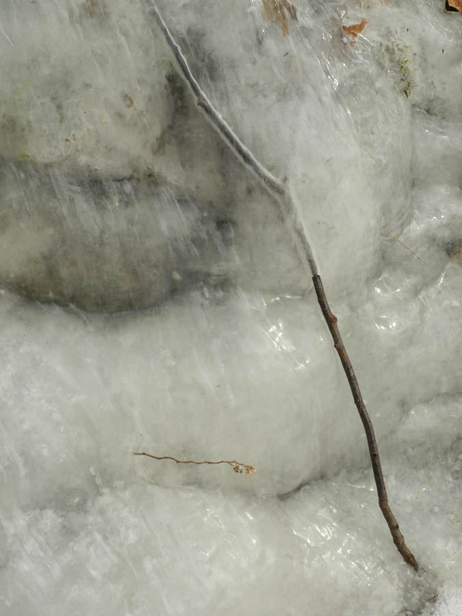
There are certain natural phenomena that occur only when particular weather conditions are met, such as snow rollers or sundogs. They are rare and marvelous. This week on my walk I saw another such unusual occurrence, a flow of ice, looking like a waterfall in miniature, frozen in time. Streams of solid water move across rock, branch, and leaf.


Beautiful small events ask for attention: a thin branch, partially covered by ice, has an extra icy halo; a weed rises, golden, from the surface.


As twigs are caught over and under ice, so are fallen leaves. A dry spot peaks out from under icicles.


The clarity of the rippled ice allows for glimpses beneath: leaves.....


....and mosses; I peer through layers to see the life beneath, jewels in a case.


On top of the ice, a tiny spider is caught. (click to enlarge photos)


This rippled wave of ice, covering all in its limited path, holding objects suspended, offers poetic metaphors, as nature often does.


January 31, 2014

The Burden of Content


Chinese Maple, Catskill, NY, 1981; oil on canvas, 14 x 28 in.


Someone recently asked me why I'd stopped doing complex landscape paintings; I answered that I wanted to get closer to 20th century reductive abstraction, which I love. But that's only part of the story: I also wanted to get out from under the heavy burden of content, the meaning––environmental, sociological––of those paintings. So this post is meant to tell the story of my journey, and it is related to my recent posts on William Carlos Williams, "no idea but in things", and John Singleton Copley, "The Primacy of the Object".

When I was a young artist exhibiting my "portraits" of domestic architecture, it never occurred to me to wonder what my paintings were about, except for the formal aspects of light, color, composition, form, mass and detail. I had studied with Philip Pearlstein, who eschewed "meaning" in his painting. The figures in his work were not metaphors or narratives; they were bodily facts, used to create dramatic compositions. As a full disclosure, I have to mention that for a few years around this time I also painted narrative figure compositions, so whatever yen for story I had went into those.


The Potato Field, Cutchogue, NY, 1982; oil on canvas, 15 x 34 in.


Soon I began to expand my field of vision to include the landscape around the houses. Because I was still very interested in structured compositions, my attraction was to land that had been worked: an agricultural landscape. I slowly began thinking about the meaning that resided in the land.


Tractor and Ag-Bags, Groton, Vermont, 1994; oil on canvas, 30 x 90 in.


I read books in cultural geography, such as John B. Jackson's Discovering the Vernacular Landscape, and John Stilgoe's Common Landscape of America: 1580 to 1845; and books that explored the meaning of art beyond the formal, such as T. J. Clark's The Painting of Modern Life: Paris in the Art of Manet and his Followers, and W. J. T. Mitchell's Landscape and Power. Now the landscape was no longer simply a beautiful expanse of space and light, but carried history and culture; it showed all aspects of its use and abuse. The agricultural landscape became, for me, evidence of the positive and negative aspects of our relationship to the land.


Hay Storage, Central Valley, California, 1995; oil on canvas, 44 x 66 in.


In the early 90s, for three years, I taught in California. Being there was a huge shock to my understanding of agriculture: this was the land of industrial farming, the image above at a dairy where they milked thousands of cows. Single vegetable crops were grown in huge acreages, everything prodded into growth with fertilizers, pesticides, and irrigation. As a colleague of mine mentioned, "the soil is just there to hold the plants up". So all these meanings resided in the paintings I was doing; they weren't overt, but they directed my subject matter of plastic and tires, machinery and manure.


White Hose, 2005; egg tempera on panel, 28 x 42 in.


In 2002 my focus shifted again, influenced by still life photographs I was doing with my first digital camera. The landscape left the picture and all that remained was the stuff of agriculture, the machinery, the plastics, the silage, the concrete. At first the paintings were large and complex, but as time went on, I made the compositions simpler as I zoomed in to the subjects. I began to feel hemmed in by my content; what had motivated me before––the difficult environmental and social issues around farming––became extraneous to my concerns, which were formalist.


Opening, 2013; egg tempera on calfskin parchment, 5 1/2 x 7 1/2 in.


In 2010 I began to paint very small works on parchment; their compositions have become quite simple and direct...."no ideas but in things"....and the things are in themselves enough. I still find my subjects in agricultural implements; they have such variety of shape and color that they are of continual interest to me. But I don't expect any story beneath them, any social/historical/environmental content; there is enough meaning and feeling and mystery in color/shape/form/light/composition. I know there are many people who wish I was still painting large complex landscapes, but I have to answer, in the immortal words of Bartleby the Scrivener, "I would prefer not to".