March 20, 2014

It's the First Day of Spring; Oh! Where is Spring?


Today is the first official day of Spring, which arrived in this part of the world at 12:57 PM. The weather, though, doesn't seem to have gotten the message, instead depositing a fresh few inches of snow on the ground overnight into this morning. The hydrangeas on the eastern side of the house are nearly covered with recent snows.


 Icicles hang from the hydrangea at the front door.


Geometric patterns of mat and floorboards are enhanced by the morning snow.


 Looking out from my kitchen window I see a mound of snow rising almost to window height.


A subtle sign of spring in the woods is the circle of diminished snow around the warming tree trunks.


And to remind me that spring will certainly come one day––I hope not too far in the future––the green seedlings of leeks and onions are growing under lights; they'll be ready to plant in the ground sometime in May once the snow is gone and the ground a bit warmed. It may be later than usual because under the two feet of snow the ground is probably frozen quite deep, but the thaw will inevitably come and spring will be sweeter and more precious after this long, cold winter.


March 19, 2014

A New Painting: "Stripes"


Stripes, egg tempera on calfskin parchment, 9 x 7 in.


While I was working on this painting I kept feeling as though I was herding cats, trying to get the different grays onto the same picture plane, and the red too. When one stripe of color seemed right, it threw off the others, and that happened again and again. I finally got it all working fairly well together, but getting the colors correct in a photo was another challenge, so what you see here is close but far from perfect. I liked the idea of trying for the shifts in gray hues, which is surprisingly more difficult than intense color. I am also playing with curves, tending down and rising up, with only a few straight lines. I don't mind if the top of the painting seems to bulge outward, breaking the picture plane, while the lower part is more sedate.


Stripes detail


I attempted to get an illusion of a reflective surface on the zigzag form and the bar it rests on. Getting the balance of value and hue correctly so that shadows read as shadows and not simply dark shapes is another perennial challenge.


Stripes detail


Here is a close detail of the simple part of the painting. You can see the variation of grays within each band of color. I love minimalist painting and wonder if some day what you see above will constitute the entire image.....


March 18, 2014

Leslie Wayne: Draped Color


Paint/Rag #36, 2014; oil on panel, 16 1/2 x 9 1/2 x 6 in.


I was totally surprised and delighted when I walked into Jack Shainman Gallery to see Leslie Wayne's exhibition "Rags". I was surprised because they were not what I expected from seeing them online; this was yet another instance that made clear how much we miss seeing work solely onscreen. I nearly didn't see the show because my online viewing had left me with a shrug as a response, which turned out to be so mistaken: I loved it.


Installation shot courtesy of Jack Shainman Gallery.


What I hadn't expected was the modest size of these works, none larger than a foot and a half. Looking at them became an intimate experience, rewarding close looking with a wealth of rich detail.


Paint/Rag #30, 2013; oil on panel, 18 1/4 x 12 1/2 x 5 in.


The paintings are made of layers of oil paint, just paint; no canvas or other ground holds them together. The panel is used to mount the painting to the wall. The paint depicts itself, becomes sculptural, is an evocative physical presence.


Paint/Rag #30, detail


There is a magical alteration in the medium as it becomes solid and folded and draped. Each piece has a different approach to color, surface, and design; the works don't settle into an easy pattern. 


Paint/Rag #24, 2013; oil on panel, 14 x 10 in.


Wayne calls the show "Rags", referring to paint rags, but I had the uncanny feeling looking at this body of work that what I was seeing were prayerful offerings. In #24 I feel hands holding the draped cloth aloft, and kept thinking of Joseph's coat of many colors.


Paint/Rag #19, 2013; oil on panel, 14 x 7 1/2 x 2 1/4 in.


There is a tenderness and vulnerability to images of folded cloth, even when intense in color. It's strange that I have this response since I'm not a religious person, but there is something in the small size of these works and their irregular folds that touches me deeply.


Paint/Rag #31, 2013; oil on panel, 14 x 9 x 4 1/2 in.


In their forms I am reminded of Medieval and early Renaissance paintings with folds of dresses and cloaks spread out around the Virgin and saints.


Paint/Rag #31 detail


The surfaces and colors are juicy and rich.


Paint/Rag #29, 2013; oil on panel, 14 x 9 1/2 x 5 3/8 in.


Then Wayne presents an austere cloth, white with a little bit of blue and yellow showing; the paint surface here is matte and seems to be worked with a knife so it has the look of plaster, as though it is the armature for a sculpture.


Paint/Rag #32, 2013; oil on panel, 15 x 9 1/2 x 6 in.


It is also wonderful to see the contrast of outer and inner colors, with the outside of the "rag" being multi-colored.....


Paint/Rag #32 detail


.....while single colors are revealed on its underside. The orange paint has a drag to it, a gritty texture contrasted with the smoother outer surface. Evidence of small cracks in the paint surface tell of time and change.


Paint/Rag #34, 2014; oil on panel, 16 x 10 1/2 x 5 in.


The surface of #34 is glossy and smooth, which works well with the regular squiggly lines. The color is colorfully somber, if that's possible as a description.


Paint/Rag #21, 2013; oil on panel, 10 1/2 x 13 1/2 x 2 1/4 in. 


Like with #24, I feel the presence of hands holding up the folds of "cloth". Folds remind us of clothing, so seem so closely related to the body and to human activity. For me this is what gives these works their tender quality.


Paint/Rag #21 detail


I especially love this piece because of its ambiguity: it shows graceful folds but they are broken and brittle, their edges torn and jagged in places; this creates a subtle emotional tension. Rags are utilitarian things, rescued from other uses, generally tossed about and disregarded. Leslie Wayne's "Rags" are objects to treasure.


March 13, 2014

Four New Drawings


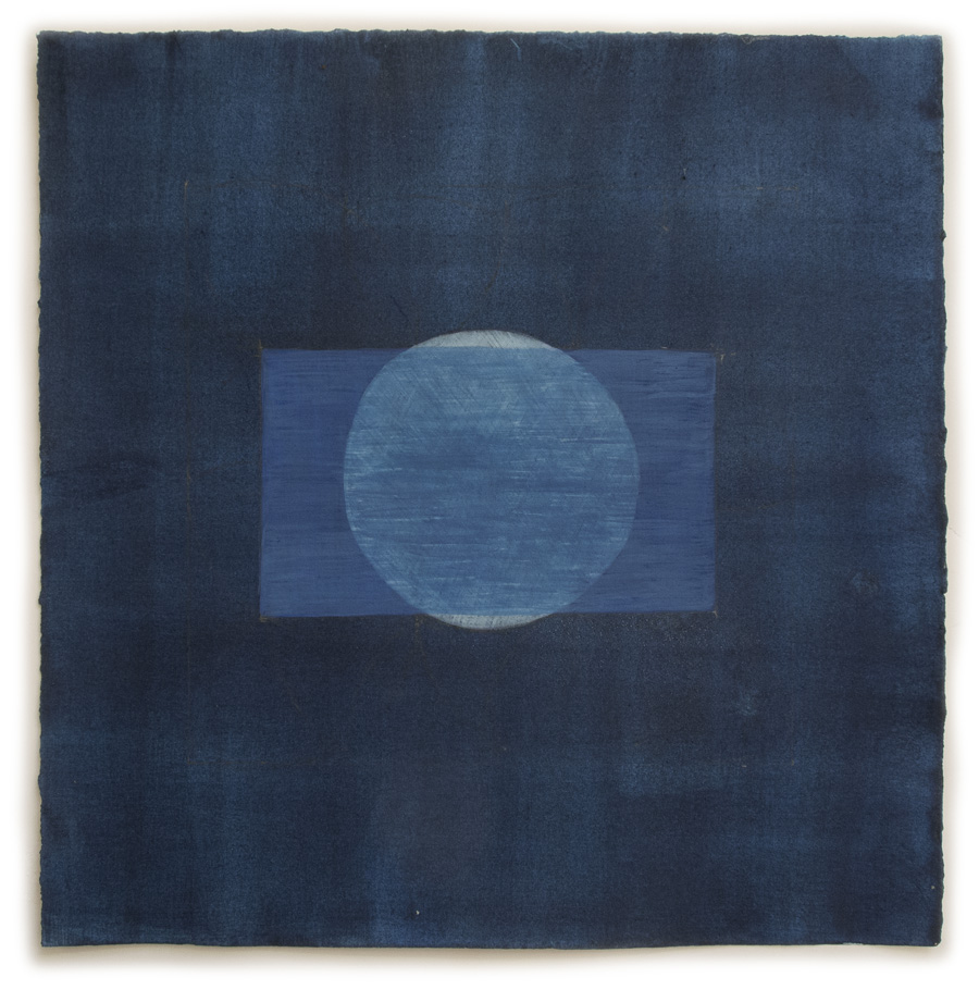
#31, egg tempera and graphite on hand-toned paper, 15 x 15 in. 


One of the things I love about working on this series of drawings is seeing how color can evoke such different moods and feelings. When I am preparing paper for drawings I deliberately choose a range of hue and value so as to have a variety of color as a foundation and a challenge. To prepare the paper for #31 I painted many layers of Milori blue until it became a deep midnight color. I chose a very simple composition for it, with which I had thought to use a contrasting color, but then decided on a continuation of the theme of blue. What ended up happening was that the drawing has the feel of a Japanese indigo dyed textile, an unintended surprise. 


#31 detail


I thought I'd show some detail shots in this post so as to show the surface texture and brushstrokes more clearly. With this piece of paper, because I put so many layers of pigment mixed with gelatin as a size, there is a bit of sparkle on the paper, which I assume is from the gelatin.


#32, egg tempera and graphite on hand-toned paper, 15 x 15 in. 


I go from dark to bright. And here I have to say that Blogger has made a mess of the color on this piece and on #34. The detail gives a better sense of the actual color, which is lighter than it appears above. After the subdued color of #31 some intense hot colors were a fun contrast. For the design, I learned something new from a small book, Sacred Geometry: by drawing lines alongside the points of the central "flower" a 12-sided figure can be found, with six squares separated by six triangles. 


#32 detail


#33, egg tempera and graphite on hand-toned paper, 15 x 15 in. 


In this piece, you can see those six squares implied between the green triangular shapes. I went back to the dark and somber for the color of the paper in this drawing, mixing slate gray with some earth red to warm it. 


#33 detail


I chose to use rather subdued colors for the shapes, keeping the mood quiet, and as though the colors are emerging from the dusk.


#34, egg tempera and graphite on hand-toned paper, 15 x 15 in. 


I'm pretty upset with what Blogger, my blogging platform, has done to the color of this drawing; I tried changing it many times and uploaded it again and again, but it was always too intense, too yellow-green, and too dark. To see the actual color, look at the detail below, which shows a light grayish green with more intense colors playing on top of it. (I guess this difficulty goes along with the terrible weather we're having––over a foot of snow, bitter cold, roaring wind––January weather in mid March, in other words.)


#34 detail


For me, the colors and shapes of #34 have an almost floral feel to them, a delicate decorativeness. I take great pleasure in exploring the expressive qualities of color, color free from any reference to an object, in this series of drawings.


March 12, 2014

A Family Recipe: Calsonness with Noodles


I am very proud of myself this week; for the first time I made a recipe for which you have to make a noodle dough: cheese stuffed in dough, called calsonness in my Sephardic Jewish home, and very similar to cheese ravioli; it's interesting to think of the food correspondences between cultures. This dish is a real comfort food, like macaroni and cheese. The calsonness and noodles are boiled separately, mixed with butter, then combined in a baking dish and baked.


I realize that this recipe isn't one that many of you will try, but I have to assure you that making the dough is easier than you might imagine. For about 40 calsonness you'll need:

2 1/2 cups flour
1 egg, beaten
1/4 teas salt
1 cup water

Mix the first three ingredients in a bowl, then add water to make a soft dough; it might be a little less or more than a cup. Knead the dough until soft and elastic, at least 8 minutes. Let the dough rest in a covered bowl for an hour.


While the dough is resting, prepare the cheese:

1 lb muenster cheese
1 egg
pinch of salt

Mix ingredients together.


When the dough has rested, roll it out into a thin sheet, about 1/8 inch thick. If the dough is resistant to rolling, let it rest a few moments. Place heaping teaspoons (actually I used about 2 teaspoons) at the top edge of the dough about 3 inches apart.


Fold the dough over the cheese, leaving some dough around it.


Cut out the calsonness into half-ish circles; I used a 2 3/4 inch cookie cutter. Press the edges together to be sure of a tight seal. You can reuse the pieces of leftover dough, kneading it slightly and rolling it out again.


I prepared the calsonness a week before I put the recipe together, so I froze them on waxed paper. When they were fully frozen I packed them in a plastic bag.


I want to make a little detour for a story. After I'd finished making the calsonness, I was sure that I hadn't done it quite right, and wished I'd been in the kitchen with my mother when she was making them. There's nothing like seeing something done that helps in the making of them. Recently, I was helping my mother make some of the pastries you see above, sambousak. They can be filled with either meat or cheese. They have a different kind of dough that you spread in your hand rather than roll out. I was fumbling with the dough while watching my mother's adept hands, and what I really had a hard time with was the elegant twists of dough at the pastry's edges. I was making very ugly sambousak and my mother nearly banned me from the kitchen. But after watching over and over and trying over and over, I finally got it and I was thrilled. Whether I'll be able to repeat it on my own is another question.


Preheat oven to 350º

  • To make a dish that serves 3 or 4 use about half the calsonness recipe––for me that was 21 pieces––and boil them till near tender, about 5 minutes. I plopped them frozen right into boiling water....and none of them broke or exploded or fell apart! 
  • While hot, mix with 2 Tbs cut-up butter, until it melts.
  • Boil 12 ounces of wide egg noodles until al dente; mix them with 2 Tbs butter. 
  • Put the noodles in a large baking dish, then place the calsonness on top of them. (I made a mistake in baking the dish: I didn't place the noodles in the bottom layer so they got too crispy as you can see from the first photo.)
  • Bake for about 45 minutes, or 30 minutes covered if you'd prefer the calsonness and noodles to remain soft. 

Enjoy a comforting meal.


March 11, 2014

At the Met: Northern Painters, Modest Landscapes


Constantin Hansen (Danish), Columns of the Temple of Neptune at Paestum, 1838; oil on canvas,
12 5/8 x 10 in.


I rarely walk through the 19th century European paintings galleries at the Metropolitan Museum of Art; my go-to galleries are the ones displaying early Italian Renaissance and early Netherlandish paintings, which feed my desire for clarity, simplicity, faith, and transcendent beauty. Of course there are many great paintings in the 19th century galleries, so on my most recent visit to the Met I took a walk through them, and was very happy to discover 3 or 4 small rooms tucked towards the rear that were full of beautiful, small landscape studies. The paintings I most admired were done by artists from northern Europe: Scandinavia––Denmark, Norway, Sweden––Flanders, and Germany. Over 30 years ago I spent some time in Norway and Denmark and was introduced to their 19th century painters, painters who I'd never heard about in the US. The work seemed very close to American Luminist painting in its clarity of light and form, its classic layering of space, and its modest size. (I wrote a blog post about Danish Golden Age Figure painting, which you can read here.) Since that time, these works have been seen in the US in various shows; all the works I am showing in the post were acquired by the Met in the last 10 years, according to their accession numbers. We are lucky to have them. Back then many artists took a painting tour in Italy, as we still do today. Several of the works in this post were in Gallery 806, which the museum has denoted as for the "School of Rome", comprising of artists in academies and also in a more informal community. Constantin Hansen was one of these artists....


Christoffer Wilhelm Eckersberg (Danish), A Section of the Via Sacra, Rome, ca. 1814-15; 
oil on canvas, 12 3/8 x 17 1/8 in.


....as was Eckersberg. Hansen captures the golden southern light, while Eckersberg has a cooler northern eye. Forms are crisp, and also rich; a minimum of brush strokes depict variations of color and surface with careful attention.
*a note: because I have a preference to use my own photos whenever possible for blog posts, these images have a band of shadow across their tops, cast by the paintings' frames.


?German Painter (early 19th century), View from the Colosseum toward the Palatine;
oil on paper, laid down on cardboard, 10 x 14 7/8 in.


Carl Gustav Carus (German), Gothic Windows in the Ruins of the Monastery at Oybin, ca. 1828;
oil on canvas, 17 x 13 1/4 in.


There is a romantic interest in ruins, but the approach is straightforwardly descriptive and a warm light suffuses all.


Gustaf Söderberg (Swedish), The Grotto of Posillipo, Naples, 1820; 
oil on paper, laid down on Masonite, 9 7/8 x 6 1/4 in.


One thing I love about these small paintings is how the artists are able to achieve a grand sense of scale in a small size. The tiny figures, the small speck of a lighted opening, are dwarfed by the soaring walls of the grotto.


Wilhelm Bendz (Danish), Study of Light in a Vaulted Interior; oil on paper, laid down on canvas, 
6 1/8 x 8 1/4 in.


A soft interior light, straight lines under a curve, is contrasted with the simple bright opening. The rapid touch of this sketch is assured and vivid.


Johan Christian Dahl (Norwegian), View over Hallingdal, 1844; oil on canvas, 9 1/2 x 14 3/8 in.


Dahl was an important Norwegian painter, an early romantic painter of landscape. In this small study he depicted a wide vista of mountains and sky, and which give a sense of the spiritual within the vastness of space and light breaking through clouds.


Thomas Fearnley (1802-1842) (Norwegian), Monolith and Trees; oil on canvas, laid down on card,
4 3/4 x 6 7/8 in. 


Some landscapes focused on the singular object, a mass of rock carefully described, a dominating presence.


Thomas Fearnley, Sunset, Sorrento, 1834; oil on paper, laid down on card, 5 3/4 x 10 1/8 in.


Simon Denis (Flemish), Sunset, Rome, ca. 1789-1806; oil on paper, 8 1/4 x 10 3/8 in.


 The drama of sunsets has appealed to many artists. These two works are fresh and vivid representations.


Johan Thomas Lundbye (Danish), An Evening beside Lake Arresø, ca. 1837; 
oil on canvas, 9 x 11 3/4 in.


Here, another sunset, but this one placed within the dailyness of a human activity; its glow is lovely and subdued; the curve of the little bare tree balances the curve of the man walking with his gun. In all these small paintings I find a pleasure in looking at the world, and a joy in depicting it directly, without fuss. I am so glad that these paintings have found a home at the Met.