September 15, 2014

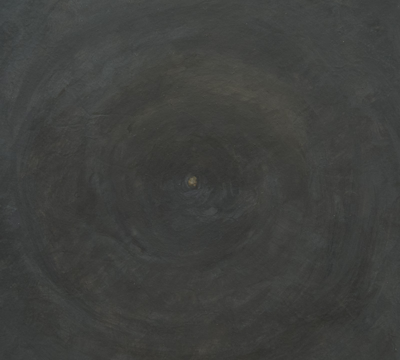
A New Painting: "Disk and Pipe"


Disk and Pipe, egg tempera on calfskin parchment, 7 x 8 1/2 in.


When I began working on this painting I found the image very strange, almost disconcertingly so. There was something about that big staring black circle surrounded by a gray bent pipe that unsettled me; it seemed to allude to a figure. As I continued with it, I became more comfortable, and now it interests me: it seems to flipflop between humor and dead-seriousness, the serious part coming from the black and gray, the humor from the shapes.


Disk and Pipe detail


In the very center of the black disk is a tiny dot; it was in the source photo and I had to decide whether or not to include it. It's a seemingly small thing that to me had large effects in the painting. I kept it because it draws your eye into the center and makes you aware of the subtle shifts of color in the black, indicating a surface not totally flat.


Disk and Pipe detail


Another indication of not-flatness is the little flip of light at the bottom of the disk. I could have left that out, but I like the way it pops the edge upward, while the green form turns down and away, a push-pull bit of illusionism.


September 11, 2014

The Ordinary Transfigured


Jean-Baptiste-Siméon Chardin, Pipes and Drinking Pitcher, c. 1737
image ©2010 Musée du Louvre


An unadorned table holds a wooden box, a long pipe resting gently on its edge, a pitcher and several vessels. There is life in each object and in the paint Chardin used to represent them. I began thinking of Chardin, and other painters of "extravagant understatement", while reading the chapter "The Art of Gum-ball Machines" in Michael Kimmelman's wonderful book The Accidental Masterpiece: On the Art of Life and Vice Versa.


Jean-Baptiste-Siméon Chardin, Still Life with Partridge and Pear, ca. 1748
image courtesy Wikimedia


"Extravagant understatement" is Kimmelman's perfect phrase for an artist whose work is insistently focused on the small things of everyday life, presented with minimal fuss but with great attention, and with every part of the painting in perfect balance. In the following, Kimmelman eloquently writes about why these paintings are so important, why they prompt thoughts of God:
I suspect it has to do with the particular quality of his silence. His are pictures of an extraordinary hushed reverence for the dignity of modest things, for paint's ability to simulate those things, and for a viewer's elevation through extended looking at those things. With Chardin one loses track of time staring, say, at a bunch of cherries, wondering at their translucence, then counting the cherries––there are five––and noticing that the five matches the sum of two peaches a green apple, and two sections of a split apricot to create perfect symmetry in the picture. A tiny observation, but like many simple facts of life, strangely marvelous when it turns out to be a key to some greater truth in life. Chardin's work is a compilation of these little facts that together make as true a record of the value of seeing the world in all its details as exists in the history of art.

Jean-Baptiste-Siméon Chardin, The Silver Tureen, detail, ca. 1728


When you look closely at a Chardin painting, like this one at the Metropolitan Museum of Art, you marvel at the tenderness and care taken to paint these details: the hair of a rabbit, the shine of silver.


Jean-Baptiste-Siméon Chardin, Water Glass and Jug, ca. 1760
image courtesy Wikimedia


Chardin's simplest paintings touch me the most: why is it that a few commonplace things on the table––a drinking glass filled with water, a brown jug, three white onions with their roots still attached, a plant sprig––gathered in perfect balance, make me feel close to weeping. Kimmelman writes that "children see the world with fresh eyes".
Maybe this is why artists who push us to look more carefully at simple things may also strike a slightly melancholic note. They remind us of a childlike condition of wonderment that we abandoned once we became adults and that we need art to highlight occasionally, if only to recall for us what we have given up.
They also remind us of the fragility of life. These small pleasures, generally so fleeting, are given us to enjoy in a way that is beyond the physical.


John F. Peto, Cup, 1890s


The paintings of an American, John F. Peto, have a similar sense of longing and loss as those of Chardin. I fell in love with his work at an exhibition at the National Gallery in the early 1980s. Much of his work is small––the three I'm showing you are less than 10 inches––but even the larger pieces have a sense of an arrested moment of intimacy. Like Chardin, Peto has a delicate, sensitive brush; the paint is descriptive yet alive. If you compare his paintings with those of his contemporary, William Harnett, Peto's have more life and a stronger formal presence; it is as though he is attempting to get at the soul of his objects, not simply their appearance.


John F. Peto, Help Yourself, 1881


It is partly because Chardin and Peto have such a command of form––of color and light, structure and space, and a consummate command of brush and paint––that their images of quite ordinary things become transcendent. Who would have thought that a small painting of candy spilling out of a white paper bag would evoke life at its most poignant?


John F. Peto, Quill in Inkwell, Book and Candle, 1894


Peto's compositions are rigorous, giving a sense that every volume, shape, and edge are carefully arranged. In this taut simplicity is a quiet eloquence.

  "To restore silence is the role of objects."
     Samuel Beckett, Molloy


September 8, 2014

A New Group of Small Drawings


sd 9, egg tempera on hand toned paper, ca. 7 x 7 in.


Of the several bodies of work that I produce––paintings, drawings, cardboard prints, boxed paintings, textiles, hooked wool drawings––there are two that fill me with intense doubt: the potato prints and this relatively new group of small drawings (You can see the first 8 pieces I did here.)  I am working somewhat against my sensibility with these, a sensibility more at home with the clarity of geometry and a precisely defined structure. Yet at the same time I'm intrigued by the possibilities of fluidity and improvisation; I feel I should stretch my comfort zone and keep going, and maybe something will come of it. I prepare the papers at the same time as I prepare the paper for my larger drawings, but I approach the task with more openness, working with brushmarks and layering of color. The violet pigment was acting strangely when I was toning this piece of paper: it kept globbing up, but I decided to just work with it. When I came to add some paint to it, I made just three small lines of violet, similar yet a little different from the irregular marks of violet on the paper's surface.


sd 10, egg tempera on hand toned paper, ca. 7 x 7 in.


Okay, I say to myself, you can also be a painterly painter if you want to be....so I prepared some papers with very visible brushwork, creating space and composition. I made very minimal additions to these papers, intending them to be quiet remarks.


sd 11, egg tempera on hand toned paper, ca. 7 x 7 in.


For some reason, this toned paper asked for a small volume floating on its surface.


sd 12, egg tempera on hand toned paper, ca. 7 x 7 in.


Although it is dark, this paper has a sparkly surface because I used a pigment called Iron glimmer. The dark red lines that I added with paint tended to sink into the surface, so I glazed them with a couple of layers of the egg medium to make them shinier.


sd 13, egg tempera on hand toned paper, ca. 7 x 7 in.


I sit looking at the paper for a long time before I touch my brush to the surface: what to do, what to do? I am never sure that what I choose to do makes sense, but here I was thinking about emphasizing the diagonal mark of the brush.


sd 14, egg tempera on hand toned paper, ca. 7 x 7 in.


In sd 14 I added five little blobby lines; the other lines were from toning the paper.


sd 15, egg tempera on hand toned paper, ca. 7 x 7 in.


For some reason it is very difficult to photograph reds, and the red center with its green border may not be very accurate as to color. I chose to emphasize the squarish opening with a linear square, then added a glazed square on top of it; it changes color and value depending on the position of your eye.


sd 16, egg tempera on hand toned paper, ca. 7 x 7 in.


One small addition in paint: a blue rectangle, off center, its solidity making it appear to float over the transparent ground. I sometimes feel as though I'm floating far from solid ground while I work on these small drawings, but I suppose that as long as they interest me, no matter their quality, I will keep making them; uncertainty can be a good thing.

September 7, 2014

The Dazzling Light of a Late Summer, Early Morning


When I stepped outside early this morning the air was crisp and the light was golden and raking, picking out details while leaving large swaths of leaf and ground in shadow. After days of welcome summer warmth, with air thick and moist, I am now ready for the clarity of fall.


Bedraggled honeysuckle leaves float against the clear blue sky, made beautiful by the sparkling light.


The pond is in shadow, but grasses at its edge catch the sun.


The reflection of birches is crystal clear.


An intense pink, the remaining petals of an Obedient plant shine in front of dark weeds and sedges, the pond water a deep blue.


The low, early sun has illuminated details of sedges, distinct in front of the soft pond reflections.


When I walked back towards the house, I saw unopened yellow flower heads picked out in light while the surrounding grass was still mainly shadowed. It was as if many little spotlights were on, illuminating characters about to begin their act. I finally researched the name of these dandelion-like flowers that are so widespread here: Cat's-ear, so named for its hairy leaves, like the interior of a cat's ear.


When I came indoors, I noticed many small, 1/4 inch, burrs attached to my fleece bathrobe (yes, I went out to take pictures in my bathrobe, with bare feet in garden clogs). They are wonderfully clever for seed dispersal. If you enlarge the photo, you'll see the small red hooks that attach themselves to people or animals walking by. It's not surprising that the inventor of Velcro, Georges de Mestral, was inspired by the burdock burrs that attached to him and his dog during a walk in the Alps.

Here are reasons I love writing this blog: going out in the stunning light of early morning with a task to perform, one that helps me to see things I would not have noticed. And a reason to learn new things––the name of a flower, the history of velcro and its relation to nature––things I would never have learned otherwise.


September 5, 2014

Peppers, and Carrots and Potatoes: Spreads for Bread


It's the time of the garden season when I feel almost oppressed by all the produce coming out of the garden. I've been freezing corn and broccoli and zucchini and swiss chard and peppers and tomato sauce; I've been canning tomatoes. I've been eating lots and lots of vegetables; I have to eat my way through 7 heads of cauliflower––which are early and luckily not all ripening at once––because I don't like frozen cauliflower. (See my post "Cauliflower, Four Ways") I'm always looking for new ways to prepare vegetables, so when I had lunch guests this week I pored through Deborah Madison's Vegetarian Cooking for Everyone's chapter on appetizers and found a delicious roasted red pepper spread. I also made a carrot and potato appetizer from Claudia Roden's Mediterranean Cookery. These two favorite cookbook authors never disappoint. 


Roasted Red Pepper Spread

1 large red bell pepper, roasted
1 garlic clove
1 Tbs extra virgin olive oil
a few drops of red wine vinegar
salt and freshly groung pepper

I roast the pepper over the flame on top of the stove, turning it until it is blackened and soft; then I scrape off the black skin and remove the stem and seeds. 
Drop the garlic into a food processor while the blades are running, then add the oil and pepper; process until fairly smooth. Or you can use a mortar and pestle. Then add vinegar, salt, and pepper to taste. 


Carrot Potato Appetizer

1 1/2 lb carrots
1 lb potatoes
salt
2 garlic cloves, chopped
4 teas cumin
3 Tbs olive oil
2 Tbs red wine vinegar
large pinch of cayenne

Peel the vegetables and cut into pieces, the carrots smaller than the potatoes because they take longer to cook. Put them in a pan with the salt and garlic and water to cover; boil until soft.
Drain, mash, and stir in the rest of the ingredients. 


September 3, 2014

A Life Changing Critique


Failures 


Can a critique change the course of an artist's life, being that a change in their art is equivalent to a change in their life? In mid-September 1849, Gustave Flaubert asked his trusted friends Maxime du Camp and Louis Bouilhet to listen to a reading of his just completed manuscript, the first Temptation of Saint Anthony; he was almost 28 years old. In his book The Perpetual Orgy: Flaubert and Madame Bovary, Mario Vargas Llosa describes Flaubert before this important reading: "We may be quite certain that he is happy, nervous, fearful of their verdict as he begins reading". The verdict, stated by Bouilhet:
We think you should throw it in the fire and never mention it again. 
Give up subjects so vague and diffuse that you're unable to get a grasp on them and bring them into focus; since you have an invincible tendency toward lyricism, you must choose a subject where lyricism would be so ridiculous that you'll be obliged to watch yourself and eliminate it..... 
The source of the story of the reading comes from Maxime du Camp's memoirs, so the absolute truth of them is questionable, but Vargas Llosa writes
Be that as it may, we have no reason to doubt his testimony that the verdict that he and Bouilhet handed down against the first Temptation was an extremely harsh one. 
Flaubert begins to be a great creator when he reacts against this lyrical, sentimental, romantic bent that predominates in his early writings, and here the sentence passed by Maxime and Louis in the course of that long night at Croisset played a capital role. The judgment of the two friends was not only a quite fair one; even more importantly, it was a useful one: it helped Flaubert become a different writer.
The powerful effect of this critique on Flaubert, turning him into the great artist that we now know, giving us Madame Bovary, made me think about a critique in my past that in a similar though less dramatic way, shifted the direction of my painting. I had just come back from Skowhegan, an intensive and exhilarating summer art school, where I had primarily studied with Gabriel Laderman. During the summer my work had moved from partially abstracted still lives to naturalistic perceptual work. Therefore, my plan for my second year of graduate school at Brooklyn College was to continue to make studies from life, of still life, of the figure, of the sky. When I explained this to my graduate advisor, Philip Pearlstein, he told me not to treat myself as a student, but as an artist. Just as Flaubert's friends told him to look close by for a subject, Philip said that I should look out my window, look at the neighborhood, find subjects around me that engaged me. But whatever I chose to do, take it seriously and take it as far as I could.

I felt at the time, and still feel, that this critique saved me from months and years of fruitless labor. Have you ever had life altering evaluation of your work?


September 2, 2014

A New Painting, A Diptych: "Black Disks"


Black Disks, egg tempera on calfskin parchment, 2 panels each 6 1/2 x 6 1/2 in.


The composition for this diptych came about serendipitously: I had taken several shots of black circles on a farm machine; when I looked at them in Adobe Bridge, where I preview all my photos, one of the images was turned sideways or upside down (the one on the right) and its curve lined up perfectly with the image to its left. Ah-hah! instead of choosing one image and making a single panel work, it made sense to do a diptych, with the curve and the black disks uniting the two panels; showing their difference are the upper and lower colors––yellow and brown––and the arhythmic shadows.


Black Disks detail


At one point in the work, I had everything completed but the painting of the two black disks, which were still just sketched in; the piece looked uninteresting to me at that point. I drooped, thought it would be a failure. But then I finished those two shapes and the entire painting snapped into focus; a lesson that everything matters, and it's not over until it's completely finished.


August 29, 2014

Color Shifts


The woodland path is already dotted with bright, fallen color.


Looking up for its source, I see a branch of red-orange among the still-green.


The greens predominate, but they've warmed from the cool bright greens of spring and early summer.


The color show begins in early August when the Burning Bush, Euonymus compacta, is tinted red; in another month it will be a flaming crimson.


Ferns are turning gold and brown, with delicate patterns on their fronds.


The leaves and stems of loosestrife (sterile) are now as bright as its flowers were.


Fruit of the rosa rugosa show brilliantly round and glossy. All these color signs, like those of seedheads, announce the end of summer and the coming blaze of fall, before winter's white and gray.


August 27, 2014

A New Textile: "Blue Arc"


Blue Arc, hand dyed wool on linen, 25 3/4 x 12 in.


This new piece is similar in its structure to Double Diamond, a work from a couple of months ago. In each, I stitched together two panels to make the complete work––here two long rectangles––with the design moving from one to the other. In Blue Arc there is just a simple curved line, beginning in the upper part of the left rectangle and ending at the bottom right. I did quite a bit of sketching to figure out a line that seemed balanced and comfortable where it was. For color, I used a muted yellow and red, with the line a bright turquoise blue.


Blue Arc detail


At first I was going to have the line separating red and yellow areas go straight across the two panels, but then I decided to have a slight jig: the line of red begins where the blue touches the edge, and it is higher on the right with the double line of hooking. This slight offset emphasizes the quality of the line, which you can see is a lot more irregular in close-up than when stepping back to see the entire work. It's a little like seeing a confusion of brushstrokes when stepping up to a painterly painting, which resolve into an image at a distance.


August 26, 2014

Spreading Seed


Days are shortening, the crickets are loudly announcing announcing the coming end of summer, and many plants are setting seed. The precise geometry of the thistle flower becomes a fluffy mop carrying seeds off on the wind.


A dandelion-like weed also disperses its seeds by the wind, just as a dandelion does. The round seedhead has its narrow seeds at the center, attached to the light parts that catch the wind. I learned from Wikipedia that seed dispersal comes in two main forms: autochory, which is when the plant uses its own means to disperse seeds; and allochory, using external means. Using wind is a main form of allochory.


There are plants that use animals to spread their seed, such as the chokecherry, which is attractive to many kinds of wildlife who eat the berries and deposit the seeds elsewhere. If you've ever seen bear scat, it is full of seeds. 


These beautiful star-like seedpods are on the Dictamnus albus, or gas plant.


When the seeds are mature, the pods open. I'm not sure how the seeds are dispersed; it may be simple gravity, which would be an autochory means, like an apple dropping from a tree; or perhaps the seed is ejected.


The oriental poppy has a very beautiful seedhead, perfect in the clarity of its form. Its tiny seeds fall out of openings under the top of the seedhead.


The simpler geometry of mallow unfolds a five part cap to reveal the black seeds inside.


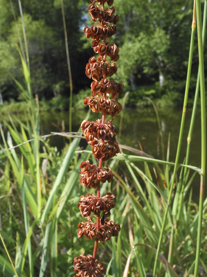
Wild sorrel develops a tall tower of seeds gathered in tiers, richly red and elegant.


Queen Anne's Lace does a curious thing when its seeds develop: the flattened flower curls up into a cup shape, with the reddish seeds inside. I never knew why this happened, but while doing a little research for this post, the invaluable Wikipedia told me that when dried, the umbels detach from the plant and roll along with the wind, like the "tumbling tumbleweed". This is a tiny sample of the many  way seeds develop and disperse, allowing species to survive and to spread.