January 13, 2015

Morning Light


In winter, the sun hangs low in the sky; it streams into the house, reaching corners that the high sun of summer never touches. It is compensation for the freezing temperatures and the short days. Shadows become as dense as objects, as though a clear illustration of Plato's Cave.


Here is the original of that shadow: some lilacs from last spring, their dried heads arced downwards.


The morning sun picks out tiny details of goldenrod seed heads.


A hanging bunch of marjoram is echoed in its shadow.


The objects on my shelves glow in the brief illumination of morning.


And a cup emerges from the dark.


A gilded pear in a brass bowl becomes a mystery.


Shadows create geometries, of windows....


....of a ladder back chair.


Out of doors, the morning shadows are bright blue under a blue sky, the mountains of snow repeating the dark mountains in the distance. The brilliant sunlight is a gift in a winter of endless gray.


January 10, 2015

A New Textile: "Circling"


Circling, hand dyed wool on linen; 2 pieces: 17 x 15 1/2 in. (each circle with a 9 1/2 in. diameter) and 7 in. diameter, 21 x 19 in. overall.


Two circles, attached, are connected by inverted color curves. I was thinking circles, both for this textile and for my most recent group of hooked wool drawings. The piece could have been complete with the two conjoined circles, but I thought a little bounce would be added by the additional circle floating above.


Here is the spot where the two circles are attached. There is a green line separating the two large color areas, just for emphasis. I hooked the larger color areas of the circle in horizontal lines and the smaller areas parallel to their inner curve; this emphasizes their difference and creates a bit of a shallow space, as though the horizontal areas are held within cups. Or are they simply phases of the moon?.....


January 7, 2015

January


This year, January insists it ain't kidding around: It Is Winter, and it has been Cold.  This morning dawned partly cloudy, temperature around zero, with a thin coating of bright ice on branches. The morning high of 10º was forecast to be the warmest part of the day; now, at 4 PM it is 5 below zero.


The year started beautifully: dawn on January 1st was glorious. The first days were normally wintry cold.


During the night of January 4th the wind began to roar, rattling my metal roof and awakening me with the noise. The morning sky was clear, but the gusts of wind swirled the snow across the landscape. The day was bitter cold.


I braved the outdoors that day for only a few minutes: I wanted to photograph the glazed surface of the snow, polished by the high winds.


At sunset that day, Sunday January 4th, a pink cloud hung above the rippled snow.


That night, when I walked into my east-facing bedroom, I saw a strong light coming through the windows: it was the full moon shining on the icy snow; my hilltop house was transformed into a ship on the high seas.


This morning glittered with ice on branches and ice crystals hanging in the air.


At midday, a cold front began to blow in, with snow and wind. It's going to be a bitter cold night; the forecast is for 20-25º below zero. It's certainly not unheard of around here, but it is cold. When I wake up tomorrow and look at the thermometer, it'll seem as though it barely has any mercury in it. But as you can see from the photos above, winter does have its beauty. And here's a poem from John Updike about this first month of the year. (In my house it's the wood stove that purrs, and sometimes the cat cozily purrs beneath it.)

January

The days are short,
The sun a spark,
Hung thin between
The dark and dark.

Fat snowy footsteps
Track the floor.
Milk bottles burst
Outside the door.

The river is
A frozen place
Held still beneath
The trees of lace.

The sky is low.
The wind is gray.
The radiator
Purrs all day.

January 6, 2015

A New Print: "Blue Frames"


Blue Frames, 2014, ink on Sekishu Natural paper; 2 panels, each 15 1/2 x 14 in.; image size 9 x 8 in.;
ed. 2


Have you ever had an initial idea about a work which you were sure was wrong, so you re-did it, but then the re-do was clearly off so you went back to your original thought? I don't believe this has happened to me before, but it did with this print, a diptych. I had originally planned it as a two-panel work, with the yellow panel on the left. I think that's what threw me off, because the weight of the red on the right (see below) was too heavy. When I saw the proof of the two panels, I thought "no, that doesn't work; the two plates have to be on one sheet". So I printed on one sheet, not realizing how placing the red on the right was a mistake of balance. I printed a whole edition of 5, which I ended up tossing when I decided that I didn't like it. I had to order new paper to reprint the edition, but somehow, because of my sloppy printing, ended up with only 3 good prints: one artist's proof and two in the edition. But at least I'm happy with the print as it is now; we hit and miss and sometimes hit again.


January 4, 2015

Judith Scott: Aesthetics and Biography


This first sculpture that Judith Scott (1943-2005) made at the Creative Growth Art Center in Oakland ca. 1988 was a wrapped group of sticks and other objects, its intense presence giving the appearance of a ritual bundle, made for magic and for prayer.


Before she began to sculpt, the first works Scott made at the art center were drawings. I learned at the link above that she was not especially interested in these two dimensional works.


I do like her work on paper, and am glad that they were included in the exhibition at the Brooklyn Museum, Judith Scott: Bound and Unbound. They have an energy and sense of color that points to her sculptural sensibility.


It was in a fiber arts class that Scott discovered her aesthetic voice. There she began to wrap various found objects and materials in yarn and string, sometimes making sculpture that was fluid and oddly shaped, like an imagined living creature.....


....while other works were compressed into a solid form. Because of the complex layers of wrapping––here, even clothes hangers are included––there is tension and a sense of a pod about to burst open.


This piece from 1993 has a lighter, more lyrical quality, a delightful sense of play.


Working with the basic idea of wrapping, Scott has a remarkable range of expression: we go from lighthearted to funereal; I see this white sculpture as like an Egyptian mummy, a hermetic object, closed and unknowable.


Map-like, a relief sculpture carries us over territory of different textures and colors.


I love this piece, one of the few that relates to geometric form; I love the color and the square of lighter threads at the center.


A spill of orange threads top heavier green wool, regularity within the welter of lines. Looking at this piece, and the works above, can anyone doubt that they were made by someone with a clear and developed aesthetic sensibility, an artist willing to experiment, to push her boundaries? And yet, to unsophisticated art viewers, this is not art; my aunt found it "depressing", and I had a very lively conversation with my mother, with whom I saw the show, about the definition of art. She claimed it was not art.


Sheila Hicks, Lares and Penates, detail


So....here is a detail of a Sheila Hicks piece, made up of many small wrapped forms. Hicks is an acknowledged and respected fiber artist.


Why might we not see Scott's work as "art"? it has been recognized as such by critics, galleries, and museums. Here is where biography comes in and confuses things: Judith Scott was born with Down Syndrome and spent many years of her life in a state institution, thought to be uneducable. It turned out that she was deaf, and not so badly disabled. When her twin sister Joyce moved Judith to be with her in California in 1986, Judith's life changed: making sculpture for 18 years at the Creative Growth Art Center, a place for adult artists with disabilities, brought out a vibrant creativity.


As I processed the photos I took at the Brooklyn museum show, I became more and more convinced of Scott's unique and lively vision. There is no question in my mind that her sculpture was produced with the same kinds of aesthetic decisions that are part of any artist's process. There is attention to form and to color, and to the tensions produced in the wrapping of objects. I do wish that the show had been given more space in the museum; I felt that the works were too crowded. They had enough presence to be given more space, with room to walk around each one.


It's marvelous to think of the materials Scott used to make her sculpture: here the primary color is blue, with old blue jeans and other fabrics piled and tied together into a flop-limbed bulbous body.


There is tremendous energy evident in the gathering of this complex array of fabrics, yarn, paper, and other "stuff". We are excavating feelings as we regard these works, bringing up memory, surprise, unease, delight. There is aesthetic pleasure in the forms and colors. Here is art.


January 2, 2015

A New Painting: "Central Red"


Central Red, 2014; egg tempera on calfskin parchment, 6 1/2 x 8 1/2 in.


My last painting of 2014 is not especially festive; it's rather austere in fact, even with the red vertical and horizontal shapes, since grays predominate. What especially interested me in this image was the shallow spaces, the planes layered one atop the other; and the simple geometry of it. 


Central Red detail


I hope that there's a sense of air behind the reds, a space before we get to the dark gray surface, with its shadowed shapes. For me there's a world within light and shade, form and shape, which yearns toward something beyond its surface.


December 31, 2014

Have a Sweet New Year!


John Peto, Help Yourself, 1881; oil on canvas, 8 1/16 x 10 1/16 in.


How better to ring in the New Year than with images of sweets, signs of delicious delight? I wish that you all can help yourself to the good things in life. Peto shows us that beauty and wonder can come in a small, ordinary, simple package.


Wayne Thiebaud, Seven Suckers, 1970; oil on canvas, 19 x 23 in.
Image courtesy NY Times.


One of the great painters of desserts brings us yummy suckers, the luscious paint as juicy as the candy.


Will Cotton, Chocolate Forest, 2001; oil on linen, 75 x100 in. 
Image courtesy Will Cotton.


For my chocolate loving friends, here is a huge painting (imagine standing in front of this bigger than 6 foot high by 8 foot wide canvas!) of chocolate lawn, lake, and trees: heaven for some.


Photography Studio: Schadde Brothers, Satinettes, Filled Confections, and Ye Old Style Stick Candy, ca. 1915; gelatin silver print, 8 1/2 x 10 5/8 in. 


I enjoy going to the Met's website where you can search their collections. When I put "candy" in the search bar, several photos by this studio came up. They reminded me of my childhood, when you could go into a store and buy penny candy.


Box, Britain, early 19th century; enamel on copper, 1 5/8 x 1 1/2 in. 
Image courtesy of Metropolitan Museum of Art.


This charming little box held sweets. Boxes such as this were popular gifts in 18th century England. I offer you only its image as a New Year's gift.


Juan Van der Hamen, Still Life with Sweets and Pottery, 1627; oil on canvas, 32 1/4 x 48 13/16 in.


In 17th century Spain, the boxes holding sweets were of wood, and glass jars held moist confections. Like a table spread with delicious treats, may the new year bring you joy.


December 23, 2014

New Hooked Wool Drawings


2014 #17, hand dyed wool and egg tempera on linen, 15 1/2 x 16 1/2 in.


Recently when I've worked on studies for a new group of hooked wool drawings, my thoughts ran in themes: last time it was lines, this time circles and curved forms.  Half-circles balance......


2014 #18,  hand dyed wool and egg tempera on linen, 17 x 15 in. 


.....and a circle rests (rolling?) on a line.


2014 #19,  hand dyed wool and egg tempera on linen, 18 x 17 in. 


Ovals push outward, with positive and negative spaces flipped.


2014 #20,  hand dyed wool and egg tempera on linen, 15 x 12 in. 


In #20, as in #19, the space between has the weight of hooked wool, and the shapes––"racetrack" (oval with straight lines, and partial circles––are thin paint. Is there something a little uncomfortable with this reversal? I'm not sure.


December 21, 2014

At the Met: Luxurious Lacquer


Incense Box with Fragrant Grass Design, China, 14th century; carved black, red, and yellow lacquer


Oh, how I love the Metropolitan Museum of Art! I've wandered the galleries there for years, but there is always something new to discover. A couple of years ago I went down a staircase from the Medieval galleries and found the Antonio Ratti Textile Center which was then showing very beautiful European lace. On my most recent trip, walking up a staircase at the end of the Chinese collection, I discovered 4 small galleries––#s 219 - 222––on the 3rd floor, dedicated to Chinese Decorative Arts. My favorite show tucked away up there was Sumptuous: East Asian Lacquer, 14th - 20th Century (though I didn't see anything from the 20th century). You can see all 44 pieces in the show at the link. There is such wonder in fine objects such as these, in their creativity of pattern and image, and in their inventive and complex process.


Box with Pommel Scrolls, China, 1st half 14th century; carved red and black lacquer


These gorgeous patterns are carved into lacquer that was layered on wood. The lacquer comes from the sap of the lacquer tree, which hardens when exposed to oxygen and humidity (this information from a wall label at the show). The red lacquer is colored with cinnabar, the black with carbon.


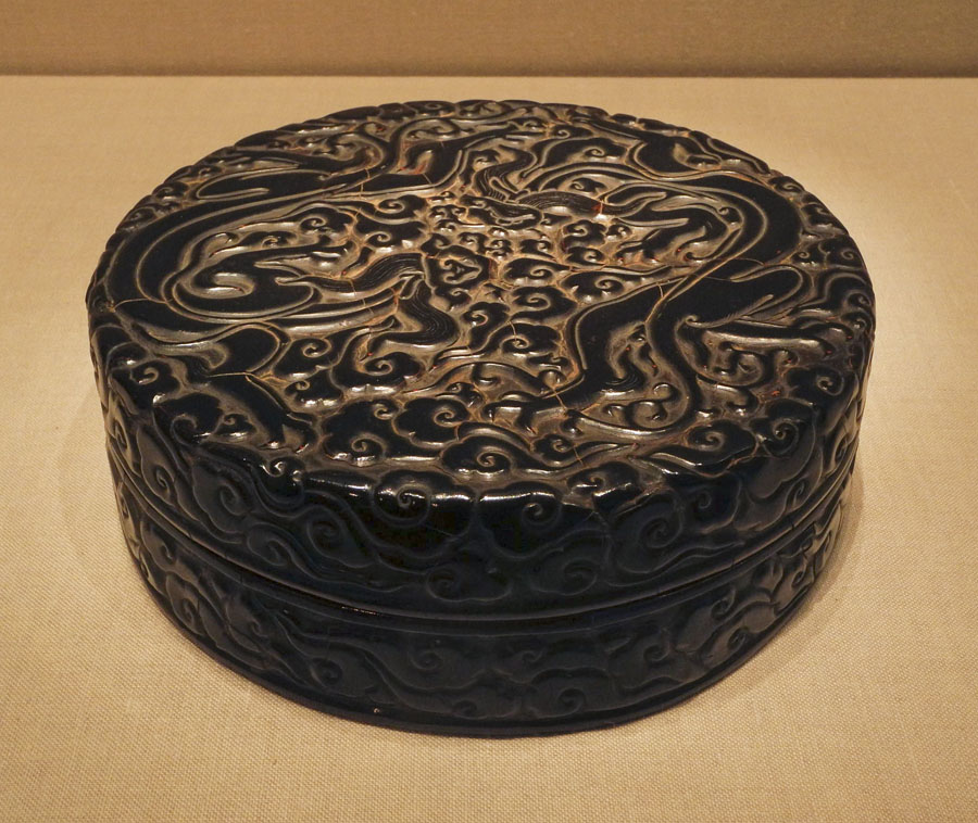
Box with Dragons Amid Clouds, China, late 13th-early 14th century; carved black, red, and yellow lacquer.


As many as 200 layers of laquer are laid down on the wood surface, though the number is usually around 30; each layer is allowed to dry completely before the next one is added.


Box with Landscape and Scroll Pattern, Japan, Edo period (1615-1868); carved red lacquer.


Carved lacquer began in China; the technique was also used in Japan. The carving allowed for beautiful relief effects, much like "fine art" sculpture. My favorite pieces are the two red dramatically carved Chinese boxes with their overall patterns.


Box with Geometric Designs, China, late 17th century; black lacquer with mother-of-pearl inlay.


Another spectacular technique in lacquerware is using mother-of-pearl inlays. The  mother-of-pearl, some of which was tinted on the back to give it some color, sparkles against the rich black of the lacquer. This piece is especially fine, with its tiny patterning; I can hardly imagine the patience and precision that was required to make it.


Box with Peony Scrolls, Korea, 15th-16th century; black lacquer with mother-of-pearl inlay.


A swirlingly lovely pattern of flowers, leaves, and branches.


Incense Box with Chrysanthemums, Japan, second half of 19th century; gold hiramaki-e on mother-of-pearl ground. 


I love this little box, made with the maki technique of sprinkling gold powder on lacquer; here there is also a mother-of-pearl inlay. It makes a light-filled object, delicate and poetic.


Writing Box with Plum Blossoms and Moon, Japan, 18th century; reddish-brown lacquer with gold hiramaki-e, lead, and mother-of-pearl inlay.


This, and the next few pieces, use a combination of techniques, used to best express the character of the image. The simplicity of design of this writing box, with its dark circle for a moon and its curved branch of blossoms, reminds me of the Rinpa aesthetic, in which nature is described with sensitivity and is balanced with emptiness.


Writing Box with Poet Kakinomoto Hitomaro, Japan, 17th-18th century; black lacquer with gold and silver takamaki-e, hirmaki-e, cutout gold and silver foil application, and lead rim.


Kakinomoto Hitomaro was the "patriarch of Japanese poetry". Inside the lid of this lovely box is a landscape (which you can see here) that illustrates his poem
Dimly through morning
Mists over Akashi Bay my
Longings trace the ships
As they vanish beyond
the island. 

Stationery Box with Moon and Autumn Grasses, Japan, 18th century; black lacquer with powdered and sprinkled gold and silver hiramaki-e and silver foil application.


The delicacy of the imagery on this box is full of longing and memory.


Box with Crabs and Waves, Japan, 17th century; black lacquer with gold maki-e


A much bolder design displays a different sensibility, but each, the grasses and the crabs, are assuredly elegant and ask for quiet and prolonged looking. Wouldn't it be wonderful to be able to be intimate with any of these works?


School of Shibata Zenshin (1807-1891), Writing Box with Gourd, Japan, 1886; black lacquer with gold and silver hiramaki-e, colored lacquer application.


 This final piece is dated and the maker is known. It is just as beautiful as more ancient works, just as sensitive to nature and to the composition on a surface, and the drama of gold or color on a black ground. In Japan the gourd is associated with spring, so the inclusion of dandelions is a seasonal expression. The jagged leaves and many-petaled head of this common flower is so carefully observed that it becomes as valued as a rare plant, a transformation of life into art.