March 13, 2015

Something New: Book Paintings


Dan Walsh, Catalog, 2004; watercolor and mixed media on Yoyoi paper, wood and canvas cover; 8 15/16 x 10 1/8 in.; ed 6, 2 AP's. 


Just when I think that I couldn't possibly get another new idea for a format or medium, along comes a show that excites and inspires me. Last month it was the Dan Walsh show at Paula Cooper. Along with terrific paintings (I wrote about his last show here), there were cases displaying books that he'd made. The precise, yet hand made aspect of many of the books was very beautiful, showing geometries hard and soft.


Dan Walsh, Grid Book, 2008; ink and pencil on paper, 11 1/2 x 13 in.; ed 10, 1 AP


I wish I could have seen more than the double page on view. Here was a variation on a theme of the crossed forms often found in his paintings. Since they are paint, or ink, I wonder how he managed to make editions of these books. It was the hand-made-ness of Walsh's books that so made me want to make books, and got me to figure out how to do very small painted pages in very small books. 


Book 1, cover; egg tempera on Sekishu natural paper, 4 5/8 x 4 7/8 in; 12 pp.


In my often funky fashion, the two books I made are rather irregular and imperfect, but I see that as part of their quality, being similar to my potato prints in that way. I folded strips of Japanese paper and bound them with a simple 4 hole Japanese binding, explained clearly in this video.


Book 1, pp. 2, 3


As you can see in the photos, the paper, although doubled, is translucent, so allows the shapes from one page to appear as ghosts on another.


Book 1, pp. 4, 5


I used the painting on a previous page to guide the work on the following one, to allow for a subtle relationship between shapes. I love this quality of the thin Japanese paper. 


Book 1, pp. 6, 7


The painting of these pages is completely improvisational: my brush hovers over the page, drops down, and marks a shape (of course I hover, I mark). I mix colors that I hope will work with what came before.


Book 1, pp. 8, 9


Improvisation comes in handy sometimes: I groaned when I noticed I'd dropped some paint on the right edge of the page, but then thought "why not paint over it?". I wouldn't have thought of painting on the edge if the sloppiness hadn't happened.


Book 1, pp. 10, 11


I then emphasized the use of the edges by painting two more rectangles along them. I am studiously avoiding the concept of narrative here, wanting each page, or double page, to read as "painting"; there's no development of form or idea, just relationships from page to page. 


Book 1 back cover


The final page is also painted. There was something fanciful and lighthearted for me in making this book, and the one that follows. I'm not sure if it's the medium of books, or the way these are made, or if it's the shapes and colors, but the experience was very pleasurable. I shy from calling these "artist books" because that seems so formal, and these are so informal, so "book paintings".


Book 2, cover; egg tempera on Akatosashi paper, 7 x 6 1/4 in.; 8 pp. 


My second book is larger, but with fewer pages. You might notice that the binding is much neater as I gained some practice. I happen to love this darker paper; it is very beautiful to use, with a wonderful character.


Book 2, pp. 2, 3


The ghosts of other pages aren't as present with this paper, though. With this book, I'm using thicker and more varied shapes, not just rectangles as in Book 1.


Book 2, pp. 4, 5


 I am still paying attention to how the shapes on one page relate to those on the next.


Book 2, pp. 6, 7


I am still using very minimal means, with lots of empty space.


Book 2, back cover


I thought this––3 tiny circles––was a fun way to end the book, centered between the thin lines of the previous page. I often try to articulate to myself what it is about minimal abstraction that so appeals to me, so satisfies my aesthetic longings, but it's difficult. I will just say here that there is a sense of touching something beyond the everyday, a reaching for a sense of the essential, that permeates these forms.


March 12, 2015

Louise Nevelson: Pasted Form


Untitled, 1959; cardboard, paper, and wood collage on board, 36 x 48 in.
(I apologize for the reflections in the photos.)


After seeing the recent exhibition of Matisse cut-outs at MoMA, I've been more alert to the possibilities of collage, even including pasted shapes in some of my own potato prints. So it was a real treat to see a recent show of Louise Nevelson's powerful collages at Pace Gallery. The show included several later assemblages, but what most interested me were the earlier, flatter works, of various materials pasted onto wooden boards. The images are graphically strong, the use of materials wide-ranging and inventive; anything that came to hand was of use. Of course there is a strong tie to the earliest collages (from the French coller, "to glue") by the Cubists Picasso and Braque. Nevelson's work might be closer to that of Kurt Schwitters, who made wooden collage/assemblage constructions, and built entire environments.


Untitled, 1956; cardboard, foil, paint, and wood collage on board, 46 x 36 in. 


A triangle fits into a partial circle, and the curve and diagonals are repeated in the forms below. A piece of foil adds light....


Untitled, 1956 detail


....the flaps of a flattened cardboard container add gentle angles, the verticals of the corrugation repeating the larger wooden verticals alongside.


Untitled, 1959; cardboard, foil, paint, paper, and pencil collage on board, 46 x 36 in.


This piece emphasized verticality, but balances that with horizontals above the tall, thin verticals, tops it off with a large broken curve, and surprises us with a black lacy semicircle. I love the lines of circles at the bottom of the cardboard shape. We have a strong sense of knowing where the ordinary stuff used to make these collages comes from––a doily, a box that held cans––but it is transformed into the stuff of art.


Untitled, 1959, detail


The elements have an architectural feel to them, as though the forms reference built structures. The color, though subtle, is very beautifully adjusted, one surface to another.


Untitled, 1960; cardboard, paper, pencil, and wood collage on board, 36 x 36 in. 


Elegantly curved forms are alongside pieces of wood that are torn and jagged; the deep browns and blacks make the work an elegy.


Untitled, 1957; fabric, leather, and wood collage, 40 x 30 in.


Untitled, 1957; cardboard, metal, pencil, velvet, and wood collage on board, 40 x 30 in.


The two pieces above may be my favorites in the show: the stacking of rectangular elements is so satisfying to my eye. And then there is the reference to books in the shape and in the use of what look like leather bindings.


Untitled, 1963; cardboard, foil, paper, spray paint, and wood collage on board, 36 x 23 7/8 in.


The regularity of those rectangles is unusual, though, in Nevelson's body of work; she reveled in combining disparate elements and making them into a whole. In the gallery press release she is quoted as saying "the way I think is collage". Untitled, 1963 is emblematic of her putting one seemingly disconnected thing next to another––a torn piece of wood and some lace; aggressive next to sedate, irregular next to patterned––and making a unified statement.


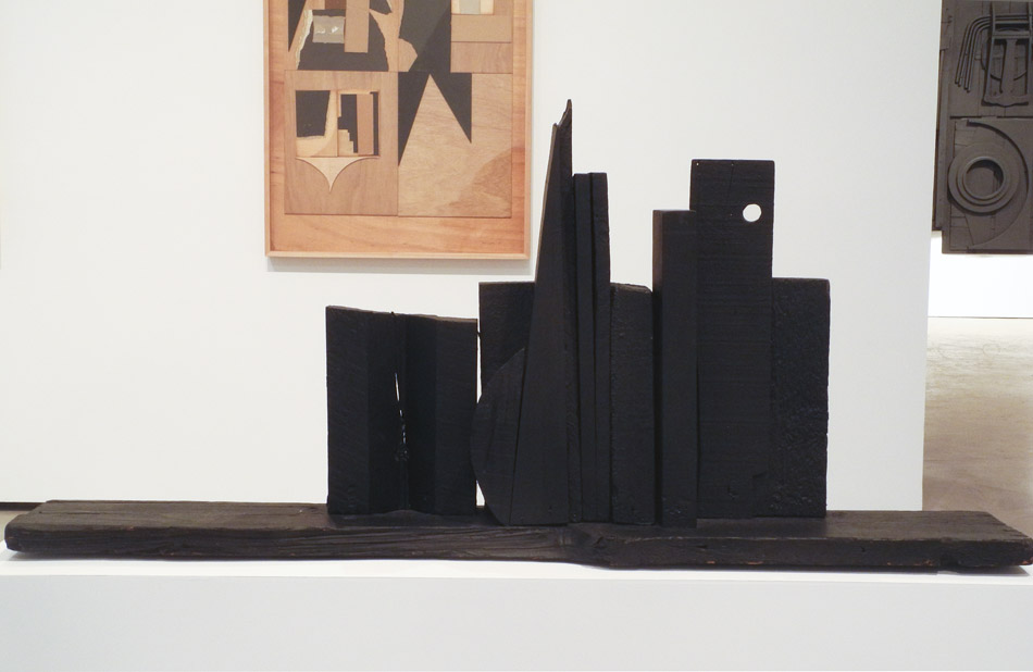
Moon Spikes, 1953; wood painted black, 22 3/4 x 49 3/4 x 7 3/4 in.


I'd like to end with a small early sculpture by Nevelson. In it we can see her desire to place shape next to shape and to see what conversation emerges. From the book Dawns and Dusks by Diana MacKown, 1976, (found on the Louise Nevelson Foundation site) is this quote from Nevelson:
When I compose, I don't have anything but the material, myself, and an assistant. I compose right there while the assistant hammers. Sometimes it's the material that takes over; sometimes it's me that takes over. I permit them to play, like a seesaw. I use action and counteraction, like in music, all the time. Action and counteraction. It was always a relationship – my speaking to the wood and the wood speaking back to me.


March 10, 2015

Snow Melt


A touching phenomenon happens in the woods at this time of year: the temperature is warm enough that natural objects begin to sink into the snow as into a soft enveloping cushion; there's a feeling of tenderness in the way each small thing is held.


A bit of evergreen stem rests beneath an ice-rimmed hole.


Dried leaves have settled into the footstep of a deer.


Scattered needles make a pattern on and in the snow.


Circles bare of snow have widened around the warmth of trees.


Snow and ice have retreated from the bark of an ancient apple tree, and mosses have emerged, looking like a miniature hilly landscape.


The temperature was in the mid 40s today, a beautiful and delightful day. It feels as though it's been 6 months since we've experienced that mildness, though it's probably been only 3. It was a perfect day to begin pruning my apple trees, so after my snowshoe in the woods, I took my hand pruner out to my old lady tree, the first tree I prune each year.


She's very old and bent over, and I don't expect her to live much longer, but there are vigorous new shoots every year, heading straight up, that have to be pruned off. This tree seems so wizened, yet has so much life left in it, that it's a lesson in aging gracefully and with energy.


March 9, 2015

A New Painting: "Rectangular Blues"


Rectangular Blues, egg tempera on calfskin parchment, 7 1/8 x 9 1/2 in.


It's interesting to see the responses to our work out in the world: sometimes pieces we think "meh" of are greeted with enthusiasm, and works we really like are duds. Does this mean our own judgement is faulty, or that of the viewers? Maybe neither, and it's just a matter of taste. I happen to really like this painting I recently finished, and didn't like the last one much. I have an austere streak, and this image satisfies it: very simple overlapping rectangles, all variations of one color, with areas of black. Sunlight crosses the blue at repeating diagonals. I made the source image's light grassy areas into deep darks to keep a minimal expression of form; I added a bar across the left center of the painting, to bring light into it.


Rectangular Blues detail


I considered changing the curved forms at the upper left into a rectangle to keep with the shaped theme, but I thought that the variation added some energy to the composition. Although based on real things out in the world, balancing these paintings feels much like making an abstract image. I am concerned that the light and the form are convincing, and that the painting stands on its own without reference to the real world.


March 7, 2015

At the Met: The Grace of Korean Ceramics


Brush holder with lotus decoration, mid 19th century; porcelain with openwork design, 5 1/4 x 5 1/4 in.


At the Metropolitan Museum of Art, there's a gallery––#233––in the Asian wing dedicated to Korean art. I often stop in there on my visits to the museum because there are always beautiful objects on display. There is currently an exhibition there celebrating "Korea: 100 Years of Collecting at the Met", which contains many wonderful things, all of which you can see at the exhibition link. What most pleases my eye, as is often the case in this room, are the elegant and graceful ceramics, often with a celadon glaze; their color and shape, their sensitive delineation of natural forms, are refined and have a sense of perfection. It is a warm perfection, one that elicits a longing for beauty.


Gourd-shaped Ewer with decoration of waterfowl and reeds, early 12th century; stoneware with carved and incised design under celadon glaze, 10 1/2 x 7 7/8 in. 


This ewer has marvelous curves and fanciful little squiggles at the top of the lid and handle. When I see a piece like this I can't help but wonder what it feels like to lift it, to pour a liquid from it, to run my hands over its curves. My sensuous experience has to be limited to sight. A you can see from the date of this ewer....


Bowl with foliate rim and peony decoration, first half of 12th century; stoneware with mold-impressed and incised design under celadon glaze;, 2 1/4 x 7 5/8 in. 


....and of this elegantly incised dish.....


Melon-shaped ewer with decoration of bamboo, first half 12th century; stoneware with carved and incised design under celadon glaze, 8 1/2 in. 


.....and this inventively decorated piece, these three works are ancient. As I learned from this brief essay on the Met's website, they were made during the Goryeo dynasty (918-1392). The artisans learned much about celadon technique from China. The color comes from "the raw materials from which it was made––iron in the clay and iron oxide, manganese oxide, and quartz particles in the glaze––and to the reduction atmosphere created at a certain stage of firing by dramatically reducing the level of oxygen inside the kiln." For me the color is more than a reference to the natural world, the greens of the plant world; there is quality of innate light, of calm pleasures.


Dish, second half of 15th century; porcelain, 1/2 x 8 7/16 in.
Bottle, first half 19th century; porcelain, 13 15/16 x 8 1/4 in.


Two very simple pieces, made hundreds of years apart, both showing how attention to the flowing movement of a curve can make an object that is wonderfully satisfying.


Moon Jar, second half of 18th century; porcelain, 15 1/4 x 13 in. 


The fullness of this irregular jar, named Moon Jar ––dalhangari––because of its shape...and I think of the full moon just passed hanging round and white in the sky, with reds on it as it rises.


Jar with decoration of flowers and insects, mid 18th century; porcelain with underglaze cobalt-blue design, 13 1/2 x 11 3/8 in. 


Fresh and delicate drawings enliven the surface of this jar, with insects flitting about and the flowers and leaves floating in a breeze.


Square bottle, first half of 19th century; porcelain, 7 x 4 1/4 x 4 3/8 in.


Amidst all the curves, it is a nice surprise to come across this rectangular form, simple and clean; perhaps it alludes to architecture or furniture. The slight curves of the neck play off nicely against the square sides. It is a very lovely thing.


Kashyapa, 1700; wood with polychrome paint, 22 x 9 in. 


Finally, I bit of joy to end: a small sculpture of Kashyape, "the eldest of the two principle disciples of the historical Buddha Shakyamuni." His visage and gesture are full of peace and calm and loving-kindness; what perfect feelings to be conveyed by a work of art.


March 4, 2015

New Hooked Wool Drawings


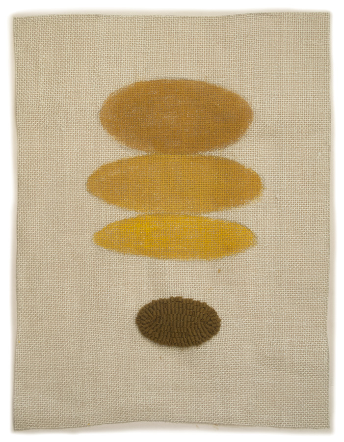
2015 #1, hand dyed wool and egg tempera on linen, 18 x 13 1/2 in.


When I first began this series of hooked wool drawings in 2010, my images were all centered on the linen surface, like sketches in a notebook. I later began using the entire surface, creating a different kind of energy. With this group of four I thought I'd stay with the centered image. Above are two ovals, one in paint and one hooked.


2015 #2, hand dyed wool and egg tempera on linen, 18 x 13 3/4 in.


Here are more ovals––or should I call them ellipses?––arranged horizontally. Three of them are painted in different yellow hues, the fourth, the smallest one is hooked in wool.


2015 #2 wool choices


After I'd painted the ovals, I wasn't sure I wanted to use the color of wool I'd originally decided on. I can't even remember which one it was of the three, but I did end up using the color in the middle because of its assertive contrast. It often happens that a color of wool I'd picked out for a drawing looks wrong once the shapes are painted.


2015 #3, hand dyed wool and egg tempera on linen, 15 x 18 1/2 in. 


In 2015 #3 there is a hooked line, a hooked shape, and a painted shape; the shapes are different reds, the line a greenish yellow.


2015 #4, hand dyed wool and egg tempera on linen, 17 x 13 in.


As in 2015 #3, #4 has the elements of hooked shape, painted shape, and line, but in this case the line encloses the painted shape.


2015 #4 detail


This closer look gives a better idea of the way the different surfaces play off each other. The textures make a kind of mini-relief sculpture whose physical presence contains a lot of the meaning (such as it is) of the work.


March 2, 2015

Waiting Patiently


We are still in deep winter here in northern Vermont: today the wind is howling and snow is blowing. But there are tight little packages on trees and shrubs ready to burst into flower and leaf when the time is right. A pair of American Cranberry buds stand up tall, their rounded shapes coming to a point like onion domes.


In the woods, the buds of beech trees are long and elegantly wrapped.


The lilac has large rounded buds, which look as though they're ready to open, but it will be two months before that will happen.


Branches and buds of blueberry bushes are a vivid red, pulsing with life next to the cool white snow.


Small buds climb raspberry canes.


Two red apple tree buds point downwards, but hold up hope.


The apple trees, with their pointing red fingers, look like they are celebrating their good fortune on a bright and cold day. Some day in May, the buds will open, leaves will begin to form; this year there will also be flowers, and if all goes well, fruit in the fall. The trees and shrubs know that winter will end and the growing season will begin; they remind me to be as calm and patient as they are.