September 10, 2015

Velázquez: The Greatest Artist?


Diego Rodriguez de Silva y Velazquez, The Spinners (Las Hilanderas) or the Fable of Arachne, 1655-60; oil on canvas, 86 x 114 in.
All images except the last courtesy of Museo Nacional del Prado website, where you can see high resolution images, in great detail.


If you were asked the rather ridiculous question of who is the greatest artist of all, who would it be? I say "rather ridiculous" because to look at great artists of different times or cultures and try to evaluate them on a comparative scale seems impossible. The love I have for the paintings of Fra Angelico is equaled by that I have for Kazimir Malevich, or for Egyptian relief sculpture; who wants to choose? But recently, reading the wonderful book Rendez-vous with Art––a conversation at various museums, between the long-time director of the Metropolitan Museum of Art, Philippe de Montebello, and Martin Gaylord, an art writer––I came across a chapter that reminded me of my years-ago feeling that Velazquez was the greatest of them all. Gaylord and de Montebello were at the Prado, in front of The Lances, and de Montebello remarked
I find it very hard to talk about Velazquez; he strikes me dumb––because he was a painter of miracles, the miracle of converting paint into life, into "truth", as a visitor to a display of paintings at the Parthenon in Rome, in 1650, exclaimed about Velazquez on seeing his portrait of Juan de Pareja, now in the Met. There, this is life!
Manet called Velazquez "the supreme master", and we saw his influence on Manet in a 2003 exhibition at the Met, Manet/Velazquez: The French Taste for Spanish Painting. I was lucky enough to have visited the Prado thirty years ago––and the Prado is the only place to truly see Velazquez––and I too was astounded; seeing the paintings in reproduction did not prepare me for their intense presence. The famous Las Meninas was remarkable, but I remember being especially thrilled by The Spinners; the quality of light and movement of ordinary activity, with the curtain drawn back, made it seem as though there were actual figures on a stage.


The Spinners detail


The assured fluid brush adds light and life; each figure is an individual, caught in a moment's gesture.


Velazquez, Mercury and Argos, ca. 1659; oil on canvas, 50 x 98 in.


I love this painting for its beautifully composed forms, for the touching male beauty (although it's a story of Mercury's stealth)...


Mercury and Argos detail


...and the sensuously painted flesh, so alive that we feel we can run our hand over it.


Velazquez, The Jester Calabacillas, 1635-39; oil on canvas, 42 x 33 in.


What points so strongly to Velazquez's greatness are his portraits of the jesters and dwarfs and actors at court, these special yet ordinary individuals––not the royalty he also depicted–––that show his depth of feeling, and his humanism. They are real people, breathing flesh and blood, about to get up, to turn, to gesture towards us.


The Jester Calabacillas detail


How does Velazquez achieve this magic of life? One way is by softening the forms, and by dissolving their edges. This gives an indeterminate quality to the figure, allowing for a sense of motion: the eyes can turn, the mouth change its expression, the head tilt, since they're not fixed in space.


Velazquez,  Francisco Lezcano (The Boy from Vallecas), 1636-38; oil on canvas, 42 x 33 in.


Here is another remarkable portrait, of a jester who was companion to Prince Balthazar Carlos.


Francisco Lezcano detail


There's a sense of a tender and giving person, yet one with pride. Velazquez paints these men with dignity and sensitivity; I feel that he loves them.


Francisco Lezcano detail


The fluidly painted detail of warm reflected light under the hands is another keenly observed element that adds life.


Velazquez, Juan de Pareja, 1650; oil on canvas, 32 x 27 in.
Image and quote courtesy of the Metropolitan Museum of Art website.


Finally, a painting I can visit each time I go to the Met. How I love standing in front of this portrait of a man––a man who had been a Moorish slave and assistant in Velazquez's workshop; who became a painter and was freed in 1654––and feeling as though I am in the presence of a living human being. When shown in Rome where it was painted it was acknowledged that
...everything else seemed like painting but this alone like truth.

September 8, 2015

A New Painting: "White Wall"


White Wall, egg tempera on calfskin parchment, 8 1/4 x 11 in.


I wondered if I could make a painting with a nearly blank center; a painting that was about white and the colors reflected or shadowed across it. The composition is quite simple, almost confrontational in its frontal planes. 
(Click to enlarge to see the surfaces more clearly.)


White Wall detail


There are warm reflected lights and cool shadows. I love the challenge of transforming paint into light.


White Wall detail


The colors were changed many times for the right balance of hue and value; the layering of translucent egg tempera makes a more interesting surface, with its slight variations in color .


White Wall, at 8 1/4 x 11 inches, is larger by a couple of inches than any painting I've done in the past few years, but it doesn't look so in this photo; that's because the scale of the forms is small compared to say, the large yellow curves at the upper right. I look at the painting now and think it could have been a bit bigger. To show how my paintings have gotten larger over time, I hung the painting Reds, from 2011 at the lower right, which is 7 x 5 inches, while the recent work is in the 8-9 inch range. That doesn't seem like such a big difference, but at these small sizes it's a large increase. I feel satisfied with the size and scale of my current paintings, but who knows where I'll go in the future....


September 3, 2015

Hilma af Klint: Spiritualism and Aesthetics


The Seven-Pointed Star, No. 5 and No. 7, 1908; tempera, gouache, and graphite on paper mounted on canvas, ca. 29 x 24 in.
I photographed all the images in this post, except the installation shot, from the catalog Hilma af Klint: A Pioneer of Abstraction


In 2012 the Museum of Modern Art mounted a great exhibition, Inventing Abstraction: 1910-1925. If they had thought to include the work of the Swedish artist Hilma af Klint, the early date would have been 1906. Why was her work missing from this important show? She was a woman; she lived in Stockholm, away from major centers of modern art; she was intensely involved in Spiritualism; when she died in 1944 she stipulated that all her work, over 1000 paintings, be kept together, not sold, and not exhibited for 20 years because they would not be understood. Her work was first seen in the exhibition The Spiritual in Art: Abstract Painting from 1890-1985, held at the LA County Museum of Art. From that catalog and the work of hers that I'd seen online recently I was intrigued by this relatively unknown painter. Then the artist Ravenna Taylor showed me the majestic catalog Hilma af Klint: A Pioneer of Abstraction, from a 2013 exhibition at the Moderna Museet in Stockholm and I was stunned and thrilled by the work. Granted, all my responses are only based on seeing reproductions, but I hope I will be able to see the actual paintings some day.

What I saw in this catalog excited me aesthetically: in the paintings above, the flowing lines move gracefully across the page, a dance of lines forming shapes and intimating volumes. It all feels in delicate balance, with perfectly placed color. They are beauty and delight.


The Seven-Pointed Star, No. 2, 1908; tempera, gouache, and graphite on paper mounted on canvas, ca. 29 x 24 in.


This painting seems to refer to plant forms, which would not be surprising since af Klint was a landscape, portrait, and botanical painter before she turned to abstraction. But then again, it was not exactly that she herself turned: in the works she did between 1907 and 1915 she claims she was guided by the "High Masters" , and that the works were a commission, executed through her, but she herself had no, or little, agency in their making. The seeds of this work was in a spiritualist group that she and four women friends formed in the 1890s, called The Five, where they would practice automatic drawing. A spiritualist medium was one profession in which women excelled and were respected. And lest you scoff, dear readers, during that time it was a widespread practice; even such a pragmatic thinker as William James engaged in seances. There was a desire to reach the world beyond our merely physical one.


The Ten Largest, No. 5, Adulthood, 1907; tempera on paper mounted on canvas, ca. 126 x 93 in.


Natural, lilting forms populate a series of ten very large joyous paintings. (To get a sense of their size, see the final photo in this post.) During the period from 1906 to 1908, af Klint said that she channeled the paintings as a medium....


The Ten Largest, No. 9, Old Age, 1907; tempera on paper mounted on canvas, ca. 126 x 94 in.


....the form, the color, the intricate drawing were passed to her from one of her spirit guides. She was a pure medium, changing nothing, working directly, through the years 1906-1908; from 1912-15 she had some discretion in her painting. Would she have ever made these marvelous paintings, so full of light and color, with such inventive form, if she hadn't felt she'd been guided? it seems unlikely to me. Spiritualism and Theosophy were in the air at that time, and important abstract artists such as Kandinsky, Mondrian, and Malevich used those ideas as a basis for their paintings. For Malevich, as for others, abstract painting was a way to tap transcendent truths:
Let us proceed out of the labyrinth of the earth into boundless space with numbers and color and let us husk the grain of consciousness.

The Dove, No. 14, 1915; oil on canvas, ca. 61 x 51 in.


To remove that husk, do we have to understand the meaning of every shape and symbol in af Klint's paintings, since every element of her paintings has a specific meaning?


The Swan, No. 16, 1915; oil on canvas, ca. 61 x 60 in.


I don't feel I have to be able to read the intended meaning in each of these paintings; they themselves speak, as color, form, light. The balance and tension of circles that seem to spin above a boundless dark provide an aesthetic satisfaction, a sense of tough beauty.


The Swan, No. 23, 1915; oil on canvas, ca. 60 x 59 in.


Segmented ellipses within diamonds; a composition horizontally and vertically nearly symmetrical; an intensely colored wheel sinking to the bottom, a lighter one floating up; the whole flip flops from a spacial to a flat reading of space. This is a complex painting in the guise of something simple.


Altarpiece, No. 1, 1915; oil and metal leaf on canvas, ca. 94 x 71 in.


This is one abstract painting that has an overtly spiritual narrative, as of a pyramid/staircase both rising and going back in space, and meeting a radiant disk. On the one hand, it seems a little formulaic, but on the other, it has a powerful presence. Af Klint painted some works with overtly figurative elements, but her abstractions are what interest me.


No. 41, Group1, The Parsifal Series, 1916; watercolor and graphite on paper, ca. 10 x 10 in.


The works that truly surprised me were some delicately colored drawings....


No. 98, Group 111, the Parsifal Series, 1916; ca. 10 x 11 in.


....so reticent as to be almost not there. The circle, the square, the triangle: basic shapes that express a reality beyond the ordinary, a world beyond the physical. The tiny triangle within the soft pink circle in No. 41 focuses the attention and calms the mind as does the slight orange shape intersecting the square in No. 98. These two pieces appeal to my love of simplicity and of geometric abstraction, and they open the heart.


No, 117 and No. 118, Group 111, The Parsifal Series, 1916; watercolor and graphite on paper, 
each ca. 11 x 10 in.


Subtly brushed squares upon squares are a clear indication of how a basic shape can point to something essential and transcendent.


Buddha's Standpoint in Worldly Life, 1920; ca. oil on canvas, 15 x 11 in.


The Mohammedan Standpoint, 1920; oil on canvas, ca. 14 x 11 in.


In these later circular images, which express harmony between the world's religions, there is something that reminds me so strongly of Tantric paintings, which were made as guides to meditation. There is a similar depth, a similar sense of quiet power, a power that goes beyond the simplicity of the image. In thinking of Hilma af Klint's work as coming from powers above her, I am also reminded of the experience I had when first beginning to do my drawings based on Islamic design, which I explained in a blog post:
....it seemed as though I was hardly doing the work at all, but that it was coming to me from the past or from an unseen place. 
So I had a small glimpse of what af Klint might have felt as she was working.


Several paintings from the series The Ten Largest; image courtesy Art Blart blog, where you can see more images.


The paintings are explosive, bursting with life and energy; truly astounding for 1907. They might have changed the history of modern painting if they had been known at the time. Hilma af Klint had a complex belief system that was embedded within her entire body of work, but what we are left with are the paintings. It is important to understand their origins and intent, but we are interested mainly because af Klint created work that is truly beautiful.


August 31, 2015

A New Textile: "Overlap"


Overlap, hand dyed wool on linen, 10 x 21 1/2 in.


Two overlapping circles, pushed to the right by a field of gray, or are they moving to the left? As the circles overlap at their centers, they form a pointed shape called a vesica piscis, a "fish's bladder. It's a shape I first learned about when I began to do my series of drawings based on Islamic design. The vesica piscis is seen in sacred art; it is the shape that often encloses Christian religious figures. I understand how this came about: a circle is a perfect form, so two circles intersecting would yield something transcendent.  


Overlap detail


However....there's nothing sacred in this design; for me it's simply an interesting pattern. When I began this piece, I had the usual decision to make about the direction of the hooking: should I make it circular? I didn't think that would work, because then what would happen with the overlapping shape? So I went for a simple horizontal, vertical, diagonal. The colors of the circles were mixed to achieve the orange of the center shape.


Overlap detail


For the background––a gray with some of the pink and yellow added to it in spot dyeing––I used an random pattern; I think the irregularity of the hooking does help it to sit back, not claiming much attention....except for the push it gives the circles.


August 28, 2015

Blogging


These are the images that illustrated my first blog post on August 1, 2009. They were accompanied by a brief paragraph:
Bees are gathering pollen in squash blossoms. The raspberry canes are loaded with berries, so it's a good day for making jam. I use the long cooking method, with 3/4 cup sugar for every cup of crushed berries. By using 1/4 to 1/2 unripe berries, the jam is sure to thicken. 

That was it, though on the same day I also published two posts with images of recent textiles. At the time, either there weren't the do-it-yourself websites widely available, or I didn't know of them, so in order to have an online presence after losing my NYC gallery I decided to start a blog. I knew that I wanted to combine my work with the natural world around me, and at the beginning I did that, in very short blog posts, published 5 or 6 times a week, sometimes more, with more than one post a day. As time went on, I wrote longer posts, and tried to balance the subjects between my work; the artwork of others, both contemporary and historical, with a bit of writing on other fields such as literature and film; and the natural world, including my garden, the woods, and as a tangent, recipes.

I wanted to explain to my longtime and new readers, during this anniversary month, how my thoughts about keeping up with this blog have changed over the years. At the beginning, I would just toss off a thought or two; I would often show work in progress, step by step. Now I show only finished work because I'm not interested in showing my progress; now I only write a post if I feel I have something substantial to show and write about. Since I've now written so much, many subjects have been covered; take a look at the "Some Favorite Posts" on the right sidebar of the blog to see some of them. The result of this is that I may write posts 2 or 3 times a week, or sometimes less. I still love doing this: I love sharing my work and my ideas about it; I love the process of writing, as it helps me to understand my thinking; I love taking photographs.....I will just do it less often.


August 26, 2015

Late Summer Harvest


As August advances, the sound of the cicadas and crickets reaches a crescendo, heralding the height of the summer, and its ending. It is a paradoxical time, as the fruits of autumn and those of high summer ripen at once. The main crop of Duchess of Oldenburg apples is ripe, and what says fall more than a bite into a crisp, tart apple?


As they ripen, the apples fall to the ground, making picking easy, and providing delicious meals for the local deer, and an occasional bear. The image is one of pure abundance.


In the vegetable garden, the summer crops are ripening. The corn is late this year, the ears are small and the plants not as prolific: cool wet weather for much of the summer is to blame. But I am enjoying what there is. 


The tomatoes, too, have had a hard time with this summer's weather; I won't be canning many quarts this year. I'm glad I'm not a farmer, and don't depend on earnings from the always uncertain harvest.


I baby along the peppers (Carmen) and eggplants (Diamond; from Fedco Seeds).....


....and melons, which I grow on a soil warming black plastic mulch, and under row covers, to keep them toasty during those cool northern summers. It's especially magical to grow melons in this short season climate. This golden beauty is an Orange Honey melon, a honeydew variety.


The seedheads of dill plants are blooming like yellow starbursts, soon to form seeds.


The dill seeds are for me, the sunflower seeds––here a head partially eaten––are for the birds. I love seeing the small birds flitting among the sunflowers, hanging from the laden heads, eating their fill.


And then there are the flowers: the hydrangeas that in late summer are can be picked and dried for winter bouquets. The Annabelle hydrangea turns from white to green when it is ready to be dried.


The blooms of Hydrangea paniculata glow pink as they mature. Flowers, fruit, vegetables, all honor the fecundity of summer.


August 24, 2015

A New Painting: "Three"


Three, egg tempera on calfskin parchment, 8 x 9 1/2 in.


I've titled this painting Three because of its three cylindrical elements. The three volumes are on two colored planes, blue and lemon yellow. The two cast shadows are similar, but not exactly the same: I thought they were identical until I looked at the finished painting the next day and saw the differences; I decided to keep them as they are to add a little imperfection and quirkiness to the image (or was I just being lazy?). 


Three detail


Painting a convincing shadow is always difficult, but especially so with yellow, which is such a light color; the shadow can so easily go dead. I hope there's light within these shadows. We tend to think of a shadow as something dark, but there's always color and light within it.


August 20, 2015

Leon Polk Smith: Perfect Pitch


A selection of paintings from the 1960s; image courtesy Leon Polk Smith Foundation website.


 Sometimes I say to myself in wonder, "how is it I didn't know this artist?!". It is a thrill to learn of the work of a painter, Leon Polk Smith (1906 - 1996), whose use of shape and color and space is so varied, so simple and bold, and so perfectly balanced. And on top of that, I feel such an affinity for what he's doing; it feels close to my textile work. I look at the selection of works above and feel exhilarated. In 1962 Smith wrote (he was part Cherokee, from Oklahoma):   
As to color, - The traditional use of somber color was never a part of my environment. I grew up in the Southwest where the colors in nature were pure and rampant and where my Indian neighbors and relatives used color to vibrate and shock in all its intensity with equal rampancy. 


My recent introduction to Smith's work was at Washburn Gallery, where the two paintings above (sorry for the poor photos) were hanging in a group show. They are 5 or 6 feet high. In these paintings, black and white take on the vibrancy Smith speaks of. The shapes move and energize the space of the canvases, oval and rectangular, as the colors switch their places forward and back. I imagine that these paintings are from the 60s or 70s (sorry not to have the info). 


Accent Black, 1949, oil on canvas, 42 x 31 in.


During that same visit to NYC I came across an earlier Smith painting at the Met, a wonderful gridded composition with a jazzy feeling. The Met's description of the work cites its influences as Pueblo design and Mondrian.


Accent Black detail


The color relationships in this painting are subtle and beautiful and rich.


A selection of drawings; image courtesy Leon Polk Smith Foundation website.


There is a Matisse quality to some of Smith's drawings, pointing to Matisse's organically shaped cut-outs. Another artist that comes to mind is Ellsworth Kelly, and I imagine that Smith's large paintings have a similar presence to those of Kelly.


Black-White Repeat, 1952; oil on canvas, 51 1/2 x 38 1/2 in.
This and the following images all courtesy of Leon Polk Smith Foundation website, except for the installation shot.


I am sharing one painting from each decade of Smith's career. In the black and white painting above, the positive and negative spaces do a flip-flop, with first the white shapes taking precedence, then the black, with the whole having a totem-like energy.


Correspondence Green, 1966; oil on canvas 68 1/4 x 50 1/4 in. 


A similar play of figure/ground happens in this painting. At first the big green shape commands attention; its rounded forms bounce across the plane, but then that dagger-like point of black pushes back. I can see how this kind of movement in space led to....


Constellation # 5 Blue - Red, 1972; acrylic on canvas, two elements 94 x 47 in. 


....a series of shaped paintings, many composed of numerous elements, with color flowing across them.


New Moon for August, 1983; acrylic on canvas, 120 x 60 in.


The diagonal blue shape is so powerful that it hides, at first, the perfectly vertical, perfectly symmetrical, white pointed oval.


Event in Red, 1994; acrylic on canvas, 72 x 24 in. 


During the 1990s, Smith explored the dynamism of lines moving across the picture plane. A simple black slightly curved line animates the elongated rectangle.


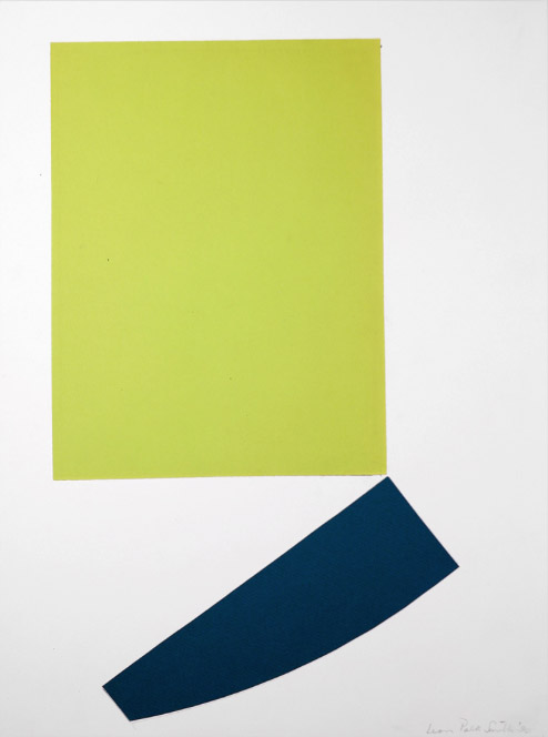
untitled, 1990; paper on paper, 20 x 14 in.


Lastly, a work on paper, here a collage which, when I first saw it, made me exhale: aaahh!....such beautiful balance in its color and shape.


Installation view of exhibition "Leon Polk Smith: 50 Years of Separation" at Washburn Gallery; image courtesy Washburn Gallery.


This installation view gives an idea of the sizes of the work: the large paintings are from the 1990s, the smaller ones from the 40s. The Brooklyn Museum mounted a large exhibition in 1995-96, Leon Polk Smith: American Painter; at the link you can see 25 images of the installation which give a sense of the scale of the works on a wall; if this work interests you, it's worth taking a look. 
The only thing good about being an ignoramus, as I sometimes am, is this thrill of discovery.