February 29, 2012

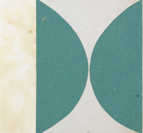
A New Textile: "Empty Center: Blue/Green"


Empty Center: Blue/Green, hand dyed wool on linen, 9 x 9 in. 


The fourth in my series of Empty Center themed textiles is complete, and it feels very minty to me, with a light coolness of color, reminding me of pistachio ice cream. Like Empty Center: Blue/Brown, which you can see below, there are two small shapes across the blank expanse (well, I know it's not blank, but it's devoid of clear shape). Like in the previous work, the shapes are engaged with each other. The more aggressive form of the green rectangle could make it seem as though it's about to launch into space, with the blue triangle as target. Or is it passively waiting for the blue to arrive and cap its energy? However we read it, the two shapes activate the space between.


You can see the subtle color variations in this detail. I dropped very dilute amounts of blue and green dyes onto fabric scrunched in a pan to get this effect. Below are the four pieces that I've competed in this series. I plan to do more, but not now; I have lots of other ideas I want to explore and other series to extend.


February 28, 2012

At the Met: The American Study Collection


I love things. I enjoy looking at all sorts of objects in antique shops; I even like spending time wandering the aisles of my local job lot store, admiring the shapes, colors, and textures of things on display, from housewares to rugs to clothing to foodstuffs. So it's a special treat for me to see a wide variety of decorative art objects and paintings collected in glass cases in the Luce Center Visible Storage, part of the American Wing at the Metropolitan Museum of Art. It is a place of delight and discovery, similar to another surprise find at the Met, the Greek and Roman study collection, which I wrote about a couple of years ago here; it inspired the first of my series of posts from the museum. The objects are arranged by material, and then by color, as in these blue and white ceramics....


or these brown earthenware pieces. At the rear is an amusing lineup of mugs, called Toby mugs or jugs, from the mid 19th century. There are few explanatory labels in this collection, but you can look them up by their number. For instance, that charming cow creamer was made in the mid 1800s by the American Pottery Company in Bennington, Vermont. I once had a contemporary white jug very similar to that.


Shimmering colors of blown glass bottles are arranged on shelves; they are similar in shape, yet each has a distinct personality.


I love the angular shape and honeycomb pattern of this tea set. It looks like it might have been made at the height of modernism, but it's from the Chelsea Keramic Art Works, ca. 1879-83. To see a high resolution photo of the set, go to the Met's website


This is a marvelous pair of vases, so very different, each so expressive, one in color and one in shape. The brilliantly colored vase looks like a piece of glass, but is of earthenware, made in the early 20th century by Weller. Its green companion, with curving arms that seem to encircle a pair of wide eyes, is from the same period, the same material, and is by Gates Potteries.


This is a detail from a charming painting of a hunting scene (sorry, I didn't get label information). The horses' faces have more energy than the placid faces of the men. The legs of horses and dogs repeat as though in a low relief carving, and the scene is topped off by clouds billowing behind trees. 


There was a great deal of furniture in the study collection: tables, and rows of chairs, desks and bureaus and chests. Many of them have decorative painting, as here with stylized flowers in a large simple container. 


A similar floral motif is made into a elegant and sophisticated object, using inlaid woods instead of paint. This is a detail of a secretary that was made by Herter Brothers of New York in 1882; you can see the whole piece here. Although I'm sure that the Met has much of its collection hidden away, it's wonderful for us object lovers to be able to ramble through these study collections; they may be filled with things not quite good enough for the formal galleries, but they're a treasure nonetheless.

February 26, 2012

Mandelbrot: The Perfect Afternoon Cookie


On winter afternoons I often have a craving for a sweet; not something rich and gooey, but satisfying enough to provide a little energy boost and a feeling of treating myself. Mandelbrot, or almond bread, fits the bill perfectly. They are sweet but not overly so, and are lightly flavored with orange and lemon and studded with almonds. Mandelbrot are the Jewish equivalent of biscotti, another twice baked biscuit, but are a little softer and more chewy. Like biscotti, they keep for a very long time in a covered dish. They freeze well, layered on waxed paper in a covered box or tin, and I love being able to just dip in and pull out a cookie whenever I have a sweets urge.

My recipe comes from Claudia Roden's The Book of Jewish Food; it's easy and delicious.

3 eggs
3/4 cup sugar
1 cup vegetable oil
grated zest of one lemon
grated zest of one orange
a few drops vanilla
a pinch of salt
1 Tbs baking powder
3 3/4 cups flour
1/2 - 1 cup whole blanched almonds
1 egg yolk for glaze


  • Beat the eggs with the sugar until it's a pale, thick cream
  • Add the oil, lemon and orange zest, vanilla, salt, and baking powder and beat to a light emulsion.
  • Blend in the flour and work in the blanched almonds. 


  • Oiling your hands so they don't stick, form the dough into two long logs, about 3 inches in diameter on either a well oiled or a parchment covered baking sheet. I love using parchment; it makes cleanup so much easier. 
  • Brush with egg yolk and bake in a preheated 350º oven for 30 minutes, or until lightly browned. 


  • Let the cakes cool completely. If you try to cut them when they're still warm, they will break apart. 
  • Cut into diagonal slices about 1/2 inch thick. 
  • Arrange on a baking sheet, cut side up and bake in a preheated 400º oven until lightly browned. 

Makes lots of cookies, so enjoy!


February 24, 2012

A Walk in the Woods: The Texture of Time


There is an old sugarhouse at a turn of the path in the woods. Long unused, it sinks closer to the earth each year. When I first encountered this small building, its roof was upright; now it has collapsed. A few days ago the light catching on the edge of a lichen covered tree caught my attention as it contrasted strongly with the dark rich reds of rust.


What was once bright metal is now a patina of reds and greens and browns, only the small clamps retaining some of their original blue-gray hue. Years of weather have crumbled the wood, and its surfaces are lost under a blanket of moss and lichen.


The colors and forms seem less and less a product of human manufacture; as they decay they have taken on the character of the surrounding woods, richly colored and textured.


February 23, 2012

A New Painting: "Black and White", with Some Thoughts on Touch

 Black and White, egg tempera on calfskin parchment, 6 1/4 x 7 1/4 inches.


While I was plying my brushes during the painting of this work––and, by the way, I use round synthetic bristle brushes, Rydal Gold by Stratford & York––I was considering how much variation I wanted to show in the "touch", the visible movement of paint. For me there's always a balancing act between achieving a clear sense of form and having the paint look lively and fresh. 


Irrigation Equipment (detail), 2002, egg tempera on gessoed panel.

When I began using egg tempera in 1995, paint handling seemed more straightforward: I used the traditional method of cross hatching to build the form with many layers of translucent, pencil-like strokes. A dozen years later I decided to leave this method behind, as I described in this blog post.


Untitled, ca. 2007, egg tempera on gessoed panel, 7 3/4 x 5 3/4 inches.


Around the same time I was doing a series of non-objective paintings, brushing on many layers of color for a shifting, atmospheric effect. I was playing with paint and having a very good time. Doing these works helped me to figure out the way forward with my representational paintings. 


In Black and White, the whitish part of the painting has smoother handling, while the black has a more visible varied stroke. Some of this is to express a difference in the surfaces depicted; some is a result of the pigments and how they demand to be used. The black pigment, Mars Black, did not want to sit still, calmly and opaquely;  I went along with a painterly stroke, which would provide a textural contrast to the quieter white, and add some physicality to the forward planes. These strokes don't come easily; I often repaint for a more graceful mark.  Seeing the orange abstraction again and thinking about its surface has made me realize that there are other ways I can enrich my paint handling, perhaps with more layering of color. I'm grateful for the learning process that comes with writing this blog. 

February 22, 2012

An Open Heart: Billy Collins' Poem "Aimless Love"


Have you ever seen something utterly ordinary––sunlight touching a dish, an insect climbing a stem, a leaf sinking into snow––and been touched to your soul by the sight of it? Sometimes these small moments seem to carry the meaning of existence. Poetry, with its concise form, is the perfect vehicle for expressing this experience. I recently wrote about the poems of Fernando Pessoa–– "Occasionally I hear the wind blow, / And I find that just hearing the wind blow makes it worth/ having been born."––which you can read here. And last week a Facebook friend, the artist Katherine Aimone (thanks, Katherine!) posted a marvelous poem by Billy Collins that sweetly and simply and humorously spoke of these moments. So I'd like to share it with you.

Aimless Love

This morning as I walked along the lakeshore,
I fell in love with a wren
and later in the day with a mouse
the cat had dropped under the dining room table.

In the shadows of an autumn evening,
I fell for a seamstress
still at her machine in the tailor’s window,
and later for a bowl of broth,
steam rising like smoke from a naval battle.

This is the best kind of love, I thought,
without recompense, without gifts,
or unkind words, without suspicion,
or silence on the telephone.

The love of the chestnut,
the jazz cap and one hand on the wheel.

No lust, no slam of the door –
the love of the miniature orange tree,
the clean white shirt, the hot evening shower,
the highway that cuts across Florida.

No waiting, no huffiness, or rancor –
just a twinge every now and then

for the wren who had built her nest
on a low branch overhanging the water
and for the dead mouse,
still dressed in its light brown suit.

But my heart is always propped up
in a field on its tripod,
ready for the next arrow.

After I carried the mouse by the tail
to a pile of leaves in the woods,
I found myself standing at the bathroom sink
gazing down affectionately at the soap,

so patient and soluble,
so at home in its pale green soap dish.
I could feel myself falling again
as I felt its turning in my wet hands
and caught the scent of lavender and stone.


As an homage to Collins, I took this photograph of the soap dish at my kitchen sink: the soap, its square resoluteness worn and softened, serving as resting place for the woven soft rectangle of scrubber; both gently touched by light, vulnerable, as they rest on the hard metal. Thank you, Billy Collins, for opening my heart "propped up/ in a field on its tripod" to this sight of the soap "so patient and soluble".

February 20, 2012

A New Textile: "Empty Center: Orange"

Empty Center: Orange, hand dyed wool on linen, 9 x 9 in.


 In this third in my series of textiles with the Empty Center theme, I put two vertical bands of color at opposite edges, and with a very different result. Instead of a sense of open, or embraced expanse, I felt here a confinement of space, as though bounded by the bars of a window. This is not a value judgment at all, just an observation that the visual sense of the center can be so changed by its edges that it leads to a different emotional register. Of course the warm color also changes the mood. 


As with the previous works, I dyed the wool for the center by dropping dilute amounts of the color in the shapes at the edge. Since this piece had only one color, I cheated a little by adding a tiny amount of green to the dye for some of the drops in order to add variation to the color. In the detail above, you can see the warm orange color along with some subtly cooler spots.


The first two pieces in the series had somewhat similar colors, so their centers are fairly close in hue, while the third piece looks very different. I'm working on a blue/green piece now, whose center is different yet again. The little rule I've set for myself on how to dye the wool has yielded variations I hadn't expected or planned for; what fun!

February 19, 2012

At the Met: John F. Kensett, Minimalist

 Sunset on the Sea, 1872, oil on canvas, 28 x 41 1/8 in. 


Sometimes we are reawakened to an artist's work by seeing it in a new context, which scrubs our eyes clean and opens a space in our mind. This happened to me during my recent visit to the Metropolitan Museum of Art's new American Wing. In a gallery devoted to 19th century landscape painters, one stood out for me in a startling way: John Frederick Kensett. It's as though I saw a completely new painter, one who looked at the world with a sense of its essential nature, and who left the extraneous behind. A painting: sea and sky, the light of sunset gently touching the waves, the only diagonals barely traced in the upper sky. A painting full of light, but not drama; an everyday glory.


 Eaton's Neck, Long Island, 1872; oil on canvas, 18 x 36 in. 


A curve of beach and hillock sweep into the space of sky and sea, each element in perfect balance.


 Eaton's Neck, detail


Kensett's touch is restrained yet visible, alive in its descriptive power.


 Twilight on the Sound, Darien Connecticut, 1872; oil on canvas, 11 1/2 x 24 1/2 in. 


Another still sunset, with elements separated by treed masses, a human trace in the floating boat.


 Passing Off of the Storm, 1872; oil on canvas, 11 3/8 x 24 1/2 in. 


This painting is a marvel of light and air. Clouds are reflected in water of nearly the same hue, yet each is itself: the water transparent and reflective, the clouds indefinite masses. Three simple rectangles make up the composition: water, dark clouds, and the bright band above them.


 Passing Off of the Storm, detail.


Small details of boats, a fisherman, a bird taking flight, are added with quick strokes of the brush; they seem to hardly be there at all, just brief touches on the landscape.


 A Foggy Sky, 1872; oil on canvas, 30 1/2 x 45 3/4 in.


Salt Meadow in October, 1872; oil on canvas, 18 x 30 in. 


I photographed the first four paintings above at the museum, then went to the Met's Kensett website page to see if I could find additional works that fit the feeling I had that day of a painter using minimal means to express a great deal.  I found the two paintings above, which are not on view in the galleries, but in the study collection, so I will try to see them on my next trip. In preparation for writing this post, I pulled my Kensett book, John Frederick Kensett: An American Master, from my studio bookshelf. It wasn't until then that I realized that all the work I'd been so drawn to were part of what is known as Kensett's "Last Summer's Work", a group of 39 paintings that he completed during a three month period in 1872, mainly around his Darien, Connecticut studio on Contentment Island, an amazing achievement. Tragically, Kensett died a few months later, and in 1874 his brother gave this group of paintings to the Metropolitan Museum, many of which are still in the museum's collection. I can't help but wonder how his work would have developed if he had lived; would he have continued to be inspired by the spare landscape on the Long Island Sound, and emptied his paintings even more of incident? In his Last Summer's Work, Kensett has left us paintings which are quietly attentive to specifics of light and landscape, and through that very sensitive attention transcends them.


February 17, 2012

Harbingers of Spring


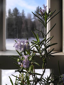
During our northern frost free months, from June through September, I have two potted plants on my small porch, red geraniums and rosemary. When cold threatens, I bring them indoors to winter in my south-facing living room windows. Along with a never-blooming but still alive orchid that resides among books on a table, they are my only house plants.


It's nice to see a bit of greenery in the house during winter, but what I truly love are the flowers that begin to appear in February as the days lengthen. They are a signal that the turn of the season toward spring has begun.


Even outdoors the flowers are yearning upwards: with this year's limited snow cover, the Snowdrops are free to show their green heads above the dark earth.


Upstairs in the house, under grow-lights, the leeks and onions are the first of the garden vegetables that I start from seed. I don't plant the next round of seeds––early broccoli, peppers, eggplant–––until April, so these alliums are a cheerful reminder, in the midst of winter, that the time for playing in the dirt, and watching the magic of growing things, is not far off.

February 15, 2012

A New Painting: "Grays"

 Grays, egg tempera on calfskin parchment, 7 1/2 x 6 in.

 In the past I've painted grays––of rocks and concrete, of grain storage bins––but my recent work has been of brighter hue, so from the start this painting was going to pose a challenge. It turned out to be a challenge I thoroughly enjoyed as I balanced the values and hues to make a harmonious whole. The value relationships underwent some very dramatic changes: at first the ocher colored background was a much darker hue, the grays lighter next to it; the top plane was originally close to white. I didn't like the dark shape on the right, so wiped it off and began again with the lighter hue, which meant that the grays also had to be adjusted. They are all mixed with different pigments––ultramarine blue, cadmium red, cadmium yellow, yellow ocher, brown ocher, burnt sienna, earth green and white––and the color shifts subtle depending on the amounts of each. I painted many layers, adjusting each slightly, until I felt satisfied.


Arthur Dove, Fog Horns, 1929; oil on canvas, 21 1/2 x 28 1/2 in.


While I was working, I kept thinking of Arthur Dove; I remembered seeing gray paintings of his, and it's possible that the circular motif of my painting also brought his work to mind. I found a perfect illustration online in the painting above.


Ellsworth Kelly, Green Curves, 1951, ink on paper and gouache on paper, 7 1/2 x 8 in. From the collection of MoMA.


 Ellsworth Kelly is one of my favorite contemporary artists, whose work has greatly influenced my textiles. As I was painting the large curve that begins at the upper right of the panel, I felt that I was drawing a Kelly curve. Like most artists, I am very beholden to my artistic ancestors, but their voices don't usually sound so loudly during the painting process; it was a pleasure to converse with them.


Grays, detail


February 14, 2012

Winter Light: Shapes


The low light of winter, which reaches far into rooms, encourages me to see the objects in my home afresh; it frames and highlights the often overlooked. Since today is Valentine's Day, I thought I'd begin this post with a sculpture of a heart, but not the iconic of the day; this is a Sacred Heart, given to me by a Latina student years ago. Its organic shape is held between geometric lines of shadow.


 A round red bowl sits on the flat planes of a table, all in golden light.


A horizontal and vertical support a reflective volume.


On plaster, rectangles; on wood, a curve; shadows cast from window and shelf.


A dark diagonal moves across the scarred plane, on one side and then the other of circles marking a table's construction.


Rectangles: light glances across the uneven hand planed surface.


The swooping curve of a pitcher sinks into darkness, its curved handle bright in shadow and in light. The fullness of form is flattened in its shadow, an abstraction that could refer to many things. For this "Winter Light" series I find myself drawn more and more to simple, abstract compositions, moving away from particular things and towards mystery.


Some other Winter Light posts: