May 31, 2016

The Myriad Forms and Colors of Tulips


Ballade


I wasn't going to do a tulip post this year; after all, 6 posts from 2010-2015 seemed enough. But then I saw this tulip, a lily-flowered variety I've never grown before; it was such a beauty, with its white-edged purplish pink petals that it insisted on being photographed and shared. Ballade is stunning when young and only the tips of its petals are out-curved....


Ballade, with Blinky the cat


....and also beautiful when more mature and open.


Passionale


Each fall I plant several varieties of tulips for cutting, usually choosing ones I haven't grown before. Passionale has a more traditional cup-like tulip shape, with a deep rich violet color.


Shirley


When Shirley is young, her shape and color remind me of pursed lips. In the catalog, this tulip is described as changing from day to day as the pink edge spreads. I didn't see this with the cut flowers in my house....


Shirley, later


 ....but I left one in the garden and the pink did indeed suffuse the entire flower as it aged.


Washington


This tulip is known as a "Rembrandt-type" because of its flamed petals. Tulips similar to this were at the heart of the tulip mania in 17th century Holland.


Washington, with Poppy the cat


I love having tulips all over the house in spring.


Menton


Menton is such a classic, stately flower that I grow it almost every year. Its colors subtly shift from pinkish to orangish.


Charming Beauty


Double, or peony-flowered tulips are gorgeously extravagant. This variety has wonderfully varied colors in its petals, glowing like a sunset.


Virichic


Lastly, here is a viridiflora tulip: tulips that have a green stripe running up the center of their petals. The green is in wonderful contrast with the pink in the petals, petals which are expressively narrow.


Passionale, dried


Even when they are dead, some tulips are still beautiful: instead of the petals falling they dry in shapes that are like expressive dances. Spring is moving on, from daffodils to tulips, and now to lilacs; each is a great pleasure in its own way, but for me, tulips are a new adventure every year.


May 25, 2016

A New Clay Relief: "Points"


Points, painted porcelain, 7 1/4 x 10 1/4 in.


In developing compositions for my recent clay reliefs I've alternated between images that were invented abstractions, worked up from thumbnail sketches, and those that were inspired by photos of agricultural implements, like the ones I use for my paintings. Points is one of the invented ones, and it's possible it will be the last. I think that my "found" images have more unusual juxtapositions of forms, so are more interesting to me. Another thing I realize is that I love working with complexity in these reliefs: multiple forms overlapping in various depths; it is challenging and engaging. The thought of doing very minimal compositions in clay does not interest me at this time, as much as I love minimalism.


Points


I am showing two photographs of this piece, shot in different light, each of which highlight a certain part of the sculpture. The top photo makes the outward-angled horizontal in the center more clear, while the second photo, with its light coming from the left, shows the curved form of the main downward truncated triangle.


Points detail


While sculpting this piece I attempted to have a contrast between the crisp clarity of the triangular shapes and the somewhat softer surface and edges of the background spaces. In this detail, you can see the sharp edge on the bottom left and the irregular edge on the right. I am feeling my way, with much uncertainty, as I work on these reliefs.


May 22, 2016

At the Met: The High Art of Low Relief


Limestone footstool, Cypriot, 1st half of 5th century B.C.


Sculpture in low relief is both real––in the sense of its actual three dimensionality––and illusionistic, in that it shows us forms that are abbreviated, and asks us to imagine them in the round. In this way it stands between painting and sculpture, which is likely why it has fascinated me for so many years. On my most recent trip to the Met, I decided to find various examples of low relief, from different countries and different periods of time. The footstool above has simple decorative elements, slightly raised and incised, their floral pattern contrasting strongly with the violent scene between them.


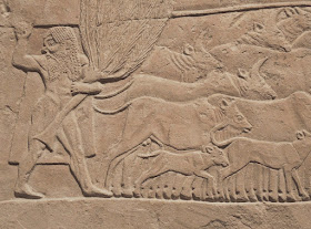
Limestone relief, Cypriot, end of 6th century B.C.


The herdsman Eurytion, carrying a tree as a weapon, moves his cattle forward. Their forms are barely indicated yet are full of life. Although the animals are shown overlapping, moving back in space, their hooves march along all together in a line.


Marble stele (grave marker) of Eukleia, Greek, 4th century B.C.


Some reliefs are very simple: the rounded form of a loutrophoros, a vase to carry water....


Upper part of the marble stele of Kallidemos, detail, Greek, ca. 350-325 B.C.


....or the decorative element of a rosette, clearly geometric in its parts.


Front of a coffin platform, China, 6th - early 7th century.


A beautifully modeled winged horse prances within a roundel.


Marble panel with Two Griffins Drinking from a Cup, South Italian, 800-900.

Two facing griffins are flatly modeled, and are decorated with pattern in the symmetrical design. Its structure is explained by its probable derivation from Near Eastern textile design.


Marble panel with a Griffin, Byzantine, 1250 - 1300.


Here is another griffin made several hundred years later, but still richly patterned, surrounded by floral motifs. It's interesting to compare the way the griffins are carved with the Chinese horse, which is so much more rounded.


Ivory Icon with Christ Pantokrator, Byzantine, 1000-1200.


In this small icon, a great deal of detail and a grand sense of presence is achieved in a very shallow space; clothing, hair, and book are simplified into patterns, while the stern visage of Christ adds the spiritual.


Door Panel, French, ca. 1520-40; oak


Returning to animals, this beautifully carved door has a representation of a salamander, the letter "F" and a crown, all emblems of King François I.


I love the elegance of the rounded tail, the raised bumps along the spine, the haunches and the toes; the clarity and description of form are a marvel.


Fragment with the head of a goddess, Egypt, ca. 2353-2152 B.C.


I'm ending this post with a detail of an Egyptian relief, a tender and lyrical depiction of an ear. It is Egyptian relief carving that is my greatest love in this medium; seeing a great show of Middle Kingdom art, which I wrote about here, inspired me to begin my attempts at clay reliefs. It is wonderful to be able to wander through the Met and remind myself of all the approaches to, and possibilities of, this aspect of art making.


May 17, 2016

A New Painting: "Hook"


Hook, egg tempera on calfskin parchment, 5 7/8 x 9 in.


A simple composition of horizontal and vertical rectangles is thrown for a loop with the addition of a curved form. I use that idiomatic expression deliberately, since the hook shape lets the mind wander into metaphor.


Hook detail

May 14, 2016

The Magic of Sunset and Mists


It was serendipity that got me out of my indoor cocoon last evening and gave me the gift of a beautiful sunset. I was watching the remarkably beautiful, moving, and tragic film by Ettore Scola, A Special Day. Taking an intermission to get some fruit and see if Blinky the cat was back from his evening rambles, I stepped out on the porch to let him in and gasped at the color suffusing the landscape. Mists rising after an afternoon rain created layered veils of distant trees, turning the views into visual poetry. I got my camera, put on my gardening shoes and wandered outdoors until the light faded from the sky. Above is a view of my vegetable garden, facing west; it was my first shot, taken at 8:04 PM.


My favorite old apple tree had a strong presence silhouetted against the misted background trees. As I was photographing, I knew that these images couldn't come close to the experience of being in the landscape: they simplify in lights and darks; the richness of color in the foreground is flattened into dark drama; the soft haze of distance is partly lost. The air, the scents, the sounds are gone; the translation of a three dimensional world into two dimensions leaves out so much, but I wanted to try to record this nonetheless.
(I recommend clicking the images to enlarge them so as to see more detail.)


Coming closer to that apple tree a few minutes later, the emerging leaves were tinged with the sunset's glow.


Still facing west, a large crabapple tree against the brilliant sky.


The same tree a little later, with the ever changing clouds.


From the backyard I looked towards the east, where distant trees faded into pink haze.


This last shot was taken at 8:17 as the sky began to darken but color remained in the clouds. The telephone pole is holding up the world as wires cross the sky. In a brief quarter hour I was in an earthly heaven.


May 11, 2016

A New Textile: "Red/Brown Ground"


Red/Brown Ground, hand dyed wool on linen, 11 x 10 in.


I had a yen to revisit an occasional series that I worked on in 2012 and 2013: my figure/ground series. You can see an example here and here. My aim is to have shapes and colors equally balanced so that no one shape takes precedence as the "figure" which then relegates the other shape to the background. In this piece the circular brown shape pushes into the red, a red which would ordinarily be much stronger because of its intensity of color; here, because of the sense of movement of the warm brown, I hope they are equalized and become interlocking. 


Red/Brown Ground detail


I hook a line around each shape––both the red and the brown––so that one doesn't appear to be slipping behind the other, and use horizontal and vertical lines of hooking to keep the shapes differentiated and flat. This is a fun and interesting challenge.


May 5, 2016

At the Met: The Ordinary Becomes Extraordinary


Walter Dorwin Teague, "Bluebird" Radio, 1934; manufacturer: Sparton Corporation; 
glass, chrome-plated metal, fabric, painted wood.


I love good design, and seeing the attention paid to all aspects of a manufactured object: a thing in everyday use can be beautiful. Currently at the Metropolitan Museum of Art is a display of American modern design from the John C. Waddell collection, gathered in a couple of cases in the contemporary galleries. The wall label informed me that modern design in the US was in a sorry state at the time of the Exposition International des Arts Decoratifs et Industriels Modernes in Paris in 1925, but afterwards, with the inspiration of that exposition, a new effort was made by artists and designers and they produced "strikingly innovative objects". The radio above certainly is a stunning thing....


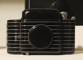
Walter Dorwin Teague, "Bantam Special" Camera, 1936; manufacturer: Eastman Kodak Company; 
metal, enamel.


....as is this camera. They were designed by Walter Dorwin Teague, who was considered the "dean of industrial design", a leader in the field along with Henry Dreyfuss, whose objects are below, and a few others. These modernist objects have a dramatic and satisfying aesthetic presence. It would be nice to own this radio and this camera just to be able to look at them. 


Henry Dreyfuss, Electric Toaster, 1932; manufacturer: Birtman Electric Company;
chrome-plated metal, plastic, glass.


This toaster is an inventive combination of flat black planes and a big rounded chrome belly topped by an open rectangle. It's an improbable combination of elements that's visually exciting.


Henry Dreyfuss, "Big Ben" Alarm Clock, 1938; manufacturer: Westclox Company;
metal, chrome-plated metal, enamel.


I'm pretty sure I had one of these clocks when I was young. It's one of those everyday things that we wouldn't pay any attention to, but shown in a museum we take another look and notice its crisp design. Dreyfuss also designed the Princess telephone.


Henry Dreyfuss, Kitchen Utensils, 1934; manufacturer: the Washburn Company;
metal, painted wood.


I love the shapes of the handles on these kitchen utensils; they're utilitarian and amusing at the same time.


Henry Dreyfuss, Thermos Bottle and Cups, ca. 1933; manufacturer: The American Thermos Bottle Company; metal, glass, plastic, paint, cork.


This thermos features another surprising combination of shapes, as in the toaster above: a long, flat-sided body topped by a rounded cup, all painted red and black, like a harlequin.


Wolfgang and Pola Hoffman, Cigarette and Match Holder with Ashtray, ca. 1930; manufacturer: Early American Pewter Company; pewter. 


I wonder if designers these days are spending any time working on cigarette accoutrements. But these two pieces....


Donald Deskey, Cigarette Box, ca. 1928; manufacturer: Deskey-Vollmer Inc.; 
painted wood, silver leaf.


....are beautiful examples of the former glamour of smoking cigarettes. For a fascinating look at good contemporary design, see the film Objectified, by Gary Hustwit, which I wrote about here. An industrial designer has a difficult task: to make the object both useful and attractive; I'd like to honor those who achieve it.


May 2, 2016

A New Painting: "Hidden Bolt"


Hidden Bolt, egg tempera on calfskin parchment, 6 1/2 x 8 1/4 in.


I love shapes: their juxtapositions, their color, the way one balances or is in tension with another. Their taut, precise edges excite me; the light flowing over them carries an added drama. I am offering a defense of painting that is not painterly, not "expressive", not about the figure or narrative events, but is restrained and is focused on the formal elements of painting. I am writing this now because while this painting was in progress I felt a passion for its shapes, a delight and an exhilaration that reminded me why I continue with this subject matter. 


Hidden Bolt detail


And, there are metaphors within the most straightforward of images.
I paint, after all, for myself; if others like what I do that is a wonderful bonus.