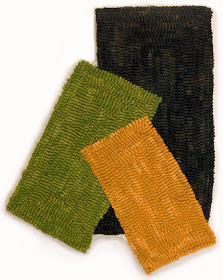
With this piece, I've gone back to working with shapes outside a rectangle, like my series of one shape moving outside a quadrilateral, which you can see here. This piece was inspired by drawings of Joel Shapiro which I'd seen online. I loved their color and energy, their intimation of a figure with limbs pinwheeling out in space. My piece is much simpler, with three elements, a large black rectangle anchoring the whole. For color harmony, when I mixed the color for the green and orange, I added a bit of each color to the other. I decided to hook the rectangles following their outline, round and round, making each shape an individual. My one annoyance is that the line on the right of the black rectangle curves inward at the bottom; I don't know why that happened, but rug hooking regularly thwarts plans. The black triangle now looks like it is jutting leftward instead of being a continuation of the upper part of the rectangle. But then, the orange rectangle has a curve to it too. So, does it work for you, or does this curve throw it off?


It works for me. Clever overlap of lighter colors over darker also gives it a dimensional forward-in-space on the overlaps quality. Nice.
ReplyDeleteThanks, Mona. I hadn't planned on the illusion of that "forward-in-space", but it was nice that it happened.
ReplyDeleteI like the curves, it puts life into the rectangles, makes them less formidable. in a painting the curves would look contrived, here they look perfectly natural.
ReplyDeletethanks, rappel. It's so interesting how materials act so differently, and the quirks of rug hooking do lead to very different results than if it were a painting. Which is why I never try to make these compositions in paint!
ReplyDeleteI'm not sure that really takes away from the piece. It's pretty cool. Question: how do you think the rugs come across in the photos? Do you think it pretty much captures how it looks in real life? Just curious.
ReplyDeleteYael, glad you like this. As for online vs real life, for me the biggest problem is getting a sense of how large the work actually is, which is why from time to time I take pictures of them with other work in an interior setting. The color is fairly accurate. This problem is especially acute with my paintings, which many people assume are a great deal larger than they actually are.
ReplyDelete