April 8, 2011

The Delicate Beauty of Persian Manuscript Painting

Gushtasp Slays the Dragon (folio 250b), early 1440s; opaque watercolor on paper.


On a recent visit to NYC I went to Asia Society to see a marvelous exhibition of an important Persian illuminated manuscript "A Prince's Manuscript Unbound: Muhammad Juki's 'Shahnamah'". The Shahnamah is Persia's national epic, telling of kings and conquerors. Many of the images were of battles and bloodshed, but even so, were full of wonder in their details and color. The careful balancing of one color against the next and the precise lyrical renderings are a joy to see. In the painting above, the pink is caught between two blues and the dragon adds pale flaring greens. I especially love the often used device of having the composition flow outside the frame, as though to bring the story even greater life by bursting its bounds. So much of the pleasure in seeing these paintings is in gazing at the refined details, so the museum kindly provides magnifying lenses for visitors. But the website doesn't have good enlargements, so I thought I'd share some images from a catalog I have on my shelf: A Jeweler's Eye: Islamic Arts of the Book from the Vever Collection, a collection housed at the Sackler Gallery of the Smithsonian. (click on images to see enlargements)
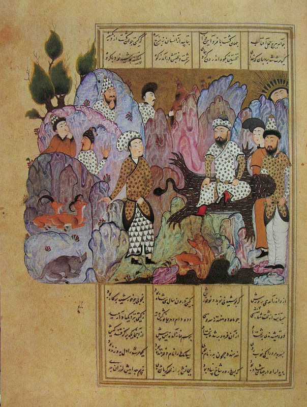

The Court of Gayumarth, from a copy of the Shahnamah of Abu'l-Qasim Firdawsi; Iran, 1518; opaque watercolor, ink , and gold on paper; 11.4 x 7.6 inches.


What I most notice in this painting are the patterns, of clothing and of fanciful rocks. The white patterned dress creates a lively counterpoint to the undulating details of background forms, and hidden quietly among them are several animals. King Guyamarth was the first legendary ruler of Iran, who was supposed to have lived on a mountaintop, worn leopard skin clothing and tamed wild beasts.


The Court of Gayumarth, detail


Sultan-Mahmud of Ghazna in Discussion with a Dervish, from a copy of the "Makhzan al-asrar" of Mawlana Haydar; Iran, 1577-78 (?); opaque watercolor, ink and gold on paper; 6.9 x 3.6 inches.


This has long been one of my favorite Persian paintings. The simple shapes, rectangular or undulating, are perfectly balanced, as are the pale and bold colors; the gold of the rectangles holding the text are repeated in the fluttering leaves. The carefully observed and refined details are a wonder, such as the storks on the roof and the snake slithering out from behind a wall. As with most Persian, and also Indian, miniature painting, the forms are essentially flat, but there is such sensitivity in the use of line that the merest suggestion of volume creates a sense of solidity.


Khusraw, Dressed as a Shepherd, Visits Farhad, from a copy of the "Khamsa" of Amir Abu'l-Hasan Yaminuddin Shusraw Dihlawi; Iran, 1564; opaque watercolor, ink, and gold on paper; 6 x 3.8 inches.


In another rocky landscape, a king goes to visit his rival in love. The trees spread outside the frame and at the bottom of the image is lush green spread with flowers, and fed upon by grazing animals.


A Poem by Amir Shahi, from the Late Shahjahan Album, calligraphy by Mir-Ali al-Sultani; Iran, sixteenth century; opaque watercolor, ink and gold on paper mounted on board; 18.5 x 13.75 inches.


Beautiful calligraphy is surrounded by gracefully looping lines of flowering branches, punctuated by elegant animals. It is a love poem, which blooms into something larger:
My heart is caught in your wavy hair.
My head bows only on your path.
Wash with ambergris the tablet of the gracious mind
That the condition of love be one heart and one lover.
Laugh at the fair since not one of a thousand roses of your springtime has yet bloomed.
Close your eyes like narcissus to the good and bad of the world
For in this garden the rose is one thing and the thorn another.
Shahi, do not be sad if your heart is upset
For the condition of the world is not stable.

April 7, 2011

A New Painting: "Red Disks", a Diptych


Red Disks, egg tempera on parchment; 2 panels each 3 3/8 x 6 1/2 inches.


We are used to thinking of a diptych as a side by side arrangement of two panels, and I have generally followed that formula, for instance with Red Construction, and Blue/Green, but here I decided to place one panel atop the other. The long narrow shape of each panel makes this placement seem inevitable, but it was the movement and placement of shapes that especially encouraged it. I like the way the thick curving line moves from top to bottom panel; I see this element as the primary connection between the two parts. There is also the repetition, to the left and right, of the platforms holding the disks, and the intruding rectangles of red. The jagged rhythms from the diagonals play against the long horizontals and there is movement in and out of space. I think this painting (and I consider it one painting) balances the spacial complexities and doesn't fly apart into competing details; am I correct?


April 5, 2011

Intrepid Snowdrops


We are used to the symbolism of flowers––red roses for love, white lilies for purity and innocence––but when I walked past the budding snowdrops today and saw them rising out of icy snow, I felt that they could be a symbol for bravery. While other flowers still huddle underground, these delicate-seeming flowers emerge into winter. They are a commonplace reminder that life can go on in the most difficult of conditions, and they tell us to take heart.


April 4, 2011

A New Textile: "A Part"

A Part, hand dyed wool on linen; 2 pieces, 9 x 9 and 4 1/2 x 4 1/2 inches.


It seemed an intriguing idea to me to take a quarter of a square and fling it off into space where it can dance on the wall apart from its implied origin. As for color, I wanted the large shape to change from blue to violet, and the small square to be a slightly lighter blue to accentuate its floating-off quality. I achieved this by dipping one end of long piece of wool fabric in a pot with blue pigment, and gradually adding more violet while dipping more of the cloth into the pot. Although the transition is not smooth, I hope the jumps and variations in color add texture and life.


In the detail, you can see some of the many hue changes. And below, I hung the work on the yellow wall in the kitchen, and above it the painting Double Curve, which is 6 1/2 x 5 inches. I like the conversation between these works: the curves talking to the straight lines, the reds to the blues and violets, and both speaking of simple shapes.


April 3, 2011

A Walk in the Woods: Emerging Green


Winter has been very reluctant to depart this year, and just two days ago we had several inches of snow. Though my vegetable garden is still under a heavy white blanket, parts of the lawn are clear (until the next snow). In the woods, the retreating snows have exposed surfaces covered with glorious greens: the bases of tree trunks festooned with mosses...


and rocks scattered across the forest floor, rising from the snow as though high mountain peaks above clouds.


Rotting stumps display a verdant landscape of moss and lichen and small shelf mushrooms


and there are beautiful frothy mosses on an exposed bank.


Small vernal pools have begun to appear, and in the midst of graying brown leaves, some fallen pine needles, or more brilliantly, fern fronds that have amazingly stayed fresh and green through the winter. They greet us with the promise of new growth and awakening life.

April 2, 2011

"Hiroshima, Mon Amour": A Meditation on Memory


Embracing bodies, covered in dust, as though buried long ago, barely emerge from the dark. The particles of dust become sparkles of light, and then flesh emerges whole. It is a perfect beginning for a film about love and loss, war and horror, and the terrible ease of forgetting. I wanted to acknowledge the ongoing tragedy of earthquake, tsunami, and now nuclear disaster in Japan; discussing Hiroshima Mon Amour is a vehicle for me to obliquely honor those affected.

The film, made in 1959, at the beginning of the Ban the Bomb campaigns, was originally conceived as an anti-war documentary to be set in Hiroshima, the site of one of the two atomic bombs dropped on Japan in 1945. The director, Alain Resnais, instead enlisted the novelist Marguerite Duras to write a fictional screenplay. Her dreamlike, repetitive, incantatory prose, combined with compelling imagery and the beautifully delicate score by Giovanni Fusco, takes us into a world of intense feeling and regret.


It is a love story. A French actress, in Hiroshima to make a peace film, and a Japanese architect, neither of whom are named, meet and love over a day. In that time they, mostly she, talks. She goes to the Museum:
He: You saw nothing at Hiroshima. Nothing.
She: Four times at the Museum at Hiroshima.
The photographs, the photographs, the reconstructions for lack of anything else.
Metal made as vulnerable as flesh.
He: you saw nothing at Hiroshima. Nothing.
He was at war when the bomb was dropped; he lost his family. To him, she saw nothing. Can we know what we do not experience?


She had her own small, personal story of war loss; her Japanese lover's sleeping hand brought back the pain of seeing the dead hand of her youthful lover, another impossible love. When she was 18 in the French village of Nevers, she fell in love with a German soldier.


He was killed, she was disgraced. What in other circumstances would be innocent love, in wartime became a crime. She had told this story to no one, not her French husband, only to Him, her Japanese lover. They spoke of the tragedy of forgetting; she feels she is forgetting the German, her first great love, and she begins to conflate the Japanese with the German.
She: Like you, I know what it is to forget.
He: No, you don't know what it is to forget.
She: Like you, I too have struggled with all my might not to forget.
Like you, I forgot.
As we all have.
Can we live without forgetting?


In her he sees "a thousand women in one". In both of them we see the tragedies of war, huge and small. In the final scene they finally name each other:
She: Hiroshima. That's your name.
He: Yes, that's my name. And your name is Nevers, Nevers in France.

March 31, 2011

Middle Eastern Stuffed Onion Rolls: Mehshi Bassal


I grew up loving the stuffed vegetable dishes my mother makes: eggplant, zucchini, tomato, onion, all stuffed with a mixture of meat and rice and cooked in a sour tamarind sauce. I had a great onion crop last summer, so thought I'd share this recipe, a real treat, that used a few of my very large onions. The combination of the sweetness of the onions and the sour sauce is delectable, and the long cooking time adds extra caramelized flavor. You can find tamarind paste in middle eastern or Indian groceries; pomegranate syrup, which is also sour, is an acceptable substitute. This recipe is from my cousin Poopa Dweck's book Aromas of Aleppo.

for the filling
1 lb ground beef
1/3 cup rice
1 teas ground allspice
1 teas ground cinnamon
1 teas salt
1/4 teas pepper
2 Tbs vegetable oil
1/4 cup water

Combine all the ingredients in a bowl. (I knead the mixture with my hands, as my mother does, but a spoon will also work.)

3 very large onions
filling
3 Tbs tamarind paste
2 Tbs lemon juice
1 cup boiling water
1 teas salt
  1. Peel onions and make a vertical cut to the center and not more. Place them in boiling water and cook for 10-15 minutes, until they soften and begin to open. Drain, and when cool enough to handle, separate the layers.
  2. Spoon about a tablespoon of filling in each layer, more for larger pieces, less for smaller, then roll tightly. If you have filling left over, you can form it into balls and cook with the onions.
  3. Line the bottom of a medium saucepan with onion remnants or sliced potatoes; this will prevent the onion rolls from burning and sticking. Place the rolls closely in the saucepan; layering is fine.
  4. Combine the tamarind paste, lemon juice, salt and water and pour over the onions. Put a small plate on top to hold down the rolled onions. The liquid should cover the onions when pressed down with the plate.
  5. Bring to a boil on top of the stove, then simmer, covered, for 40 minutes. Transfer to a preheated 350º oven and cook for another hour and 20 minutes.
  6. Remove them from the pot by turning it over onto a serving dish. If you try to lift them with a spoon or other utensil, it's more likely they'll break apart. As you can see from my photo below, I didn't make the prettiest rolls, but they are still delicious.


March 30, 2011

A New Painting: "Blue Bolts"

Blue Bolts, egg tempera on calfskin parchment, 4 3/4 x 5 1/2 inches.


After working on my last painting, which was a disappointment, it was a pleasure to turn to this blue painting. I like the bulging planes over flat ones, broken by dark lines, the mysterious dark at upper left sheltering curving cylinders. It was not without its difficulties however, primarily owing to the blue pigments being transparent. I used Ultramarine blue, Cobalt blue and Manganese blue cerulean, none of them opaque. In order to achieve a moderately even surface in the light areas, I had to paint many many layers of color. The resulting surface has some texture to it, but I hope it's not distracting. In the dark areas, transparency is a plus because I can glaze thin layers of color easily to get a depth of shadow that retains some light.

Looking at this painting makes me think about the emotional resonance of color. Most of my paintings have a dominant color. How are our responses to a painting tied to the color of the work? are we able to go past the "I love yellow, therefore...; I dislike red, therefore..." judgment?


March 28, 2011

Longing for Spring


A week ago I wrote a celebratory blog post for the Vernal Equinox, when it seemed that the earth was warming and plants were ready to emerge from sleep. But weather is an uncertain thing, and since that time we've been thrust back into winter, with blustery cold and intermittent snows.


The pond is a frozen white expanse, and cattails are dark lines against it. I mark important seasonal milestones in my calendar each year and sigh when I read the events from last year's mild spring: I dug parsnips, meaning the garden ground was well thawed, on March 16th; robins appeared on the lawn on March 24th; wood frogs began quacking in the water of the pond on April 2nd.


Birds will not be tempted onto ground still covered with snow and ice.


But the plants in the house realize it's spring, as the longer daylight hours encourage them to bloom. The brilliant red geranium, and the tiny blue flowers of rosemary remind me to be hopeful. Spring, however late, will arrive, and will be all the more cherished.

March 27, 2011

The Wild Genius of Antonio Gaudí


I've long been aware of the unusual character of the works of the Spanish Catalan architect Antonio Gaudí (1852 -1926), having seen photos over the years. It was not until a few days ago, when I saw the 1984 film Antonio Gaudí by Hiroshi Teshigahara, the director of Woman in the Dunes, that I understood the full extent of his remarkable imagination and unique accomplishment. Matter of fact, I wondered "how in the world did this stuff get made??". The entire time I was watching the film I kept bursting out in exclamations a bit too racy to write here, from sheer astonishment and delight. The film is a visual feast, a nearly silent, but music filled, ode to Gaudí, less documentary than poetic essay. The filmmaker took us to rooftops and the pinnacles of towers where dark hooded sentinels stand watch above the city of Barcelona; these wackily decorative elements were some of my favorite aspects of the architecture.


Gaudí's forms are based in geometry and nature, and this powerful shape is atop a tall pillar of the still unfinished cathedral, Sagrada Familia. Its elaborate structure reminded me of a trip I made to the Prado in Madrid years ago, where I saw medieval paintings thick with baubles of shiny colored glass and surrounded by heavy gold. The Spanish character seemed to be far from the rational Italian one, and Gaudí's work celebrates an intuitive imagination.


This room feels like the inside of a body, with ribs arching softly overhead.


At times during the film, Teshigahara shows us influences on Gaudí, including Romanesque churches and the tall rock formations of Catalonia, that seem to be the inspiration for the tall pinnacles of the Sagrada Familia. His brickwork above acknowledges that past while doing wonderfully surprising things with arches and pillars.


Gaudí's most delightful project is the Park Güell in Barcelona. This pillared walkway has the feel of a path through the woods, the irregular stones giving the appearance of rough bark.


There is beautiful, randomly pieced tilework in the park, full of life and color, on the creatures living there and on the grand sinuous benches surrounded a large open square.


So much color and texture go into the tops of Gaudí's buildings, making them a sheer joy to see. These roof tiles are like something alive, flowing with movement. I began to think about Frank Lloyd Wright, the American early 20th century architect, because he was also inspired by nature in his designs; he was also a architectural genius. He had many followers, trained at Taliesen East and West, while I believe Gaudí was unique although he collaborated with a large number of architects and artisans. Wright's work now seems almost staid and conventional to me next to the extravagant and powerful inventions of Antonio Gaudí.


*To see more images from this film, go to this link for my photo album. (click on images to enlarge)

March 25, 2011

A New Textile: "Green/Yellow Ground"

Green/Yellow Ground, hand dyed wool on linen, 11 x 10 inches.


I've gone back to my figure/ground series with this work, in which I attempt a balance of colors and shapes, with none taking center stage. You can see a photograph of the four previous pieces in this series on this blog post. When I dyed the green and yellow wool, I added a little of each color to the other, to tone them down and create more of a relationship. I decided to hook the green shape in a vertical direction because I felt that horizontal lines at top would make the green shape too aggressive in its rightward push. The result is a very simple composition that is satisfying to me. There's also a bit of humor in the faint figural allusion in the shapes. Or is this something only I see?


March 24, 2011

Memory: Constructing a Life


Today, if I write it down, it's because I remember it. The autumn I have is the autumn I have lost.
Fernando Pessoa, The Book of Disquiet

There are rare times when I read a sentence that resonates so strongly within me that it sends my thoughts bouncing about excitedly: "of course, of course!" Aren't all our lives a collection of memories, a gathering of stories always in flux?

In his The Book of Disquiet, Fernando Pessoa (1888-1935) poetically wanders through life, noting small events with beautiful prose. In short fragments he writes his thoughts and his belief that he does not truly exist, or that he exists as a multitude of personalities. "I realized...that I am no one." When I first read these words a year ago, I found them so disturbing that I did not continue reading, but now they feel so true.

The quote about remembering took me back to the many times I gave lectures on my work, how I spent time arranging slides, gathering quotes, working out an arc for my narrative. Then one year I realized that I had been leaving out an entire body of work because it didn't fit in to the story I'd been telling, so I began to tell it a different way. A life consists of thoughts, of shifting memories.

March 23, 2011

"Red Teeth" Revisited


At the risk of boring some readers, I thought I'd show the changes I made in this painting and discuss why I still don't think it's successful. The reworked painting is above, and you can see that I darkened the top area of reddish color, thinking it would compete less with the green. In order to balance the whole, I made the green shape a little smaller at top, so it wouldn't dominate the composition as much, and darkened the bright line at its upper edge.

But...the green and red shapes still read too much like flat shapes and have no physical presence. I now believe that this characteristic is at the heart of this painting's problem and it was pointed out by a Facebook friend, Jeff, who wrote that the realistic and abstract spaces, usually coexisting well within my paintings, were pulled apart here. This made me realize something essential to my work: that there is a fine balance to be achieved between the real and the abstract.