March 15, 2012

A New Painting: "Two Textures"

 Two Textures, egg tempera on calfskin parchment, 5 1/2 x 7 in. 


I had a lot of fun working on this painting, and it put me in a silly mood. I'm a little loathe to mention this, but the soundtrack in my head was "The Eggplant That Ate Chicago", one of those comic songs from the 1960s. Now that I've ruined this painting for you...in all seriousness, it was interesting for me to work with these opposing surface textures, one so smooth and shiny, the other rough. I have used texture in recent work, but to a very limited extent as I mainly focus on abstract shapes and light. I like the way the big shiny shape pushes into the space, while "speaking" with the other side through its openings, repeated by an opening of light in shadow at left. Is it possible to put the narrative genie back in the bottle once I've released it?


Two Textures, detail.

March 13, 2012

Swiss Chard Soup with Lemon


I still have lots of greens from last summer's garden in the freezer, so I went looking through my cookbooks to find a soup recipe that would use some of them. Deborah Madison's great cookbook Vegetarian Cooking for Everyone came through for me, with a recipe that looked very good, using swiss chard. I like to freeze lots of chard so I can make this pizza throughout the winter. This soup will become another seasonal favorite; it's easy to make and is tangy with the flavor of lemon juice.

2 Tbs butter
1 onion, chopped
3 red potatoes, peeled and thinly sliced
1 bunch chard, stems removed, about 10 cups
2 cups sorrel leaves, stems removed, or juice of 1 large lemon (I used the lemon juice since I have no sorrel during winter.)
salt and freshly ground pepper
1/3 cup creme fraiche or sour cream
1/2 cup cooked rice or small toasted croutons


  1. Melt butter with onions and potatoes in a soup pot over medium high heat. Cook, stirring occasionally, under the vegetables begin to brown, about 8 minutes.
  2. Add 1/2 cup water and scrape bottom of pot to release juices.
  3. Add greens and 1 1/2 teas salt; cook until they wilt.
  4. Add 6 1/2 cups water (I added a little less since I like a thick soup), bring to a boil and simmer, partially covered, for 12 to 15 minutes.
  5. Let the soup cool a bit, then puree it and return to the pot.
  6. Taste for salt and season with pepper. Add lemon juice if you didn't use sorrel.
  7. Mix the sour cream or creme fraiche with a little bit of soup to smooth it, then add to the soup. 
  8. Serve with rice or croutons in each bowl. (I like to make croutons with my home made sourdough bread, frying it in olive oil.)

March 12, 2012

At the Met: Things I Noticed on the Way from Here to There

 Standing Man, Iran, 2nd century AD; gray stone.


The Metropolitan Museum of Art has such extensive collections that it's easy to discover something new each time I visit. As I march quickly through galleries on my way to an exhibition, a glance at an object can stop me in my tracks and draw me in for a closer look. I always enter the museum from the lower level, not the main entrance, so when I go up to the second floor, I walk through the galleries of Ancient Near Eastern Art. How is it possible that I keep seeing new things there? On my last visit to the museum, I discovered the charming fellow above, wonderfully simple in form and pattern, and with one of the jolliest expressions I've seen on an ancient sculpture.


 Head of a King, Iran, 4th century AD; gilded silver.


In the same gallery is a later piece, a head with similar stylization of hair and beard, eyes and eyebrows. The rounded headdress is a shapely repeat of the form of head and hair under it. This king is facing the world full of curling wit.


 Hunting Dog, European, 15th-16th century; iron.


This small, fluidly running dog is not a new find, but a favorite of mine that I visit each time I walk through the medieval galleries on my way to the American wing. The elegant curve from muzzle to tail pleases me enormously.


 University City Pottery, Vase, 1913; porcelain.


Coming out of the painting galleries in the new American wing, you pass through a rich collection of American art pottery. The glaze on this piece is amazing, like gathered crystalline shards, sparkling and complex; it is almost like a new life form spreading, branching, flowering.


Dankmar Adler and Louis H. Sullivan,  Exterior Ornament from the James W. Scoville Factory, 1885; terracotta. 


 Louis H. Sullivan for Dankmar Adler, Panel from the frieze of the Rothschild Building, 1880-81; painted cast iron.


I don't know how I've missed seeing these gorgeous decorative panels; they are just under the staircase to the second floor, on the way to the American wing cafe. To me this is a clear illustration of Thoreau's saying that "we find only the world we look for". These beautiful objects, inventively designed with fanciful plant forms, must not have been within my "intellectual ray" until now. They are both from buildings that were demolished in the 1970s; luckily we have these remnants to admire, standing face to face with them in their dramatic grandeur rather than seeing them atop a several storied structure.


Vase, Qing Dynasty, 18th century; porcelain painted in famille noire enamels on the biscuit.


And finally, to celebrate spring, this detail of a beautiful Chinese vase. The cases surrounding the Great Staircase at the Met are full of porcelain treasures; each time I pass them I stop to admire a few, to notice a design, a color I haven't seen before. There isn't a single hallway, room, or corner in this museum that doesn't offer some sort of visual delight if we are just open to it. 


March 11, 2012

A New Textile: Red/Gray Ground

 Red/Gray Ground, hand dyed wool on linen, 11 x 10 in. 


With this piece, I've gone back to a series I've worked on intermittently, a figure/ground study. In each I attempt to design the colors and shapes so that no one shape will take precedence over another, or that they flip back and forth from being the main event to the background. (to see 4 others in this series, go to this blog post.) I'm never sure when I dye the wool or draw the shapes that they will be in balance. With this work, I feel that the red becomes dominant even though I made sure to dye a cool hue. Another mistake I may have made was in using a dark gray dye instead of black, which might have had more punch. I also think I should have moved the line between the shapes toward the right at top, so the gray would have had a more substantial area, giving it more visual weight. I went for a very simple design with this piece and I'm a bit on the fence about it. What do you think?


Red/Gray Ground, detail

March 9, 2012

A Walk in the Woods: Paying Attention


"One shouldn't go to the woods looking for something, but rather to see what is there." John Cage

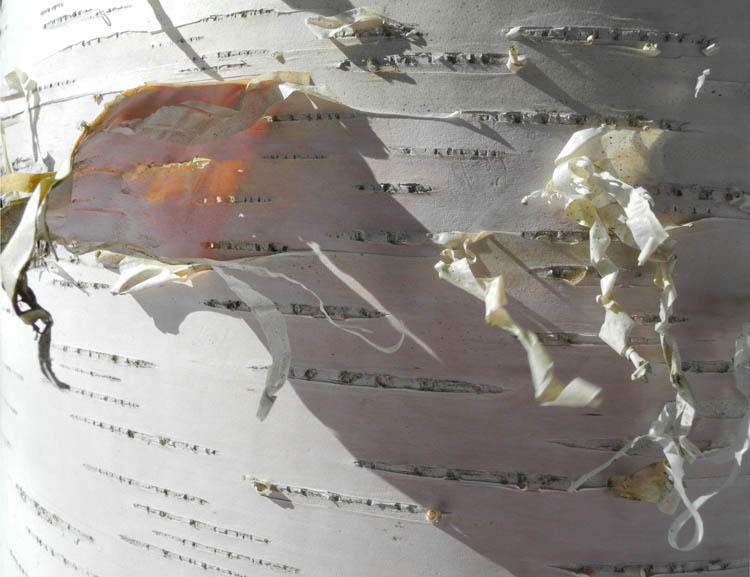
There are so many ways to take a walk in the woods, from treating it as robust exercise, to various levels of sensuous engagement: smells, sounds, views of near and far. And touch: the feel of the uneven path, branches brushing against your body, brambles catching on clothes and skin. Sometimes I watch the distant views and the shifting relationships of tree trunks as I walk past them; sometimes I walk with my eyes to the ground, a different world from the one above. Every aspect of looking rewards attention; there is always something new to see, or a new way of seeing something known. Last week I noticed an odd massing of yellow texture on the pinkish white bark of a birch. Gathered tightly in groups, with a porous texture, beautifully warm in color against the bark, tiny dried shelf mushrooms looked like many hands folded one over another. After seeing this, my eyes became attuned to the stories told on tree bark.


Such as here, where I could see three layers of the tree exposed, the outer bark torn away to reveal what is underneath. The rough outer bark and scratched (by animals?) heartwood are separated by a bright layer of fresh looking wood, which according to this website, is, I believe, the living sapwood. 


There is such rich variety in this small area of rough bark, a rugged landscape in miniature, greens and rusts of lichen add color, a small patch of captured snow a reminder of the season.


I love seeing the white circles of lichen alongside the circular spread of hairy-textured liverwort, the white looking as though someone had run through the woods with a paintbrush, daubing here and there. 


A couple of days later, the sun emerged, and the peeling birch bark glowed pink, its delicate peels dangling, twisted; it is a small moment of joy. As Mary Oliver writes, in her poem "Yes! No!"
"Imagination is better than a sharp instrument. To pay attention, this is our endless and proper work." 


March 7, 2012

"Black Cylinder" Redux

 Black Cylinder, egg tempera on calfskin parchment, 5 3/4 x 5 3/4 in. 
Updated. 


A few days ago I posted the image below of a new painting, Black Cylinder, stating that I was not sure about it and felt it wasn't quite right. With the wonder that is the internet I had a virtual studio visit with readers via blog and Facebook comments, and email. Several things that people said were very helpful, even though I did not follow the advice directly. I am going to name friends as a way of thanking them and I hope no one minds.

  • Martin Scholte thought I should have a vertical band instead of triangles.
  • Rosaire Appel suggested removing the top left triangle.
  • Susan Taverna saw an unresolved painting because neither the abstraction nor the realism took precedence, so the balance was out of whack. 
  • Most helpful, because she crystallized the realism/abstraction conundrum, was Rhea Wilson, who simply pointed out that the right side of the painting was three dimensional and the left two. 

So, what to do? I first played around in photoshop, getting rid of the top left triangle as Rosaire suggested, which made me want to move the diagonal farther to the right. Ah-hah, I liked that better because the light area of blue could then converse more easily with the light blues on the right. On to paint....
When I painted the left blue triangle in its larger size, I did not like the dark blue going clear to the edge at top, so I took up Martin's idea of a vertical and painted a thin light blue vertical. Another ah-hah, as that light line repeated the rhythm of the cylinder's vertical. I painted the light blue a little more realistically, with a value change, so it could be read as sky.
I then added a light blue edge on the big blue shape at top and a darker line on the diagonal, to give a feeling of weight; not too much, just a small indication.
So, here I am now in the image above, there I was below. I am much happier with the painting: the elements seem to be in better balance and I have my online critique group to thank. What do you think? better, or not?


 Black Cylinder, first version

new version on left. old on right

March 6, 2012

Town Meeting Day


It's the first Tuesday in March, which means it is Town Meeting Day in Vermont. In my small town we meet at 10AM in the community building to elect town officers, discuss town business, and vote on the budget (and visit with our neighbors). It is the essence of democracy at its bedrock level, citizens coming together to discuss their town's future. It is an ordinary task, but truly extraordinary in its implications.


We meet in a room that many years ago was the school gym, newly fitted out with energy efficient lighting. Before the official start of the meeting, our State Representative, Chip Conquest, gives us an overview of the legislative session.


Along the east wall, various groups set up displays, such as this from the library, with newly acquired books and upcoming events.


The girl scouts have brought cookies, and there are other goodies from homemade whoopie pies to chili for hungry attendees.


Each year I look forward to my morning coffee with a donut made by the talented Bing Page. Yum!


A few weeks before the meeting, we receive the town report, which includes the budget figures, lists of town officers and reports from various committees and organizations in the town. It is their opportunity to tell us what they've been doing for the past year and what they hope to accomplish in the next. We can look it over and come to the meeting with any questions we might have. The page I've shown above has the first few articles we'll be voting on during the meeting.


Article 1 is always to elect a moderator, without whom the meeting cannot go forward. We've been very lucky in our moderators, who are crisp and clear and fair and well versed in the rules, essential for an orderly meeting. Our current moderator, who does a great job, is Wayne Dyer. 


Citizens get to ask questions and town officers spend time answering as many as come up. Our Road Commissioner, Brent Smith, who wears several hats in town, including Emergency Management Coordinator, has to give lengthy explanations of a proposed new bridge and a repeating station for emergency communications.  When everything is discussed to our satisfaction, we vote, usually by voice. Something that seems a little close goes to a show of hands. If that seems close, we have paper ballots; they are handed out, we write our choice and place it in a box. The votes are then tallied by a town officer. This year we were in accord, and everything passed by ayes. 


Here are our charming voting booths, for Australian ballot questions, such as the school budget, and for state and national elections. Note the small American flag motif on the curtains. I walk into the booth with my paper ballots where there is a writing shelf, pencils at the ready. I mark the ballots and then drop them into the proper boxes; happily everything is color-coded: purple for school budget, white for Presidential primary etc. At the end of this meeting, I leave the community building feeling very happy and deeply touched by our exercise of democracy.

March 5, 2012

Doubt

 Neil Welliver, Light in Brook, 1985, oil on canvas, 24 x 24 in.

"Doubt is a central factor all the time. There's always the doubt: What the hell am I doing out here in the woods, all alone, painting?" Neil Welliver. 

One day last week, while looking at the painting on my work table, I had a powerful physical sensation of the floor dropping out from under me, my head going dizzy and my innards flip-flopping as I thought, like Welliver did (though for me it's not a "central factor"), "what the hell am I doing, making tiny paintings of details of farm machines?" I have written about uncertainty before, in this blog post inspired by seeing the film Andrei Rublev by Andrei Tarkovsky; the post includes a wonderful statement by de Kooning on artistic uncertainty, the sense that we never really know if what we are doing has quality. For me, doubt goes beyond uncertainty; it is a deeper questioning of my entire artistic enterprise. It's not simply "is this painting any good?"; it's "is my entire project––my subject, my style––just plain bad, or just plain dumb?" I assume we all have these moments.


Philip Guston, Beggar's Joys, 1954-55, oil on canvas, 71 x 68 in.


I thought of Philip Guston while I was in my swoon of doubt. He was a well regarded abstract painter, making canvases full of gorgeous masses of brushstrokes gathered in a luminous field.


 Philip Guston, Multiplied, 1972, oil on canvas, 66 x 80 1/2 in.


But then, in 1970, he had a show which shocked everyone: they were cartoons! of parts of figures and rooms and peopled with the Ku Klux Klan. This abrupt shift was not well received at all. I wonder how he coped with the extremely negative response to the show.


Philip Guston, Drawing for Conspirators, 1930; graphite, ink, colored pencil and crayon on paper, 22 1/2 x 14 1/2 in. 


Guston was going back to the content-rich work of his early years, saying "I got sick and tired of all that Purity! I wanted to tell stories." After the Marlborough show, he spent several months at the American Academy in Rome, painting images, his time there described in this review. I haven't found any quotes from him about this period in his painting life, but is it possible he did not feel massive doubt at times? He continued on with strength and purpose, finally achieving great acclaim for what are remarkable paintings. 


 Brice Marden, D'après la Marquise de la Solana, 1969. Oil and wax on canvas, three panels, 77 5/8 x 117 3/8 inches


Brice Marden is another artist whose work changed abruptly, from subtly colored monochrome panel paintings, lushly austere...


Brice Marden, Cold Mountain 5 (Open), 1989 – 1991,
oil on linen (108 1/8 x 144 1/8 in.)


to overall webs of lines inspired by Japanese calligraphy. His new work was highly acclaimed, a very different experience from that of Guston, so it is hard to think of him as having doubts about his way forward. There is an opposite side to doubt, which the work of these two artists brings to mind: exhilaration, the excitement of moving onto a new path however treacherous it might be. My journey has been more gradual, from images of Victorian houses, to agricultural landscape, to abstracted machinery (you can see an overview on my website); happily, my moments of brutal doubt give way to a pleasure in painting. As Bertolt Brecht wrote: "It's all right to hesitate if you then go ahead."


*thanks to the website The Painter's Keys for extensive lists of quotes that can be searched by author and by category. 


March 4, 2012

A New Painting: "Black Cylinder"

 Black Cylinder, egg tempera on calfskin parchment, 5 3/4 x 5 3/4 in. 


I'm not sure about this painting: I don't dislike it, but I don't love it; it's somewhere in between. I think the problem is that the large blue plane doesn't have enough visual weight. I deliberately painted it to sit alongside the lighter blue triangles, but maybe that is a mistake. I'm wondering: if I paint a thin darker blue line along the lower edge to indicate some depth, do you think it would work better? I'm thinking it might. 


I worked very concentratedly on the cylinder, which holds the painting in place; I like that little flaring lip at bottom, which gives the form a bit of quirky personality. I used some color variations in the blue, for physical presence and liveliness, continuing a thought I had with my previous painting, Black and White, where I wrote about layering color. In this painting I did just that: I loosely brushed some ocher and different blues as an underpainting for the blue, and some reds and yellows as underpainting for the cylinder. Because egg tempera is a translucent paint, initial layers can have an effect on the ones above. This is one of the great qualities of this medium (though at times I would prefer the simplicity of opacity), and its source of luminous color.

March 1, 2012

Winter Light: The Sparkle of Bad Housekeeping


On a recent sunny afternoon, I was reclining on my sofa, reading. I looked up, and noticed a thread-thin line of sunlight floating from the ceiling. That little touch of loveliness come from my laziness with the vacuum cleaner; it inspired me to look out for other moments created by the overlooked threads of spiders.The delicate weaving of light above is visible for only a brief time as the sun moves across the room.


Wispy lines wander from seed head to seed head on a spray of dried Cimicifuga.


The petals of an Annabelle hydrangea are like shyly hidden damsels behind a woven screen.


Two lines of a triangle lightly drawn in space emphasize the structure of an old door latch.


This mass of spider threads is like a tiny woven basket, suspended from a pole and trailing decorative filaments.


The glass of a window, which should be invisible, makes its presence known as tiny lines against the pane hold the sunlight. The bits and pieces of dust and spider web turn a transparent plane into flickering patterns of light and dark; from this perspective, dirty windows can be beautiful.

February 29, 2012

A New Textile: "Empty Center: Blue/Green"


Empty Center: Blue/Green, hand dyed wool on linen, 9 x 9 in. 


The fourth in my series of Empty Center themed textiles is complete, and it feels very minty to me, with a light coolness of color, reminding me of pistachio ice cream. Like Empty Center: Blue/Brown, which you can see below, there are two small shapes across the blank expanse (well, I know it's not blank, but it's devoid of clear shape). Like in the previous work, the shapes are engaged with each other. The more aggressive form of the green rectangle could make it seem as though it's about to launch into space, with the blue triangle as target. Or is it passively waiting for the blue to arrive and cap its energy? However we read it, the two shapes activate the space between.


You can see the subtle color variations in this detail. I dropped very dilute amounts of blue and green dyes onto fabric scrunched in a pan to get this effect. Below are the four pieces that I've competed in this series. I plan to do more, but not now; I have lots of other ideas I want to explore and other series to extend.


February 28, 2012

At the Met: The American Study Collection


I love things. I enjoy looking at all sorts of objects in antique shops; I even like spending time wandering the aisles of my local job lot store, admiring the shapes, colors, and textures of things on display, from housewares to rugs to clothing to foodstuffs. So it's a special treat for me to see a wide variety of decorative art objects and paintings collected in glass cases in the Luce Center Visible Storage, part of the American Wing at the Metropolitan Museum of Art. It is a place of delight and discovery, similar to another surprise find at the Met, the Greek and Roman study collection, which I wrote about a couple of years ago here; it inspired the first of my series of posts from the museum. The objects are arranged by material, and then by color, as in these blue and white ceramics....


or these brown earthenware pieces. At the rear is an amusing lineup of mugs, called Toby mugs or jugs, from the mid 19th century. There are few explanatory labels in this collection, but you can look them up by their number. For instance, that charming cow creamer was made in the mid 1800s by the American Pottery Company in Bennington, Vermont. I once had a contemporary white jug very similar to that.


Shimmering colors of blown glass bottles are arranged on shelves; they are similar in shape, yet each has a distinct personality.


I love the angular shape and honeycomb pattern of this tea set. It looks like it might have been made at the height of modernism, but it's from the Chelsea Keramic Art Works, ca. 1879-83. To see a high resolution photo of the set, go to the Met's website


This is a marvelous pair of vases, so very different, each so expressive, one in color and one in shape. The brilliantly colored vase looks like a piece of glass, but is of earthenware, made in the early 20th century by Weller. Its green companion, with curving arms that seem to encircle a pair of wide eyes, is from the same period, the same material, and is by Gates Potteries.


This is a detail from a charming painting of a hunting scene (sorry, I didn't get label information). The horses' faces have more energy than the placid faces of the men. The legs of horses and dogs repeat as though in a low relief carving, and the scene is topped off by clouds billowing behind trees. 


There was a great deal of furniture in the study collection: tables, and rows of chairs, desks and bureaus and chests. Many of them have decorative painting, as here with stylized flowers in a large simple container. 


A similar floral motif is made into a elegant and sophisticated object, using inlaid woods instead of paint. This is a detail of a secretary that was made by Herter Brothers of New York in 1882; you can see the whole piece here. Although I'm sure that the Met has much of its collection hidden away, it's wonderful for us object lovers to be able to ramble through these study collections; they may be filled with things not quite good enough for the formal galleries, but they're a treasure nonetheless.