May 31, 2013

Lilac Love


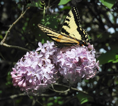
Insects love lilacs. When I went out to pick some flowers for the house a few days ago, I saw the air around the shrub alive with movement, heard a loud buzzing and humming. The beautiful, fragrant flowers were attracting all kinds of insects, including the most beautiful, the Swallowtail butterfly.


Not only grand beauties sip at the flowers; there is also a small dark butterfly with fringed wings.


And then there are bees of all sorts, including the big bumblebee.


And other creatures that I think are bees....


....but because of their shapes I'm not sure. I love the big red eyes on this one.


And this, I believe, is a honeybee. I didn't see them for years, but last year they began reappearing, which is very welcome.


There were many of these little, dark insects, most just sitting on the leaves.


And here, my favorite of all: a fuzzy insect with a long proboscis with which it sipped from deep inside the lilac floret. Us humans appreciate the lilac flowers aesthetically, but for these insects they are sustenance and life.


*I suggest clicking on the images to enlarge them (on the blog to see a slide show) to get a better look at these insects.


May 29, 2013

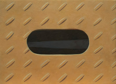
A New Painting: "Opening"


Opening, egg tempera on calfskin parchment, 5 1/2 x 7 1/2 in. 


This painting is both symmetrical and asymmetrical. The asymmetry of the small patterned shapes throws the certainty of the opening's central position into question. When I was working on drawing the grid for the pattern of oblong shapes, I considered centering them along with the opening (they were not centered in the source photograph), but I decided that the image would be more energetic, stranger, a little more mysterious, if I kept it just as it was, slightly out of whack. The shape hidden within the opening adds another kind of shift. 

The other decision that I made was about color: how saturated, what value was the plane of reddish color to be? Most of my paintings have quite intense color, so I thought that I'd make the color of this one lighter and less saturated than is my propensity. I think it's a good idea for me to push against my inclination from time to time. 


Opening, detail


I had thought that painting the pattern of small raised shapes would drive me a little batty, but it turned out that the grid was simple to do and the shapes felt almost like a textile pattern, a texture on a flat surface. The image, I hope, maintains its simplicity in spite of its detail. 


May 28, 2013

Florida's Foliage, and a Flower


I was in Florida over the weekend for a family wedding. It was sunny and warm and windy: perfect weather for getting away from the cold and wet Northeast. I wandered around the grounds of the hotel, and down to the beach, with my camera; there was plenty to catch my eye in the shapes and colors of foliage. In one large planter, different foliage of strong character and clear shape, made a dramatic statement.


The bright, light green heavy leaves connected, pattern-like, to a strong curving stem.


These leaves had a gentle, orange-tinted fuzz; their light color stood out from the darker foliage.


Down towards the beach were the rounded large leaves of the Sea Grape, with its fruits newly formed.


A beach plant has leaves splashed with red.


Not all the leaves at the Florida shore were bold and dramatic; here is a delicate-leaved plant with subtly red stems wandering across the sand.


Another combination of red stem and green leaf, with leaves sticking out like spikes from their sheaths.


I saw a few small flowers, but this pink one was the most interesting. It reminded me of pea flowers and might be in the same family, but just a lot more sexy. The wedding was held at the Flagler Museum, which had beautiful grounds; a lovely courtyard with gorgeous plantings; and the most remarkable tree I have ever seen, a kapok tree with a huge spreading trunk that seemed to me like something out of a fairy tale (you can see images of the tree here). It was a treat for me to feast my eyes on new forms, so different from those of Vermont.


May 23, 2013

At the Met: Birds, Grand and Ordinary, in Japanese Art


Ishida Yutei, Flock of Cranes detail

At this time of year, when birds return north for the warm months, it seems a perfect occasion for visiting the exhibition Birds in the Art of Japan at the Metropolitan Museum of Art. You can see all the work in the exhibition at the link; they include screens and hanging scrolls, prints and three dimensional objects, all with birds as their central motifs.


Ishida Yutei, Flock of Cranes, Edo period, 1767-84; pair of six-panel folding screens; ink, color, and gold on gilt paper.


This screen is a tour de force, with its complex intermingling of the forms of cranes, each one an individual, each graceful and full of life, with the staccato endings of their skinny legs. 


Attibuted to Kaiho Yusho, Lin Hejing and His Crane (detail), early 17th century; two-panel screen remounted as a hanging scroll, ink and light color on paper.


Lin Hejing, a famous northern Sung poet, is shown in a tender gesture towards his pet crane. 


Nagasawa Rosetsu, Cranes (one panel of two), 1780s; ink and color on paper.


A third image with a crane shows us the humorous aspect of the bird, as it faces us straight on, with a quizzical expression. 


Attributed to Kano Sanraku, Autumn Millet and Small Birds, Edo period (1615-1868); pair of eight panel folding screens; ink, color, and gold on gilt paper. 


A very busy scene is pictured on this screen, as birds hover about the ripe grain, a visual feast for us. There is a wonderful sensitivity here in the various attitudes of the birds as they fly about. 


Shibata Zeshin, Three Crows in Flight and Two Egrets at Rest, late 19th century; two panel folding screen; colored laquer and white pigment on gilt paper.


On a withered branch
a crow has come to rest––
autumn evening.
––Matsuo Bashō
A very different image from the previous screen, this is much simpler in form and pared down in composition. There were several paintings of crows in the exhibition, and I learned from a wall label that they've been a part of Japanese art since ancient times. They have a dual nature for the Japanese: "in Confucian teachings, a crow is a symbol of filial piety, since younger birds are said to take care of their elders when sick or disabled. Despite these positive associations, crows are nevertheless considered pests by farmers and city dwellers alike, for raiding crops or for their raucous cawing at the crack of dawn." I can relate to that!


Mochizuki Gyokkei, White Peafowl, 1908; pair of six-panel folding screens; ink, color, gold, and gold-leaft dust on silk.


Peacocks are the most remarkably beautiful of birds, but I've never seen a white one. This painting shows us a regal bird in all its glory. 


Kawanabe Kyosai, Eagle Attacking a Monkey, 1885; hanging scroll; ink and color on paper.


Not all is simple beauty: a powerful eagle, its eye and talons emphasized with white, its feathers bold and dramatic, attacks a small monkey. From the wall label I learned that in this work the artist "distilled the soul of the Japanese nation". 


Mori Sosen, Silkies, before 1808; hanging scroll; ink and color on silk


Not all was grand drama in these paintings; even the domestic chicken had a place. These are special chickens, to be sure; silkies have fluffy feathers, almost fur-like, which the artist has captured beautifully. In all the paintings in the show, there's a sense of careful observation of each bird––its form and character and details––as the artist transforms a three dimensional creature into a beautifully rendered image.


Kosode Robe with Roosters and Hens, 19th century; silk, metallic thread, embroidered figured crepe.


Chickens even show up, delicately embroidered, on a rich red robe. 


Inro with Peacock, 18th-19th century; lacquer work with gold and silver in low and high relief, and mother-of-pearl inlay. 


An Inro is a small container that was hung from the belt of a kimono. This beautiful, jewel-like object has a peacock sitting elegantly across its curved form. Whether a regal bird such as a peacock or eagle, or an ordinary crow, Japanese artists depicted them with reverence, with beauty, and with the respect of close attention. 

May 21, 2013

The Elegance of Tulips


Golden Artist


Perhaps it is because they are a single flower on a single long stem that tulips have such grace, no matter their form. They have a clarity of shape that is very appealing. The slightly ruffled edges of Golden Artist, a viridiflora tulipcall attention to the green stripe running up the petals. It seems perfect in its irregularity.


Menton


This tulip is one of my favorites, that I plant every year. Its form is of the classic tulip shape, with rounded petals; when closed like this it has an air of modest beauty. 


Ballerina

 With Ballerina, a lily-flowered tulip, the petals point delicately outward, their red and orange like flames.


Ballerina


 A group of them in a vase, with back lighting illuminating the spread open petals, is arresting.


Queen of Night


A pitcher of dark-colored tulips makes a dramatic statement.


White double


Double tulips have some of the froth and extravagance of peonies; their elegance is more exuberant and less restrained and classic.


Freeman (double), Prinses Irene


They are quite gorgeous, and I can't resist having some each year. Having vases full of tulips in Spring is a wonderful treat.


Red Emperor 


Each fall, I plant a row of several varieties of tulips in the vegetable garden, just for cutting. That way they are protected by the garden fence from the appetite of deer, who love tulips. Years ago, when I first began gardening here, before I understood the ways of deer, I planted some tulips in my flower borders. They lasted a few years; some years they bloomed, some years they were eaten. But then they stopped flowering. They had stopped flowering for probably ten years or so, and then, surprisingly, these red tulips came back last year, along with some pink ones in another border. The deer have left them for me to enjoy, for which I'm thankful.


May 19, 2013

Atmosphere and Touch: The Paintings of John Zurier


A Spring a thousand years ago, 2012; glue tempera on cotton, 72 x 44 in.


Within these minimally painted, sensitively brushed paintings there is a sense of boundless space, of light shimmering through thin veils of color. In his exhibition at Peter Blum Gallery, John Zurier presents paintings which were inspired by a visit to Iceland, as can be seen in the titles (none of which were translated). The title of the show is the same as the painting above, and comes from a poem by an Icelandic poet, Stefán Hördur Grimsson:

The night shed its blue tears
on grass and woods 
and the earth grew cool and deep
beneath my feet
and I felt for a moment
as though a pallor struck my breat
and my bones were rotting
and I was seized by fear. 
Then I thought I heard a low whisper
like that of a closing flower:
You are a spring a thousand years ago.

 Standing in front of this painting, I felt swept into a space of time and mists, so similar to the feeling of Chinese landscapes.


Sorgin, 2013; oil on linen, 21 x 15 in. 


The paintings are paradoxically both rich and hardly there. I sense great care in the making of the work, and yet there's a feeling of freedom in its brushwork, freedom that comes from practice and from close attention.


Sorgin, detail


In this detail you can see how Zurier uses the dry brush and thin paint to make subtle layers of depth, all illumined by the light coming from the canvas beneath. I am made more aware of his attentiveness by the edges of many of the paintings; in Sorgin there is a very light line at the left edge. It seems that Zurier deliberately folded the corners of the canvas to have them expand outside the rectangle, little dips of irregularity. This is why I photographed all the paintings on the wall and did not crop them close.


Hellnar, 2012; distemper on linen, 108 x 75 in.


Even though it's a vertical painting, Hellnar has a strong sense of a landscape space, like A Spring above. It is a soft and distant landscape, one just out of reach. Another interesting aspect of Zurier's paintings is that even his larger work feels very intimate; it is enveloping and meditative.


Hellnar, detail


In this detail, you can see that Zurier again calls attention, subtly, to the edge. All his paint is subtle: thinly applied so that the texture, and often the color, of the linen canvas shows through. Some of the paint he works with is an ancient technique of distemper, which is pigment mixed with a glue size as a medium. The paint tends to be thin, which suits Zurier's sensibility well. 


Mosfellsbœr, 2012; distemper and oil on linen, 26 x 21 in. 


In this small, very different composition, small black bars dance on the grayed surface, marking places but ready to move and shift. The unpainted right edge of linen is puckered from the shrinkage of the painted portion; veins run across the surface, the paint is there as if to indicate an aerial landscape.


Oblaka (for Mark), 2007; oil on linen, 38 x 31 in. 


One of the things I admired about this show was the variety of approaches to making a painting; Zurier explores paint and surface, with each painting having a character of its own. Oblaka is like something hidden, with time-worn abrasions poetically revealing color. 


Vonin, 2012; distemper on linen, 18 x 22 in.


 Within a simple band of blue, some shapes: islands? clouds? or simply irregular forms floating, but bound to the unpainted linen ground.


Vonin, detail


The distemper paint puddles and catches on the texture of the linen, the brush gently indicating forms, varying the transparency of blue. 


Hӓrnevi, 2013; distemper on linen, 75 x 108 in.


Each painting in the show, whether big or small, is the right size for what it has to express. That is also true of Hӓrnevi, the largest painting in the show. Across the large expanse of dark linen white paint is brushed on in varying degrees of transparency, creating a shifting cloud-like space that is seemingly endless and deep. Within this field three irregular green rectangles float, beings in nothingness.


Zurier again calls our attention to the edge, with thin painted green lines: the atmosphere has a boundary, it is not infinite. In this beautiful exhibition, these seemingly thin and fast paintings are truly deep and thoughtful and slow.


May 16, 2013

On a Large Dairy Farm


I am inordinately fond of dairy farms: they have provided me with subject matter for my paintings for over 25 years; they are often in beautiful settings; they remind me of the complex issues regarding our food supply. This morning was lovely, with fog lifting to bright and clear skies, so I went out to one of my favorite local farms, Hatchland Farm, to take photos for paintings.


It is located just over the border in New Hampshire, in Connecticut River floodplain, so the soil is rich and moist. The views looking south (this photo and the one above) take in a large sweep of plain and low hills. The dairy farms of the Northeast have kept the land open and vistas deep, but there are industrial techniques that go along with a successful dairy farm. In the top photo are silage bunker and Ag-Bags, and above is a pump for a manure lagoon.


Young calves are kept in hutches, in order to keep them healthy. The milking cows live in large, airy, free stall barns, so they can move about. On a large farm such as this one, which milks around 500 cows, the cows do not go out to pasture, which of course gives one pause, but it is the modern management system; the cows seem calm and happy in their environment. This farm is nearly unique in that they bottle their own milk, which is excellent, and make ice cream too.


I enjoy seeing the ingenuity, the not-letting-anything-go-to-waste attitude, using old tires to hold an earthen bank. If you enlarge the photo, you'll see a few cows wondering what I'm doing. They are the most curious of creatures.


Some of the architecture around the farm is dramatic; a white quonset barn, protecting the sawdust bedding for the cows, is stunning amid the green and gray.


Some of the most remarkable structures on a modern dairy farm are the silage bunkers and Ag-bags, which store silage––chopped grass, alfalfa, or corn––in such a way as it becomes fermented, so much more nutritious for the cows. This farm feeds its animals almost solely from its own fields which are fertilized by manure; they use no artificial growth hormones. So even though it looks like an industrial farm, it is truly healthily run, and a family owned business. The owners are warm and friendly people, not minding me trudging around taking pictures each year.


Here are a couple of huge Ag-bags with different kinds of silage. I love the shapes of these, so wonderfully sculptural.


As I love the sea of tires, row upon row of circles, holding down the plastic protecting the silage in the concrete bunker. These objects, these structures, provided me with subjects for painting over many years. You can see a few of the paintings I did that include plastic and tires here on my website.


This is a closeup of corn silage; you can see the kernels of corn chopped along with the stems and leaves and cobs; nutritious stuff. 


The ultimate in recycling on a dairy farm is the turning of animal waste into the best of fertilizers. Liquid manure is being pumped from the lagoon into a tanker, which will spread it on the fields. I am assuming that they are getting ready to plant corn. Another modern touch: the worker atop the tank is busy with his cell phone while waiting for it to be filled. A bucolic pastoral this is not, but it is a beautifully managed and maintained farm, and I'm happy to be able to buy their milk, and hope to try their ice cream soon; and, their machines still provide interesting images for painting.