September 30, 2013

New Prints, Cardboard and Potato


Squared: High Parallelogram, ink on Sekishu natural paper; image size 8 x 8, paper size 15 x 15 in.; 
ed. 4


Squared: Downward Triangle, ink on Sekishu natural paper; image size 8 x 8, paper size 15 x 15 in.;
ed. 4


A few months ago I started a series of cardboard prints that I called Squared; you can see the first two prints here. My idea was to use a small square made up of the lines of corrugation, and place within it a simple geometric shape. I am interested in how the shape activates the space around it, and how varied that can be; during each session I've placed one shape high and one low, creating different energies. 


Untitled 37, ink on Nishinouchi paper, 15 x 14 3/4 in.


As is usual during my printing sessions, after pulling the cardboard prints I play with potatoes, cutting them up in different shapes, dipping them in ink and stamping the color on paper. For 37 I used the same shape in the same color, stamping it four times on each line as the ink became fainter.


Untitled 38, ink on Twinrocker paper, 10 x 14 in.


Here different shapes march across the paper in variations on primary colors.


Untitled 39, ink on Twinrocker paper, 14 x 11 3/4 in.


Every time I make a print that has rounded shapes separated by lines, I start to see a figure...which I don't like, but maybe the playfulness of it is redeeming?


Untitled 40, ink on Nishinouchi paper, 12 x 9 in.


Very simple: four and four.


Untitled 41, ink on Twinrocker paper, 18 x 8 1/4 in. 


Lastly, a tall narrow piece. I dipped the rectangle in blue ink only twice, allowing the marks to get more ghostly as they moved to the right. At first I couldn't decide whether I should add another element, but then placed a pale yellow circle at the center. I think it works, but due to the improvisational nature of these works, I am never quite sure. Uncertainty, the healthy attitude in the studio.....

September 28, 2013

Changes


Titian (ca. 1490-1576), Bacchus and Ariadne, 1520-23

Titian, The Death of Actaeon, ca. 1559-75


A friend recently asked me if I missed doing the large, complex paintings I used to make. I don't at all miss them; I'm very engaged in the work I'm doing now. The question got me thinking about how so many artists changed their painting style or content during their working life. The giants of the 20th century, Picasso and Matisse, were always trying new approaches; sometimes they were subtle shifts and sometimes dramatic. Titian's early work was influenced by Bellini and Giorgione, since he worked with both as a young artist. His color was brilliant, the forms crisp and clear, with a planar ordering of space. Later, his brush became more active, color less crystalline, the space flowed in sweeping curves. I could say his paintings went from precise to painterly.


Jean-Baptiste-Camille Corot (1796-1875), Fontainebleau, Black Oaks of Bas Breau, 1832-33

Corot, Landscape, 1860


Corot's work followed a similar path, from the clear light and form of his early work to the soft, painterly effects of his mature landscapes. This change, from a more controlled expression to one that is more open seems not uncommon, for instance in the work of Constable, Turner, and Monet.


Samuel Palmer (1805-1881), The Harvest Moon, a Drawing for 'A Pastoral Scene', 1831-32

Palmer, A Dream in the Apennine, 1864


A very different kind of change happened in the work of the British artist Samuel Palmer. When a young man, he was in the circle of followers of William Blake. For about 10 years he produced intense and mystical landscapes while living in a cottage in the village of Shoreham. These small works, which I saw several years ago in a show at the Met, are compelling and strangely beautiful; they are very personal expressions of landscape as symbol of spirituality. Then he moved to London and became a rather conventional landscape painter out of a need to make money. Walking from the gallery full of the Shoreham works into that of later paintings was moving from exhilaration to a dull thud. The later painting I've reproduced above, though, has some of the lyrical strangeness of the early work, but doesn't quite rise above its rather ordinary format.


Piet Mondrian (1872-1944), The Gray Tree, 1911


Mondrian, Composition in Blue and White, 1935


In the 20th century we have some greater changes, as artists move from representation to abstraction. Mondrian did so in stages, from early work that was stayed close to perceptual reality and gradually became more abstracted until it became line and color. Then for many years he worked variations on his ideas until the final exuberance of Broadway Boogie Woogie.


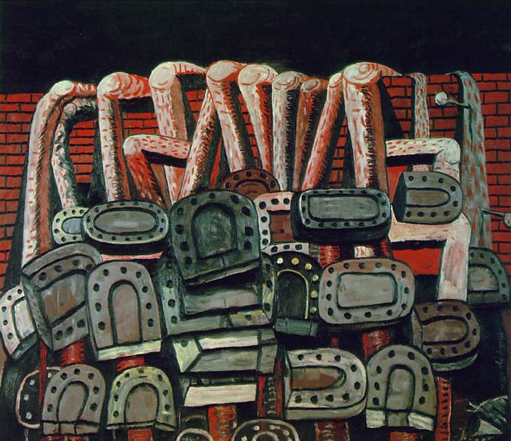
Philip Guston (1913-1980), Zone, 1954

Guston, Ancient Wall, 1976


Rather than a gradual change in his work, Guston stunned the art world in 1970: instead of showing his beautifully atmospheric abstract paintings, his new show was full of cartoons! I was at that opening, and we just didn't know what to make of these wild images, disturbing and bitterly funny. Guston was torn to shreds by the critics at the time. It was brave of him to make this enormous change, and it took us a while to catch up with him; now his figurative work is revered.


Guston, Drawing for Conspirators, 1930


The interesting thing is that he was going back to concerns he had in his early years, when he was a representational painter. Years before he returned to figuration he was dissatisfied with abstraction; in 1960 he wrote (via Wikipedia):
There is something ridiculous and miserly in the myth we inherit from abstract art. That painting is autonomous, pure and for itself.....But painting is 'impure'. It is the adjustment of 'impurities' which forces its continuity. We are image-makers and image-ridden. 

Thumbnail details of my paintings, 1981-2005


And me? My changes in painting have been less of style, which has stayed consistently precise and based on perceptual reality, and more of subject, focus, and size. (The photos above are a screen shot from my website; if you click this link, you can then click on each image to see the entire painting.) My early paintings were "portraits" of Victorian houses; I love the way light played over the large forms and small details. Later I expanded my view out from architecture into the landscape; the landscape then became the subject, but it was a working landscape of agriculture. I found myself more and more interested in the stuff of farming, and how its ordinary ugliness contrasted with the beauty of the land around it, and how the inputs of fossil fuels and plastics affected our environment. Then I focused entirely on the objects, seeing the abstract qualities of their forms. Over time my paintings got simpler and more abstract––I tired of the insistent narrative––though still using the same subject matter of agricultural implements. Now they are very small, inspired by medieval manuscript painting. My desire during the past couple of years has been to make intimate paintings, very simple and abstract, yet calling forth mood and feeling.


Blue Box, 1970, 16 x 20 in.


An interesting correspondence with Guston is that my most recent work can seem to be a reprise of work I did when a young artist, still in grad school, something I only realized fairly recently. Flat forms played against volumetric folds, color was invented, and was bright and contrasting. Maybe here can even be seen the seeds of all of my abstract work in textiles, drawings, and prints. We all go through many changes in our lives; in our work some of us are consistent over years, and some of us change. I believe that the important thing is to allow ourselves the freedom to do whatever it is that feels right.


September 25, 2013

The Death of a Tree


Yesterday afternoon I was in the vegetable garden picking broccoli and I happened to look up toward the northwestern edge of my field....something was wrong. It took me a few moments to realize that a large apple tree had fallen. It was near a huge old crabapple, and I used to string a hammock between them. I've lost trees before, but never such a large one. We get used to seeing certain forms in our landscape; this tree's demise will leave a blank space until my memory of it fades.


It was so sad to see its sturdy trunk lying horizontally...


....and its roots upended, a mournful illustration of the word uprooted. The death of a tree is not an unusual occurrence here; the woods are full of broken trees and dying stumps, but unless one falls in my path, which happens fairly often, I don't usually notice. This tree and I have a long acquaintance, and it will be missed as a good companion.


Another sad fact is that this year the tree was loaded with apples; in my 20 years here I've never seen so many. They are winter apples, ripening very late in the season for winter storage, so they are still on the tree, still not ripe. It's possible that the heavy weight of fruit was too much for the old tree and it succumbed to heavy winds.


Now these beautiful apples are close to the ground so all the deer in the neighborhood can feast on them. I will have someone come and cut up the wood into stove length logs, so it will keep me warm next winter; then I will spread its ashes on the garden for fertilizer. The tree will live on, as all matter does, in another form.


September 24, 2013

A New Painting: "Untitled (Red, Pink), for Popova"


Untitled (Red, Pink) for Popova, egg tempera on calfskin parchment, 9 x 5 7/8 in. 


This painting, or to be more specific the colors and shapes of this painting, were inspired by the Russian artist Liubov Popova, who was part of the Suprematist group of artists and later a Constructivist. About twenty years ago the Museum of Modern Art mounted an exhibition of her work, and I've carried my admiration of it for all these years. 


Liubov Popova, Painterly Architectonic, 1917; oil on canvas, 31 1/2 x 38 5/8 in. 


I particularly love her series of Painterly Architectonics, with their dynamic overlapping shapes and sometimes surprising colors. For me, her use of red and pink is nervy and exhilarating. My use of a pink ground with red triangular shapes of folded cloth come from a desire to pay an homage to this painting.

Pink Triangle (for Popova), 2006; hand dyed wool on linen, 12 x 10 in.


It's not the first time I've done so: several years ago I did a textile as an homage. Now that I am using cloth as a still life material for painting, I came back to the theme. 


Untitled (Red, Pink) for Popova, detail


Looking at both painting and textile, I think the textile is more successful. I could whine a little about how difficult it was to get a good photograph of the painting, and how much better it looks in person (which I believe it does), but I'm not sure that the poignant quality that I felt while painting this image, like something left or dropped unheedingly, is evident; or if the painting stands successfully on its own. Maybe one day I'll try the red/pink theme again.


September 22, 2013

The Dust Bowl: Have We Learned its Lessons?


Black Sunday dust storm, Ulysses, Kansas 


As I stood on my porch yesterday afternoon listening to the wind roaring in the trees, watching the black clouds building, I wondered what it was like to know that instead of high rain clouds what was approaching was an enormous billowing mountain of dirt, about to engulf everything in its path. This was a reality faced by the people of the southern plains for several years during the period of the "dirty thirties" known as the Dust Bowl. A few years ago I read a fascinating 2005 book by Timothy Egan, titled The Worst Hard Time:The Untold Story of Those Who Survived the Great American Dust Bowl, which you can read online here. Egan writes eloquently about remnants of farms and lives:
In those cedar posts and collapsed homes is the story of this place: how the greatest grassland in the world was turned inside out, how the crust blew away, raged up in the sky and showered down a suffocating blackness off and on for most of a decade. 
It is worth your time to read the introduction to the book at the link above, a clear and impassioned overview of the nation's greatest environmental disaster, caused entirely by human activity.


Arthur Rothstein, Farmer and sons in dust storm, Oklahoma, 1936


A few days ago I watched the Ken Burns documentary "The Dust Bowl", which was originally broadcast on PBS about a year ago. At the link you can see more photos, along with some videos and commentary. The documentary seemed to me to be based on the Egan book, and though specific credit isn't given, Egan is one of the talking heads in it. There are also interviews with several survivors, and amazing short films of the storms, which are frightening in their intensity. It's hard to imagine what is was like living through it all. The photo above was taken by a young photographer, Arthur Rothstein, sent to the southern plains by what became the Farm Security Administration.


Arthur Rothstein, A farmer shows how high the wheat should be, North Dakota, July 1936


Rothstein captured many iconic images of the terrible drought that came after several good years of rainfall in this most inhospitable area. For centuries the soils were held by native buffalo grass, but early in the century the government encouraged people to settle on land that was marginal at best for agriculture; people were told by boosters that "rain will follow the plow", and at first it seemed to be true: rains were plentiful, and wheat, which was in great demand during the first world war, grew well.


Arthur Rothstein, Sand Dunes, Oklahoma Panhandle, 1936


So more and more land was put under the plow, with the expectation that the good years would continue. But as in the Egypt of the Old Testament, good years gave way to bad.


Dorothea Lange, Abandoned farm with windmill, Texas, June 1938


Another of the photographers sent by the Farm Security Administration to document the conditions in the southern plains was Dorothea Lange. Her images are of abandonment and devastation.


Dorothea Lange, Abandoned farm north of Dalhart, Texas, 1938


The hopes of so many for a decent life with land of their own went unfulfilled.


Dust bowl, Dallas, South Dakota, 1936; USDA


This town is in south central South Dakota, population in 2012: 120. Although the dust storms were worse farther south, they also affected the northern plains. In the mid 1970s I taught for a year as an artist-in-schools in Wagner, South Dakota, only 70 miles from Dallas (on the plains 70 miles is a hop, skip, and a jump). I remember seeing homesteads, even tiny towns, gray and bleached and empty.


Black Sunday dust storm over town, from PBS film


The dust storms were a vivid display of living for the moment and not thinking of consequences. Finally, Roosevelt's administration undertook actions to alleviate the worst practices of the plains farmers: shelter belts of trees were planted, contour plowing along with better plowing techniques were encouraged, land was bought back to establish national grasslands. Some land has never recovered from its loss of topsoil.


Crop circles, Kansas, satellite photo from NASA


Farmers in this dry land farming region soon discovered the benefits of irrigation. Under the central US is a vast aquifer, the Oglalla aquifer. We can see the green circles created by center pivot irrigation when we fly over the Great Plains. The aquifer took thousands of years to fill and will be emptied in another hundred. We continue to ignore other looming, though slow moving, disasters. To answer my question above: it seems we haven't really learned a thing.


September 19, 2013

The Colors of Early Fall


We've had several gorgeous days this week, when being outdoors is a joy; the air is mild and crystal clear, the sun bright, the insects are singing their late summer song, while birds on their way south fly hither and thither. And the color! although we still have 2 or 3 weeks until peak fall color with all its brilliant reds, early fall has its pleasures in subtler hues as leaves change from the deep green of summer to the yellow-greens or red-greens of early fall. The whole landscape takes on a warmer complexion. A maple tree begins to show red at the ends of its branches, like cool red-tipped flames.


Leaves are a mixture of reds and greens.


The forest floor has begun to be a colorful carpet underfoot as newly fallen leaves cover those browned and dried from last season.


Some plants are already showing vivid crimson, such as wild blackberries.


Although much more restrained in their color changes, ferns can be quite beautiful in golden yellows and browns.


At this time of year, you can be surprised by a haze of golden light, or a sparkle of red, behind a flickering mass of green.


Fall blooming asters are attracting the small sulfur butterflies which dance in the air in large numbers, alighting here and there to sup on flowers.


With the humidity of summer gone, the clear air allows deep views east to the White Mountains of New Hampshire.


A couple of days ago I walked down to the village, photographing as I went. The light and color were exhilarating; and it was fun to see a mailbox anchored in an old milk can.


At a turn in the road before its final descent into the village, signs pointing the direction echo the yellows of leaves and road marking; electric lines emphasize the movement of space. It is a totally ordinary scene, and totally glorious. 


September 18, 2013

A New Textile: "Yellow/Blue Diptych"


Yellow/Blue Diptych, hand dyed wool on linen, 2 panels each 12 x 9 1/2 in. 


Diptychs create tension between two parts, allowing for an energy that would not exist in either panel on its own. In this piece I was interested in the way the two similar shapes would play against each other in the space between the panels. 


Rather than have a single solid color as a background for each shape, I decided to dye a variegated ground made up of the two colors. I spot dyed the fabric by scrunching it up in a wide pan and dropping color here and there on it.


I hooked the variegated wool in a random pattern, to give it more of a background feel....


....while the two shapes are hooked in line with the edges of the shapes, which makes them seem more solid. After I decide on a composition and work out the color, after dyeing the wool, the next decision is the direction of the hooking; the loops of wool are a little like brushstrokes, which can change the form and feeling of a painting.