Showing posts with label collage. Show all posts

March 30, 2015

At the Met: Robert Motherwell's Lyricism


From Lyric Suite, 1965; ink on paper, 11 x 9 in.


Freely brushed inks spread across paper with fresh abandon, a color haloing a darker one; circles that might have been accidents mark a path, add a loose geometry to fat flowing lines.


From Lyric Suite


In 1965, Robert Motherwell bought 1000 sheets of Japanese paper; 600 drawings were the result of his brushing colored inks on unsized paper. He wrote (my information from the Metropolitan Museum of Art's wall labels):
Each picture would change before my eyes. The pictures literally continued to paint themselves as the ink spread in collaboration with the paper. 
A selection of this series, named after Alban Berg's Lyric Suite––a string quartet that Motherwell listened to in his studio––is currently on view at the Met. It's wonderful to see the variations of form, to get a sense of the immediacy of these works.


From Lyric Suite


According to the Met: "Motherwell worked quickly and without conscious control, executing between ten and fifty drawings a session." I can readily imagine how thrilling it was to work in this manner, to wonder how a mark, a splash will transform into an image.


From Lyric Suite


There is so much life in these drawings; they don't stay still politely, but have a continuing pulsing energy. The drawings remind me of the looser forms of Asian calligraphy, which require many years of study in order to have the knowledge to use free brushwork.


From Lyric Suite


I had never thought much of Motherwell's work, since all I knew of it were the Elegies to the Spanish Republic, a series of works whose forms I found leaden and repetitive. Then last year I saw a couple of later paintings from the Open series, and realized that I didn't know the artist at all; I loved those works. The mezzotints below are from that series. They are minimal, but have an expansive space, beautifully brushed color, and inherent light.


From Lyric Suite


I see a similar sensibility in the Lyric Suite drawings and the Open series, with their forms inhabiting large spaces, floating within them. There is a great respect for the ground plane and its strong presence; the artist's entry into it is as collaboration, not dominance.  


Mezzotint in Crimson, 1969; mezzotint, plate: 8 11/16 x 5 13/16, sheet: 25 1/8 x 19 15/16 in.


The exhibit included several other works in different mediums by Motherwell, including mezzotints using the form of his Open series. I have read a couple of different origin stories for this series, which he began in 1967. One is that it came from a chance arrangement of one small vertical canvas leaning against a larger one. Another, from MoMA, is that it was "responding to the impulse in European and American visual arts to regard painting as a window". But that goes against the general idea of the "integrity of the picture plane".


Mezzontint in Indigo detail, 1968; mezzotint, plate: 8 13/16 x 5 13/16 in..


To me the works are existential: the open rectangle a human structure, existing in boundless space. The intervention of geometry is delicate, unassertive, but insistently present; the field, though dark, is luminous. I find them very moving.


Gauloises Bleues, 1968; aquatint and collage, plate: 9 3/4 x 5 1/4, sheet: 22 x 14 5/16 in.


Motherwell was also a master of collage, and I have regretted missing recent shows of this work. This small piece shows a perfect balancing of large and small shapes, and color. There's a narrative to the work, too, since we realize that the sky blue wrapper is from a cigarette package. 


Untitled, 1973; pasted papers and lithograph on paper. 


A later collage makes reference to Motherwell's Elegy series, as rounded forms are bound between vertical lines; protected? imprisoned? The two ovoids have more buoyancy than the black shapes of his Elegies; they feel human, even musical. Their colors––green and white––have hope within them, and the irregular pink bars have some warmth. It is such a pleasure to newly discover an artist I'd long dismissed; thanks to the Met for this nice little show, on the 100th anniversary of Motherwell's birth.


March 23, 2015

New Cardboard and Collage/Potato Prints


Orange Oval, Lime Green Circle; ink on Akatosashi paper; each: image size 9 x 8 in., paper size 15 1/2 x 14 in.; ed 4. 


I spent a day printing last week, making two cardboard prints and nine potato prints. I think of the two cardboard prints as a pair (although not a diptych), since they share similar ideas: one simple form on rectangles of lines; bright colors on dark paper. My initial idea was to have the color lighter than the paper, which didn't exactly work out with the orange, just the lime green, but that's okay.


Orange Oval


I'd been doing prints with more complex compositions and had a desire to make smaller and simpler images this time. I used a handmade Japanese paper that I love, Akatosashi, for its surface and dark color. It is impossible to convey the texture and look of Japanese papers in photographs; it does help to click the images to enlarge them. 


Lime Green Circle


 The color of Lime Green Circle comes closer to my initial idea of a color brighter than the paper, but it may be that it sinks too much into the paper, making the image hard to see from a distance; up close it is very vivid. 


Untitled 71; pasted painted paper and ink on Masa dosa paper, 7 x 10 1/2 in.


I've become quite enamored of the process of collaging painted or unpainted thin Japanese papers and then doing potato prints on top of them. I was inspired by the exhibition of Matisse cut-outs at MoMA. The day before I'm going to print, I tear some paper into shapes, paint some of it with egg tempera, and glue it on sheets of paper. This time I mostly used heavier weight paper––Masa dosa and Nishinouchi––for the ground so that it wouldn't pucker that much.


Untitled 72; pasted paper and ink on Masa dosa paper, 23 x 17 in.


Untitled 71 and 72 both have a simple painted rectangle glued on the surface, but the scale is entirely different, with one taking up much of the picture plane and the other settling on the bottom.


Untitled 72 detail


The detail might give some idea of the different textures of painted paper and inked circles.


Untitled 73; pasted paper and ink on Akatosashi paper, 3 panels each 19 1/2 x 7 in.


This piece began with two semicircles and one circle pasted on paper; I then added the printed squares. After I had stamped the square alongside the circle at the right, I wished I could have taken it back and left the circle on its own, but I still like the print. All these potato/collage hybrids are improvisational and I never quite know what I'll do or how they'll turn out.


Untitled 74; pasted paper and ink on Nishinouchi paper, 20 x 12 1/2 in.


In Untitled 74 I pasted unpainted paper––Gifu green tea medium, which has a green tint––a circle on top of a square, then added lines with potato print.


Untitled 75; pasted paper and ink on Masa dosa paper, 15 x 12 in.


Two pasted shapes at bottom anchor the composition, as the printed blue circle floats above.


Untitled 76; pasted paper and ink on Nishinouchi paper, two panels each 15 x 8 in.


A diptych of colored rectangles.


Untitled 77; pasted paper and ink on Gifu green tea medium paper, 6 3/4 x 11 1/2 in.


For this print I pasted a rectangle of white paper on the green and balanced it with a line of stamped squares.


Untitled 78; ink on Nishinouchi paper, 9 x 7 1/4 in.


I thought I should do a couple of pure potato prints, so did this, with a circle and three squares....


Untitled 79; ink on Masa dosa paper, 11 x 8 in. 


....and here, crossing thick lines. I have to admit that although I've done many potato prints that I like a lot, right now my heart is with the addition of collaged paper.


March 12, 2015

Louise Nevelson: Pasted Form


Untitled, 1959; cardboard, paper, and wood collage on board, 36 x 48 in.
(I apologize for the reflections in the photos.)


After seeing the recent exhibition of Matisse cut-outs at MoMA, I've been more alert to the possibilities of collage, even including pasted shapes in some of my own potato prints. So it was a real treat to see a recent show of Louise Nevelson's powerful collages at Pace Gallery. The show included several later assemblages, but what most interested me were the earlier, flatter works, of various materials pasted onto wooden boards. The images are graphically strong, the use of materials wide-ranging and inventive; anything that came to hand was of use. Of course there is a strong tie to the earliest collages (from the French coller, "to glue") by the Cubists Picasso and Braque. Nevelson's work might be closer to that of Kurt Schwitters, who made wooden collage/assemblage constructions, and built entire environments.


Untitled, 1956; cardboard, foil, paint, and wood collage on board, 46 x 36 in. 


A triangle fits into a partial circle, and the curve and diagonals are repeated in the forms below. A piece of foil adds light....


Untitled, 1956 detail


....the flaps of a flattened cardboard container add gentle angles, the verticals of the corrugation repeating the larger wooden verticals alongside.


Untitled, 1959; cardboard, foil, paint, paper, and pencil collage on board, 46 x 36 in.


This piece emphasized verticality, but balances that with horizontals above the tall, thin verticals, tops it off with a large broken curve, and surprises us with a black lacy semicircle. I love the lines of circles at the bottom of the cardboard shape. We have a strong sense of knowing where the ordinary stuff used to make these collages comes from––a doily, a box that held cans––but it is transformed into the stuff of art.


Untitled, 1959, detail


The elements have an architectural feel to them, as though the forms reference built structures. The color, though subtle, is very beautifully adjusted, one surface to another.


Untitled, 1960; cardboard, paper, pencil, and wood collage on board, 36 x 36 in. 


Elegantly curved forms are alongside pieces of wood that are torn and jagged; the deep browns and blacks make the work an elegy.


Untitled, 1957; fabric, leather, and wood collage, 40 x 30 in.


Untitled, 1957; cardboard, metal, pencil, velvet, and wood collage on board, 40 x 30 in.


The two pieces above may be my favorites in the show: the stacking of rectangular elements is so satisfying to my eye. And then there is the reference to books in the shape and in the use of what look like leather bindings.


Untitled, 1963; cardboard, foil, paper, spray paint, and wood collage on board, 36 x 23 7/8 in.


The regularity of those rectangles is unusual, though, in Nevelson's body of work; she reveled in combining disparate elements and making them into a whole. In the gallery press release she is quoted as saying "the way I think is collage". Untitled, 1963 is emblematic of her putting one seemingly disconnected thing next to another––a torn piece of wood and some lace; aggressive next to sedate, irregular next to patterned––and making a unified statement.


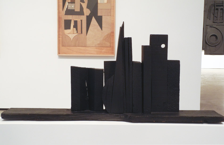
Moon Spikes, 1953; wood painted black, 22 3/4 x 49 3/4 x 7 3/4 in.


I'd like to end with a small early sculpture by Nevelson. In it we can see her desire to place shape next to shape and to see what conversation emerges. From the book Dawns and Dusks by Diana MacKown, 1976, (found on the Louise Nevelson Foundation site) is this quote from Nevelson:
When I compose, I don't have anything but the material, myself, and an assistant. I compose right there while the assistant hammers. Sometimes it's the material that takes over; sometimes it's me that takes over. I permit them to play, like a seesaw. I use action and counteraction, like in music, all the time. Action and counteraction. It was always a relationship – my speaking to the wood and the wood speaking back to me.


December 18, 2014

New Potato Prints, With Collage


Untitled 64, ink and pasted paper on Akatosashi paper, 14 x 10 in.


As is my wont, seeing an art exhibition has inspired new ideas for my work, in this case the marvelous show at MoMA, Henri Matisse: The Cut-Outs. I began by painting some paper shapes, using my Japanese printmaking papers; then I glued them to sheets of paper, taking some time to figure out a placement that would have some energy. Once the papers were dry, I added ink using potato stamps, as with my previous potato prints. In the print above, the yellow-orange rectangle is pasted paper, and the thick red line is printed. Because I used thin Japanese papers, there is a lot of wrinkling and shrinking from the pasting process.


Untitled 65, ink and pasted paper on Twinrocker paper, 7 x 15 1/4 in. 


Untitled 66, ink and pasted paper on Twinrocker paper, 14 x 10 3/4 in.


When I used a heavy weight handmade paper, such as the Twinrocker above, there was no wrinkling. But it's odd, I prefer using the more delicate papers for this work; there's something about the vulnerability of the thin paper that is very attractive to me.


Untitled 67, ink and pasted paper on Akatosashi paper, 7 1/2 x 13 in.


In Untitled 67  I tore a triangle from a piece of Gifu Green Tea Light paper, which is a spotted white. I balanced it with a printed white square.


Untitled 68, ink and pasted paper on Gampi Smooth paper; 2 panels, each 15 x 12 in.


The pale green rectangles of Gifu Green Tea Medium paper are close in value to the warm-colored ground paper, Gampi Smooth. Because they are both quite thin and a lot of glue (I used wheat paste) was needed for the large pieces of pasted paper, the work is quite wrinkled. I can't decide if it's a distraction or an integral aspect of the process, but I didn't dislike it enough to discard it. 


Untitled 68 detail


 I added lines of a pale white slightly tinted with green to unify the composition.


Untitled 69, ink and pasted paper on Nishinouchi paper, 10 1/2 x 20 in.


A long red rectangle of pasted paper holds up some fading circles rolling on a blue horizontal. This paper, Nishinouchi, is a heavier handmade paper, so wrinkling is less evident. I am considering using my heavier Japanese papers for my collage/potato print hybrids. Feedback is welcome; you can see the images better if you click to enlarge them.


Untitled 70, ink on Gampi Smooth paper, 15 x 25 in.


Finally, a print that has no pasted paper on it. I stamped the four shapes, then stopped to think: I had planned to add something in the center, but as I looked at the print, it seemed less and less necessary to me. I'm still not sure that the print has any value, but I'm glad I left the center empty.