September 12, 2012

A New Painting: "Black Lozenges"


Black Lozenges, egg tempera on calfskin parchment, 7 x 5 1/2 in.


I am so happy that I still love painting. Days went by with me busy with other projects––textiles, prints, photography, blogging, processing garden produce––and not sitting at my work table, brush in hand. Sometimes I wonder if all these activities, which give me tremendous pleasure, would supersede my first art love, painting. But then I began to work on this new painting, and felt again the calm satisfaction of putting paint on a surface, layering paint bit by bit until I had convincing form and light. It takes a quiet concentration of almost meditative quality that my other pursuits can't match. As much as I love abstraction, there is magic for me in making an illusion on a two dimensional surface. 


I'd just written a blog post on translucence, which you can read here, so I had it on my mind. Instead of using black paint for the dark shapes, I decided to paint thin layers of color, which would create a richer and deeper black. I began with a Cadmium red purple, then added Phthalo green, and then Ultramarine blue. I sometimes went back and forth with the colors until I had the black I wanted. 

I'd like to also speak to my description of these shapes, which I call "lozenges" because they remind me of pill forms. But according to Wikipedia, lozenges are elongated diamond shapes. I tried looking up "oval with straight sides" and came up with only "stadium shape" or "racetrack shape".  It boggles my mind that there's not mathematical term for this shape, since it is fairly widespread. If anyone has the answer to this, please let me know. 


I like the repeated curved forms in this image, side to side, up and down. They unite what might otherwise be a divided composition.


September 11, 2012

Flowers of Late Summer

Cosmos


Summer is drawing to a close: the days have a crisp, clear quality; the vegetable harvest is peaking; the trees are showing some autumn color as their chlorophyll begins to disappear. But in the garden, some flowers come into their full glory at this time of year. The annuals in the vegetable garden add bright color to the fading plants around them. The cosmos dance about above delicate foliage.


Lavatera


Lavatera forms a dense mound of color, almost tropical in feeling.


Sunflower, Red Sun


Although some of the sunflowers have finished blooming and are producing seed (which a local gray squirrel is finding very attractive) some are still showing brilliant color.


Shirley Poppy


Poppies bloom most profusely in late spring into early summer, but there are some popping up now, like this frilly double, pink alongside the red of tomatoes. 


New England Aster 


The cultivated New England Asters have escaped the formal flower borders and now bloom alongside their wild cousins around the pond. 


Cimicifuga racemosa Atropurpurea


Most late flowers are saturated reds and yellows, violets and pinks, but Cimicifuga sends fragrant white spires seven feet in the air. They are deliciously attractive to insects, and to me. 


September 10, 2012

A New Textile: "Egyptian Birds", A Diptych?


Egyptian Birds, hand dyed wool on linen; two panels, each 9 x 9 in.


After writing a blog post about Egyptian Predynastic art, which you can see here, I thought I'd make a textile homage to the stone palettes of the period, which have such beautiful and graceful shapes. They are simple works, so to keep the textile simple I decided to use the technique of cutting the loops of wool to create a low relief effect. I've used this technique twice before––see one example at the end of this post––but not for a few years; it's good to be reminded of it. I hadn't originally planned on a two-panel work, but after finishing Purple Fowl, it seemed that it could use a companion, so I worked up some studies and settled on what became Turquoise Falcon. The problem is, I'm not satisfied with it; the shape doesn't please me, even though I liked the study.


Purple Fowl, hand dyed wool on linen, 9 x 9 in.


I enjoy the full curves of the form, narrowing to in a thin shape. 


Purple Fowl, detail


In this detail, you can see how the cut loops look against the complete ones.


Turquoise Falcon, hand dyed wool on linen, 9 x 9 in.


This piece doesn't have the grace of the other for me; it looks too much like a map of Africa. Of course you can chime in with your opinions, as they're always welcome, but I think that the diptych Egyptian Birds is no more, and that only Purple Fowl remains. 


Ovals (for Robert Mangold), hand dyed wool on linen, three panels, each 16 x 7 in.


September 7, 2012

Translucence


Did seeing light passing through the delicate petals of a flower....


or through leaves, illuminating them in an unearthly glow....


Two Border sections; France ca. 1200; pot-metal glass and vitreous paint. At the Cloisters, NYC.


...inspire the builders of ancient churches, leading them to include the art of stained glass in their windows? The effect of light pouring through color, illuminating it as though it is shining from within, is very different from that of light bouncing from a solid surface. Both are beautiful, but there is something additional that comes with translucence, a sense of the spiritual, as light bonds with color. 


Georges de la Tour, Saint Joseph the Carpenter, 1640s; oil on canvas, 54 x 40 in.


Georges de la Tour often shows dramatic light effects in his paintings, and in this work he goes farther by showing the Christ child's hand as translucent; the light becomes a part of the fingers, as though to point to the child's future. 


Henri Matisse, Lilacs, 1914; oil on canvas, 57 1/2 x 38 in. 


Through the Renaissance, many painters used translucence to great effect by using thin layers of color, glazes, to make their paintings. When we come to the modern era, most artists worked directly with paint, without glazing or scumbling. Matisse, in a painting from one of my favorite years of his work (which I wrote about here), is using the oil paint thinly, so as to get the effect of light passing through it. In the upper left corner, he is showing the flowers shining against the dark.


Altoon Sultan, Fertilizer Tanks, Baton Rouge, Louisiana, 1997; egg tempera on panel, 9 x 10 7/8 in. 


From the glorious to the very mundane: I have enjoyed painting images of plastic because of its translucence, the way the light shines through it, making a very ordinary object glow with vibrant life. And one of the qualities of egg tempera that has kept me working with it exclusively is that it is a translucent paint––between the opacity of oil and the transparency of watercolor––that allows for rich color effects. As much as I love the sparkle of sun on the landscape and light's flow over an object, there is a special joy in seeing color's translucent jewel-like shine.


September 5, 2012

New Prints: One Cardboard and Two Potato


Baby Blue, ink on Gifu green tea light paper; image size 8 x 20 in, paper size 16 1/2 x 28 in; ed. 4


After working at Cone Editions on digital prints (which I wrote about here), I began to think about pushing my cardboard prints a little larger. The composition for Baby Blue (lightheartedly named for the color, though I couldn't stop thinking about the song by the Echoes while I was working on it) was originally going to be made up of three ovals, so I expanded it to five. I like the sense of a huddled group that comes from the additional shapes, although I miss the iconic quality of three. To get the color, I used a new tube of ink that I'd gotten from Graphic Chemical, a cobalt blue, which I mixed with a bit of orange and some white. My other ink supplier, Daniel Smith, has only a phthalo blue, which has a very different character. 


Baby Blue, detail


I wanted to show a detail of this print so you could see the mottled surface of the paper. I chose it because I thought that its tiny specks went along with the spirit of the image, and added some life to it.


Blue Cloud, ink on Masa dosa paper, 15 x 12 in.


I work on my prints in my kitchen, so when I set up for pulling a cardboard print edition, I extend the working session by using leftover ink for some potato prints. I generally do between 8 and 12 prints, pleasurably stamping away with potato shapes. This session though, did not go well, and though I did around 10 prints, I was happy with only two, which is why they don't have their own blog post as usual. Sometimes I do something that is so simple, so buoyant in feeling, that it makes me really giggly (this is aside from any judgment of quality). Blue Cloud was like that; it seemed complete with just two shapes. 


Blue Cloud detail


The blue comes from the color mixed for the cardboard print, stamped using an irregular oval shape. I chose to pair it with a slightly more regular circle, but a circle made of a mix of colors. It seems that sometimes I can't resist metaphoric titles, a lot more fun than "blue oval".  


Waves, ink on Masa dosa paper, 17 x 22 1/2 in. 


More metaphor in titling, as the shapes bounce along. In both these potato prints I've placed shapes toward the center of a larger sheet of paper; for me there's something touching about them floating, surrounded by all that empty space. I don't want to solely rely on this as a compositional strategy, but it's quite wonderful to work with as one idea among others.


September 4, 2012

Labor Day, and Lewis Hine's Child Workers

John Dempsey (looked 11 or 12 years old) who said he helped only on Saturdays, working faithfully in the mule spinning room. Jackson Mill, Fiskeville, Rhode Island, April, 1909. 


Labor Day is not simply a day to commemorate the end of summer; sometimes it's good to remind ourselves that it is meant to honor workers, and that we have come a long way as a nation since the holiday was established in 1894, soon after the terrible violence of the Pullman Strike. Thinking about this, I dug up my old book of photographs of workers by the passionate reformer, sociologist turned photographer, Lewis Hine (1874 - 1940): Lewis W. Hine and the American Social Conscience. His images of children at work are heartbreaking, and powerful.


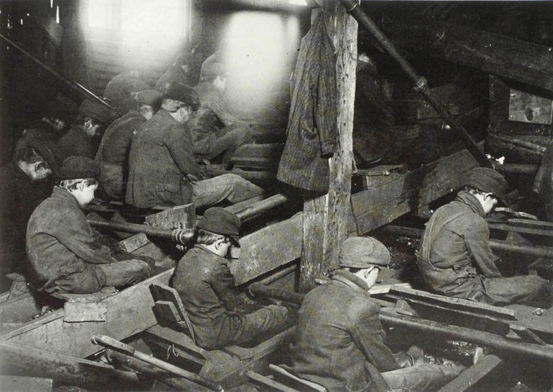
A view of the Pennsylvania Breaker. The dust was so dense at times as to obscure the view. South Pittston, Pennsylvania, 1911.


Hine was the photographer for the National Child Labor Committee for 10 years beginning in 1908. It is shocking to read the history, at the link, of attempts at reform of child labor laws. The Owen-Keating Act of 1916, meant to outlaw child labor, was deemed unconstitutional in 1918. It wasn't until 1938 that the Fair Labor Standards Act prohibited "oppressive child labor". And the "breaker boys" above were certainly oppressed, as they worked in awful conditions to separate coal from its impurities.


Neil Gallagher, Worked Two Years in Breaker. Leg Crushes Between Cars. Wilkes Barre, Pennsylvania, November 1909.


 The work was also very dangerous. Hine presents his evidence in a clear, matter of fact manner, allowing us to have a direct look at his subjects. In addition to being valuable as documents, his works have a strong formal presence.


Indiana Glass Works, 9 PM, 1908


Young boys in the glass industry were known as "blowers dogs" who carried the product from the glass blower to the cooling oven. It was another dangerous and unhealthy occupation.


Leo, 48 inches high, 8 years old, picks up bobbins at 15 cents a day. Fayetteville, Tennessee. November, 1910. 


Even a small child has great dignity through Hine's eye. Lewis Hine brought these individuals, their lives and work, to the attention of a wide public; he certainly can be credited with the movement toward a humane treatment of children. Looking at these photos, I find it hard to believe how terrible things were, even though I know such conditions still exist in other parts of the world. I tip my hat to the workers of the world, and wish them safe and healthy and just working conditions.


August 30, 2012

The Curves of Yesteryear


What is it about old automobiles that draws our admiration? is it simply a nostalgic longing for the good old days, a sentimental walk down memory lane? or is there actual beauty in their design? I would say that there's something of both at work. I recently saw this deep red 1951 Ford coupe parked at a garage on a back road; the color, the chrome, the generous curves, made for a striking design. Every detail seemed considered, from the repeated circles of headlights to the exact curve over the headlight, which then dipped down and rose again over the hood.


When I look at photos of cars from the 1940s or 1950s cars before the age of fins, I see lots of luscious curves, and can't help but think––especially since men had a habit of calling cars "she", along with ships––that the designers caressed them as they would a woman's body. Then there's all that shiny chrome which seems a symbol of modernity. In the days before the Interstate Highway System, which was authorized in 1956, a car must have been a status symbol, an emblem of freedom, and of the open road. There was "See the USA in your Chevrolet". I don't think we have a romance with our cars in quite the same way anymore. 


And on the hood, a rocket, a paean to the Jet Age, a time of excitement and new possibilities, and new prosperity after the war. 


The round shape of the cantilevered rear view mirrors echo the circles of headlights. 


The tail light is inspired wackiness, with its long pointed oval and three protuberances, like a rocket turned on its side.


The wheel cover is elegant, and the three ridged lines emphasize forward movement. 


I loved seeing that amid all the curves in this car, there was one element that had straight sides: the gas cap lid. 


The door handle and lock also have a jet age look with the zoom of pointed sides. I like the little detail of parallel lines in front of the button, again suggesting speed like the lines on the wheel cover. 


Here's just a little comparison with a very non-romantic vehicle, my 2006 Subaru Forester. The design is simple and uses easy-care materials, but the round key hole does not work with the oval scoop behind the handle; the lines of the handle do not line up with that scoop. Those are just small design decisions that make the vehicle utilitarian and not artful. 


Even the rear of this car has pizzazz, and I can imagine it cruising down a highway that used to be, garnering attention from the smattering of autos on the road. I cannot imagine that in 50 or 60 years anyone will be feeling nostalgic about today's cars, except for a very few exceptions; good design does count. 


August 28, 2012

Some New Potato Prints


Green Squares, ink on Masa dosa paper, 23 x 18 in.


My varied printmaking ventures––with cardboard plate multiples; with digital prints; and with these images made by cutting shapes from potatoes, dipping them in ink, and stamping them on paper––have been giving me a lot of pleasure. I'm able to explore new kinds of imagery and push myself in new directions. This leads to a lot of flopping on my face, but that's okay. It also leads to a lot of uncertainty as to how to assess what I'm doing. I'm beginning to be more relaxed about throwing work away; since the potato prints are fast and intuitive, there are bound to be a lot of duds. One thing I'm learning is that I like working on a large sheet of paper, such as the one above, so that the image can have lots of breathing room. 


Four Square, ink on Nishinouchi paper, 12 x 10 in.


I'm also figuring out that sometimes a very simple image feels right...


Balancing, ink on Akatosashi paper, 4 3/4 x 13 3/4 in.


although I also enjoy the fun and humor of this more complex print. 


Dropping, ink on Sansui SH8 paper, 19 x 10 in.


I like using the same shape, stamping it over and over as it runs out of ink. 


Escape,  ink on Masa dosa paper, 8 x 23 in. 


 Like in my textiles, geometry has an irregular presence in the prints.


Black Boxes, ink on Gifu green tea medium paper, 15 x 13 in.


...enclosed and open...


Crisscross, ink on Twinrocker paper, 18 x 23 1/2 in. 


This print is on a beautiful sheet of handmade paper that's been in my drawer for years. (I regret that my photographs don't give a better sense of the paper surfaces.) When I'm working on a large sheet of paper, I have to put my fear of wasting paper aside, and just plunge ahead as though it's a sheet of cheap newsprint.


Inward, ink on Masa Dosa paper, 7 x 12 in. 


Here I'm playing with an empty center and the pull of shapes toward each other. I feel that these prints express different moods, though mostly balanced toward the lighthearted. And although I can feel like I hit a brick wall (my most recent potato print session was mostly trash), working in this medium is still a surprising joy.


August 27, 2012

A Monarch Emerges


A week ago, on August 18th, while sorting through some swiss chard leaves that I was about to wash in preparation for blanching and freezing, I was surprised by this small, elegant, jade-colored chrysalis attached to a leaf. At first I didn't know what it was, since this is its back and it is usually photographed from its gold-banded front. It is the chrysalis of a Monarch butterfly, and I'm very glad I didn't boil it. I put it back in the garden, propped up in the swiss chard.


 9:52 AM


Well, yesterday it happened again. I found another chrysalis on the swiss chard, just in time before it was boiled. It looked a little further along in its growth than the previous one, and I put it back in the garden. I was very surprised this morning, when I went to check the two chysalises, that the one I found yesterday had turned black overnight (the previous one just has dark spots and I think it will not mature). This is an indication that the butterfly will emerge soon.


10:38 AM


A little later and I could see the Monarch's orange wing showing through as the chrysalis became more transparent. From online research, I thought I had at least a half hour before the butterfly would begin emerge from its small container, so I went in the house to do some chores for 20 minutes. 


11 AM


 Oh! how sad I was to return at 10:58 (the first photo I took of the butterfly had that time stamp) to see that I had missed the process of unfolding from the chrysalis. But what a beautiful creature, and how amazing that it emerged from that one inch, delicate shell so quickly.


12:03 PM


An hour later it had tentatively begun to open its wings as they dried and hardened. It moved higher on the leaves until it was close to their top. By 1:30 it was gone, flown off on its adventures. It is a delight to see these bright butterflies flitting here and there, high in the air, and down to sip on flowers. Their  transformation from caterpillar to chrysalis to butterfly is a magical one and lends their existence an air of mystery and metaphor. They are freedom; they are possibility.