February 14, 2013

New Drawings


#9, egg tempera and graphite on hand toned paper, 15 x 15 in. 


When I find compositions within the Islamic design pattern of six circles around one, (you can read in this blog post how I came to be working in this way), I sometimes paint an image that seems to come from another culture, another century. The orange and green shapes, on a dark ground of burnt siena, are for me reminiscent of India. I like how the dark ground becomes positive shapes at the center, creating petal forms around the two shapes formed by overlapping circles, known as vesica piscis


#10, egg tempera and graphite on hand toned paper, 15 x 15 in.


This composition is much simpler, with just four elements, but it wasn't simple to arrive at colors that worked. When I set up my work table to tone paper, I like to play with different hues and values, and it's great fun to see what my color mixing will come up with. Then I have to decide which colors I will paint the shapes; I have watercolor studies, but they are on white paper, so my approach has to be different once I have the colored grounds. When I began this piece, the yellow was closer to an ochre and the blue more of a blue-gray. After looking at it unhappily for a few days, I realized that those colors were too dull for the intensity of the background orange; once I changed the colors, I was much more satisfied with the piece.


#10 detail


One thing I'd like to point out is that I am a far worse craftsperson than Islamic masters. Those curves are supposed to meet in the same place, so that the petal forms are clearly defined. I can never seem to be that exact, and the centers of my circles wobble about. But I don't worry about it; it's fine with me.


#11, egg tempera and graphite on hand toned paper, 15 x 15 in.


Color decisions don't only involve hue, but also value and translucency. Here I decided to have dark violet diamonds surrounded by lighter shapes, but the yellow at center is the most intense. It is also the only translucent shape, so that we can faintly see the pencil lines beneath it. 


#11, detail


Some pigments are naturally more translucent than others; I can also add Titanium white to a color to make it more opaque. When I saw that the yellow was tending toward translucence, I used that quality and contrasted it by mixing more opaque colors for the blue and violet.


#12, egg tempera and graphite on hand toned paper, 15 x 15 in.


Two red half-circles balance, tilted, on a stable orange one. All three shapes are translucent, so the underlying drawing ties it all together, and adds a bit of whimsy to the strong shapes. I am still fascinated by the range of expression that emerges in these drawings, all based on the same pattern of overlapping circles.


February 12, 2013

A Winter Garden


Even during stark winter there is beauty to be found in the garden. The circle of an urn, dark upon snow, has a massive geometry beneath the complex deep reds of sedum seed heads. Today I visited my friend Chris Esten, whose garden during the growing season is a thrilling place to see. I wrote about it in this blog post, if you'd like to see it in its glory. She is also The Green Reaper, with a great list of plants, some of which are in my own garden. 


Her winter garden is full of visual delights; I could see things unnoticed during summer, or, as in the case of this exfoliating tree, things that only happen in winter. The thin strips of bark expose a cool, smooth underlayer.


There are stems that glow a beautiful warm color in winter.


And stems that shoot skyward in curving exclamations. The enormous Paulownia plant makes a stunning statement even in winter.


The loose petals of hydrangea are supplemented by the crisp, richly colored forms of seeds. 


And here, a graceful flow of a hosta flowering branch shows its seed containers opened, and black seeds hidden inside.


Shrubs are protected by netting, and look like women in old fashioned hats with veils.


Conifers are bejeweled with icy droplets.


The flower buds of a magnolia are fuzzy cones that I thought were pussy willows, even though it was much too early for them. But no, magnolias form their buds in fall and carry these lovely forms all winter, holding within them the promise of spring. 


February 10, 2013

At the Met: The Character of Cloth


Marble Relief with a Dancing Maenad, Detail, Roman ca, 27 B.c-A.D. 14, copy of a Greek relief.
See the entire sculpture here.

When walking through the galleries at the Metropolitan Museum of Art, my attention is often caught by an aspect of a larger work that encourages me to explore it as a theme. On my recent visit it was the expressive qualities of fabric, something not usually thought of as animated, that in two and three dimensions heightens the emotional charge of the subject. The figure in this relief is lovely and graceful, but it is in the swirling, lifting dress that we feel the dance, the movement and joy. 


Enthroned Virgin and Child, Detail, North French, ca. 1210-20; oak with traces of paint.
See the entire sculpture here


The sharp edged, precise folds of the Virgin's robe have reserve and dignity...


Enthroned Virgin and Child, Detail, German, ca. 1280; oak with paint.
See the entire sculpture here.


Claus de Werve, Virgin and Child, Detail, French, ca. 1415-17; limestone with paint and gilding.
See the entire sculpture here


...while in these two works, the Virgin's robes have a weighty voluptuousness, adding an earthy sensuousness to the tenderness of the figures. Especially in the case of the de Werve, the voluminous robes imply the Virgin of Mercy, who shelters humankind under her cloak.


The Annunciation, Detail, Austrian, ca. 1390; limestone with traces of paint.
See the entire sculpture here


These folds are almost lyrical in their gracefulness, the cloak falling in overlapping rivulets down the dress, a beauty commensurate with the moment of the Annunciation


Mourning Virgin from a Crucifixion Group, Detail, French, ca. 1450-75; walnut with traces of paint.
See the entire sculpture here


The severity and clarity and monumentality of these folds speak of a reserve of strength in grief.


Benedikt Dreyer, Meeting of Saints Joachim and Anne at the Golden Gate, Detail, German, ca. 1515-20; oak with paint and gilding. See the entire sculpture here


In this work, I love seeing the different character, male and female, of the drapery: Saint Joachim's cloak flies outward with billowing freedom, while that of Saint Anne hangs quietly from her hand.


Copy after Robert Campin, Virgin and Child in an Apse, Detail, ca. 1480; oil on canvas, transferred from wood. See the entire painting here


Hans Memling, Virgin and Child with Saints Catherine of Alexandria and Barbara, Detail, 1479; oil on wood. See the entire painting here


Gerard David, The Annunciation, Detail, 1506; oil on wood.
See the entire painting here


Oh, the glory of the cloth in these three Netherlandish paintings! Looking at them, I feel that the artists took as much pleasure in painting the intricacies of the folds of clothing as they did in faces. They are all rich in color and solid in form, and sensitively observed. We could get lost in contemplation of these fabrics, from the light, ending points in the Campin, to the heavy, complex folds of the Memling, and to my favorite contrast: the downward flowing lines of the Angel Gabriel's robe, showing him come to earth, while his cloak still flies about around him: motion and arrested motion. Looking at these gorgeous forms makes me regret a little––just a little––that we no longer wear such expressive clothing.


*To see some other posts from the Met, click here.


February 7, 2013

A New Painting: "Untitled (Violet, Green, Yellow)"...Thinking of Edges


Untitled (Violet, Green, Yellow), egg tempera on calfskin parchment, 6 x 7 3/4 in. 


One thing I love about doing this new series of still life paintings is getting to play with saturated colors that I'd never see on a farm implement, my source material for previous paintings. I set up a still life with the basic hues, but invent from there. I take a photo of the still life setup––actually several photos, trying out different compositions––and use that as my "drawing" because it establishes a fixed point of view and light.


Untitled (Violet, Green, Yellow) detail


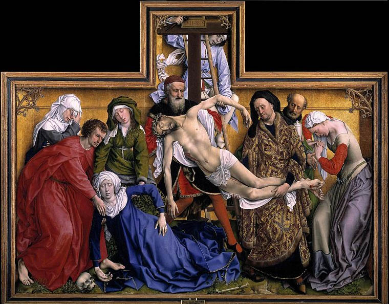
I also enjoy painting the soft curves of fabric, the light turning to dark, the sharper lines of shadow. In this painting I pushed the green curve up against the edge of the panel, thinking to have it interact with it, or with the space beyond. I like the idea of playing with the tensions inherent in form and edge; the yellow form also has a conversation with the bottom left corner. The Descent from the Cross, below, is a painting I often think of when composing:


Rogier van der Weyden, The Descent from the Cross, c. 1435; oil on oak panel, 86 1/2 x 103 in. 
photo courtesy Wikipedia. (click the link to see a high resolution image)


When I saw this grand painting many years ago at the Prado, I was amazed by the force of the figures squeezed into a shallow space. The compression added to its emotional power. One aspect of it that I loved is the way the two end figures lean against the frame of the painting, at left a foot, at the right a woman's hip; the folds of cloth also rest on the edge. This creates a incredibly convincing sense of actual space, actual form, on this brilliantly painted two dimensional surface. As I write this, and look at the van der Weyden, I realize that I should have turned the green form a little toward dark at the edge, to give it more of a look of resting against it. Maybe I'll change it, or maybe just let it go, and do better next time.


February 5, 2013

The Colors of White


White birch trees look so dramatically white with dark woods behind them, but close inspection of their bark shows subtle shifts of pale colors––pinks and yellows––spotted by darks, added to by grays.


Glowing yellow lines bleed into surrounding peeling bark, while lines left behind are less saturated.


Warm white, cool white, yellowish or pinkish or grayish white: today on my walk I was noticing all these hues, and they brought to mind my favorite aspect of Cézanne's still life paintings, their white cloths of many colors. 


Paul Cézanne, Dish of Apples, 1876-77; oil on canvas, 18 1/8 x 21 3/4 in. (Detail)
To see the entire painting in high resolution go to the Met's website


As much as I love the weighty presence of his apples, I love even more how Cézanne describes a white cloth by finding numerous hues within it: cool blues and greens in the shadows, broken by hints of pinky grays and yellows.


Paul Cézanne, Still Life with Apples and a Pot of Primroses, ca.1890; oil on canvas, 28 3/4 x 36 3/8 (Detail) To see the entire painting in high resolution, go to the Met's website


The surface is alive with touches of blues and greens (look at that little squiggle of green at the center). The cloth looks white alongside the heavy orbs of fruit, but like the birch bark, is really full of color, objects seemingly simple, yet rich with complexity.

*click to enlarge the images; you'll be glad you did.

February 4, 2013

A Luminous Field: Wolfgang Laib's "Pollen from Hazlenut"


Wolfgang Laib, Pollen from Hazelnut (photo courtesy NY Times)


A softly glowing rectangle on a raised platform is now a quiet space within the bustle of the Museum of Modern Art's dramatic atrium. The artist Wolfgang Laib gently sifted eighteen jars of hazlenut pollen, gathered over many years, making a simple, soft edged rectangle. When I saw this piece I thought it was very beautiful, and the pollen, which for Laib is an "essence of life", seemed to carry light within it. After watching the brief video on the exhibition website, and this video at ArtInfo, I am even more impressed with the quiet, patient process of gathering and sifting pollen.


I hadn't intended to write about this installation, but then two interesting, nearly heated discussions about the work took place on Facebook, hosted by artist friends, Ravenna Taylor and Chris Ashley. Prodded by the review of the piece in the NY Times by Ken Johnson, which you can read here, they questioned the very premise of the work, worrying that collecting pollen might damage the bee population. The other question, emphasized in Johnson's review, was does the work depend too much upon a cult of the artist, on his myth? do we have to know the story of the work to appreciate it, and if so, does this diminish the work? I personally found the Johnson review mean spirited and way off base, but then, I liked the work and he found it boring. All I needed to know was in the title, Pollen From Hazlenut; it told me that this gorgeous granular substance was pollen, containing male sperm cells, essential for pollination of plants. It was not pigment, or any other material; its meaning is inherent in the material and does not need further explanation, but it is of extreme importance that this is a stuff of life. Life that Laib calls "very ephemeral" but also "very eternal". I don't feel a great question coming from this work, of human beings' relationship to nature, but just a request to notice life as it is. 


The form of the work is minimal: a thin coat of material, a rectangle upon a rectangle. The color of the platform is gray, slightly tinted to red, which I thought worked well with the yellow of the pollen, increasing the contrast with its surroundings and adding to the luminous quality. In this detail, I see a reference to Mark Rothko's glowing paintings. 


This is a screen shot from one of the videos linked above, showing Laib collecting pollen from pine, shaking a branch so the pollen drops into the cup. He has been collecting pollen, spring to early summer, from various plants around his home for over 30 years, saving the pollen in jars and reusing it over and over. Since he works alone, in the quiet of the fields, gathering small amounts at  a time, I am certain that there is no harm to bees or plants. It is definitely not exploitative of the environment; plants produce much more pollen than they need, and because Laib works so slowly, there is plenty for the wind to carry or for bees to gather; since he is not pollinating plants, there will be no odd hybrids produced. This part of the work is very important to Laib, but I believe that even without knowing this part of his process, the piece at MoMA has presence, power, and meaning. I do not see him being a necessary part of his work, as opposed, for instance, to two other artists mentioned in the review by Johnson: Marina Abramovic and Joseph Beuys. Abramovic makes herself, her body, the center of her work, and it is often a tortured center; Beuys made his personal history essential to his. For me, Laib is a modest person, simply working away, paying attention to the world around him, inviting us to do the same, while producing beauty.


January 29, 2013

Two New Textiles: "Cherry Ribbon" & "Chartreuse Ribbon"


Cherry Ribbon and Chartreuse Ribbon


My two most recent paintings were inspired by the drawing studies for these textiles, which you can see at this blog post. Not only was I excited about making paintings based on these ideas, I was excited about the textiles too. I've enjoyed making shaped pieces––you can see two recent works here––but haven't done anything quite this sinuously complex. 


Cherry Ribbon, hand dyed wool on linen, 16 x 9 in.


I like playing with illusion, as imperfect as my attempts are. 


Chartreuse Ribbon,  22 1/2  x 8 1/2 in.


I also want the forms to be interesting, to hold the space around them in an energetic way.


Making these illusionistic pieces is a good deal more complicated than textiles with flat shapes. I dip dye a long piece of wool, gradually adding more and more of it to the dye bath so that one end is dark and it lightens gradually toward the other end. I then cut the wool apart into its graduated values, labeling each one, from 1 to 7. Being organized really helps the work along. The small hand-cranked machine you see clamped to the table is my wool cutting tool; it cuts the wool into narrow strips for hooking. 


I put some recent pieces up on my studio wall to see how they felt about each other; not bad, I think.


January 27, 2013

Sacred Landscapes: Australian Aboriginal Paintings at the Hood Museum

Lena Nyadbi, Jimbala, Jeering and Daiwul Country, 2001; ochres on canvas.


It is amazing to me that an art that comes out of a strong spiritual tradition, with deep roots over millennia, can seem so vibrant and fresh to my eyes. The Australian Aboriginal paintings on canvas can stand with the best contemporary abstraction in formal terms, with additional emotional weight coming from their meaning. There is a beautiful selection of these works currently in an exhibit, Crossing Cultures: The Owen and Wagner Collection of Contemporary Aboriginal Australian Art at the Hood Museum of Art.  I wrote a blog post about the paintings on bark in the exhibition, which you can read here; in this post I am showing the paintings of the central desert, which are mainly acrylic on canvas, which seems a strange medium for work so tied to tradition. The story of the beginnings of these paintings is very interesting: for thousands of years, Australian aboriginal painting was done on rocks, on sand, on bodies. It wasn't until 1971-2, when art teacher Geoffey Bardon encouraged the men at Papunya in central Australia to put their ephemeral sand paintings onto canvas, that a new world of painting began. At first the work was quite controversial; sacred designs meant to be solely for ritual and only seen by initiates were being shown. Soon the artists confined themselves to depicting symbols that were not secret and could be seen by the public, but they still used traditional dot patterning, and the paintings continued to be immersed in the sacred landscape. The curved forms in the painting above refer to caves where, in the Ancestral period, the fish Daiwaul took shelter from a group of women seeking to net him. He escaped by jumping over them and shedding his scales, which became varied colored diamonds in the landscape. This site in Western Australia, has been despoiled by a mine, now the largest producer of diamonds in the world.


Narputta Nangala Jugadai, Murrtja Kapi, 2003; acrylic on canvas.


Small curves, the mounds of hills separated by the blue of rarely running creeks in the artist's ancestral home. In this painting, she is paying homage to the land of her mother, south of Uluru, also known as Ayer's Rock.


Raymond Tjapaltjarri, Litjardi, 2005; acrylic on canvas.


Ronnie Tjampitjinpa, Fire Dreaming at Murmunya, 2003; acrylic on canvas.


In these two paintings, the linked circles represent the travels of Tingari men during the Ancestral period, when they created the land. Litjardi is a water site in the Western Australia desert, and at Murmanya the Tingari established the technique of burning the land for regeneration. It is wonderful to know the stories behind these paintings, but the images themselves, without knowing their meaning, have the power to enchant. 


Joseph Jurra Tjapaltjarri, Pukaratjina, 2006; acrylic on linen.


This remarkable painting, made up of thousands of dots making wandering lines across its large surface (all these paintings are medium to large sized; this one probably five feet wide), shows a water site. There the men would camp and weave hair-string belts which were worn during ceremonies.


Pukaratjina, detail


The dots are made by sticks dipped into paint. The technique has a mesmerizing effect as you follow the meandering marks.


Danny Gibson Tjapaltjarri, Mukula, 2009; acrylic on canvas.


Mukula, detail


I love the geometric patterning of this painting, with the sense of shapes moving outwards from a central site. This image is also about the journeys of the Tingari men of Ancestral times. Mukula is another ancient ceremonial site. 


Yukultji Napangati, Yunala, 2006; acrylic on canvas.


I felt awed when I stood in front of this painting; the power of its repeated dots, subtly shifting, was palpable.


Yunala, detail


Perhaps an online viewer can get more of a sense of this from the detail, which you can imagine spreading across the entire surface of the canvas. Yunala is a site were Ancestral women gathered food, the roots of the silky pear vine, twining underground.


George Tjungurrayi, Karrilwarra, 2009; acrylic on canvas.


Red and orange lines angle and curve in a stunning pattern that seems geometric and organic at the same time, or like a topographical map. Karrilwarra is an ancient site associated with the Snake ancestor, who created the sand hills, water soakages, and rock holes of the area.


Makinti Napanangka, Lupulnga, 2005; acrylic on canvas.


This painting was different from most in the exhibition with its free handling of expressive vertical marks, seemingly untied to a traditional expression. But I learned from the wall label that the lines refer to hair-string belts worn at the waist for sacred occasions. Lupulnga was a ceremonial site for women, and the artist's birthplace. Because this was a women's site I assume the artist is a woman; a good and important characteristic of the Aboriginal art movement is the large number of women painters involved. It is wonderful that the thousands of years of Aboriginal culture has interacted with the contemporary world to give us these works, so tied to the past yet so alive.

*To see a blog post on the bark paintings in this exhibition, click here.