September 16, 2013

Geometric Painting, Strict and Loose


Kazimir Malevich, Suprematism (Self Portrait in Two Dimensions), 1915; oil on canvas,
31 1/2 x 24 3/8 in.


I have long loved abstract painting, and within that broad field, I have most admired paintings using geometry as their form. There is something about the rigor of the stripped down canvases that moves me; it points to a sense of a reality at the heart of things, which I wrote about in a blog post "Geometric Abstraction: Toward the Essential". It was not until I began making textiles that I was able to explore my interest in abstraction, which has now expanded with making prints, drawings, and most recently, boxed paintings. Today I'd like to speak about the continuum within this art of reductive means, allowing a range of expression from severe to playful, austere to sensuous. Even with Malevich, that most serious of artists searching for purity and truth, his Suprematist compositions at times balanced color and shape in such a way as to seem buoyant.


Liubov Popova, Painterly Architectonic, 1917; oil on canvas, 31 1/2 x 38 5/8 in.


Another Suprematist, Popova pushed her dynamic paintings of overlapping planes into new territory by using unheard of color combinations: red and pink? ! This is one of my favorites of her paintings, and it's inspired works of mine, including a painting I'm working on now.


El Lissitzky, Untitled, ca. 1920; oil on canvas, 31 1/3 x 19 1/2 in. 


El Lissitzy, usually more restrained in his color choices, here plays with tilting rectangles of intense color. Pink makes another appearance, along with oranges and deep red, all contained within a light egg-like oval. In the three works I've shown above, I see play within an abstract structure of line and shape. 


Piet Mondrian, Composition in Blue and White, 1935; oil on canvas, 41 x 38 in.


It is uncanny how standing in front of a Mondrian painting, made with the most minimal of means––line and rectangle, primary colors and black––can be such a moving experience. I have felt that I was sinking into a world beyond appearances, that I was touched by the universal. The austerity of his work in reproduction is belied by the richness of the paint in actuality, so it is a human hand guiding us to his truth. What is so interesting to me is how he was affected by his move to New York City during WW II, moving away from his black lines and into a more visually dynamic imagery with "Broadway Boogie Woogie".


Hélio Oiticica, Painting 9, 1959; oil on canvas, 45 3/4 x 35 1/8 in.


Oiticica was a Brazilian artist who did some marvelous installations of hanging colored planes, one titled "Homage to Mondrian", which you can see here, and paintings which are indebted to the artists above but which tweak that tradition. Here the rectangles are slightly askew, bumping up against each other in a jittery dance.


Blinky Palermo, Speaker in a low voice II, 1969; two pieces: cotton and cotton on wood; 
31 1/2 x 84 1/2 and 22 1/4 x 43 1/4 x 4 in. 


The German artist Blinky Palermo expanded the parameters of minimalism, especially in his final complex work "To the People of New York City", which you can read about in an excellent blog post by the painter Steven Alexander. In this earlier piece it is as though he is thumbing his nose at a strict interpretation of what makes a painting; he simply hangs a piece of red fabric above a stretched piece of the same fabric, variations on a rectangle.


Harvey Quaytman, Untitled, 1991; acrylic and rust on canvas, 46 x 46 in. 


Harvey Quaytman (you can see more of his work here) uses crisply formal shapes, but the thing you can't tell from a photo is that he creates a surface so gorgeous, so elegantly rich, that it's almost dizzying.


Mary Heilmann, Little Mondrian, 1985; acrylic and watercolor on canvas, 30 x 22 in.


Mary Heilmann's paintings use the history of minimalism as fresh jumping off points, a way to joyously paint over a loosened geometry.


Richard Tuttle, Ten, D, 2000; acrylic on plywood, overall 40 x 40 in. 


Tuttle also has a way of subverting geometry; although it is part of the structure, it is allowed freedom to waver and drip. I think of Tuttle's and Heilmann's work as a "funky" minimalism.


Stephen Westfall, Tunnel Vision, 2006; oil and alkyd on canvas, 24 x 30 in.


Another way to subvert geometry while using it is with humor and association. Here Stephen Westphall, with very crisp and precise shapes, wittily reminds us of the everyday, what had been ordinary air mail envelopes.


Ellsworth Kelly, Curves on White (Four Panels), 2012; oil on canvas; four paintings, each comprised of two joined panels; 70 x 54 in, 60 x 60 in, 70 x 44 in, 60 x 60 in. See high resolution image at 
Matthew Marks website


Finally, one of the great contemporary painters: Ellsworth Kelly, who is still producing beautiful work at 90 years old. When I first saw this image online (I unfortunately wasn't able to see the show) it was a jolt, then a feeling of exhilaration: flat colors and simple curves touched a life force, a reality as essential as that of Malevich and the Suprematists, though in a brighter key. I love thinking about the myriad ways these artists, and many others, approach geometry; they have inspired me, moved me, given me ideas, and deep pleasure while spending time with their paintings.


September 12, 2013

Evening Light, Late Summer


The sunlight becomes noticeably different by mid-August, as the sun travels lower in the sky. And now, in early September, the raking light in evening is especially beautiful; it illuminates the late blooming flowers....


...and the crops of late summer. Onions, just pulled, glow as though lit from within.


The leaves of carrots and beets become more than their ordinary selves...


...while red cabbage leaves look like stained glass windows.


September is the month for ripening tomatoes, which hang in the evening light like lanterns. After the summer's heavy rains, the plants aren't healthy, but nevertheless I've had a decent crop for canning.


Cool greens become golden in early evening.


Dill flowers are bursts of light against the dark woods.


Pumpkins are glowing orange and green, not yet ripe. Winter squash crops were also badly affected by the wet weather, so I'm hoping that they will ripen before a hard frost.


I love the colors of sunflowers amid the vegetables during summer; now the heads are mostly hanging dark and heavy with seeds, for the birds to enjoy and for next year's flowers.


September 9, 2013

A New Painting: "Emerging Black"


Emerging Black, egg tempera on calfskin parchment, 6 x 8 in.


This painting was a clear example to me of how my vision changes from one year to the next: a while ago I was looking through some of the photos I took last summer, 2012, for paintings, searching for something else and I came across this image; it was a reject at the time. (I take lots and lots of photos; the ones I like I save in folders; the ones I really like I make paintings of.) When I saw it again I thought...hmm, this is interesting; why didn't I like it last year? I was now fascinated by the large black forms emerging from the curved red surface, volume against plane, with the curves all rhythmically interacting.


Emerging Black, detail


I was surprised how difficult it was to get a black that had a warm hue––it kept looking too blue––but after much overpainting I finally got the effect I was after, a black that was lively and balanced the red, which I deliberately kept on the cool side, warming it slightly as the plane moved forward. My last post on the picture plane is somewhat relevant here, as the black forms see to want to burst from it, but being  broken by the edges of the panel they are flattened again.


September 7, 2013

Breaking the Picture Plane: A Tradition of Trompe l'Oeil


Philip Pearlstein, Female Model on Eames Stool, 1978; oil on canvas, 48 x 60 in.
See a high resolution image on the Metropolitan Museum of Art website.


Recently, a friend visiting the studio objected to one of my cloth paintings––a diptych you can see here––because it broke the picture plane. Their comment got me thinking about the modernist credo of "the integrity of the picture plane", and why it wasn't of importance to me; matter of fact, I take a kind of glee in illusionism, in the sense of the thing depicted popping off the surface of the painting. The phrase comes from a Clement Greenberg essay of 1960 titled "Modernist Painting". In it he writes:
The Old Masters had sensed that it was necessary to preserve what is called the integrity of the picture plane: that is, to signify the enduring presence of flatness underneath and above the most vivid illusion of three dimensional space. The apparent contradiction involved was essential to the success of their art, as it is indeed to the success of all pictorial art. The Modernists have neither avoided nor resolved this contradiction; rather, they have reversed its terms. One is made aware of the flatness of their pictures before, instead of after, being made aware of what the flatness contains.
I agree wholeheartedly with Greenberg that there is an "apparent contradiction" in the essential flatness of that window that is the picture surface but can contain illusion. For me, it leaves an opening to play with the back and forth that illusionism provides; it does not proscribe it. I also realized that my attitude of "why not break it?" must have come from my teacher Philip Pearlstein, who wrote, in an undated essay about painting from direct observation:
Photographs do not break the picture plane, and so they parallel one of the great dictums of 20th century modernist art, which is that form follows function. The paper is flat, that is, the picture plane is flat, therefore the artist must keep his picture flat. Therefore the photograph is accepted as modernist art. Therefore one of my aims in painting is to break the picture plane.
In the Pearlstein painting above, that knee juts out and pops through the picture plane.


Wall painting from the west wall of Room L of the Villa of P. Fannius Synistor at Boscoreale, ca. 50-40 B.C.; See a high resolution image on the Metropolitan Museum of Art website


There have been many practitioners of "trompe l'oeil", fool the eye, painting throughout the history of art, who take a deep pleasure in an intense illusionism, to the point of the viewer having to step close to the work to confirm that indeed it is flat. The Greeks and Romans were especially interested in illusion in their paintings, which often have architectural elements that seem real alongside the flatter planes of color. In the Wikipedia entry on trompe l'oeil, there's an old Greek story that I first heard many years ago:
A version of an oft-told ancient Greek story concerns a contest between two renowned painters. Zeuxis produced a still life painting so convincing that the birds flew down to peck at the painted grapes. A rival, Parrhasius, asked Zeuxis to judge one of his paintings that was behind a pair of tattered curtains in his study. Parrhasius asked Zeuxis to pull back the curtains, but when Zeuxis tried, he could not, as the curtains were Parrhasius's painting––making Parrhasius the winner. 

Franceco di Girogio Martini, Studiolo from the Ducal Palace in Gubbio, 1478-82; See a high resolution image on the Metropolitan Museum of Art website, plus more views.


A truly marvelous work in this genre is this room which you can see at the Met. Its illusions are uncannily convincing and the workmanship superb. It is made of finely inlaid woods: walnut, beech, rosewood, oak and fruitwoods.


Franceco di Girogio Martini, Studiolo from the Ducal Palace in Gubbio, 1478-82, detail


The objects that you can see through the "open doors" reflect the inquiring mind of Duke Federico.


Rogier van der Weyden, Francesco d'Este, ca. 1460; oil on wood, 12 1/2 x 8 3/4 in.;
See a high resolution image on the Metropolitan Museum of Art website


Some old masters consciously brought our attention to the picture plane by placing an object or a hand at its edge, as in this van der Weyden portrait. The hand rests on a ledge which is equivalent to the lower edge of the painting, making the two hands seem physically present in our space. 


Frans Hals, Petrus Scriverius, 1626; oil on wood, 8 3/4 x 6 1/2 in.; See a high resolution image on the Metropolitan Museum of Art website.


Frans Hals pushes the idea a little farther as hand and glove emerge from the portrait's frame. If we think of the picture plane as being continuous with the frame, the hand certainly breaks that plane.


Juan Sanchez Cotan, Cardoon and Parsnips, ca. 1604; oil on canvas, 24 13/16 x 33 7/16 in.


Many still lives, such as this by Sanchez Cotan, have objects protrude past a frame or a table, calling attention to painting's magical illusions.


Vicente Victoria (1650-1709), Arms.


Some of the most effective trompe l'oeil paintings depict objects hung on a wall, a shallow space more easily portrayed as an illusion.


Charles Wilson Peale, Staircase Group, 1795; oil on canvas, 89 1/2 x 39 3/8 in. High resolution image at Google Art Project.


In the United States there was a lot interest in the notion of illusion on a flat surface, which Peale enhanced by adding an actual wood frame surrounding the canvas, with one actual wooden step on the floor. This is a very witty commentary on flatness and illusion. 


Martin Johnson Heade, Gremlin in the Studio, ca. 1865-75; oil on canvas, 10 1/8 x 14 1/4 in. 
Collection of the Wadsworth Atheneum


Humor intensifies in this landscape by Heade. A flat little creature under a canvas propped up on saw horses seems to have managed to open the bottom edge of the painting in order to allow the pond water to escape....naughty fellow!


John Peto, Lock and Key, 1890s; oil on academy board, 8 x 6 in. 


Trompe l'oeil was very popular in the 19th century and William Harnett was probably its most famous practitioner, but for me John Peto is a much superior artist. I go back to Clement Greenberg's quote above to explain why: Peto is always aware of the paint and of the flat plane that he's working on, while with Harnett's paintings I see a total immersion in illusionism so that detail overwhelms the sense of a whole.


John Peto, Toms River, 1905; oil on canvas, 20 x 16 in. 


The tangibility of Peto's paintings comes from a tender love of their objects so strong that I feel a yearning towards them, a desire to touch, and to understand their quiet emotional power. I believe that nostalgia is part of the mix, that longing for the lost past, but of greatest importance, Peto makes us aware of the beauty of ordinary things, and of their value.


August 29, 2013

Boxed Paintings: "Red Yellow Blue and Black"


Red Yellow Blue and Black, egg tempera on calfskin parchment, box size 2 3/4 x 5 x 3/4 in.

A couple of weeks ago I had a little brain surge in the studio, an idea to paint the small square scraps of parchment left over from the panel making process; I wrote about it here. I happily began working on my first piece of what I'll call "Boxed Paintings". At the beginning of the process, I decided to use the three primary colors plus black as a way of unifying the piece, as well as sticking with simple geometric compositions, as in Russian Constructivism or De Stijl


Of course the box needed a lid, so I made one and painted it. The underside is painted yellow. The inside of the box is red and blue, so the lid has opposite colors, with the addition of black and yellow. 


Individual Paintings, one side; each ca. 1 1/4 in. square


The box is filled with ten tiny paintings, painted on both sides.


Individual Paintings, other side; each ca. 1 1/4 in. square


The two sides are related by composition and color because I wanted to use the translucency of the parchment.


With the light coming through, it is easy to see how one side converses with the other. You can also see, by comparing these images with the ones above, that there's no fixed top and bottom. This box of paintings is meant to be played with, the pieces picked up, moved around in the box, listening to the noise of them. They curl and bend because of the material, but in this instance it's a plus, adding variety and depth to the painted pieces. I have some ideas for future boxes and look forward to making more in the months ahead. 


August 27, 2013

From the Orchard: Apple Butter


There is a small orchard behind my house, with antique varieties of apples. They bear fruit only every other year, but this is their year and it's a big one. The trees are loaded with fruit, as are all the wild apples in the area; the conditions must have been perfect for pollination. They are also coming ripe a couple of weeks early, so I am busy this week canning apple butter and apple sauce. I made a first batch of apple butter with the very early apple Sops of Wine. These apples, Duchess of Oldenburg, ripen next. They are a great cooking apple, tart and crisp. I learned from the Fedco Trees site that it is an 18th century apple, imported from Russia in 1835. I thought I'd share my apple butter recipe, which is actually from an old copy of the Joy of Cooking, but I assume the recipe is still in the new version. It's very simple to make and if you don't have a canner, you can freeze the apple butter instead.

4-5 lbs flavorful apples (I use 5 lbs because my apples sometimes are wormy, so I have to cut chunks out)
2 cups water
1/2 cup sugar for each cup pulp
3 teas cinnamon
1 1/2 teas cloves    (If you don't want it very spicy you can use a little less of the spices)
1/2 teas allspice


Wash the apples, quarter them and remove the stems. Place them in a pot with the water and cook until soft.


Press the apples through a fine strainer or food mill. leaving behind the skins and seeds.


Put this pulp in a heavy bottomed pot, measuring the amount. Heat it and add the sugar and spices. I had about 6 cups of pulp, so added 3 cups of sugar. When you add the spices, the mixture will darken. Cook at a low bubble, stirring often so it doesn't stick, until it is spreadably thick. A standard description of the proper jam consistency is "sheets from a spoon" but I find that hard to use with apple butter, which tends to plop from a spoon. Joy of Cooking suggests another test: put a small amount on a plate; if there's no separation of liquid, then it's done. Remember that it will thicken as it cools. Behind the pot of apple butter is the boiling-water canner.


Put in clean hot jars, with boiled lids and clean rims finger tight. Boil in a canner for 10 minutes. I love hearing the pop pop pop of lids as they seal shut after being removed from the canner. The recipe says this makes 5 pints, but I got only about 4 pints. With all my other jams, I should have a two year supply of this delicious, spicy apple butter.


August 26, 2013

Two New Drawings


#21, egg tempera and graphite on hand toned paper, 15 x 15 in.


It should have been four new drawings....
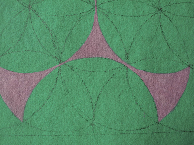
Each time I set up my table to tone paper for these Islamic design-based drawings, I tear down four pieces of paper; it's easier to work on a few at a time, always four different colors, as long as I've prepared the size for the color toning. Then I add the circles that are the basis for the painted designs. On one of the sheets of paper, I drew the wrong size rectangle, so I re-toned the paper; then while I was working, I somehow managed to splash color on part of the background and was unable to remove it. That is what happens when I don't pay attention. The second failure came from working with paint that was too opaque for the background's transparency; another instance of not focusing intently on the work I'm doing. But I'm happy with these two pieces. 


#21, detail


In all these drawings, the variations in surface quality are interesting to me. With #21, I wanted to emphasize the contrast of opaque and transparent paint by having a very glossy finish on the red shapes, so I painted a thin layer of the egg white medium, glair, onto them.


#22, egg tempera and graphite on hand toned paper, 15 x 15 in.


These attenuated shapes are somewhat strange to me, therefore intriguing. They seem to float above their ground or be embedded within it. 


#22, detail

The shadow of black lines around the forms add some volume to them. The change of surface appearance from painted and background colors are not as apparent in the photo as on the drawing itself; it is subtle, but there.

I have an odd rule for myself with these works: that I do them in groups of four, so perhaps with my next session of drawing, I'll do six in order to catch up.


August 24, 2013

A Box of Old Postcards


Postcards are souvenirs––remembrances––of places we've visited and things we've seen. Many years ago I bought a box of old postcards, other people's memories, from a yard sale, which now sits on a high shelf in a cupboard. After writing my recent blog post, "Old Things", about poking through antique shops, I remembered the postcards and took the box down to look at them. Flipping through the cards I remembered many favorites, because of color or image, and I thought about how they describe a culture. The preponderance of cards are American, and they tell of travel and the open road, a time when that was all new and fresh. I wish the cards were dated, and very few were actually mailed, but I associate them with the burgeoning car culture of the 1950s. Here are a group of motel and hotel cards, with one Greyhound bus terminal at the upper right. As always, you can click to see the images enlarged. I love the old printing techniques which led to wacky color, and the textured surfaces of some of the cards. The card at the lower right, from a motel near New Orleans is postmarked 1955, and the message says "I think the sun shines twenty times brighter here than at home". On Moore's Brick Cottages a note says "We sleeped here."


There are automobiles pictured in many of the cards, of different vintages, the oldest being the car driving through the giant sequoia in the Mariposa Grove of Yosemite National Park. The interstate highways were begun in the 1950s when automobile travel became part of American "freedom". 


Looking at the color on some of the postcards makes me regret the perfect quality of modern printing processes. We no longer see brilliant red splashed in an unreal way on cactus plants, purple on Spanish moss, and all manner of colors on beach goers and Notre Dame cathedral.


I have several postcard books, with multiple views, generally in an accordion style booklet. The book at the lower left is a regular booklet, bound with staples, of the "treasure state" of Montana. Printed on smooth paper, the color is super saturated and unreal, so very much fun to look through. Above it is the Grand Tetons, and to the right the Hoover Dam, neither as amusing as the Montana booklet. The booklet at top of the Mariposa Grove seems of an even earlier vintage, printed as it is on textured paper.


My favorite small group of cards from one place are those from the basilica of Saint Anne de Beaupré in Quebec, Canada. It is a pilgrimage site and the cards show supplicants on the stairs and the pillars of crutches left behind. The bottom card, intensely colored, shows the relic of Saint Anne, the patron saint of Quebec. I doubt contemporary cards could have near the charm of these.


The box also contained a large selection of old French black and white postcards, beautifully printed in crisply detailed images, that yet appear as out of a dream. The ancient airplane flying above the ruined tower, the storks and the cathedral, are poetic images.


A real treasure is a beautiful booklet of cards, carefully separated by tissue, of the town of Chalons-sur-Marne. The images are of buildings, parks, and landscape of the town. Turning the pages of softly yellowed images and delicate yellowed tissue is like entering into a forgotten memory.  


Most touching of all to me are the figures appearing on the streets, standing quietly as they look at the camera. They are small within this lost world, looking out at us from an imagined past.