Showing posts with label studies. Show all posts

March 18, 2015

Doug Ohlson: Intervals and Balance


Earendel, 1969, oil on canvas, 90 x 121 in.


Squares of color, placed carefully on adjoining vertical panels, move in space––forward/back, up/down, across––mark weights, move the eye. The sense of empty and full gives rise to the reference to a musical notation, one with sounds and many silences, but with passionate order. In the current exhibition at Washburn Gallery, Doug Ohlson: Panel Paintings from the 1960s, we can see four very large, ambitious paintings, each with a different quality of color, light, and rhythm. I love Earendel's offbeat balance, with colored squares of intense and subdued hues. From the irregular placement and varied hues of the squares I got a sense of buoyancy.


Earendel detail


The squares are very carefully painted with even brushstrokes moving the paint vertically. The ground color is laid on with no visible touch at all, so becomes a boundless space.


Howick, 1967, acrylic polymer on canvas, 92 x 76 1/2 in. 


Howick is a beautifully mysterious painting, with colors that are dark, yet incredibly rich. There is a subtle iridescence in the brown paint, impossible to show in a photo, that adds a quality of light within darkness. The painting asks for long contemplation, similar to that required by an Ad Reinhardt painting. Another thing to notice is that in this painting the panels are not of equal width as are all the others; the panel containing the square is slightly wider, as though to accommodate it, to emphasize its importance even though its color is quiet and unassertive, almost not visible.


Sterne, 1967, acrylic polymer on canvas, 90 1/4 x 186 in. 


In Sterne....


Cythera, 1967, acrylic polymer on canvas, 90 7/8 x 207 7/8 in. 


....and in Cythera, the panels are slightly apart rather than joined, creating a more insistent rhythm between them; the small jumps in space read almost like passing time, especially since the works are so large, 15 and 17 feet across. Larger than body size, they require distant viewing, then invite us closer, to walk past each panel, experiencing the changes over the entire painting. Color is carefully balanced for a expression of contrast or of subtlety. I don't know how accurate my photos are regarding this important aspect of Ohlson's work: the color on the gallery's website is very different from that in their small catalog of the show, and my color is yet a third variation on the actual paintings.


The above and the following are all Untitled, 1967, colored paper on paper. 


Ohlson worked out his compositions from small color studies. In them we can see his play with color and balance. He made notes to himself alongside this study. At the top right is written "12/26/67 from 11/18/67 drawing idea, the panels could open up in this - also more colors". At the lower right: "sqs get too small".


I love seeing the variations of placement and color of squares and how it changes the feeling of each piece. With only 3 squares on 9 panels the intervals between the left side panels become even more important as they lead up to the emphasis of the brown squares.


The difference in hues makes the blue advance visually or settle into the same plane as the surrounding greenish brown.


Here are two ways of approaching cool reds, with unsaturated and saturated color squares. Although the blue is cooler in hue, it is so intense that it pops off the surface, while the greenish squares stay put. There is also the playing with balance: which works better, the upper squares on the right or on the left? four squares at bottom or five? Within the seeming simplicity of the elements he uses, Ohlson explored complex issues of color and placement of form, and of enveloping presence.


October 2, 2014

Nicholas Krushenik: Serious Fun


Rousseau Giving Love and Lions, 1962; acrylic on canvas, 76 1/2 x 51 1/2 in.


Nicholas Krushenik (1929 - 1999) used the elements of cartooning––bold colors, simple shapes, black outlines––to create vivid and inventive abstract paintings. A show of his early work, currently at Garth Greenan Gallery, is a visual delight, with each painting exploring very different ideas of color and shape in space. With all their emphasis on flatness, they are not at all flat, but bend and curve and wobble with vigorous energy. His titles are wonderfully allusive, as in this painting's reference to Henri Rousseau. Rather than thinking of jungle greens, however, my immediate response was to weaving with this pattern and its bulging irregularity.


Rousseau Giving Love and Lions detail


The paint was anything but flat in Krushenik's paintings. I enjoyed seeing the history of changes and the subtle layering of color that looked solid from a distance.


Quick Red Fox, 1963; acrylic on canvas, 84 3/4 x 55 1/2 in.


Blue and yellow wave pointed ends as though a tattered banner. Their intense color floats above a neutral gray, an unusual color in this show. Looking at this painting, I see how the black lines separate the colors, but also pop them out toward the picture plane; even though it's an intense color, the orange settles back as background with no black lines for contrast.


Horizontal Stripes, 1963; acrylic on canvas, 84 1/4 x 51 1/2 in.


These horizontal stripes aren't quite horizontal (I sense a joke here), with red flames licking the yellow and white. This painting flows downward, and white points push aggressively into the red, creating a figure/ground quandary.

Pango-Pango, 1963; acrylic on canvas, 80 1/4 x 47 in. 


I'm having fun trying to decipher Krushenik's titles: Pango-Pango is the former name of Pago Pago, the capital of American Samoa. I don't quite see anything tropical in this image, but I do love the flip-flop of the two blue eyehole forms above the red and yellow "mat" (again I see weaving). There's a great deal of clever image-play in this piece, with the blue shape above being twisted by insertion of a black line, while the one below is flatter, but....it looks at though it is folded up from the blue surround, where it sits in front of the red/yellow forms. The black lines at top and bottom push those blue shapes together. The seemingly simple has great complexity.


Sterling Moss at the Esses, 1962; acrylic on canvas, 65 3/4 x 52 in.


Most of the paintings in the show are in a vertical format, and each uses the format differently. Here another woven group of shapes move downward but don't quite make it to the bottom of the canvas. Could it have something to do with who Stirling Moss is? This title was so mysterious that I googled and up came the race car driver Stirling (not Sterling) Moss, and Esses are curves on a racetrack. Was there an accident? But leaving out the possible narrative, in a nervy way, the artist abruptly ends the red and purple shapes, leaving a white shape that is startlingly present.


Your Fastener is Disengaged, 1962; acrylic on canvas, 60 x 42 in.


I laughed out loud at this painting. The bulbous forms are like swaying heads, or like that funny thing that hangs down at the back of the throat, the uvula. As fasteners, we have an amusing time thinking of them all fitting together, like wacky, organic, zippers. They undulate on top of the wavering grid of brown and orange: organic and sorta geometric.


Untitled, 1961; graphite and acrylic on paper, 12 1/2 x 8 1/2 in.


It was very interesting to see some studies for the paintings, to see where Krushenik started.....


Untitled, 1961; acrylic on canvas, 30 x 24 in.


....and how he ended up. The idea of a squiggly bounded line with a form resting in its curve was clarified and the colors of shapes changed. The resulting painting is much more dramatic with the black curving rectangle at bottom, the black band at top; the blue shape has more presence than when it was a less defined yellow as in the study. 


Untitled, 1961 detail


Looking closely at the small painting (click to enlarge), you can see that there were changes of line and shape in the making of it. It is carefully balanced. 


 3 drawings, all Untitled, 1961; graphite and acrylic on paper.


I love seeing the buoyant energy of these drawings. I see the thought process, especially in the one on the right as the artist tries variations on a theme, one of whose results we see above. I was so happy to see this show of paintings full of intelligence, quirky beauty, and wit.


November 23, 2012

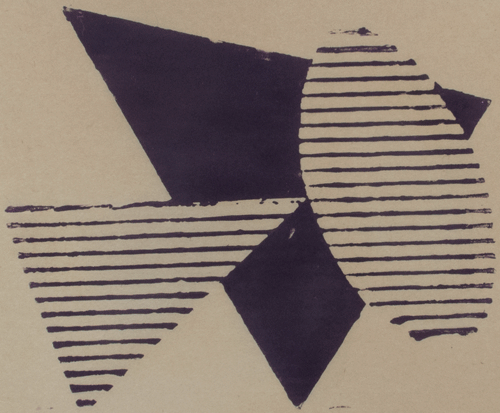
A New Cardboard Print: "Three Purple Shapes", With Help From Popova


Three Purple Shapes, ink on Akatosashi paper; image size 10 x 12 in., paper size 18 1/2 x 22 1/2 in.; 
ed 4


Although this image is contained within the rectangle of the cardboard plate, the print appears to be of free floating shapes.


Cropped to just the image, it's easier to see the rectangle. I had a bit of a hard time working out the composition for this piece. Here is the initial study:


As you can see, I originally had the design entirely within the rectangle. I did several sketches, moving the angles here and there, up and down, but was never comfortable with the results. Then I thought to look at my catalog of of the work of the Russian constructivist Liubov Popova....


Liubov Popova, Pictorial Architectonic, 1916-17; oil on canvas, 41 1/2 x 27 3/4 in. 


...an artist I greatly admire, who I wrote about in this blog post. Looking at her work allowed me to free myself from the confines of the rectangle and think about overlapping shapes, think about shaking loose from an expected format.


February 10, 2012

New Hooked Wool Drawings, and the Benefits of Doodling


 I've always doodled during meetings. When I was teaching, my notes at department meetings were covered with little inked shapes, but they had little to do with my artwork. They were a way to keep my hand busy while my mind was both concentrating on the matter at hand and wandering about. I still ply my pen during the rare meetings I now attend, usually building interconnected piles of flat and volumetric squares, sometimes with circles added. Nothing much, just doodling. For some reason, at my last meeting of my local town library's trustees, I began to doodle little images that could work as sketches for my ongoing series of drawings. And I came up with some pretty good ideas, which I later filled in with color at home. I could call this group of works "The Library Drawings".


2012 #2, hand dyed wool and egg tempera on linen, 16 3/4 x 13 1/4 in.


As with most of my drawings, these have centered images, and as with many, they have a light, humorous quality. I pushed the primaries red yellow blue, so that they become a zippy brilliant flag, like that of a hot and happy country.


 2012 #3, hand dyed wool and egg tempera on linen, 14 1/4 x 12 in.


An orange square creeps out and ensnares a green circle.


 2012 #4, hand dyed wool and egg tempera on linen, 16 x 12 3/4 in.


Three cuddling ovals sit atop two hooked circles.


2012 #5, hand dyed wool and egg tempera on linen, 13 3/8 x 12 1/2 in.


And I leave it to you to find a metaphor for this one (I'll keep the image that pops into my mind to myself for now).


September 1, 2011

A New Textile: "Red Bars"

Red Bars, hand dyed wool on linen; 4 pieces, each 6 x 6 inches.


My idea for this quartet came from a photo I took this summer for my painting; a thick bar alongside a curved hose:


I liked the idea of the wide flat form interacting with a narrow curve, so I did a few thumbnails. At first I thought of using strong colors similar to the ones in the photo, but then decided to be a little silly and go with pink as the background color. I chose to make the piece of multiple panels in order to have a rhythm move from one to the next: a flowing line, a staccato bounce of dark shapes. The color of the rectangles was a little difficult: Red Bars started out as Blue Bars, but after I hooked one panel I realized that blue didn't work at all; it look saccharine sweet. So I looked through my piles of dyed fabric remnants to find another color and the grayed red looked perfect to me.


Another decision was how to make the curving line: should it be a color, or something more subtle? I liked the idea of the line being less insistent, hardly there, so...


..what I did was hook the curved line and cut the tops of the loops, which gives the appearance of a line running through a field, like the path of a deer cutting through high grass.


Philip Guston, Untitled (Light Bulb), oil on panel, 12 x 14 inches. (1969-1973)


As I was working on this piece, I kept thinking of Philip Guston, whose paintings, both the abstract and the later great figurative works, included brilliant explorations of the impossible colors red and pink. Blood and flesh=life; and thumbing the nose at "good taste".

June 7, 2011

A New Textile: "Objects #1"

Objects 1, hand dyed wool on linen, 9 x 15 inches.


The genesis of this piece was in the film Objectified, a terrific documentary on industrial design. I was inspired by the images of objects, which you can see in this blog post I wrote about the film, so began to do thumbnail sketches of them. I kept changing and refining until I came up with four sketches that I liked, which you see below, so decided to do a series. The color idea for the group is to have fairly quiet color, a bit grayed and subdued. Of course the dyed wool never comes out exactly as I plan, which is for the best; a little lack of control is fun.


My thoughts about the hooking direction are as follows: each "object" would have hooking following its lines while the surrounding shapes would be horizontal and vertical. In this first piece, I thought of the pale blue as the shape furthest back so hooked the green with an outline; the blue bumps up against the green, so gives a sense of being behind it. Maybe. Since the blue is a light color, it feels almost bright, so pops up equal to the green, or maybe in front. No matter. Here I feel like quoting my favorite Samuel Beckett phrase: "Ever tried. Ever failed. No matter. Try again. Fail again. Fail better."


These four sketches are a guide to the series. As you can see, the color of #1 is brighter than it was in the sketch. I just dyed the wool for the second piece, which is the violet triangle with a yellow swoop above #1; I like the colors, but won't be able to quite tell how they work until the piece is mostly finished and I see it with its companion.

December 1, 2010

A New Rug Hooking Project in Progress: "Three Red Circles"


I'm back to a shaped piece with this work, with overlapping circles mounted on a rectangle. I thought it would be interesting to use a different color range than my mostly usual, and go with dark colors, the "pedestal" being close to black. The subject could be fairly buoyant (the bouncing balls of Betty Boop?) and the dark colors might push against that, making the piece more complex.


The dyeing session for this work did not go easily at all. What you see above are the final colors, but it took a while to get there. For the blacks, I started with a color called "Silver Gray", which looked great in my swatch book, but when I dyed the wool, it came out close to violet; I guess the color had an undertone of red. So the wool went back into the dye pot with black and a warm brown, and that fixed the color. Then to the reds: the darkest red was at first too light, so needed to be redyed. I added some yellow to the lightest red to create a cool to warm color movement, but then the middle red looked too cool, so back in the pot to add some yellow to that too, at which point the balance of colors looked right.


Here's the full sized drawing, which is around 11 x 14 inches. For the circles, I run around the house looking for bowls, pots, or other objects, such as rolls of tape, to find just the right size to use as a template. Above are embroidery hoop, bowl, bowl.


And there's the piece just begun, with the black portion to be hooked vertically, as if holding up the circles, which will be concentrically hooked to their centers. When I look at the sketch above, the circles look like heads in a crowd; I wonder what imagery will pop up when I finish this.

September 28, 2010

A New Rug Hooking Project: Purple Points


I've begun the second of a series of four hooked rugs that have an overlapping form jutting out from the space of a framing shape. (to see sketches of the four, go to this post.) I've used a triangle again, but this time I designed it to stick out from the background at two of its points, one slightly and one in what will be an elongated journey onto the wall. The colors are vivid secondaries, green and purple, a memory of summer flowers perhaps...


September 14, 2010

A New Rug Hooking Project: Pointed


When I was mulling over my next rug hooking project, thinking that I'd like to do another shaped work, I happened to read some blog posts at Steven Alexander's Journal about Brazilian art he had seen while on a trip there. The top photo is work by Luciano Figueiredo, the bottom, Manfredo de Souzanetto. These paintings, minimal yet full of verve, got me thinking: why not put two elements together, with one sticking out from the basic rectangle, engaging directly with the wall.


I did a group of thumbnail sketches, coloring 4 that I liked (the sketch of pink oval with blue is not part of this series), using very saturated colors. My idea is that the color will be intense and spirited, almost verging on the garish. The first project I'm tackling is the orange triangle on a pink ground, the point of the triangle just barely jutting out from the square.


There was a large piece of yellow dyed wool which I had never used, so I overdyed it with the same cherry color I used for the deep pink, yielding an interesting orange, which tends to magenta.


Here is the ruglet just begun, with only its outlines hooked. As I've been working on it, I'm starting to feel that I'd like this group to have something of a sculptural feel, so may cut the loops of the background shape; this will give the piece a look of low relief sculpture. I used this technique in the triptych below, so you can see how it'll turn out. I'm still not sure I'll be doing this, but once I make the decision to cut, I would have to re-hook the background if I don't like it.
....but I think it will work.

Ovals, 3 pieces, each 16 x 7 inches

June 8, 2010

One Finished Painting and One Underway

Corners, egg tempera on vellum, 4 1/2 x 3 1/2 inches


I titled this painting Corners because of the way the circle is nestled into the lower right part of the panel and the curved forms flow both towards the upper left, and the triangle at the lower right; and also because I thought that Cornered would sound too much like a film noir.

In a previous post on two cylindrical paintings, I wrote about how doing watercolor studies helped in working out their color. For this new painting, I thought I'd show the original photo and the study I did based on it.


I switched to gouache for this study, which I will use in future; its opacity is better suited to exploring color for egg tempera, rather than transparent watercolor. As you can see, the color is changed from the photo: I wanted a warmer yellow ochre, a more subdued red that acted more harmoniously with the yellow, and a black with ochre overtones rather than red ones and carrying more light. I hope that this works better than the photographic color. We can also see the difference between a hand made painting and a photograph, though the painting suffers from being seen on a screen, negating much of its presence.

When I finished Corners I started right away on a new painting, having 8 newly stretched parchment panels. This piece, which I'm tentatively calling Red Swoop––though here again I have a funny title in my head, Belly Laugh, because the image so reminds me of a rotund jolly belly (would that be too too silly?)––is 6 5/8 x 5 inches. You see it below with its first layers of paint, the drawing still very fluid. An issue with this piece will be how far towards realism to take the ground that the machine is sitting on; right now it's loosely brushed in green, as it is grass. I'm not sure if I want the grass to be delineated clearly, but doing that might make the image even more surreal than it looks now. The only way to find out is to paint.