December 30, 2012

Happy New Year! With the Abundance of Spanish Still Life


Luis Melendez, Fruit in a Landscape, 1771; oil on canvas, 25 x 33 in. 


In thinking of New Year's wishes to you, dear readers, what could be better to illustrate them than with the richness of Spanish still life painting? From a watermelon bursting with juicy sweetness, pink and crisp....


Juan Fernandez, el Labrador, Vase of Flowers, 1636; oil on panel, 16 1/8 in. diameter


...to a full round vase of spring flowers, petals trembling with life and promise...


Francisco de Burgos Mantilla, Still Life with Dried Fruit, 1631; oil on canvas, 11 7/16 x 23 3/16 in. 


...to paper cornucopias of dried fruits and nuts, small pleasures that will keep through the year; all these sensuous things, of taste and sight and smell, can be symbolic of a year to come full of joy and of beauty.


Juan Sanchez Cotan, Quince, Cabbage, Melon, and Cucumber, ca. 1603; oil on canvas, 27 1/4 x 33 1/2 in. 


And in this more restrained and elegant arrangement, I think of calm and peace, and wish you both.


Francisco de Zurbaran, Still Life with Lemons, Oranges, and a Rose, 1633; oil on canvas, 24 1/2 x 43 1/8 in. (see this in high resolution on the Norton Simon museum website.)


This remarkable Zurbaran is an image of fruitfulness, with grace and balance; the bitter citrus with the sweet orange blossoms and with the rose, (and I know how many of you love your coffee!) Light washes over all, as forms emerge from darkness. May you all be similarly illumined. Happy New Year!

December 27, 2012

A New Cardboard Print: "Peppermint"


Peppermint, ink on Japanese paper; image size 10 x 10 in., paper size 18 x 18 in. 


I guess I was feeling a little silly when I designed this image (and it was way before Christmas). I was wondering if I could make something work using these candy colors; I'm still wondering. The print has some technical issues––green bleeding into pink, the ink viscosity a little tacky, some of the lines not properly inked––but I accept those imperfections as part of the process, even as adding character. But is the color just too unserious? 


Peppermint detail


To my readers: I've had to turn on word verification because of a recent high volume of spam; I'm sorry, but it helps. 

December 26, 2012

Ice Events


When I returned home from my walk today, I noticed a small marvel of ice formations: on my way into the shed, I looked down and saw a mini landscape of frozen globules under the roof line, rising up and descending to the lightly frozen grass inside.


Down on my stomach (I was wearing waterproof jacket and pants, essential for photographing in winter snow), I nearly laughed with amazement and pleasure at the fat little spheres, piled one on another, catching light. The shapes built up....


....and they dropped down...


...and they rose up singly, as a hand waving high above a crowd.


The ice even climbed up, helter skelter, alongside a rock.


It encased single blades of grass in a glittering package, which gives me the opportunity to share this apt quote by Henry Miller, via my friend, the artist Leonard Dufresne:
The moment one gives close attention to anything, even a blade of grass, it becomes a mysterious, awesome, indescribably magnificent world in itself. 


A final tiny wonder was this bit of icicle, an inch long, dangling by a delicate spider thread, twisting in the light wind, sparkling in the light.

*click the images to see them enlarged in more wondrous detail. 

December 23, 2012

Some Thoughts for the Season from William James


In this season of "peace on earth, good will to men", I wanted to share with you some of the ideas from a beautiful essay by the philosopher William James titled "On a Certain Blindness in Human Beings", written in 1898, which you can read here. He writes:
...the blindness in human beings of which this discourse will treat is the blindness with which we all are afflicted in regard to the feelings of creatures and people different from ourselves. 
To make his points, James quotes various writers at length––Stevenson, Wordsworth, Whitman, Tolstoy––but he begins with a couple of personal anecdotes, one about the disconnect in understanding between us and our dogs, which goes a long way in humorously illustrating mutual miscomprehension:
Take our dogs and ourselves, connected as we are by a tie more intimate than most ties in this world; and yet, outside of that tie of friendly fondness, how insensible, each of us, to all that makes life significant for the other!––we to the rapture of bones under hedges...they to the delights of literature and art. As you sit reading the most moving romance you ever fell upon, what sort of a judge in your fox-terrier of your behavior? With all his good will towards you, the nature of your conduct is absolutely excluded from his comprehension. To sit there like a senseless statue, when you might be taking him to walk and throwing sticks for him to catch! What queer disease comes over you every day, of holding things and staring at them like that for hours together, paralyzed of motion and vacant of all conscious life?
 James also tells us of traveling through North Carolina and seeing clearings made by settlers which he thought showed "unmitigated squalor", nature defiled. But it was explained to him that these rude clearings were victories for the people living there. I thought back on the early settlers of Vermont, who cleared land bit by bit, planting between tree stumps, whose land must have looked violently ugly at first. He admitted that he "had been as blind to the peculiar ideality of their conditions as they certainly would also have been to the ideality of mine..."

I reread this essay today with an open heart, trying to accept, in this time of mass shootings and political rancor, that I must be willing to see the significance of other lives. James, by quoting a long excerpt from Robert Louis Stevenson's "The Lantern Bearers", points out that all lives have an inner glow that might be hidden by "a rude mound of mud", but that, according to Stevenson, "...the true realism, always and everywhere, is that of the poets: to find out out where joy resides, and give it a voice beyond singing....For to miss the joy is to miss all".

So much of this essay, and one that follows, "What Makes a Life Significant", is an elucidation of deeply democratic principles, a belief that it is not only the lives of the successful and powerful that have meaning; James quotes Whitman's "Crossing Brooklyn Ferry" here to great effect, where "Crowds of men and women attired in the usual costumes! how curious you are to me!" The great gathering of humanity is as beautiful and enlarging as Wordsworth's mountain dawns. These words of James are like gospel to me:
To be rapt with satisfied attention, like Whitman, to the mere spectacle of the world's presence, is one way, and the most fundamental way, of confessing one's sense of its unfathomable significance and importance. 
This post would be very long if I included every sentence underlined, every paragraph highlighted. If your interest is piqued, read the essay at the link above; it is fairly short and very readable since it was originally delivered as a lecture. But I will end with James' summing up final paragraph:
And now what is the result of all these considerations and quotations? It is negative in one sense, but positive in another. It absolutely forbids us to be forward in pronouncing on the meaninglessness of forms of existence other than our own; and it commands us to tolerate, respect, and indulge those whom we see harmlessly interested and happy in their own ways, however unintelligible these may be to us. Hands off: neither the whole of truth, nor the whole of good, is revealed to any single observer, although each observer gains a partial superiority of insight from the peculiar position in which he stands. Even prisons and sick-rooms have their special revelations. It is enough to ask of each of us that he should be faithful to his own opportunities and make the most of his own blessings, without presuming to regulate the rest of the vast field. 

 To all my readers, a very joyous, and significant holiday, with pleasure in small things!


December 22, 2012

New Potato Prints (Improvisation is Hard!)


Half Circles, ink on paper, 11 x 9 in.


Back in July, soon after I started making potato prints, I wrote about how their improvisational process was so different from the rest of my work. It hasn't gotten any easier, and I haven't felt any more assured about what I'm up to, but something here keeps me at it. The prints in this post are from two sessions over the past two months, from which more than half the work ended up in the trash. In Half Circles, I like the image of circles that are completed, yet not whole. But, does this image....


Three Across, Three Down, ink on paper, 20 x 15 1/2 in.


...or this, carry enough form, meaning, feeling, to be any good? These do look much better in person, when the texture of ink and paper can be enjoyed, but the fact that I've never worked in this way before makes for a great deal of uncertainty. The simplicity of Three Across appeals to me....


Encircled, ink on paper, 10 x 13 in.


...as does the more complex and humorous composition of Encircled.


Barred Circles, ink on paper, 12 x 10 3/4 in. 


I've always hated repeating myself, and I'm always trying to make images different from ones that came before. With this medium, that feels more difficult, because of the limitations of potatoes, their size and the shapes I can cut from them. 


Vertical, ink on paper, 15 x 12 in. 


So, it's necessary for me to keep leaping out there,


Reach, ink on paper, 11 1/4 x 9 3/8 in. 


trying to be inventive, fresh and free.


Openings, ink on paper, 12 x 13 in. 


 And maybe not be too judgmental, but simply enjoy the process and see where it takes me.


December 20, 2012

The Bright Spirituality of Stephen Mueller


Untitled (NYC), 2010; watercolor and gouache on paper, 12 x 12 in. All images courtesy of Lennon, Weinberg, Inc. 


When I spend an hour or two walking through Chelsea galleries, I am rarely moved and thrilled by work in a show; it is a precious experience because so infrequent. Seeing the paintings of Stephen Mueller (1947-2011), currently at Lennon, Weinberg gallery (up until January 5th!, with limited schedule) was one such happy occasion. The small works on paper, in their bright, almost wacky colors, and their translucent light, were joyful and meditative. I felt I was looking at a Western cousin to the brilliant Tantric paintings of India. (You can see the entire catalog for the show here, as the gallery has generously provided an online flip book, from which I took these images.)


Untitled (NYC), detail


The small paintings invite close, slow observation. Mueller approached each form with tender care, with a delicate precision that speaks of depth and attention rather than any kind of fussy obsessiveness. His control of his medium is exquisite: from flowing, subtle translucent shifts of hue, to careful opacities.


Untitled (NYC-6), 2011; watercolor and gouache on paper, 12 x 12 in. 


What is so engaging about these works is their lightheartedness, their inventive forms not of any real world, yet seeming so true, as though they are embodied spirits.


Untitled (NYC), 2010; watercolor and gouache on paper, 12 x 12 in. 


The purple fan shape above and these double globes are figural; when I look at them my mind inhabits these shapes, and floats in their spaces.


Untitled (NYC-5), 2011; watercolor and gouache on paper, 12 x 12 in. 


Untitled (Charleston-1), 2010; watercolor on paper, 12 x 12 in. 


A mystery of these paintings is how such festive, patterned images can be so very deep and carry so much emotional and spiritual weight. Like Tantric paintings they seem to approach an essence of life and joy.


Untitled (Charleston), 2009; watercolor and gouache on paper, 12 x 12 in.


A surrounding darkness opens on a bright, full heart.


Untitled (Charleston), 2009; watercolor and gouache on paper, 12 x 12 in. 


Mueller's images are often described as mandalas, a Sanskrit word meaning "circle". Of the images I've shown, this to me is closest to a Hindu form, with its circle, and shapes like lingam, procreative forces within a brilliant light.


Kabir, 2011; acrylic on canvas, 57 1/2 x 36 in. 


My current preoccupations made me more receptive to Mueller's small works on paper––their intimacy and sensitivity enchanted me––but the larger paintings are also spirited and playful and mysterious. These are all abstract paintings that go far beyond the formal, into a world of spirit, beyond our world of appearances. 


December 18, 2012

Three New Hooked Wool Drawings


2012 #20, hand dyed wool and egg tempera on linen, 16 x 12 3/4 in. 


With these three recently completed hooked wool drawings I wanted to have three very different compositional ideas. In #20 the overlapping shapes create an illusion of transparency, thin and airy, held in by a wool line.


2012 #21, hand dyed wool and egg tempera on linen, 14 x 12 in.


#21's red line meanders across the surface, while painted shapes have an illusion of form. The line flips from a flat design to one moving forward and back in space, though I think the illusionistic aspect tends to take over.


2012 #22, hand dyed wool and egg tempera on linen, 14 1/2 x 11 5/8 in. 


In this final work, a bit of humor as a semicircle precariously tilts atop a platform, while under it, another sits solidly on the ground. This medium encourages me to be inventive, and to have fun.


December 17, 2012

A Walk in the Woods: Snow Caps


Yesterday, I drove home through weather, drizzle in Connecticut and Massachusetts, ice in southern Vermont––a reminder of how treacherous winter driving can be, with two cars overturned by the side of the road––changing to light snow farther north. I got home to a light coat on the ground, and this morning awoke to see surfaces covered by a wet snowy blanket, perfect for snowballs and snowmen, and perfect for clinging to surfaces on a windless day. In the woods, a cap of snow added another circle to the form of a sawn log, 


...while this little hat adds a touch of humor and animation to a small tree trunk.


A small white mound made a peaked hat of a pair of shelf mushrooms.


Soft oblongs were caught in the embrace of beech leaves.


Very different from a gentle hug, pine needles pierced a dollop of snow.


Snow was caught in various ways: in the curls of birch bark....


and between the twin trunks of a naked tree.


On the final ascent to my land, an old stone wall lines a ancient road, with snow creating patterns over the lichen covered rocks. As I approached home, a fine mist permeated the air, a sad reminder that winter still has a loose grip and that rain will return tomorrow.

December 11, 2012

On My Bookshelf: Color Notes


I have a small bookshelf in my work space, containing catalogs I've bought in recent years, books that offer me helpful ideas for my work. I was inspired to write this post by the artist and blogger Lisa Pressman, who has a feature on her blog entitled "What's on your bookshelf?". When I began to think about this selection of my much larger art book library, I realized that I needed some of them near when I began making abstract textiles––artists such as Ellsworth Kelly, Richard Tuttle, and Blinky Palermo gave me compositional ideas––and that now I open them most often for fresh ideas about color. 


'Abid, The Inscription of Jamshid, Mughal court, 1605-6 (detail)


The violets and golds and blue, the gray and green, of this Indian miniature are so beautifully harmonious...


Bagta, Kunvar Anop Singh Hawking, ca. 1777 (detail)


while the colors of this painting are more strident and saturated, but gorgeous still. A deep red against a sienna, the warm green against gold and blue, all are surprising and tell me "you can use this". I photographed these images from the catalog of last year's brilliant exhibition at the Met "Wonder of the Age: Master Painters of India 1100-1900", which I wrote about here. I titled the blog post "Wondrous Color", and the color of these paintings continues to thrill me.


Harunobu, Visiting a Shrine in Night Rain, late 1760s (detail)


The color of woodblock prints of Japan are very different from those of Indian paintings, having more subtle hues, with drama from strong blacks. I love the oranges, one leaning toward red, as they interact with the soft color of the kimono. The image is a lesson in how color works alongside chromatic grays.  


Utamaro, The Engaging Type, ca. 1792-93 (detail)


And here the grayish red and grayish green are in perfect balance; what a wonderful color idea for a print or textile or drawing. These Japanese prints are in the catalog for a show that was at Asia Society, (I wrote about it here) "Designed for Pleasure: The World of Edo Japan in Prints and Paintings, 1680-1860".


Sonia Delaunay, Design 1044, textile designs, fabric samples; France 1930


Jumping ahead to the 20th century, there is Sonia Delaunay, whose fabric designs are endlessly inventive. Looking at the color ranges for the same design, we can see how shifts of hue change the mood of a piece. My Delaunay catalog is from the Cooper Hewitt exhibition "Color Moves: Art and Fashion by Sonia Delaunay".


Malevich, Suprematism (Self-Portrait in Two Dimensions), 1915


Kazimir Malevich has taught me so much, about shape and form and structure and simplicity, about what is essential. Although his color choices seem pared down, there is still a richness to the deep blue and black, the deep earthy red alongside the dark yellow. My Malevich catalog is Kazimir Malevich: Suprematism. 


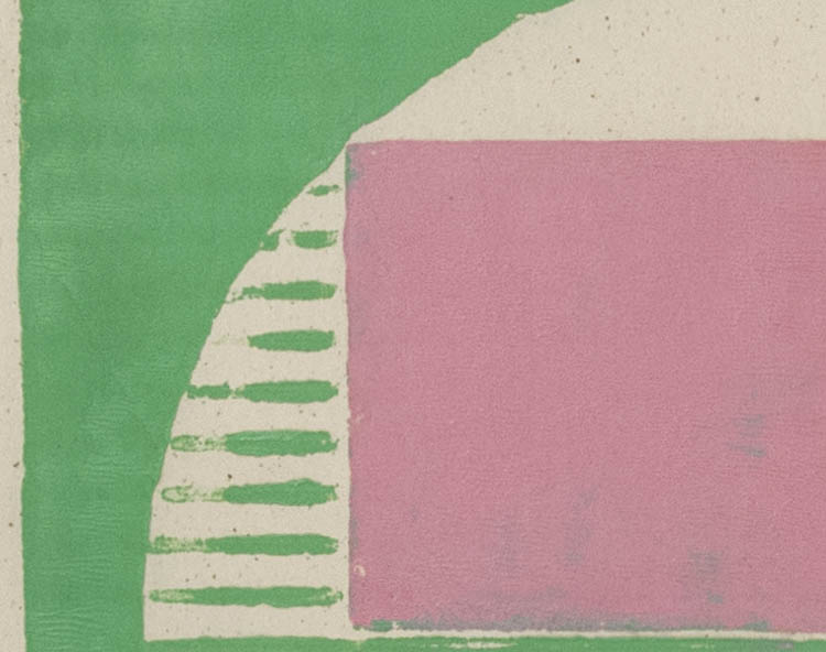
Robert Mangold, Three-color X within X, 1981


Many of Robert Mangold's paintings are a single color, beautiful to contemplate with their simple drawn forms; when he makes a multi-colored work, the color interaction, whether strident or subtle, as in this work with grayed colors, is interesting to think about. I have a magazine photo of some Mangold prints hanging on my wall to remind me of the variety of color choices. My Mangold book is simply titled Robert Mangold.


Richard Tuttle, Waferboard 3, 1996


Richard Tuttle is an art hero of mine; I love his aesthetic of the almost-not-there art made out of everyday materials. His modesty is enlarging. (I've written about his work here, here on his clay multiples, here as an inspiration for prints.) I often open the Tuttle catalog I have from the big retrospective at the Whitney, The Art of Richard Tuttle, looking for new color thoughts. With this piece I love the grayed blue alongside the yellow; the bit of unpainted waferboard adds a warmer tone, as the yellow is a coolish one.


Richard Diebenkorn, Ocean Park #70, 1974  (detail)


My most recent book purchase––aside from the Albers catalog of the works on paper show, which I recently wrote about here, and which will be a mainstay of my books on color––is Richard Diebenkorn: The Ocean Park Series. There are many wonderful thoughts about space, light, and color in these abstract paintings, with lots of interesting grays to explore. I am grateful to all these artist friends and mentors; they feel almost like friends, giving me an idea here, a helping hand there; I'm happy to have their work on my bookshelf. I imagine you too have books at hand that help in your work and in your life.


**I'll be away for a few days; see you next week.