December 19, 2016

Where to Find Meaning?


Hello and Happy Holidays to all my long-lost blog friends. I want to share with you a brief essay that I am honored to have included in the final, online, issue of the long-running art journal M/E/A/N/I/N/G, edited by Mira Schor and Susan Bee, which focuses on how to find meaning in this current political climate; there are many contributors, artists and writers. My essay is at the bottom of this page, and here below.


“I am here to wonder.” Goethe

It is difficult to understand how to respond to the political shock that descended on so many of us in early November. Where to turn, how to think, what to do? For me, it is necessary to go towards what I find essential, which is paying attention to the small moments that bring joy and beauty and surprise: winter sunlight reaching far into a room, highlighting the delicate serrated edge of a seed head; a tiny snail crossing an immensity of leaf; bright light illuminating a plastic tank; the taste of a garden tomato warmed by the sun; a tangle of tree roots pushing against city pavement; the emergence of a seedling, still a miracle to me. To slow down and notice everyday things provides sense and spirit and calm to emotional chaos. 

“The moment one gives close attention to anything, even a blade of grass, it becomes a mysterious, awesome, indescribably magnificent world in itself.”
Henry Miller

I walk in the woods, taking the same path several times a week, and each time it is different in feeling and in light, each time there are things to see that I hadn’t noticed before: a bit of moss, a fluff of seeds, a leaf dangling from a spider’s thread, all marvels.

“I think what one should do is write in an ordinary way and make the writing seem extraordinary. One should write, too, about what is ordinary and see the extraordinary behind it.”     Jean Rhys

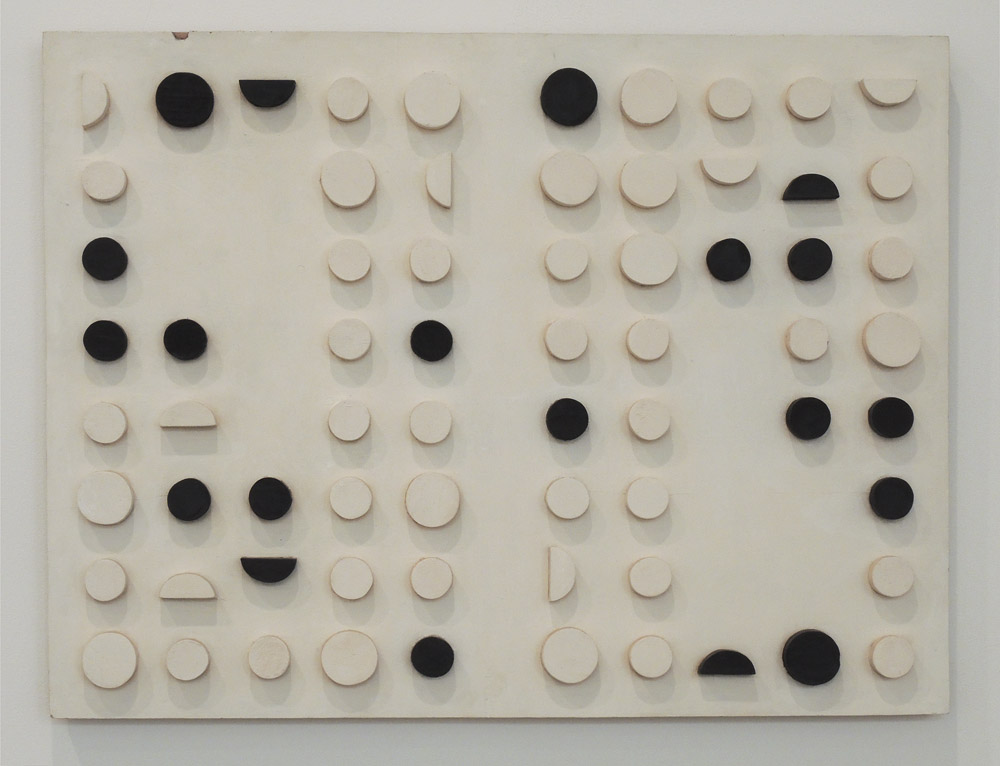
And there is art, my own and the sweep of art history. In my painting and sculpture I too attempt, like Jean Rhys, to transform the ordinary and overlooked; details of farm machinery––panels and bolts, light and shadow crossing metal and plastic surfaces––become complex formal compositions. When I was a younger artist I felt the need to make large dramatic paintings, but now I value intimacy and close looking. And I value being part of a very long tradition of picture making by Homo sapiens going back 40,000 years, when humans painted in caves, making images of remarkable sensitivity. We don’t know the purpose of these paintings, but to me they indicate a need to recreate the world, to make something beautiful from nothing. Across millennia peoples have made images and have decorated objects, not from necessity but from desire. One of my deepest pleasures is to wander the galleries of the Metropolitan Museum of Art in NYC for hours, crossing the globe, visiting favorite objects and discovering new ones. I’ve long felt that art-making was an essential part of being human but was nevertheless startled to read the following while writing this piece; it appears in the NY Review of Books November 24th issue, in a review about brain science by the early pre-history professor Steven Mithen. He asks “what gave us ‘the Homo sapiens advantage’?”

It wasn’t brain size because the Neanderthals matched Homo sapiens. My guess is that it may have been another invention: perhaps symbolic art that could extend the power of those 86 billion neurons.…

I am part of a tradition of making; I am part of the world. In paying close attention to both, I find meaning. 


September 14, 2016

On Presence in Art

Piero della Francesca, Saint Augustine, 1454-69; oil and tempera on panel, 53 1/3 x 26 1/6 in.
images courtesy of the Frick Collection website 


Three years ago there was a remarkable exhibition at the Frick Collection, Piero della Francesca in America. At the time, I wrote about this painting of Saint Augustine:
Standing in front of this painting of Saint Augustine, in the Oval Room at the Frick Collection, was like being in the presence of a powerful soul, one who looks past the immediacy of dailiness to an inward essence of life and faith.


Seated Luohan, ca. 1000, Yixian, Hebei Province, China. Earthenware with 3 color glaze, 41 inches high.


The quality of character in the Piero––a direct severity and inner calm––was similar to that of the sculpture of a Buddhist holy man.


Kazimir Malevich, Suprematist Painting: Black Rectangle, Blue Triangle, 1915, oil on canvas, 
22 1/2 x 26 1/8 in.


How do I describe presence when it doesn't apply solely to figurative art? Malevich's simple abstract paintings go beyond a design with two shapes on a plane; there's a sense of physical weight, and emotional depth. They are two shapes that express a reality beyond the shadows in Plato's cave.


Ellsworth Kelly, Black Relief III, 2010; Oil on canvas, two joined panels; 75 1/4 x 65 3/8 inches.


I feel similarly about Ellsworth Kelly's work. A sweep of black on a white rectangle, beautifully balanced, moves out towards us as though inhabiting the space before it, not satisfied to settle onto the wall. Here also, shapes become essences.


Richard Serra, Every Which Way, 2015; weatherproof steel, 16 slabs, overall 11 ft x 53 ft 6 in x 21 ft. 


Richard Serra's sculptural drama and its huge size can't help but having tremendous presence. This work in particular was very strong, with the slabs standing like personages, and silent witnesses to our tragic events.


Catherine Murphy, Polka Dotted Dress, 2009; oil on canvas, 52 x 52 in.


Of contemporary representational painters, I think that Catherine Murphy's work most clearly embodies an idea of presence, where common objects become much more than themselves, transcending their particularities and becoming dense with meaning.

I am thinking about this quality now because I realize that as I work on my paintings (see recent paintings here), I push them from a fluid, painterly beginning to a solid and clear form, form with a sense of weight that I hope leads to presence. The precision in my paintings and sculpture (see recent relief sculpture here) is not aiming to be photographically "realistic" but to get at the essential, the tangible, to conjure an image that speaks emphatically. This is a quality that I don't believe exists in my textiles (see here and here), which are objects rather than presences. Presence does not define good art; it's just one element that might or might not be a part of the work. So, readers, what do you think about this quality? is it something you think about or believe is important, or maybe not?


June 26, 2016

A Hiatus....


I began writing this blog on August 1, 2009, so it will soon be 7 years old. It was quite different when I began, with many brief posts each week, but as time went on I wrote longer posts which were more thoughtfully (I hope) developed. It's been a pleasure sharing my ideas about art and books and films and nature with you, dear readers, but now I need a break. Of course, if I want to write about something from time to time, I will do so, but I have to get away from feeling obligated to write. Even writing about my own work sometimes bores me...enough already! According to Blogger, I've written 1,459 posts, and they're all accessible. You can look through them by the labels listed at the right side of the online blog––such as art history, recipes, reading and writing, ruminations––(for email subscribers, click on "Studio and Garden" at the top of the page to get to the web version); you can also put search terms in the box at the top of the page, or simply click through to older posts. I have an active presence on Facebook, posting nature and art images almost daily, so you can follow me there. I will continue to show my new work on Facebook, and you can see albums of earlier work too.

Thank you so much for your kind interest; it's been fun, and I may be back at any time.....

June 23, 2016

A New Textile: "Surround"


Surround, hand dyed wool on linen; overall 13 1/4 x 22 1/2 in.


Two shapes, illusionistically modeled, surround a third. The colors are related in that I mixed the blue and magenta to make the purple. Although the cool red shape is not modeled to seem as though it has three dimensions, the irregularity of the dye process adds some lively variation to the color. I wanted that shape to be flat, as an anchor to the others. 


Surround detail


In order to get the range of values for this piece....


Surround detail


....and for this, I dip dyed a piece of wool so that one end had more dye and the other less, with a graduated range of color across the wool. I hooked the wool vertically, which helped with the illusion. At first I had hooked the blue piece following the curved outlines, but it looked awful; I pulled all the wool out and began again, with vertical lines.


Surround detail


For the magenta piece I hooked the wool in lines following the outline of its irregular shape. All the parts of this piece are related, yet different, following each other in their curved outlines. 


June 20, 2016

In the Cuban Vanguard: Three Women Artists


Amelia Pelaez (1896-1968), Tray with Fruit, 1941; oil on canvas in original frame, 28 x 35 in.


It is wonderful when a gallery offers us the opportunity to see work that is unfamiliar, from a country or culture generally overlooked. Galerie Lelong, in their exhibition (until June 25) Constructivist Dialogs in the Cuban Vanguard: Amelia Pelaez, Lolo Soldevilla, & Zilia Sanchez does just that. The show presents the work of three women who worked in modernist styles, each different, and each engaging. They were all supported by the Lyceum women's club gallery in Havana. Pelaez, the earliest of these three artists, worked with cubist ideas (she studied in Paris in the early 1930s) but her vivid sense of color, the heat and rhythm coming from Tray with Fruit, is culturally Cuban.


Amelia Palaez, Untitled, 1959; gouache on paper, 22 x 30 in.


Intense color shines from behind a lattice of black lines in the painting above, an image thought to derive from Cuba's mediopuntos, colonial period stained glass windows.


Amelia Pelaez, Untitled, 1952; hand painted ceramic, 5.1 inches high.


This delightful piece with its lively lines is a painting in three dimensions.


Loló Soldevilla (1901-1971), Stabile, 1954; metal and wood, 16 x 19 x 3.5 in.


Soldevilla's work seems much more tied to European constructivism in its geometric forms than that of the more image-oriented Pelaez. She too spent time in Paris, in the early 1950s. Stabile has five elements in balance: the solid squares atop verticals, the open circles rolling on horizontals; the piece does not move, yet appears fluid; it bounces.


Loló Soldevilla, Astral Dream, 1957; mixed media on wood with wooden components,
30 1/2 x 39 1/2 x 1 1/4 in.


Looking at this relief is like looking at the night sky, trying to find patterns within the random shapes and colors.


Loló Soldevilla, Untitled (Construction), 1954; painted wood, 15 x 22 x 2 1/2 in.


I like that the regularity of this piece is disrupted by the roughness of the cut circles and background.


Loló Soldevilla, Untitled, 1954; collage on paper, 11 x 9 in.


Soldevilla also made some beautiful small collages, of geometric forms that are slightly offbeat.....


Loló Soldevilla, both: Untitled, 1954; collage on paper, 9 x 11 in


....or more pure. The bright colors bring a lighthearted lilt to the work.


Zilia Sanchez, Amazons, 1993; acrylic on stretched canvas, 71 x 72 x 12 in.


Zilia Sanchez's sculptural paintings are wild and sexy and sensual; their sedate blues and whites keep them grounded in cool abstraction.


Zilia Sanchez, Moon V, c. 1973; acrylic on stretched canvas, 74 3/4 x 79 1/2 x 10 in.


Swelling forms, interlocking....


Zilia Sanchez, Erotic Topology (of the Amazons series), 1968; acrylic on stretched canvas,
41 x 56 x 12 in.


....or simply protruding....


Zilia Sanchez, White Moon, 1984/89; acrylic on stretched canvas, 23 3/4 x 19 x 4 3/4 in.


....create poetic metaphors of the body, and of longing. All three of these artists––of different periods and education and even places of residence (Sanchez left Cuba in 1962)––came from a Cuban sensibility, but one also connected to widespread artistic thought; with these elements they each created an exciting body of work that I was very happy to see.


June 12, 2016

June, June, June!


White Rugosa rose

 June is bustin' out all over!
All over the meadow and the hill!....
....Just because it's June, June, June....
Rogers and Hammerstein, Carousel

I sing snatches of this song to myself during the burst of flowering of June, the most wonderful time in my garden, a month of roses and irises and peonies. The rugosa roses I planted have begun to bloom.....


Pink Rugosa


....and they're wafting their delicious fragrance through the air. They are especially lovely early in the month, before the insects––rose chafers and Japanese beetles––arrive.


Wild rose


 This tiny rose is a wild species that was growing in my backyard when I moved here. It isn't showy, but I like it for its air of tradition.


Tree peony


June is also peony month, though so far only the beautiful pale yellow tree peony is blooming. It too is sweetly scented; a single flower spreads its fragrance from a vase on my kitchen table.


Oriental poppy


There are lots of buds on the Oriental poppy plant this year and they've begun to open, at first looking like a spread fan.


Old fashioned bearded iris


Only two perennials were in the garden when I moved into my house over 20 years ago: the common daylilies in front of the house, and this pale yellow iris.


Siberian iris "Caesar's Brother"


I love the delicacy of form of Siberian irises, and this deep purple variety is a stunning one.


Siberian iris "Summer Skies"


Then there's the aptly named "Summer Skies" with its pale blue and white petals. Siberian irises are moisture lovers, so I have some of these growing by the pond....


Yellow flag iris


....along with the water-loving yellow flag irises, Iris pseudacorus, supposedly the model for the fleur de lis. 


Korean lilac "Miss Kim"


The main event of lilacs happens in late May, but the Korean lilacs, much smaller shrubs, bloom later. Their tiny flowerets look like miniature trumpets, and they blast out the most delicious fragrance.


Snowball bush, a viburnum


The lovely viburnums bloom in June. I look out the window behind my desk and see these white puffballs nodding in the wind.


Columbine


Wildflowers are blooming: the bright yellow hawkweed dots the lawn and buttercups the fields. At my house, columbine grows wild in the tall grass beyond the mowed lawn of the backyard. Its complex flowers ask for close attention.


Blackberry blossoms


I took these photographs on Friday afternoon, during a brief spell of sunny, not too cold weather. It has been chilly, gray, damp, and blustery for a week, and when I saw these blackberry blooms I remembered the definition of "blackberry winter": a cold spell during their bloom time. So it's not unusual after all to have a week of temperatures 20 degrees below the average! It's blackberry winter, but I long for a return to spring when it will be pleasant to work in the garden, enjoying the sights and scents of June.


June 10, 2016

A New Clay Relief: "Spin"


Spin, painted porcelain, 9 3/4 x 8 1/4 x 1/2 in.


I was intrigued by the overlapping curves of this composition, which are emphasized and repeated by the soft rounded raised lines. The four semi-circular shapes above the strong diagonal are somewhat parallel to the picture plane, or move a little forward at their tops, while the lowest one moves back. I'm not sure how clear the photo is in showing the receding bottom edge of that lowest shape. To emphasize its difference its interior line is in sunken relief rather than being raised like the others.  


Spin detail


I love the process of shaping different kinds of lines in clay: rounded and straight, soft and sharp. 


Spin detail


I pay attention to the edges of the piece, and have the forms drift onto the sides. As you can see in the first photo, the forms don't stay within a rectangular boundary but move in and out according to their spacial placement. Moving actual forms in actual space, however shallow, is very exciting; it's a different kind of excitement from the illusionism of painting: both are wonderful.


June 7, 2016

Marcia Hafif's Witty Minimalism


 Installation view of the exhibition "Marcia Hafif: The Italian Paintings, 1961-1969" 


This exhibition buoyed my spirits, even on a day of seeing several great shows. I loved the off-beat humor of these paintings, their play with associations of the body and organic geometry. Hafif takes a minimal format of two or three colors, and in many of the paintings just two shapes, and what emerges is an unexpected image.This series of works were completed when Marcia Hafif (b. 1929) was living in Rome, and they haven't been shown in the US before; lucky us that Fergus McCaffrey has mounted this lively show. 


128, September 1966; acrylic on canvas; 78 3/4 x 78 3/4 in.


A strong central "figure" in violet is surrounded and pushed inward by a strong warm yellow, complementary colors which create an edgy tension. The two shapes argue with each other as to which is dominant, though in this painting, the purple seems to win.


161, October 1967; acrylic on canvas, 55 1/8 x 55 1/8 in.


 In the press release for the show, Hafif mentions that this painting of the hill shape is the most important to her of the series. She speaks of trying to equalize the figure/ground relationship:
In painting this shape, I used two competing colors, attempting to avoid figure on ground, to equalize the two spaces, but the hill remained dominant....I was placing a positive shape in order to create another positive shape by default, balancing the shapes and balancing the color so that no one prevailed.
The shape is a hill or a breast or a nose or....


157, October 1967; acrylic on canvas; 23 5/8 x 23 5/8 in.


I think that 157 is more successful in this figure/ground balance. Being around farms a lot, I keep seeing a cow's teats, but they are interlocked with the soft upward fingers. For me, this is a very amusing painting.


165, October 1967; acrylic on canvas; 23 5/8 x 23 5/8 in.
168, November 1967; acrylic on canvas, 55 1/8 x 55 1/8 in.


Here are two variations on a double dip curve, both very sexy and definitely flip-flopping in their dominant shapes.


72, March 1965; acrylic on canvas; 55 1/8 x 55 1/8 in.
73, March 1965; acrylic on canvas; 55 1/8 x 55 1/8 in.


These two paintings, of an earlier date than the ones above, have a more sedate organic geometry. They reminded me a bit of Paul Feeley's work. I especially like the push of forms in 73; they have strong presence against the shape created between them.


58, 59, 60, 61, 62, 63, (Mirror, Mirror I-VI), November 1964; acrylic on canvas; suite of 6, each 19 3/4 x 19 3/4 in.


This series uses a more pure geometry: of circles, partial circles, and rectangles. Pictorial tensions come from circles being squeezed between rectangles....all except the final painting, where the violet circle floats on the red ground, attached gently to its neighboring rectangle.


60 detail


Looking closely at the paintings, we can see the meticulous care with which they are made. One color is painted more thinly––in this case the violet–––while the red is painted more thickly. This results in subtly different textures for each color.


45 (Nearer), May 1964; acrylic on canvas, 66 7/8 x 78 3/4 in.


The idea for this painting is so simple––circles and bars––yet these elements move and shift spacially, making me wonder what I'm looking at.


15, March 1963; lacquer on canvas; 15 3/4 x 23 5/8 in.
13, February 1963; lacquer on canvas; 15 3/4 x 23 5/8 in.


Lastly, here are three paintings that I think of as "game board" paintings.....


22, April 1963; lacquer on canvas; 17 3/4 x 17 3/4 in.


.....with circles placed on a patterned surface. Over these few years in Rome Hafif created an impressive body of work, using a minimalist vocabulary while alluding to things in the world. Her later paintings, which you can see on her excellent website, are sensuously minimal and nearly monochromatic. I loved seeing these Italian paintings, a quirky prelude to the more austere work to follow.