March 30, 2015

At the Met: Robert Motherwell's Lyricism


From Lyric Suite, 1965; ink on paper, 11 x 9 in.


Freely brushed inks spread across paper with fresh abandon, a color haloing a darker one; circles that might have been accidents mark a path, add a loose geometry to fat flowing lines.


From Lyric Suite


In 1965, Robert Motherwell bought 1000 sheets of Japanese paper; 600 drawings were the result of his brushing colored inks on unsized paper. He wrote (my information from the Metropolitan Museum of Art's wall labels):
Each picture would change before my eyes. The pictures literally continued to paint themselves as the ink spread in collaboration with the paper. 
A selection of this series, named after Alban Berg's Lyric Suite––a string quartet that Motherwell listened to in his studio––is currently on view at the Met. It's wonderful to see the variations of form, to get a sense of the immediacy of these works.


From Lyric Suite


According to the Met: "Motherwell worked quickly and without conscious control, executing between ten and fifty drawings a session." I can readily imagine how thrilling it was to work in this manner, to wonder how a mark, a splash will transform into an image.


From Lyric Suite


There is so much life in these drawings; they don't stay still politely, but have a continuing pulsing energy. The drawings remind me of the looser forms of Asian calligraphy, which require many years of study in order to have the knowledge to use free brushwork.
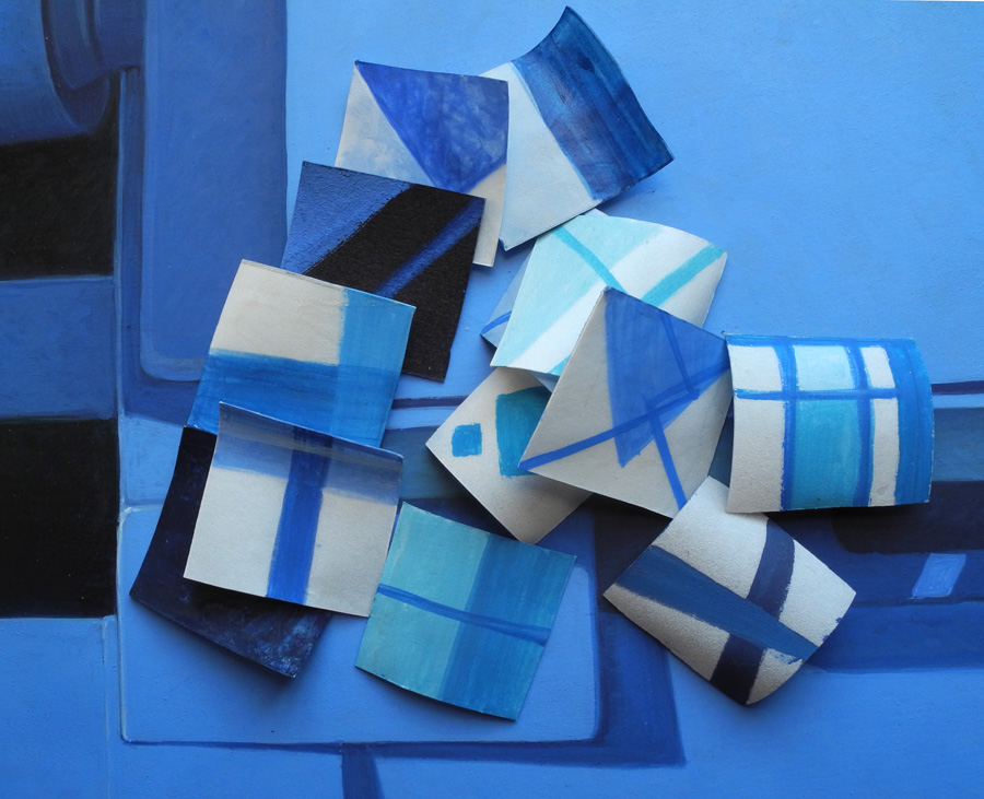

From Lyric Suite


I had never thought much of Motherwell's work, since all I knew of it were the Elegies to the Spanish Republic, a series of works whose forms I found leaden and repetitive. Then last year I saw a couple of later paintings from the Open series, and realized that I didn't know the artist at all; I loved those works. The mezzotints below are from that series. They are minimal, but have an expansive space, beautifully brushed color, and inherent light.


From Lyric Suite


I see a similar sensibility in the Lyric Suite drawings and the Open series, with their forms inhabiting large spaces, floating within them. There is a great respect for the ground plane and its strong presence; the artist's entry into it is as collaboration, not dominance.  


Mezzotint in Crimson, 1969; mezzotint, plate: 8 11/16 x 5 13/16, sheet: 25 1/8 x 19 15/16 in.


The exhibit included several other works in different mediums by Motherwell, including mezzotints using the form of his Open series. I have read a couple of different origin stories for this series, which he began in 1967. One is that it came from a chance arrangement of one small vertical canvas leaning against a larger one. Another, from MoMA, is that it was "responding to the impulse in European and American visual arts to regard painting as a window". But that goes against the general idea of the "integrity of the picture plane".


Mezzontint in Indigo detail, 1968; mezzotint, plate: 8 13/16 x 5 13/16 in..


To me the works are existential: the open rectangle a human structure, existing in boundless space. The intervention of geometry is delicate, unassertive, but insistently present; the field, though dark, is luminous. I find them very moving.


Gauloises Bleues, 1968; aquatint and collage, plate: 9 3/4 x 5 1/4, sheet: 22 x 14 5/16 in.


Motherwell was also a master of collage, and I have regretted missing recent shows of this work. This small piece shows a perfect balancing of large and small shapes, and color. There's a narrative to the work, too, since we realize that the sky blue wrapper is from a cigarette package. 


Untitled, 1973; pasted papers and lithograph on paper. 


A later collage makes reference to Motherwell's Elegy series, as rounded forms are bound between vertical lines; protected? imprisoned? The two ovoids have more buoyancy than the black shapes of his Elegies; they feel human, even musical. Their colors––green and white––have hope within them, and the irregular pink bars have some warmth. It is such a pleasure to newly discover an artist I'd long dismissed; thanks to the Met for this nice little show, on the 100th anniversary of Motherwell's birth.


March 26, 2015

A New Textile: "Arcs and Squares"


Arcs and Squares, hand dyed wool on linen, 23 x 23 1/2 in.


While doing sketches for new textiles, I thought of making a pattern that would flow through separate pieces stitched together, as in the Robert Mangold painting below. I liked the idea of using squares with a square void at the center. After trying this and that, I realized that I didn't want a clear flowing line through all four squares, so had two meet, and two be separated: point and counterpoint. My colors are like Ellsworth Kelly's blue and green, though the red is cooler and darker than the red he uses. 


Robert Mangold, Framed Square, blue; acrylic and black pencil on canvas.


Arcs and Squares detail


Here is a detail of two squares meeting, where the red line is supposed to flow from one to the next. Because rug hooking is not a precise medium, the squares aren't quite square and the lines aren't quite smooth, but I accept the imperfect nature of the medium. 


March 25, 2015

At the Met: Louis Comfort Tiffany's Molten Color


Vase, 1893; Favrile glass, h. 3 5/8 in. 


I can understand the fascination with glass as a medium: it holds light and color and carries its history of being liquid into its permanent solid form. The last time I was at the Metropolitan Museum of Art, I spent some time with Louis Comfort Tiffany's beautiful blown glass objects, designed by him and executed by skilled craftsmen. Wondrous colors and iridescence dance across the surfaces of these pieces. From the Met's label, I learned that "Favrile" was a name invented by Tiffany, from the Old English fabrilis, meaning hand wrought.


Vase, ca. 1900; free-blown Favrile glass, h. 22 in.


This very beautiful large vase, in its translucency, imitates the water that the lily-pad shapes are floating on.


Vase detail


There is a sense of movement in this vase, and a mystery in its depths.


Bowl, ca. 1908; Favrile glass, h. 6 5/16 in.


The iridescence and irregular surface variations, from rough to smooth, give this piece a look of a natural object, some small treasure found on a beach. How difficult it must have been to make something so seemingly artless.


Vases, Favrile glass


These vases have elegant tubular shapes as if to embody the flowers that they will hold. Elegant sweeps of color flow vertically and onto the bases.


Vases, Favrile glass


Tiffany was inspired by the natural world, and we can imagine that seeing light passing through the petals of a tulip brought forth some of his designs.


Vase, ca. 1912; Favrile glass, 5 3/16 x 3 1/4 in. 
Vase, ca. 1912; Favrile glass, h. 5 7/8 in.


Ancient glass was also an inspiration for Tiffany, and these vases were an attempt to "replicate the surface effects found on the ancient Roman and Syrian glass he displayed at Laurelton Hall. The effect was achieved by rolling the parison of molten glass on a marver covered with pulverized glass crumbs and exposing the surface to metallic fumes". (from the Met's website). These works are so different in their weighty quality from the translucent ones above; rather than passing through them, light is bounced back as many luminous colors. Art and nature and invention and skill came together to make these beautiful works.


March 23, 2015

New Cardboard and Collage/Potato Prints


Orange Oval, Lime Green Circle; ink on Akatosashi paper; each: image size 9 x 8 in., paper size 15 1/2 x 14 in.; ed 4. 


I spent a day printing last week, making two cardboard prints and nine potato prints. I think of the two cardboard prints as a pair (although not a diptych), since they share similar ideas: one simple form on rectangles of lines; bright colors on dark paper. My initial idea was to have the color lighter than the paper, which didn't exactly work out with the orange, just the lime green, but that's okay.


Orange Oval


I'd been doing prints with more complex compositions and had a desire to make smaller and simpler images this time. I used a handmade Japanese paper that I love, Akatosashi, for its surface and dark color. It is impossible to convey the texture and look of Japanese papers in photographs; it does help to click the images to enlarge them. 


Lime Green Circle


 The color of Lime Green Circle comes closer to my initial idea of a color brighter than the paper, but it may be that it sinks too much into the paper, making the image hard to see from a distance; up close it is very vivid. 


Untitled 71; pasted painted paper and ink on Masa dosa paper, 7 x 10 1/2 in.


I've become quite enamored of the process of collaging painted or unpainted thin Japanese papers and then doing potato prints on top of them. I was inspired by the exhibition of Matisse cut-outs at MoMA. The day before I'm going to print, I tear some paper into shapes, paint some of it with egg tempera, and glue it on sheets of paper. This time I mostly used heavier weight paper––Masa dosa and Nishinouchi––for the ground so that it wouldn't pucker that much.


Untitled 72; pasted paper and ink on Masa dosa paper, 23 x 17 in.


Untitled 71 and 72 both have a simple painted rectangle glued on the surface, but the scale is entirely different, with one taking up much of the picture plane and the other settling on the bottom.


Untitled 72 detail


The detail might give some idea of the different textures of painted paper and inked circles.


Untitled 73; pasted paper and ink on Akatosashi paper, 3 panels each 19 1/2 x 7 in.


This piece began with two semicircles and one circle pasted on paper; I then added the printed squares. After I had stamped the square alongside the circle at the right, I wished I could have taken it back and left the circle on its own, but I still like the print. All these potato/collage hybrids are improvisational and I never quite know what I'll do or how they'll turn out.


Untitled 74; pasted paper and ink on Nishinouchi paper, 20 x 12 1/2 in.


In Untitled 74 I pasted unpainted paper––Gifu green tea medium, which has a green tint––a circle on top of a square, then added lines with potato print.


Untitled 75; pasted paper and ink on Masa dosa paper, 15 x 12 in.


Two pasted shapes at bottom anchor the composition, as the printed blue circle floats above.


Untitled 76; pasted paper and ink on Nishinouchi paper, two panels each 15 x 8 in.


A diptych of colored rectangles.


Untitled 77; pasted paper and ink on Gifu green tea medium paper, 6 3/4 x 11 1/2 in.


For this print I pasted a rectangle of white paper on the green and balanced it with a line of stamped squares.


Untitled 78; ink on Nishinouchi paper, 9 x 7 1/4 in.


I thought I should do a couple of pure potato prints, so did this, with a circle and three squares....


Untitled 79; ink on Masa dosa paper, 11 x 8 in. 


....and here, crossing thick lines. I have to admit that although I've done many potato prints that I like a lot, right now my heart is with the addition of collaged paper.


March 22, 2015

On William Gass's "On Being Blue: A Philosophical Inquiry"


Language can be delicious, a taste of words juicy on the tongue, tart and sweet, with a complex depth of flavors. Such was my experience reading the long essay by William Gass, On Being Blue: A Philosophical Inquiry. Although ostensibly about the color blue in all its manifestations––visual, physical, metaphoric––the essay is truly a celebration of language. Why blue?
Of the colors, blue and green have the greatest emotional range. Sad reds and melancholy yellows are difficult to turn up. Among the ancient elements, blue occurs everywhere; in ice and water, in the flame as purely as in the flower, overhead and inside caves, covering fruit and oozing out of clay. Although green enlivens the earth and mixes in the ocean, and we find it, copperish, in fire; green air, green skies, are rare. Gray and brown are widely distributed, but there are no joyful swatches of either or any of exuberant black, sullen pink, or acquiescent orange. Blue is there most suitable as the color of interior life. Whether slick light sharp high bright thin quick sour new and cool or low deep sweet dart soft slow smooth heavy old and warm: blue moves easily among them all, and all profoundly qualify our states of feeling. 
And Gass makes lively lists:
There's the blue skin of cold, contusion, sickness, fear...absent air, morbidity, the venereals, blue pox...gloom.
There are whole schools of fish, clumps of trees, flocks of birds, bouquets of flowers: blue channel cats, the ash, beech, birch, bluegills, breams, and bass, Andalusian fowl, acaras, angels in decorative tanks, the bluebill, bluecap, and blue billy (a petrel of the southern seas), anemone, bindweed, bur, bell, mullet, salmon, trout, cod, daisy, and a blue leaved and flowered mountain plant called the blue beardtongue because of its conspicuous yellow-bearded sterile stamens.
...blue is the color of the mind in borrow of the body; it is the color consciousness becomes when caressed; it is the dark inside of sentences, sentences which follow their own turnings inward out of sight like the whorls of a shell, and which we follow warily, as Alice after that rabbit...  
I came across mention of this book while I was puttering along on my boxed paintings, Blues, and thought it would be appropriate to read it then. Gass names colors, vividly:
It is of course the sky. It is the sky's pale deep endlessness, sometimes so intense at noon the brightness flakes like a fresco. Then at dusk, it is the way the color sinks among us, not like dew but settling dust or poisonous exhaust from all the life burned up while we were busy being other than ourselves. For our blues we have the azures and ceruleans, lapis lazulis, the light and dusty, the powder blues, the deeps: royal, sapphire, navy, and marine; there are the pavonian or peacock blues, the reddish blues: damson, madder and cadet, hyacinth, periwinkle, wine, wisteria and mulberry; there are the sloe blues, a bit purpled or violescent, and then the green blues, too: robin's egg and eggshell blue, beryl, cobalt, glaucous blue, jouvence, turquoise, aquarmarine. 
And he goes on with more naming of dyes and pigments. But much of this essay is about blue language––vulgar, dirty, obscene, pornographic––and the failure of language to describe sex:
I should like to suggest that at least on the face of it a stroke by stroke story of a copulation is exactly as absurd as a chew by chew account of the consumption of a chicken's wing.  
He doesn't shy away from  profanity, he revels in it, and what could be thought of as vulgar language (just to warn you if you decide to read the essay.) He praises John Barth for not "disrupting the form" by describing a rape, only "that the lady was ravished unmercifully and turns his hero sadly away". Gass tells us, passionately,
that the ultimate and essential displacement is to the word, and that the true sexuality in literature––sex as a positive aesthetic quality––lies not in any scene and subject, nor in the mere appearance of a vulgar word, not in the thick smear of a blue spot, but in the consequences on the page of love well made––made to the medium which is the writer's own, for he––for she––has only these little shapes and sounds to work with, the same saliva surrounds them all, every word is equally a squiggle or a noise, an abstract designation (the class of cocks, for instance, or the sub-class of father-defilers), and a crowd of meanings as randomly connected by time and use as a child connects his tinkertoys. .....what counts is not what lascivious sights your loins can tie to your thoughts like Lucky is to Pozzo, but love lavished on speech of any kind, regardless of content and intention. 
 This spill of words, as through the entire essay, is thrilling to read: words built as though physical things to move around, to build with, to sculpt, not just thin squiggles on a page. Gass praises other authors in addition to Barth, and my most favorite author of all, Henry James; how could I not love this essay when James is praised in this way:
If any of us were as well taken care of as the sentences of Henry James, we'd never long for another, never wander away: where else would we receive such constant attention, our thoughts anticipated, our feelings understood? Who else would robe us so richly, take us to the best places, or guard our virtue as his wont and defend our character in every situation? If we were his sentences, we'd sing ourselves though we were dying and about to be extinguished, since the silence which would follow our passing would not be like the pause left behind by a noisy train. It would be a memorial, well-remarked, grave, jut as the Master has assured us death itself is: the distinguished thing. 

Oh my oh my! I am again swept away, thrilled by the words....my copy of the essay is full of underlinings, and I'd like to share many more, but this post would be much much too long. I will end with Gass's advice to writers, which could just as well refer to any of the arts:
So to the wretched writer I should like to say that there's one body only whose request for your caresses is not vulgar, in not unchaste, untoward, or impolite: the body of your work itself; for you must remember that your attentions will not merely celebrate a beauty but create one; that yours is love that brings its own birth with it, just as Plato has declared, and that you should therefore give up the blue things of this world in favor of the words that say them....
                         

March 19, 2015

A New Boxed Paintings: "Blues"


Blues, egg tempera on calfskin parchment, ca. 3 1/2 x 5 in.


After my last boxed paintings, Reds, I thought I'd make another box with a color theme and chose blue. There's an interesting difference between red and blue, in that tints of blue will still be called blue, while tints of red become pink, hence no longer red. We don't have a separate color name for light blue, which makes mixing blues easier than mixing reds. I used Ultramarine blue, Cobalt blue, Phthalo blue, Manganese blue cerulean, each different in hue. I stuck with geometric shapes, as different from the more organic ones in Reds.


Blues, lid and inside of box


I had a terrible time with the painting on the lid. I had worked out a composition and had a clear idea about color and transparency for it. When it was done, I absolutely hated the painting; it didn't work at all, so I wiped it off. When I saw the softly washed remains of blue paint, I thought I'd keep that atmospheric effect and add a couple of geometric elements on top of it. The inside of the box retains its simple geometry. They may be too different from each other, but I'm sticking with the idea.


Blues, paintings side 1, each ca. 1 1/4 x 1 1/4 in. 


I tried to have a variety of hues in the small paintings, and a variety of compositions within a geometric framework. My boxes usually contain 12 paintings; this one has a baker's dozen. The extra one on the bottom is painted on goatskin parchment dyed dark blue.


Blues, paintings side 2, each ca. 1 1/4 x 1 1/4 in. 


Because the calfskin parchment is translucent, after I paint one side of the square, I hold it up to the light to paint the second side so as to have a conversation between the two sides. I've placed the paintings in the same order for both photos so you can get some sense of the relationships. Blue has a wide emotional range, from its lights to its darks: daylight to night. When I put all the paintings in the box, to my eye the somber side of the color was most in evidence.


March 18, 2015

Doug Ohlson: Intervals and Balance


Earendel, 1969, oil on canvas, 90 x 121 in.


Squares of color, placed carefully on adjoining vertical panels, move in space––forward/back, up/down, across––mark weights, move the eye. The sense of empty and full gives rise to the reference to a musical notation, one with sounds and many silences, but with passionate order. In the current exhibition at Washburn Gallery, Doug Ohlson: Panel Paintings from the 1960s, we can see four very large, ambitious paintings, each with a different quality of color, light, and rhythm. I love Earendel's offbeat balance, with colored squares of intense and subdued hues. From the irregular placement and varied hues of the squares I got a sense of buoyancy.


Earendel detail


The squares are very carefully painted with even brushstrokes moving the paint vertically. The ground color is laid on with no visible touch at all, so becomes a boundless space.


Howick, 1967, acrylic polymer on canvas, 92 x 76 1/2 in. 


Howick is a beautifully mysterious painting, with colors that are dark, yet incredibly rich. There is a subtle iridescence in the brown paint, impossible to show in a photo, that adds a quality of light within darkness. The painting asks for long contemplation, similar to that required by an Ad Reinhardt painting. Another thing to notice is that in this painting the panels are not of equal width as are all the others; the panel containing the square is slightly wider, as though to accommodate it, to emphasize its importance even though its color is quiet and unassertive, almost not visible.


Sterne, 1967, acrylic polymer on canvas, 90 1/4 x 186 in. 


In Sterne....


Cythera, 1967, acrylic polymer on canvas, 90 7/8 x 207 7/8 in. 


....and in Cythera, the panels are slightly apart rather than joined, creating a more insistent rhythm between them; the small jumps in space read almost like passing time, especially since the works are so large, 15 and 17 feet across. Larger than body size, they require distant viewing, then invite us closer, to walk past each panel, experiencing the changes over the entire painting. Color is carefully balanced for a expression of contrast or of subtlety. I don't know how accurate my photos are regarding this important aspect of Ohlson's work: the color on the gallery's website is very different from that in their small catalog of the show, and my color is yet a third variation on the actual paintings.


The above and the following are all Untitled, 1967, colored paper on paper. 


Ohlson worked out his compositions from small color studies. In them we can see his play with color and balance. He made notes to himself alongside this study. At the top right is written "12/26/67 from 11/18/67 drawing idea, the panels could open up in this - also more colors". At the lower right: "sqs get too small".


I love seeing the variations of placement and color of squares and how it changes the feeling of each piece. With only 3 squares on 9 panels the intervals between the left side panels become even more important as they lead up to the emphasis of the brown squares.


The difference in hues makes the blue advance visually or settle into the same plane as the surrounding greenish brown.


Here are two ways of approaching cool reds, with unsaturated and saturated color squares. Although the blue is cooler in hue, it is so intense that it pops off the surface, while the greenish squares stay put. There is also the playing with balance: which works better, the upper squares on the right or on the left? four squares at bottom or five? Within the seeming simplicity of the elements he uses, Ohlson explored complex issues of color and placement of form, and of enveloping presence.


March 16, 2015

All That Glitters.....


I'd like to turn the old saying "all that glitters is not gold" upside down. I am very very tired of winter; the endless cold has worn me down, and when it snowed all day yesterday I moaned and groaned. But but....I woke up this morning and the landscape was sparkling: the crystalline flakes of snow were catching and reflecting light, as though they were millions of tiny jewels. The glitter wasn't gold, but it was a lovely gift, not a hollow one.


I so much wanted to capture the sense of glistening particles to share here, but so much of this phenomenon has to do with movement: a turn of the head, a shift of the eye, and the light bounces and moves; a photograph can only give a pale imitation. (It does help to click on the photos to enlarge them.)


So, I thought I'd concentrate on compositions with expanses of snow and details of objects.....


....plants....


....or garden furniture, all waiting for the thaw. The snow glitters around them.


Two years ago, a show at the Met highlighting the Rinpa aesthetic in Japanese art showed a dramatic use of emptiness in compositions with minimal natural forms; these ideas have influenced much of my work.


In the woods, thin branches rise above glittering snow, are covered by it, are shadows on it. There is still much beauty on offer in this longing-for-spring time of year.