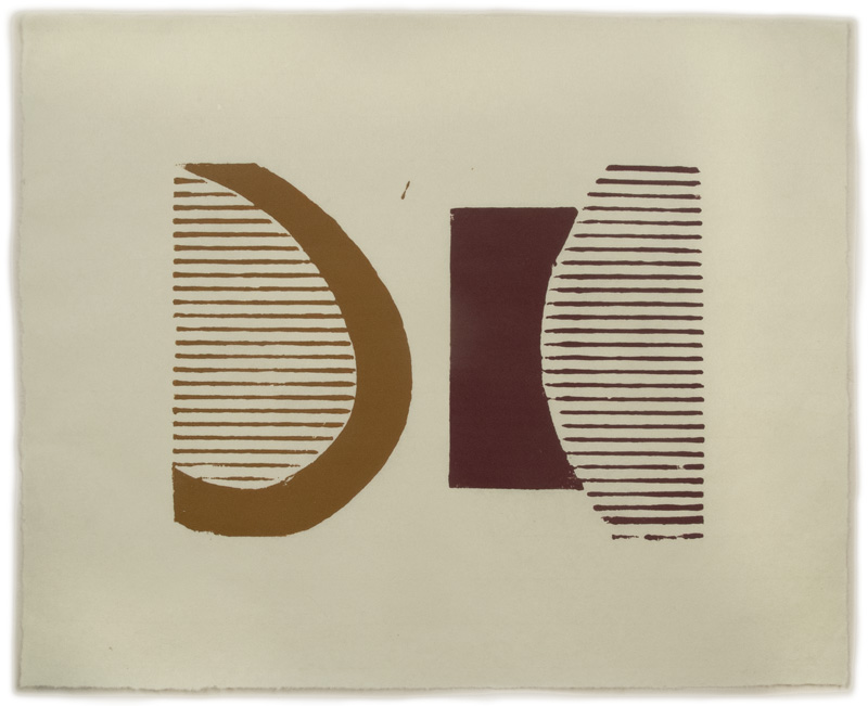
Bulge, ink on Sansui SH8 paper; image size 10 x 14, paper size 18 x 22; ed. 3
For nearly my entire art making life I have been in pursuit of precision: of form, line, light, color; my paintings continue to aim for a kind of perfection, for a slow and careful looking. So it's something of a relief to have found a medium where I can throw all that out the window and embrace accident and imperfection. The prints I've been doing, both those made from corrugated cardboard plates and those from shapes cut out of potatoes, dipped in ink and stamped, seem to have imperfection inherent in their materials. I've made many prints in the past––both lithographs and drypoints––working on the plates and having them printed by master printers. I know how important it is to have an edition in which every print is like every other, with no variations. So are these prints I'm doing actual editions, when the one above is close to perfect but has a drip of yellow ink at the top?

Another one of the edition had a doubling of lines in the red, but somehow I didn't mind.

I thought this print was perfect until I noticed that some of the lines on the right faded off, likely because I didn't put enough pressure on that side of the paper when transferring the ink. Rather than be upset about these imperfections and thinking of them as sloppiness, I've decided to embrace them, treat them as an essential element of the work. People have mentioned the Japanese concept of Wabi-sabi to me in speaking about imperfection; Wikipedia says this about it:
Characteristics of the wabi-sabi aesthetic include asymmetry, asperity (roughness or irregularity), simplicity, economy, austerity, modesty, intimacy, and appreciation of the ingenuous integrity of natural objects and processes.
I would not venture to include my work in this aesthetic, but for me there is something of a relationship.

Untitled 19, ink on Twinrocker paper, 2 panels each 15 x 7 1/4 in.
The element of accident comes into play even more with my potato prints, where the piece of potato picks up ink in an irregular way; each stamp of the same shape comes out differently.

Untitled 20, ink on Masa dosa paper, 15 x 12 in.
For me, much of the interest in these prints is seeing the variations of inking that come from the stamping process.

Untitled 21, ink on Nishinouchi paper, 10 1/2 x 14 in.
Shapes, though originating from the same piece of potato, can have a different character. None of it is planned; it is all improvised, hoping for a good outcome.

Untitled 22, ink on Nishinouchi paper, 12 x 12 in.
Repetition sets up rhythm and variation.

Untitled 23, ink on Twinrocker paper, 7 x 15 in.
And variations come from light and heavy inking.

Untitled 24, ink on Twinrocker paper, 7 1/4 x 8 in.

Untitled 25, ink on Twinrocker paper, 7 x 7 1/4 in.
These two small pieces have surprising shifts of color in the larger shapes. I simply put the potato down on the palette in a couple of places, allowing color mixing, not knowing what will result. In a sense, this process is a letting go, a letting go of preconceptions, of control.

Untitled 26, ink on Gifu green tea light paper, 10 1/4 x 11 in.
They are a letting go of the perfect, and instead finding pleasure in the irregular.
wonderful. i want to make some potato prints now. just lovely. specially like 20, 24 and 25.
ReplyDeleteGo for it, Elaine. Everyone has a different approach to the medium, as I found out when I searched online. Have fun!
DeleteInspirational work and I was interested to read about the concept of wabi-sabi
ReplyDeleteFor me, the irregularity of the forms and printing process are a big part of what makes these prints so appealing. The playfulness of the compositions goes hand in hand with the informality of the execution. I'm particularly drawn to the movement in 19 and 22.
ReplyDeleteThanks, Maureen and Tamar, for the nice comments. It's not always easy for me to accept this kind of imperfection, but it certainly helps to have support in my endeavors.
ReplyDeleteAltoon:
ReplyDelete#26 is perfection. Absolutely stunning and beautiful. For me, these prints are far better than your paintings. You are really on to something. Can you now transfer this type of "freedom" and "abandon" to your paintings? I believe you would truly be a GREAT Artist then.
Thank you, Altoon, for all your experimenting around, and breaking thru to greatness.
Bob B.
Thanks very much, Bob, for your praise. I am not, however, in the least interested in transferring this "freedom" to my paintings. I am after something very different there, a tactile sense of the real, which I will not abandon to become yet another painterly painter. Would you tell Vermeer to loosen up? (not that I'm comparing myself to Vermeer.)
DeleteI too am drawn to many of these prints. Some of their appeal, when you are dealing with abstraction, comes from their imperfection. For me, that imperfection can have more depth than say, Mondrian's abstract work, where I feel it is all worked out and there is little room for resonance. I believe the imperfection is so appealing because it leaves more room to explore possibilities.
ReplyDeleteThank you, Julie, I'm glad you like the prints. I would argue with you, however, about geometric abstraction, such as the paintings of Mondrian, which I find deep and moving and touching an eternal truth.
DeleteI love these simple but profound compositions you are putting together. They're full of quiet presence. Isn't it wonderful what can be done with such simple materials! My favorite process to work with right now is collagraph, which also shares some of the same qualities -- non-traditional (and inexpensive) materials. lots of possible variations depending on how the plate is inked, and the appeal of imperfection and irregularity. When I make an "edition" of prints from the same plate that nevertheless are each different, instead of numbering them in the traditional way ( 1/15, 2/15 etc.) I use the initials E.V. -- edition varies.
ReplyDeleteThanks so much, Kathleen. I am aware of variant editions; maybe I should sign these works that way....but they aren't quite varied enough I think.
Delete