March 31, 2013

Abstraction: Image and Paint


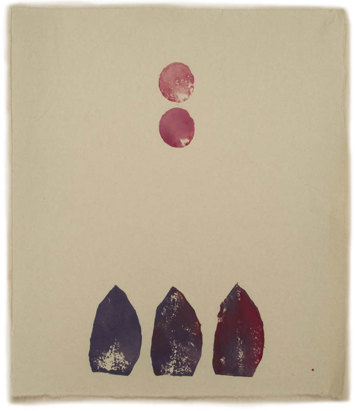
Andrew Masullo, four small paintings, approximately postcard size or a little larger.


Last week I saw two shows of abstract painting––Andrew Masullo at Mary Boone, and Painting Advanced at Edward Thorp––that got me thinking about how important the quality of paint was to me: paint itself, how it looks, how it works, how each artist uses it. 


A wall of paintings by Andrew Masullo


Andrew Masullo has a marvelous visual imagination; his paintings have seemingly endless combinations of shapes, organic and geometric, surprising and inventive. His color tends toward the bright and cheerful, and looking at the work is a happy experience.  


Andrew Masullo, oil on canvas. 


But....I just don't like the way Masullo works with paint. The surfaces are fairly glossy, whether from varnish or the paint medium, and I find that a little off putting. As you can see in the photo above, of a very small painting, the paint is built up in places, but often having nothing to do with the form, because he sometimes works for a long time on a painting. I don't get the sense when I look at these works that there is care taken with facture, with the actual handling of the paint; paint is simply a tool to get at color and shape, to make an image. The images are enchanting, but for me the love of paint is missing. 


Gary Stephan, Rickety Fields, 2012; oil on canvas, 56 x 70 in. 


I was very happy to then walk into Edward Thorp Gallery (you can see all the work in the show on the gallery website), with its strong show of five abstract painters, each with a very different approach to image and materials, each with a rich and sensuous use of paint. Gary Stephan's overlapping broad strokes create a golden field, broken by odd forms. 


Gary Stephan, Rickety Fields, detail


The crisscrossed brushstrokes create subtle color shifts and paint builds at their edges to create slightly darker lines. The mark making itself becomes form. 


Andrew Spence, Red Pink White 3, 2011; oil on canvas, 22 x 16 in.


Andrew Spence is a very different kind of painter, a minimalist with a luscious twist of color––pinks and reds and white––and clearly delineated yet ambiguous spaces. 


Andrew Spence, Red Pink White 3 detail


His paint is carefully added so that each shape, each field, is a delicious layering.


Andrea Belag, Stage Fright, 2011; oil on linen, 38 x 45 in.


In Andrea Belag's work we have paint as drama: broad strokes of large brushes create the form; mark and shape are inseparable.


Andrea Belag, Stage Fright detail


A vivid quality of light is embedded within the translucent strokes.


Jim Lee, Untitled (Departed Blue Relief), 2013; oil, acrylic on alumalite and plastic film with wood, 
32 x 24 in. 


This is a beautiful painting, with a subtly worked surface that does not show at all in photos. Jim Lee uses some unusual materials, all with careful attention. The painting is called "departed" because there is a slight relief at the bottom curve.


Rachel Malin, B O B, 2012; acrylic, ink on canvas, 54 x 40 in. 


This painting by Rachel Malin has a ethereal quality, as of forms just out of sight, melting away.


Rachel Malin, B O B detail


The thin layers of paint drip downward, the quality of thin paint adding to the image, working as line around shape. Paint is the essential building block for painters, the DNA, the primal mud from which we rise. The paint makes the image, the paint makes the form, the light, the space; we have to love the paint.


March 30, 2013

Spring Update


When I got home to Vermont yesterday, I saw that the snow had retreated from full coverage to large patches. It was gray and blustery and cold, not a warm welcome. But this morning I woke to a bright day, brisk and clear. It seemed perfect to hang the laundry outdoors for the first time this year. The snow is still piled high against the back door, so I carried the laundry basket from the front door, around to the back yard where the line is. I spent time outdoors pruning, then saw that by midday the snowdrops had opened. Two spring milestones in one beautiful day.


March 23, 2013

Happy Passover!


This brief video shows a short portion of the Sephardic version of Dayenu ("it would have been sufficient") sung by nephews, brothers, brother-in-law; its chant is very different from the song sung by Ashkenazi Jews. I love the repetitive rhythm of it. I will be heading into NYC to celebrate the Passover seders with my family, and to see some art. I want to wish all my Jewish friends a wonderful Passover, and to everyone peace, and freedom, and justice.

March 22, 2013

A New Textile: "Four Diamonds"


Four Diamonds, hand dyed wool on linen, 10 x 10 in.


This piece is another in my series of textiles with designs based on patterns, on repetitions of shapes (below, you can see four others in the series). I began with four diamonds centered on squares and chose colors based very loosely on Islamic tiles, thinking turquoise, dark turquoise and gold, but the dye color came out a bit differently––more greenish––than I expected. A bigger surprise came with the alternated background colors: 


Four Diamonds detail


A shape at the center was created that demanded attention, flipping from a negative to a positive shape, a broken diamond made up of four triangles; it was a shape that I didn't notice at all until the piece was completed, a bonus which had me confused as to how many diamonds I had, four or five? 


Here are four other works in the pattern series, all 10 inches square.


March 21, 2013

"Idiots and Angels" by Bill Plympton: Drawings in Motion, with a Tale to Tell


We enter this film in a rather conventional way: walking down the street, looking at fine suburban homes and gardens, until we come to this Addams Family-like house...


...and all hell breaks loose inside, as the main character, a truly nasty man (I'm told from reading about this film that his name is Angel), wakes up in a rage. I was immediately fascinated by the dramatic shifts in points of view in Idiots and Angels (you can see some short videos at the link) an animated feature made in 2008 (available streamed on Netflix). I was happy to learn about the artist Bill Plympton and hope to see more of his work. There are so many art forms, rich and interesting, that I know next to nothing about, and animation is one of them. Yes, I've seen the big budget, popular releases from America and Japan, and they are marvelous (I thought Miyazake's Spirited Away brilliant, and Pixar's work is great) but there's also a whole world of smaller, more artful films, such as this dark, yet redemptive one.


With the simplest of means––slightly tinted drawings, sound effects (including grunts, groans, screams) but no words at all except in the superb musical soundtrack––the story unfolds. Angel leaves his house, enters traffic, violently shoves someone out of a favored parking spot...


...then enters his favorite bar. 


The shifts in points of view are exciting, pushing us to see more than we normally would. It's something difficult to do in live action film, while with drawing an artist has no constraints: he can imagine being an ant or a swallow, can see things from near or far, exaggerating space, and it all feels right, expressively carrying the story forward.


At the center of the narrative is a butterfly, its transformation from larva to chrysalis to butterfly in Angel's hair, a powerful metaphor of transformation that returns later in the film. While others at the bar have rosy visions of the butterfly's presence, Angel, true to his character, squashes it. The horror in killing that benign insect is heightened by the huge hand shoved towards us.


Then retribution: tiny wings sprout from Angel's back; he aggressively tries to rid himself of them, but they grow and take over his miserable life, changing it, eventually ending it.


The skies weep.


But a heart lives underground, with a chance of transformation and redemption. I realize this can sound a bit corny, but the film is full of the darker aspects of human nature, with greed topping the list. I came away from watching Idiots and Angels full of aesthetic pleasure, and moral satisfaction: that enormous change could happen to the worst of us, with a little help.


March 19, 2013

A New Painting: "Untitled (Manganese Blue, Yellow, Orange)"


Untitled (Manganese Blue, Yellow, Orange), egg tempera on calfskin parchment, 5 1/2 x 7 1/2 in. 


Today, as I was working on new drawings, I was thinking about my widening art endeavors: strangely, instead of thinking that I am spreading myself too thin, I feel as though I am touching more and deeper parts of myself. Others may disagree, certainly, but for me, each series I work on calls up a different range of feeling. Even though I might use a similar compositional idea to the painting above in my prints or hooked wool drawings––using elements conversing with each other across a surface––the paintings slow process and illusionistic form impart quite a different mood.


The blue in this painting is mixed with Manganese Cerulean pigment and Titanium white. The blue is quite transparent, so it's close to impossible for me to paint an even tone; instead I tried to use its translucent quality to make a varied surface of subtly shifting hues.


March 18, 2013

It's Still Wintry, but the Buds are Ready for Spring


After some mild weather last week, we've had a succession of cold days, temperatures below freezing, with mostly gray skies and snow flurries. Winter is insisting on staying around for a while, even promising us a big snow storm tomorrow. But this morning the sun shone, the temperature was close to 30º, and with no wind it felt balmy. So, I went out to see how spring was advancing despite the weather. Buds on trees and shrubs are enlarging, looking fat and promising, like the lilac buds above. 


The buds and stems of blueberries are a warm red.


A pointed gesture comes from a pale red Nannyberry bud.


In the woods I found red branches of last season's new growth with buds swelling.


Pointed spears of beech tree buds rise above dried leaves.


On a gray day the red haze of buds is becoming visible on some trees, like a warm halo.


The first flower of spring, snowdrops are making a valiant effort through ice and snow. They are letting me know that yes, spring will arrive, and the cycle of vegetative rebirth will begin again.


March 17, 2013

Lentil Croquettes with Caramelized Onion


Now that a study has confirmed that the Mediterranean diet is very healthy (as if we didn't know!), it's nice to have some recipes for legumes such as lentils. One of my favorite meals with lentils is a family recipe, Mujedrah, which is rice and lentils with caramelized onions (the recipe is here). These delicious patties come from Deborah Madison, whose recipes I've shared before, in her cookbook Vegetarian Cooking for Everyone. I like the taste of lentils, but the onions make the dish special. The recipe is fairly simple: cook the onions, cook the lentils, puree the lentils, make the patties, fry them. In her recipe, Madison uses bread crumbs but since my only bread is a homemade sourdough a bit too strongly flavored, I use mashed potatoes; this is a trick I learned from an easy and delicious recipe from Jamie Oliver for salmon cakes, which you can see here. Deborah Madison suggests serving these lentil croquettes with a tomato sauce (she says "even ketchup" but I draw the line against that). I had them with tomato sauce from last summer's tomatoes; also from the freezer are the green beans, Northeaster, a flat bean with rich flavor; the French Fingerling potato came from the root cellar.

2 cups chopped yellow onion
2 Tbs olive oil, butter, or a mixture
salt and pepper
1 cup lentils
1/2 cup finely diced celery
1/2 cup finely diced carrot
1 egg
2 cups soft bread crumbs, or 1 cup mashed potatoes and flour for dusting
vegetable oil for frying


  1. Cook the onion in the olive oil in a medium skillet over low heat, covered, for 20 minutes. Remove the cover and cook, stirring from time to time, until the onions are brown and soft and smell delicious. Season with salt and pepper
  2. Put the lentils, celery and carrot with 1 teas salt in a saucepan with water to cover by 3 inches. Bring to a boil, then simmer until lentils are tender, about 30 minutes. Drain, saving the liquid. When they have cooled a little, puree the lentils in a food processor, using some liquid if necessary, but leave a little texture. 
  3. Mix lentils with the onion, half the bread crumbs or the cup of mashed potato; add the egg and mix well. Let cool until easy to handle, then form into rounds. I made 3 inch patties and got 10 from the recipe. Madison says you can get 18  2 1/2 inch patties. Place remaining bread crumbs or flour on a plate and dust the croquettes with it. Another tip from Jamie Oliver: put the croquettes in the refrigerator for an hour before cooking to help firm them up for frying. 
  4. Fry croquettes in shallow oil until golden brown on both sides. 

I think this recipe makes enough for four for a main dish; Deborah Madison says six. I guess I'm a big eater.


March 16, 2013

New Prints: A Cardboard and a Passel of Potato


Triangle, Circle, Square; ink on gampi smooth paper; image size 10 x 12 in, paper size 18 1/2 x 19 3/4 in.; editon 3


I had fun during my most recent printing printing session, doing a cardboard print and then launching into a long series of potato prints, stamping away with abandon. Even though some of them are "maybe's" I'm showing you all of them (and I threw only one in the trash). For the cardboard print Triangle, Circle, Square, I chose to use only corrugated lines to make the shapes, having no solid shapes at all. It gives the image a quavering quality, as though the color can't quite get its voice heard; it looks more assured when you step up close to the image. Perhaps this makes it too tentative?


Untitled 10, ink on Twinrocker paper, 8 x 7 1/8 in. 


I started this small potato print with a square at the center, and then got ready to add other elements. But I said to myself: "Stop!", so I did. I thought the square had enough interest in the variation in the ink for it to work. I like it, though it might be too simple. I have a couple of regrets in showing these works online: one is that you can't see the texture of the paper or its character; the other is that everything appears to be the same size: a work like Untitled 10 seems as large as the bigger one below. 


Untitled 11, ink on Masa dosa paper, 15 x 11 in. 


Here, three ovals horizontally, three ovals vertically; each stamped without recharging the ink, so a lighter and lighter echo.


Untitled 12, ink on Twinrocker paper, 2 panels, each 14 1/2 x 7 in.


 The idea for this piece, with a black line rising from the edge of the paper, came from a painting by El Lizzitsky that I saw at the Museum of Modern Art recently; he had forms and lines falling off the edge of the image.


Untitled 13, ink on Nishinouchi paper, 20 x 15 in. 


A grid of open forms, bounded by black lines.


Untitled 14, ink on Twinrocker paper, 15 x 7 in.


I've been thinking about pink and black this week.


Untitled 15, ink on Nishinouchi paper, 9 1/2 x 15 in. 


Pastel forms, floating above and below a violet line.


Untitled 16, ink on Twinrocker paper, 7 x 7 in.


A black bar over extended circles.


Untitled 17, ink on Ninshinouchi paper, 15 x 13 in. 


Three forms pointed toward two circles: growth or violence?


Untitled 18, ink on Gifu green tea light paper, 11 x 11 in. 


Lastly: open rectangles, as though hopscotched with yellow circles.


March 14, 2013

It's Early Spring: Time to Prune the Apple Trees


Last weekend we had a day and a half of sun, a few mild days sandwiched between gray cold, so while the sun shone I got out my pruning tools and began the annual work of pruning the apple trees. This is the first chore of the new garden season, so it's always a joy to get out into the fresh air and do some work while the ground is still frozen. I begin on the ground: I go around the orchard with the hand pruners first, then the 4 foot pruner, then the 7 foot. It's not until I finish as much as I can reach from the ground that I bring out the ladder. 


 All my apple trees are very old, and bear heirloom varieties: Sops of Wine, Peach, Duchess of Oldenburg, Sheep's Nose. This tree, with its expressive lean, has apples that must be an ancestor of the golden delicious, but I don't know its name. It's the tree that is most demanding of pruning each year, with its habit of throwing up lots and lots of upright branches, which must be removed.


My leaning tree is not in the orchard proper; here a a partial view over the back stone fence into the small orchard, which has about a dozen bearing trees.


Looking past one of the weathered limbs of an apple tree to the back of the house.


 The young buds are red and fat, holding a promise of fruit this year.


I enjoy walking around the orchard, noticing the growths of mosses and lichens on the trunks and branches.


The outer layer of bark has worn off this tree and it's being attacked by birds or insects. I always feel a pang of loss when looking at these trees: so many of them are weakened and I've lost a few over the years. I've read that apple trees have a life span of about 100 years, with only 40 of them being productive. If so, some of my trees are happily still producing lots of fruit in their old age, the Peach and Duchess mainly. The others give me a just a few apples, but not much.


I can't bear the thought of removing this old tree; it is so beautiful even though it's dead. The character of its bark and branches give me great aesthetic pleasure, as does the whole orchard, as much pleasure as tasting its apples.