October 15, 2013

Sunrise


August 16, 6:15 AM

The windows of my bedroom face east, with no shades or curtains to block the view. I wake early, so am immediately aware of the possibility of a beautiful sunrise, with light glowing behind the distant White Mountains. If the weather is mild, I grab my camera and head outdoors in bathrobe and slippers.


September 15, 6:22 AM, facing west 


Occasionally the most loveliest color is seen on clouds toward the west, here on a misty morning. 


September 20, 6:51 AM

 On the morning of September 20th the moisture in the air created a light so remarkably golden...


September 20, 6:54 AM

...that it seemed as though I'd entered a magical kingdom.


October 2, 6:53 AM


A layer of mist concealed the rising sun, which reddened the clouds above it, and touched the higher clouds with gold.


October 9, 7:19 AM


In the fall, there are often mists that hang over mountains near and far.


October 10, 6:51 AM


Sometimes there's a sunrise so dramatic that it reminds me of the paintings of the 19th century American painter Frederic Church. This is similar to the sky in his Twilight in the Wilderness.


October 15, 7:06 AM


This morning had a quieter grandeur, the sky orange and blue, the blue clouds tinged with red. I shared all these photos except this last one on Facebook, soon after I took them, but thought it would be nice to gather all the images in one blog post to show to those of you who haven't seen them before. The time and date of each photograph are stored in their data, a marvel of digital photography, so I can see the sunrise coming later as the season progresses, before the little jolt of the time change. I feel very lucky to have this view to the east, a marvelous vision of each new day.


October 14, 2013

A New Boxed Paintings: "Black and White"


Black and White, egg tempera on calfskin parchment, box size 3 x 5 1/8 x 7/8 in.


A couple of months ago I had an idea for a new series of works: a box of tiny paintings made on square scraps from my parchment panel-making process. The first box, which you can see here, was brightly colored in red, yellow, and blue, so I thought I'd go more minimal with the next piece, using only black and white; I've continued with simple geometric compositions. Because the parchment is a warm yellowish color, the white stands out on it.


Black and White, top and inside of box


My idea for the inside of the box came first, then I decided on a cover that would work with it. The tiny paintings inside the box are improvisational, but the larger paintings on the cover and inside take a little more forethought; not enough to do sketches beforehand, but enough that I actually use a ruler and pencil to mark off shapes. 


Black and White, paintings side 1; each painting ca. 1 1/4 in. square


Black and White, paintings side 2


Each painting is two sided....


....and I take the translucency of the parchment into account when painting, so each side converses with the other.


Black and White, filled box with red circle


When I had finished the box and was looking at the paintings inside, I felt that something was missing: it needed a touch of red. So I cut a small circle and painted it red on both sides, and now it adds a little surprise, like the baby inside a Mardi Gras King cake.


October 13, 2013

Narrative and Meaning


Fra Angelico, The Apostle Saint James the Greater Freeing the Magician Hermogenes, ca. later 1420s; tempera and gold on panel, 10 x 8 7/8 in.


I have a question for which I have no answer: how much of the meaning of a work is lost if we don't understand its narrative or cultural context? The painting above by Fra Angelico is one of my favorite paintings of a favorite artist: I love the tenderness with which the saint is freeing Hermogenes, love the mass of roiling devils behind; I also love the way all the forms are painted: figures, architecture, foliage; and the color is brilliant. To me it is an altogether satisfying painting. But, in the catalog for the great Fra Angelico exhibition at the Met of 2005-06, I read
The magician Hermogenes summoned devils to ensnare Saint James, but the apostle turned them on Hermogenes instead. The devils bound Hermogenes, but James ordered him freed as an act of Christian charity, and offered him his own staff as an amulet against the demons. 
Knowing this story adds another layer of emotion to the painting.


Petrus Christus, The Lamentation, ca. 1450; oil on wood, 10 x 13 3/4 in.
see a high resolution image on the Met's website.


This small panel is one that I visit often when I go to the Metropolitan Museum of Art. The sense of grief in it is overwhelming, with each portrait a sensitively depicted individual. The curve of the swooning Virgin's body repeats that of Christ, and the rhythms of arms in the surrounding figures emphasizes those curves. There is ordinariness too, in the few tools lying on the ground and the distant figures walking toward the walled town. Being Jewish, my understanding of the New Testament is very rudimentary, but even without knowing each character's role, I sense the power in this painting. There is information on the museum website that for me is extraneous to my experience of this work:
Intended for private devotion, this emotionally charged painting depicts the Lamentation according to the Gospel of John. It includes both Joseph of Arimathea and Nicodemus, who lift Christ's dead body by his head and feet, while Mary Magdalen and John reach forward to support the swooning Virgin. Mary's pose, which echoes that of her crucified son, alludes to the themes of compassion and redemption, wherein the Virgin empathically feels Christ's torment and shares his role as Redeemer.

Sultan Muhammad Nur, Page of Calligraphy, early 16th century; ink, opaque watercolor, and gold on paper. 


What about cultures farther from, and less familiar than, the European? and what of calligraphy in a language we don't understand? Is it wrong for me to find simple beauty in the flowing letters and their placement on a page? Is it diminishing the work to see it in such an abstract way? On the Met's page for this work it translates the text; the sura Al-Fatiha is the first chapter of the Koran:
Whosoever sees the Sura-i Fatiha of your face Recites: "Say, God is one!" and blows with sincerity Khidr said: "God made a fine plant spout", and passed by The moment he saw the greenery around your lip. "May God increase your beauty!" How can one say that? For there is no possibility of increase in your beauty. 

Tawaraya Sōtatsu, Waterbird in Flight, ca. 1630s; hanging scroll, ink on paper, 35 1/4 x 14 3/16 in.
Calligraphy by Karasumaru Mitsuhiro


This scroll has a perfect balance of image, space, and calligraphy; as the bird soars upward, the words reflect a watery movement. Not knowing a thing about the poem, I respond to the lyrical forms and the elegant use of empty space. On the page for this work at the Met's website, I learned that the bird is a grebe, "sometimes seen and honored, sometimes invisible and neglected" and is a metaphor for the life of a courtier. Here is the poem:
Bobbing up and down
amid the waves,
the grebe makes its way,
indifferent as to whether
it is seen or hidden.
(trans. John T. Carpenter)
Knowing of this metaphor certainly changes the meaning of the work, yet for me, it is still the formal elements––of line, form, space––that mean most to me and somehow touch me.


Early Master at the Court of Mandi, The gopis pleading with Krishna to return their clothes; Mandi, Himachal Pradesh, ca. 1635-50; opaque watercolor on paper; 11 3/4 x 7 3/4 inches.


Is it more difficult to respond to paintings with stories that are totally unfamiliar? In the case of Indian religion and mythology I know next to nothing, but how I love the paintings! The color, the clarity, the careful attention to detail, simply thrills me. After doing a little research for this post, I found out that when Krishna was young, he could be rather naughty, so stole the clothing of young milkmaids (gopis) when they went bathing. The outlines of this charming story are very clear in the painting, but the effect of the delicacy of color and form goes beyond a simple tale to leave me exhilarated.


Soul Container, unidentified Bijagó artist, late 19th or early 20th century, Guinea-Bissau; 
wood, earth, crushed plant materials, copper alloy chain, organic materials.


So much of African art is ceremonial and religious, beyond my everyday knowledge. I am grateful that museums now acknowledge the importance of the context of these works, sometimes showing them as they've been used, and not cleaned up for our Western eyes. But it is still my western eyes that pick out sculpture that I find particularly aesthetically compelling, without first knowing their use. This piece at the Brooklyn Museum had such a mysterious and searching quality that I was fascinated to read about it, which explained its magical presence:
according to Bijagó beliefs, a person's soul lives on after the body, but only as long as it is remembered by the person's family. Thus it is necessary to create a repository for the soul and to provide it with sacrifices. (from the wall label at the museum)

Paintings from the Chauvet cave, ca. 30,000 B.C.; horse heads, and lions hunting bison.


So, for me the answers to the question are yes, no, sometimes; I realize I am very much a formalist in thinking that much of a work's meaning resides in its formal qualities. The remarkably sensitive paintings from the Chauvet cave, only discovered in 1994, are the ultimate art historical mystery. They are so very beautiful, and we have no accurate idea as to why they were made. Were they religious or magical or simply descriptive? we don't know. So we have to seek their meaning in the fact of them, responding to their form and the life of their imagery, and the amazing realization that Homo sapiens has been painting for over 30,000 years and we're not about to stop. The meaning of that need is unfathomable.


October 10, 2013

Autumn Pond


It was a gray still day on Saturday, the kind of day when the colors of fall are especially vivid. The dark sky, translated as a somber pond surface, provided a quiet backdrop to the bright reds and yellows of Filipendula rubra.


The reflection of yellowing birch leaves was nearly as crisp a reality as the floating fallen leaves.


A dark tree, with its leaves still clinging, hovered above yellowed leaves highlighted on dark water.


The seedhead of an Obedient plant is a bright crimson exclamation point, a cooler red than the warm red-oranges above.


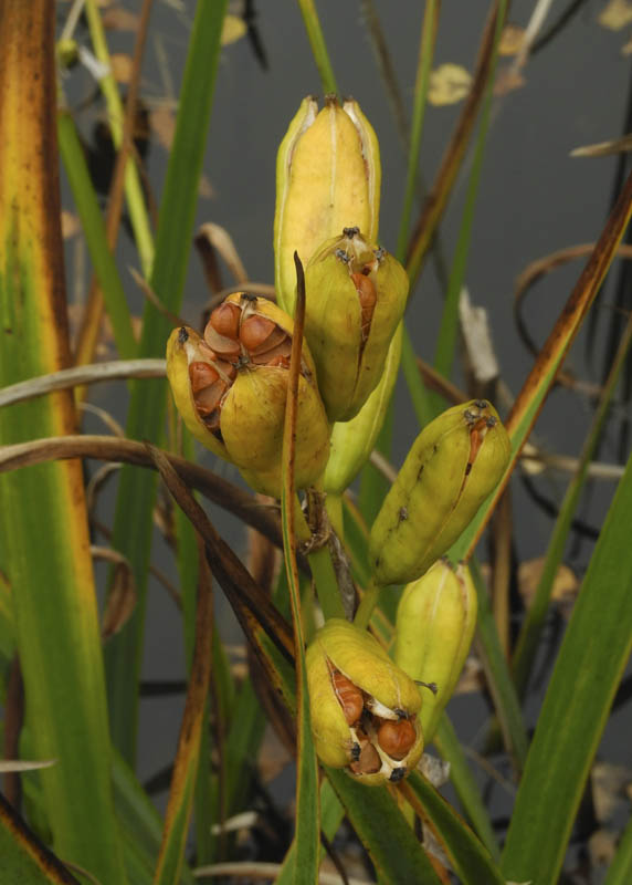
Vivid greenish yellow pods of waterside irises are bursting open to show their seeds.


Finally, on a bright day a week before, autumn ferns glow against the blue of a reflected sky. Each kind of weather has its own variety of beauty; with November coming, with its bare trees and gray weather without the brightness of snow, I have to remember that something lovely can be found even on the dingiest of days.


October 9, 2013

A New Painting: "Shadow Ladder"


Shadow Ladder, egg tempera on calfskin parchment, 9 1/2 x 7 1/4 in.


This fairly simple painting had an interesting lesson about color in its making. Every painting I do is a balancing act of the color's hue and its intensity; the forms and shadows are always a challenge in getting the values right. In order for the color to read as light on a surface all those variables have to be just right. As I worked, I was happy with the cast shadows and light, then I began to work on the horizontal bar crossing the upper part of the painting.


Shadow Ladder, detail


I first painted the light portion of this bar with the same color running across it....and a strange thing happened: it looked as though the bar was bent back towards the edge of the painting, as though it was a "V" shape and not a horizontal at all. Very odd, and how was I going to fix it? I figured that the only thing to do was make the right side of the bar more intense in color so that it would pop forward, so I glazed some thin layers of yellow over the green. I don't know if the color shift is noticeable in the photo, being fairly subtle, but it was enough to pop that edge forward; I think that it now lies parallel to the picture plane rather than receding, and creates a horizontal rhythm with the bars of shadow.


October 7, 2013

At the Hood Museum: "Cubism and Its Legacy"


Pablo Picasso, Guitar on a Table, 1912; oil, sand, and charcoal on canvas


There are currently two shows at the Hood Museum of Art that highlight the brilliance of Pablo Picasso: one is a marvelous exhibition of the entirety of Picasso's Vollard Suite of prints, 100 intaglio prints made between 1930 and 1937; the other centers on the influence of cubism over decades. Because I could not photograph the prints in the Vollard suite––the Picasso estate keeps tight control over the images––I will not write about it, except to say that the prints are vivid, ferocious, lyrical, exploring a range of expression in a black and white medium. I was especially taken with his quality of line, which in many cases reminded me of Matisse's prints and drawings. I was allowed to photograph the work in the exhibit "Cubism and Its Legacy", drawn from the museum's extensive collections, a fascinating survey showing the enduring interest in cubism's way of seeing the world. Picasso and Braque are credited with beginning this taking apart of the visual world and reassembling it in flat planes, a new understanding of form. The Hood has a beautiful Picasso that is a starting point for the exhibition.


Pablo Picasso, Guitar on a Table, detail


I love the way Picasso handled paint in this work, adding texture, an illusion of wood (a nod towards collage, which jump started synthetic cubism), and lines of charcoal to delineate shapes. It is a very elegantly balanced painting, fresh and full of light.


Jean Metzinger, Cubist Portrait, 1915; oil on canvas


Much of Picasso's cubist work is subdued in color, so it was a surprise to see this intensely colored (pink!) painting by Metzinger; I found it quite amusing.


Maria Blanchard, Cubist Still Life, ca. 1916-18; oil on canvas


A more beautifully somber work is by Maria Blanchard, using dramatically simplified flat shapes.


Preston Dickinson, Industrial Landscape, 1919; oil on canvas


Dickinson, who had spent the years 1910-14 in Paris, took the ideas of cubism and applied them to the American industrial landscape.


Preston Dickinson, Industrial Landscape, detail


I thought this work beautifully painted, and it seemed related to the Picasso in its use of texture.


Albert Gleizes, Cubist Composition, 1921; lithograph on medium weight cream wove paper


In this lithographic print, Gleizes moves from the complexity of his earlier cubist work to simplified flat planes, similar to those in the Blanchard painting above.


Henri Laurens, Standing Female Nude, 1921; unglazed buff terracotta


I thought the back of this Laurens cubist sculpture was very satsifying, with its flat planes combining with curves. You can see a Mark Rothko hanging on a far wall; it was included in the exhibition because, according to the wall label:
...it was cubism's shift away from representation and toward flatness and abstraction that made such a radically subjective form of painting possible.
It seems to me that the writer forgot all the other forms of abstraction that flourished in the early 20th century, abstraction that was non-objective, which Picasso's cubism never reached. (I wrote a post on a great show at MoMA on this period, "Inventing Abstraction", which you can read here.) It's so interesting to me that Picasso tiptoed up to the edge of non-objective painting, but then backed away and was always tied to representation, however abstracted.


George Ault, Roofs, 1931; oil on canvas


Amy Hartung, In Provincetown, ca. 1934; watercolor over graphite on heavy wove paper


We can see the architectural landscapes of Ault and Hartung as influenced by the flat, overlapping planes of cubism. Their work is also included in a American style of painting at this time known as Precisionism; other artists in this movement are Charles Sheeler. Charles Demuth, and Elsie Driggs.


Suzy Frelinghuysen, Collage Composition #7, ca. 1936; collage with charcoal and mixed media on blue paper


I was surprised at the date on this terrific collage by Frelinghuysen; it seems to fit right into the heyday of cubism much earlier in the century.


Fernand Leger, The Tri-colored Flower, 1937; oil on canvas


This is a very wacky Leger, a combination of cartoon and abstraction, and a soupçon of surrealism thrown in.


George L.K. Morris, Composition––Times Square, 1945; oil on canvas


Morris approached the the city in a different way from Ault and Dickinson; rather than buildings or industrial structures overlapping in space, a bird's eye map jumps with energy.


Stuart Davis, Standard Still Life #2, 1958; oil on canvas


I have a soft spot for Stuart Davis's paintings; they seem to me full of a joyous mood found in ordinary subjects. Even the fact that he splashes his name across the picture pleases me, something I don't forgive in others. Here it is a "wow, what fun that I did this!".


Mel Kendrick, Red, Yellow, And Blue Poplar, 1986; Japan color, wood, resorcinol resin, and thermal glue


The most recent work in the show, and a fine example of the continuing vitality of cubism, is this wonderfully lively sculpture by Mel Kendrick. Although my taste in abstraction runs to the more minimalist geometric variety, I really enjoyed the breadth of this small show, full of surprises and pleasures.


October 6, 2013

Glancing Light


The sun is lower at this time of year, the light angled, as though conspiring with the brilliant colors to make the most of their brief time of glory. The light picks out details, makes color translucent, as it dances in front of dark.


The edges of forms are illumined, making fluid lines in space.


Trunks are massed darks, making the contrast of colored woods that much more startling.


The sparkle of multi colored leaves and ferns is so much more intense than in the brighter, overall light of summer.


Highlights are picked out with great precision....


.....and long shadows add drama to vividly carpeted paths.


On a mid-morning in fall, wisps of fog hover over hills, the light is clear and raking, its shadows deep. Before slipping into its winter sleep, the plant kingdom is ablaze, a last ecstatic shout before the quiet of winter.


October 3, 2013

Diptychs: Two New Hooked Wool Drawings


2013 #18, hand dyed wool and egg tempera on linen; 2 panels, each 7 x 16 1/2 in. 


It's been at least a couple of years since I stopped listening to the radio and had complete quiet in the house, and I believe it's been very helpful to me in coming up with ideas for my work. Instead of my head being full of politics or social issues, my mind is free to wander, thinking of this and that, having little brain waves, using my "little gray cells" as Hercules Poirot would put it, or "using my noodle" as my father would say. I had taken out a sheet of thumbnail sketches for new hooked drawings, and began to think about where I would take the next works. One day I just looked down at a sketch and thought, gee, that could be a diptych! Of course diptychs have been on my mind, having just completed a textile diptych, which you can see here, and not long ago a painting diptych here. I like the way forms leap across the space between panels, the way our mind completes the curves, makes them whole, yet at the same time creates a jumping rhythm. 


2013 #19, hand dyed wool on linen; 2 panels, 12 3/4 x 8 and 8 x 8 in. 


The theme of both these pieces are curves, how they continue across a divided space, the relationships set up from one panel to the next. I like the big simple sweeps of color, wool, and linen; I enjoyed playing with vertical and horizontal formats. I think I'll do more of these.


October 2, 2013

A Salute to Marcella Hazan, with Her Smothered Broccoli in Red Wine


For over 30 years, Marcella Hazan has enriched my life through her wonderful recipes; they are marvelously delicious and always simple to prepare, perfect for everyday meals or for guests. You can see recipes from her books that I've posted on this blog at this link. So I was very sorry to hear about her death on Sunday; there's an interesting NY Times eulogy/story about her here.  It speaks of her erudition and her toughness. I experienced that myself: when I wrote a post sharing her recipe for pasta with broccoli and anchovies, I mistakenly wrote that it was in a book no longer in print. No, she wrote in a comment, they are part of a new compilation titled Essentials of Classic Italian Cooking, which I promptly ordered. Not only did she leave that comment, but she noticed a post I'd written on Morandi, and commented on that, a wonderful comment that thrilled me, and which I'll always treasure as a communication with her. Here is what she wrote:
I am not a painter, I am a cook. When I make a ragù alla bolognese, I work with a basic set of ingredients, but over a lifetime I have never made exactly the same ragù twice. No paintings I know touch me more deeply than do Morandi's still lives (his engravings are equally profound), and I think that before him Italy produced no painter of equivalent stature until you reach Caravaggio. 


But not all my favorite recipes made it into Essentials of Classic Italian Cooking. When I have a lot of broccoli coming from the garden in late summer through fall, I love to make this smothered broccoli dish from More Classic Italian Cooking; it is simple to put together and has a deep rich flavor, nothing like the fresh steamed vegetable.


1 bunch fresh broccoli, about 1 1/2 lbs
2 cups thinly sliced onion
1/2 cup black Greek olives, cut in half and pitted (I didn't have any olives at home, so made the recipe without them, though it's better with)
4 flat anchovy filets, roughly chopped (I usually add a little more, since I love anchovies)
1/3 cup fresh Parmesan cheese, cut into thin slivers (I use a potato peeler to do this.)
salt
1/3 cup olive oil
1 cup sturdy dry red wine

  1. Cut 1/2 inch from tough ends of broccoli and separate florets from stalks. Peel off dark green skin on the stalks, then cut them lengthwise into strips about 1/4 inch thick. Divide the larger floret clusters in two.
  2. In a large saute pan, cover its bottom with a think layer of sliced onion; cover this with broccoli stalks. Dot with a few olives, bits of anchovy, and Parmesan. Sprinkle a bit of salt if desired, then moisten with a thin stream of olive oil. 
  3. Repeat the layering until all the ingredients are used, saving the florets for the top layer. 
  4. Add the red wine. Cover and cook for 1 hour over medium heat, or until all the wine has evaporated. Do not stir. 


The result is a wine infused dish, with onions taking on its color, deliciously flavored with the salty ingredients of olives, anchovies, and cheese. Thank you, Marcella Hazan, for bringing such simple delights into my life.