October 31, 2011

A New Painting: "Partnered"

Partnered, egg tempera on calfskin parchment, 4 1/2 x 5 5/8 inches.


Partnered, dark and dramatic, is very different from the bright simplicity of my last painting White Triangle. It is not a flat image, as are many of my paintings, but is seen from below and has a form thrusting out toward the picture plane. I like working on very different kinds of compositions, so as to constantly challenge myself, and in order to explore a range of moods and feelings. It might seem strange to think of paintings of farm implements as having feeling, but I certainly hope that they do, just as non-objective painting does.


In this detail you can get a sense of the surface of the parchment and of the paint. Matter of fact, I had a hard time photographing without glare; I have a new camera which wants to pick up every teeny surface imperfection. The background color that you see is darker than I'd originally painted; I wanted to heighten the drama, the sense of lighted forms emerging from gloom. This painting is the first in a series of three that picture handles of some sort, a theme that appeared, unbidden, among my photographs.

October 29, 2011

Machine Tools: for War, for a New Middle Class

Engine Lathe, 1825, unknown maker.


I love machines, the way they look, each part shaped for a purpose different from those of everyday life, and often very beautiful in design. I don't know what purpose the small curved opening serves in the lathe above, but it is lovely with its three surrounding bolts. And of course my paintings are based on agricultural machines. So when my friend, the artist Ravenna Taylor, reminded me of a marvelous small museum in Windsor, Vermont, The American Precision Museum, with its collection of machine tools, I looked forward to visiting. A machine tool is a machine that makes the components of other machines. Right in the building that now houses the museum was the Robbins & Lawrence Armory Company which began as a manufacturer of weapons.


Gunstock Lathe


Robbins & Lawrence developed machine tools for the manufacture of fully interchangeable parts, in fulfilling an order for 25,000 rifles for the US army. As a plaque outside the museum states about the precision now possible in these machines: "the social implications of this technological revolution have been universal."


Robbins & Lawrence Milling Machine, 1850.


This milling machine was developed by Frederick Howe right in the same building that now houses the museum. It was used to shape the lock plate of rifles, which now could be so precise that they no longer had to be filed to fit them together. It is difficult to think of war-making machinery as having a good purpose, but I suppose we have to admit that the exigencies of war have led to many innovations. I of course think that wonderfully fluted shape is elegant, an art work in itself...


Drill Press, Phoenix Iron Works, George S. Lincoln & Co., Hartford, CT, 1840s.


as is this detail of interlocking brass gears; the shapes of forms both painted and brass look as though they were not only purposefully designed, but that aesthetics played a part. Dieter Rams, an important 20th century German industrial designer, wrote ten principles of good design, and one is "Good design is aesthetic".


Van Horn Planer, Springfield, MA, 1857.


I love the repeating green curves and circles of this planer, accompanied by a brass band of gears and levers and large ball handles. And the reverse curve of the handle arm is so full of imaginative fun.


Shaper, Warner & Whitney, Nashua, NH, 1860.


Another wonderful collection of shapes, more austere with the grand verticals backed by circles, emphasized with bolts. This is such a machine age image, looking like it could come out of a Charles Sheeler painting.


Wood Shelf Clock Movement, Eli Terry, CT, ca. 1830s.


When reading a wall label at the museum, I learned that clocks were a luxury item before the mid nineteenth century. Eli Terry figured out how to make wooden parts that could be assembled to make a clock, and they sold for $15. Clock makers began to use early machine tools to make clocks which by the 1840s sold for just $1, two days wages for an unskilled worker.


High-Wheel Bicycle


Bicycles were another consumer item that became affordable and widespread thanks to machine tools. The first bicycles, the high-wheeled variety, like clocks, were only for the wealthy. But later, new techniques and the idea of using two wheels of the same size and chain driven gears made bicycles very affordable and a reliable mode of transportation.


Willcox & Gibbs Sewing Machine, made by Brown & Sharp, Providence, RI, 1870s.


Another beautiful machine, the swooping curve looking like a graceful swan's neck, ending in the beak of the needle. An interesting story was on the label for this sewing machine, telling of the interconnections of the machine tool industry: Henry B. Leland, who headed the sewing machine division at Brown & Sharp, later went on to found the Cadillac company. The automobile has made the United States what it is, for better or worse; machine tools and the assembly line made them affordable and then a necessary part of life, making the suburbs possible, and trips on the open road...

October 27, 2011

"Nothing Gold Can Stay"


Nature's first green is gold
Her hardest hue to hold.
Her early leaf's a flower;
But only so an hour.
Then leaf subsides to leaf.
So Eden sank to grief,
So dawn goes down to day.
Nothing gold can stay.

This is the perfect time of year, when the last yellows in the landscape drop away, to think of the clear simplicity of Robert Frost's marvelous poem, which belies a rich complexity; just as "dawn goes down to day", the golden promise gives way to a light of different character; life more ordinary, but still a green leaf; life that includes death.


October 24, 2011

Vivid Pattern: the Textile Designs of Sonia Delaunay

Skirt, Tissu simultané no. 186, France, ca. 1926; block printed wool jersey.


For me, there was no gap between my painting and what is called my "decorative" work...I never considered the "minor arts" to be artistically frustrating; on the contrary, it was an extension of my art, it showed me new ways, while using the same method.
Sonia Delaunay, Paris, 1979.

It wasn't until a couple of years ago that I became aware of Sonia Delaunay's textile work; I knew of her as a painter of brightly colored abstractions, which she and her husband Robert Delaunay called Orphism. I wrote about discovering her design work, along with others, in a blog post on textile design, which you can see here. Then last spring, I was lucky enough to be able to see the very exciting show of Delaunay's textile work at the Cooper-Hewitt museum.


Scarf, Tissu simultané no. 14, France 1924-5; block printed cotton.
Project de tissu simultané no. 33, France 1924; watercolor on paper.


I saw rooms full of vibrant color and marvelously inventive designs– geometries, swirls, squiggles, florals – an unending run of ideas. The title "simultaneous" comes from Robert Delaunay's theory of color relationships, which he called Simultaneism. I later ordered the catalog for the show, Color Moves: Art & Fashion by Sonia Delaunay, from which I photographed all the images in this post, and it was quite difficult to choose just a few.


Design C53, France, 1924; gouache and pencil.


Because I've been interested in pattern lately – see a recent textile of mine here, and a post on pattern at the Metropolitan Museum of Art here – I thought I'd do this post on Delaunay's design work. In a design such as C53 we can see Delaunay's close relationship with modernism; this could stand equally well as a pure painting.


Design 1189, fabric samples, France 1929, printed silk.


This pattern is actually a good deal more complicated than it looks. I tried copying it, thinking I might use it for one of my own hooked wool works, but oh my! it was difficult to follow. I love seeing how different the mood is in each of the color combinations.


Design 945: textile design, design card, France 1929; gouache, ink, and pencil on paper.


A pattern like overlapping seashells, where different heights of line make up the shape, has a fresh openness to it. In the design card we can see the color thinking, the change of hue and value for each of the color ranges.


Design 1177, France 1933; gouache on paper.


I love this design, its syncopated rhythm, and am quite sure I'll steal it one day for one of my own works.


Design 951bis, fabric samples, France, 1929; printed silk.


This is a very witty pattern, the overlapping lines looking to me like frayed fabric.


Design 1317, working drawing, France, 1934; colorprint, pencil, and ink on paper.


This pattern is so exuberant it makes me smile, as does so much of Delaunay's work. There is seriousness in the fact that these patterns are all for use, for printing on fabric; but the effect is incredibly joyous throughout.


Scarf, produced by Liberty's of London, France, ca. 1967; printed silk voile.


Later in her life, Delaunay became successful as a painter, so did not do many textile designs after the mid 1950s. This is one of the few scarf designs she did during that time, and it is very close to her painting in its form, with a beautiful array of colors, moving from subtle at bottom to more intensely contrasted at top. The work of Delaunay is a great lesson in the leveling of different fields of art, and in how foolish it is to assign hierarchies.

October 22, 2011

A New Painting: "White Triangle"

White Triangle, egg tempera on calfskin parchment, 6 5/8 x 8 inches.


This is a very simple image, which nonetheless required a lot of decisions along the way, beginning with how large to make the painting. At first I had the horizontal dimension at 7 1/2 inches, but thought a slightly larger size would work better; it's surprising how a small change – in this case only 1/2 inch – can make a big difference in the scale of pictured objects. The second big decision was how much texture to include in the painting: in my reference photo the upper part of the blue was a rust red color, variegated reds with some blue mixed in, which was also the case with the blue vertical bar. There was also a good deal of texture in the white; it was torn and uneven.


I kept some variation in color and value, but it's pretty subtle compared to the original; I chose to have a strong blue/white image. To achieve an opaque white I had to paint many layers of color, using a large round brush and freely mixing slight hue and value shifts on the surface. My aim is to have a lively surface enhance the minimal composition, to give a sense of weight and presence to the forms, with the two bolts holding it all down.


This photo, shot with the light at an angle, shows the uneven surface of the parchment. Because my calfskin painting surface came from a living being it sometimes is not completely smooth. I bought one skin that had a "natural" finish and more obvious veining than other skins I've used. So I am using it in paintings where the surface irregularities will add to the painting and not be a distraction; I think that this surface works for this painting, and its silken feel is very luscious to work on.

October 20, 2011

In the Studio: Once a Hedgehog, Now I'm a Fox


"the fox knows many things, but the hedgehog knows one big thing" is a fragment from the Greek lyric poet Archilocus that became the theme of a famous essay "The Hedgehog and the Fox" by the political philosopher Isaiah Berlin. Berlin uses the fox/hedgehog idea to divide writers and philosophers into two categories: those who expanded on a single idea and those whose thoughts ranged widely. He labeled as foxes Aristotle, Shakespeare, and Balzac, and as hedgehogs Plato, Dante, and Dostoevsky. My studio definitely looks like a fox's lair these days.


Paintings share the walls with textiles, salon style, all bumping up against each other, conversing, vying for attention.


Ten years ago, this studio did not look like this at all. At the time, I was painting large landscapes with strong foreground elements – farm implements – and there would have been a big painting on a big crank wooden easel; I completed only a few each year. For thirty years my focus was narrowly fixed on painting and some print making. My subject matter was architecture, then agricultural landscape, with a bit of still life thrown in during the 80s, and a little figure painting before that.


In 2006 I began making small hooked rugs, which allowed me to explore an entirely different aspect of my aesthetic sensibility: my deep interest in minimalist abstraction. And the textiles in turn influenced my paintings. In addition to these two mediums, I now write and photograph for this blog, which in the past two years has been a spur to thinking and become an important part of my creative life. (Thank you, readers!)


For me, this opening up of my artistic output has been nothing but positive; I love doing all the different things I am working on. But I sometimes wonder if out in the larger world a varied output makes it harder for people to understand what you're about; they find it hard to cross categories; or maybe it dilutes energy and focus. So...what do you think? Are you a fox or a hedgehog? do you feel that one or the other way of approaching work is best for you? for anyone else?

October 19, 2011

Festive Fall


Even in Vermont, many people do not raise vegetables or garden seriously, but in the fall they decorate their homes and businesses with the bright colors of the season. It seems to me to be a remnant of the past, a celebration of the harvest, with something as simple as placing a pumpkin in a flower border, here in front of a neighboring town's post office.


The intense colors of fall mums are everywhere, if just in a pot on a stoop. This gorgeous collection, along with an ornamental kale is in front of, believe it or not, the local Dunkin Donuts. I appreciate that they make an effort to have a lovely little flower border at their store.


Another favorite harvest symbol are corn stalks; in my town during its Fall Foliage Festival, they are tied to every post on the main street; here they add verve to a plain gray mailbox.


Some displays include stuffed figures, some of which look forward, as this one's face does, to Halloween. I have seen figures that don't seem related to Halloween though, and I wonder if this is a custom that goes back to something like scarecrows. If anyone knows about this, I'd appreciate any information.


And here, in front of my friend and neighbor Deborah's house, a pair of doggy sentinels stand guard with their baskets loaded with pumpkin. This cheerful front door is in keeping with her whimsical sensibility, which is in great evidence in her garden, which you can see here. As we get closer to Halloween, I'll enjoy seeing the homemade ghosts, ghouls and goblins, but now I'm happy with the pumpkins and corn and autumn chrysanthemums.

October 17, 2011

New Hooked Wool Drawings

2011 #35, hand dyed wool and egg tempera on linen, 16 x 14 inches.


I've just completed a new batch of drawings, trying several ideas which are quite different from one another. I was thinking recently that something that I really like about using the medium of hooked wool is that my imagery can be wildly different in each piece, either with these drawings, or with the completely hooked works, and still have some unity because of the material I'm using...at least I think that's the case. In the piece above, the idea was to have a warm side of the rectangle and a cool side – red/orange, violet/cool gray – separated by lines. It took me some time to decide what color and value to use for the line; I'm happy with the choice. Fun things happen when I change mediums: the straight pencil lines of the sketch for #35 turn wobbly in wool, and become more active, more organic.


2011 #36, hand dyed wool and egg tempera on linen, 13 x 15 inches.


I don't know where the idea for this came from, but it does remind me of old cartoons, and the big eyes of characters like the Road Runner and Wile E. Coyote. Beep, Beep!


2011 #37, hand dyed wool and egg tempera on linen, 13 3/4 x 13 1/2 inches.


This is a more minimal, restrained image, the circle caught, floating, in the arms of a semi-circle. I had at first thought I'd make the small circle out of hooked wool, but then decided to paint it in order the keep the image lighter in visual weight.


2011 #38, hand dyed wool and egg tempera on linen, 10 x 14 3/4 inches.


When I'm sitting on the subway in NYC, I sometimes sketch things I see in the subway car or passing stations whose shapes interest me. This piece comes from one of those sketches. My idea was to activate the space between the shape by the repeat of the dark red diamond. I think I made the space between the shapes a little too wide, so the piece isn't as successful as I'd like. Thirteen inches might have worked better. If you have an opinion, I'd be happy to hear it.

October 15, 2011

deKooning, Until 1949, in Color and Black & White

Father, Mother, Sister, Brother, c. 1937; oil on board, 12 x 22 inches.


The large and comprehensive exhibition of the work of Willem deKooning now at the Museum of Modern Art is a completely exhilarating experience. Ah...the paint! the drawing, the color and line; the sheer passion in evidence! It is a meager thing to see online reproductions, but I did want to share my excitement. If only I could have taken photographs at the show, I would have loved to show many details, to give a sense of the richness of the marks, of the way deKooning built his forms with lines of charcoal and brush, leaving a layered story on the surface of the painting. But a few small images will have to do. They are all from the excellent website for the show, where you can see more paintings and drawings. Because there is just so much to look at, I thought I'd focus on the earlier part of his career, because for me there were more surprises, more work with which I was unfamiliar. There was a very accomplished still life drawing, made when he was 17 years old and still in his native Holland, that looks back to humble Dutch still lives. I love the painting above: the color, and the organic shapes held in place by a geometry of line and shape. But it gives only a small indication as to the powerful work that would soon follow.


Seated Woman, c. 1940; oil and charcoal on masonite, 54 1/16 x 36 inches.


There are such beautiful color harmonies in the paintings of the 40s; icy blues and greens alongside the warmth of yellow and reds. Line, in paint and charcoal, searches out form. I am struck by the pure grace of this image, and find myself thinking of Indian miniatures, which also have flat areas of gorgeous color bounded by sensitive line; also of Matisse, and of course Arshile Gorky, a friend and great influence. The paint is alive, the surface doesn't sit still, the figure is lost and found and lost again.


The Wave, c. 1942-44; oil on fiberboard, 48 x 48 inches.


Bouncing bulbous forms, weighted, floating, held in by the room, or the edges of the canvas; an opening, washed red, like a geometric sentinel. The paint is brushed on thickly and thinly, opaque and transparent, layered and scratched; there is the sense of a fierce search.


Pink Angels, c. 1945; oil and charcoal on canvas, 52 x 40 inches.


With this painting I can quote deKooning, in one of his most famous sayings: "Flesh was the reason oil paint was invented." The furious flesh of a sensuous woman is broken apart, entwined in the gold of her surroundings. The line is curving and elegant, the paint wrestled with. The search for form is so palpable that it gives the painting a vibrant life, a powerful presence.


Judgment Day, 1946; oil and charcoal on paper, 22 1/8 x 28 1/2 inches.


When I look at this terrific small painting, in which there's a vigorous confusion of forms, with charcoal lines adding structure and at the same time making it more frenzied, I can't help but think of the fantastic monsters in the paintings of Hieronymous Bosch. Although the color is bright, the mood is dark, as these terrible beings writhe in their tangled space.


Orestes, 1947; enamel on paper mounted on plywood, 24 1/8 x 36 1/8 inches.


At the exhibition was a spectacular long wall of deKooning's black and white paintings from the late 40s, all mid-sized, all with the most luscious of paint surfaces. The story goes, according to the great biography deKooning: An American Master by Mark Stevens and Annalyn Swan, that deKooning was so poor that he sometimes couldn't afford paint. So one day he and Franz Kline decided to go to a sign painters store (deKooning had been a sign painter) and buy 5 gallon cans of black and white enamel paint. But, the book points out, there had also been the influence of Picasso, who had been using Ripolin enamel, painting in black and white, and leaving drips on his paintings.
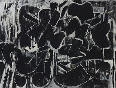

Dark Pond, 1948; enamel on composition board, 46 3/4 x 55 3/4 inches.


Whatever the reason, this stripping down of means opened a new range of expression, bold and tactile, of black shape building on shape, defined by white. In Dark Pond the white lines are like light seeping through, creating layers of complex spaces. This painting is like a novel, full of stories, intertwining and richly detailed, compellingly wrought. I love this painting.


Painting, 1948; enamel and oil on canvas, 42 5/8 x 56 1/8 inches.


Painting is another intense and complex image, with the shapes seeming to exist in more of an actual room space, hovering above the dripped white at upper left and the geometry at the right. Although abstract, there is a sense of object-ness as each weighty form demands a place; the surface of the work tells of this struggle to achieve rightness, a glorious wrestling with paint.


Attic, 1949; oil, enamel, and newspaper transfer on canvas, 61 7/8 x 81 inches.


With this much larger painting, as with the great Excavation which follows, white becomes the primary color, with black as the color of line. The forms are dense, swirling, bursting with aggressive life. deKooning's paintings look as though they are done with great bursts of intuitive activity, but he approached them carefully and deliberately. Again from the biography, Gus Falk, a former student, described deKooning working on this painting: "'Maybe I could throw a line here', he would say. He would erase parts, redraw it. In other words, he did it like Ingres. It was not throwing his guts on the wall." That this work was never easy is evident in the depth of feeling in the paintings. He never settled on a theme or style, comfortably repeating them, but kept moving and experimenting, creating a life's body of work that for me is the greatest of his generation.

October 13, 2011

A Walk in the Woods: Bright LInes


The low sun of October illuminates objects differently from the full high sun of summer. Its slanting light catches the edges of things, separating them from their dark surroundings. When I entered the woods a few days ago, my eye was caught by the shining earth-red lines dangling in mid air, pine needles caught by branches during their descent to earth.


Other reds, more brilliant, but finer in line, topped by little nodding heads, are the fruiting bodies of mosses.


The light picks out a spider's thread, the most delicate of gestures, sweeping across a space from twig to twig, At this time of year, when the mass of trees across the pond is darkened by back light, I sometimes see highlighted against them, along with the bright spots of flying insects, a silvery line floating in air, written by a spider and mysteriously released to float free.


I have to admit a fondness for the bright blue, totally artificial, lines of plastic tubing running through the woods, especially when glowing with light. They are pipes for collecting maple sap in spring and their manufactured color adds a festive note to the natural hues of woodland plants. As the lines stretch from tree to tree, blue or white against dark, they become large drawings articulating space.