August 29, 2013

Boxed Paintings: "Red Yellow Blue and Black"


Red Yellow Blue and Black, egg tempera on calfskin parchment, box size 2 3/4 x 5 x 3/4 in.

A couple of weeks ago I had a little brain surge in the studio, an idea to paint the small square scraps of parchment left over from the panel making process; I wrote about it here. I happily began working on my first piece of what I'll call "Boxed Paintings". At the beginning of the process, I decided to use the three primary colors plus black as a way of unifying the piece, as well as sticking with simple geometric compositions, as in Russian Constructivism or De Stijl


Of course the box needed a lid, so I made one and painted it. The underside is painted yellow. The inside of the box is red and blue, so the lid has opposite colors, with the addition of black and yellow. 


Individual Paintings, one side; each ca. 1 1/4 in. square


The box is filled with ten tiny paintings, painted on both sides.


Individual Paintings, other side; each ca. 1 1/4 in. square


The two sides are related by composition and color because I wanted to use the translucency of the parchment.


With the light coming through, it is easy to see how one side converses with the other. You can also see, by comparing these images with the ones above, that there's no fixed top and bottom. This box of paintings is meant to be played with, the pieces picked up, moved around in the box, listening to the noise of them. They curl and bend because of the material, but in this instance it's a plus, adding variety and depth to the painted pieces. I have some ideas for future boxes and look forward to making more in the months ahead. 


August 27, 2013

From the Orchard: Apple Butter


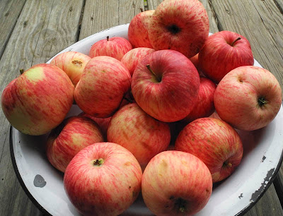
There is a small orchard behind my house, with antique varieties of apples. They bear fruit only every other year, but this is their year and it's a big one. The trees are loaded with fruit, as are all the wild apples in the area; the conditions must have been perfect for pollination. They are also coming ripe a couple of weeks early, so I am busy this week canning apple butter and apple sauce. I made a first batch of apple butter with the very early apple Sops of Wine. These apples, Duchess of Oldenburg, ripen next. They are a great cooking apple, tart and crisp. I learned from the Fedco Trees site that it is an 18th century apple, imported from Russia in 1835. I thought I'd share my apple butter recipe, which is actually from an old copy of the Joy of Cooking, but I assume the recipe is still in the new version. It's very simple to make and if you don't have a canner, you can freeze the apple butter instead.

4-5 lbs flavorful apples (I use 5 lbs because my apples sometimes are wormy, so I have to cut chunks out)
2 cups water
1/2 cup sugar for each cup pulp
3 teas cinnamon
1 1/2 teas cloves    (If you don't want it very spicy you can use a little less of the spices)
1/2 teas allspice


Wash the apples, quarter them and remove the stems. Place them in a pot with the water and cook until soft.


Press the apples through a fine strainer or food mill. leaving behind the skins and seeds.


Put this pulp in a heavy bottomed pot, measuring the amount. Heat it and add the sugar and spices. I had about 6 cups of pulp, so added 3 cups of sugar. When you add the spices, the mixture will darken. Cook at a low bubble, stirring often so it doesn't stick, until it is spreadably thick. A standard description of the proper jam consistency is "sheets from a spoon" but I find that hard to use with apple butter, which tends to plop from a spoon. Joy of Cooking suggests another test: put a small amount on a plate; if there's no separation of liquid, then it's done. Remember that it will thicken as it cools. Behind the pot of apple butter is the boiling-water canner.


Put in clean hot jars, with boiled lids and clean rims finger tight. Boil in a canner for 10 minutes. I love hearing the pop pop pop of lids as they seal shut after being removed from the canner. The recipe says this makes 5 pints, but I got only about 4 pints. With all my other jams, I should have a two year supply of this delicious, spicy apple butter.


August 26, 2013

Two New Drawings


#21, egg tempera and graphite on hand toned paper, 15 x 15 in.


It should have been four new drawings....
Each time I set up my table to tone paper for these Islamic design-based drawings, I tear down four pieces of paper; it's easier to work on a few at a time, always four different colors, as long as I've prepared the size for the color toning. Then I add the circles that are the basis for the painted designs. On one of the sheets of paper, I drew the wrong size rectangle, so I re-toned the paper; then while I was working, I somehow managed to splash color on part of the background and was unable to remove it. That is what happens when I don't pay attention. The second failure came from working with paint that was too opaque for the background's transparency; another instance of not focusing intently on the work I'm doing. But I'm happy with these two pieces. 


#21, detail


In all these drawings, the variations in surface quality are interesting to me. With #21, I wanted to emphasize the contrast of opaque and transparent paint by having a very glossy finish on the red shapes, so I painted a thin layer of the egg white medium, glair, onto them.


#22, egg tempera and graphite on hand toned paper, 15 x 15 in.


These attenuated shapes are somewhat strange to me, therefore intriguing. They seem to float above their ground or be embedded within it. 


#22, detail

The shadow of black lines around the forms add some volume to them. The change of surface appearance from painted and background colors are not as apparent in the photo as on the drawing itself; it is subtle, but there.

I have an odd rule for myself with these works: that I do them in groups of four, so perhaps with my next session of drawing, I'll do six in order to catch up.


August 24, 2013

A Box of Old Postcards


Postcards are souvenirs––remembrances––of places we've visited and things we've seen. Many years ago I bought a box of old postcards, other people's memories, from a yard sale, which now sits on a high shelf in a cupboard. After writing my recent blog post, "Old Things", about poking through antique shops, I remembered the postcards and took the box down to look at them. Flipping through the cards I remembered many favorites, because of color or image, and I thought about how they describe a culture. The preponderance of cards are American, and they tell of travel and the open road, a time when that was all new and fresh. I wish the cards were dated, and very few were actually mailed, but I associate them with the burgeoning car culture of the 1950s. Here are a group of motel and hotel cards, with one Greyhound bus terminal at the upper right. As always, you can click to see the images enlarged. I love the old printing techniques which led to wacky color, and the textured surfaces of some of the cards. The card at the lower right, from a motel near New Orleans is postmarked 1955, and the message says "I think the sun shines twenty times brighter here than at home". On Moore's Brick Cottages a note says "We sleeped here."


There are automobiles pictured in many of the cards, of different vintages, the oldest being the car driving through the giant sequoia in the Mariposa Grove of Yosemite National Park. The interstate highways were begun in the 1950s when automobile travel became part of American "freedom". 


Looking at the color on some of the postcards makes me regret the perfect quality of modern printing processes. We no longer see brilliant red splashed in an unreal way on cactus plants, purple on Spanish moss, and all manner of colors on beach goers and Notre Dame cathedral.


I have several postcard books, with multiple views, generally in an accordion style booklet. The book at the lower left is a regular booklet, bound with staples, of the "treasure state" of Montana. Printed on smooth paper, the color is super saturated and unreal, so very much fun to look through. Above it is the Grand Tetons, and to the right the Hoover Dam, neither as amusing as the Montana booklet. The booklet at top of the Mariposa Grove seems of an even earlier vintage, printed as it is on textured paper.


My favorite small group of cards from one place are those from the basilica of Saint Anne de Beaupré in Quebec, Canada. It is a pilgrimage site and the cards show supplicants on the stairs and the pillars of crutches left behind. The bottom card, intensely colored, shows the relic of Saint Anne, the patron saint of Quebec. I doubt contemporary cards could have near the charm of these.


The box also contained a large selection of old French black and white postcards, beautifully printed in crisply detailed images, that yet appear as out of a dream. The ancient airplane flying above the ruined tower, the storks and the cathedral, are poetic images.


A real treasure is a beautiful booklet of cards, carefully separated by tissue, of the town of Chalons-sur-Marne. The images are of buildings, parks, and landscape of the town. Turning the pages of softly yellowed images and delicate yellowed tissue is like entering into a forgotten memory.  


Most touching of all to me are the figures appearing on the streets, standing quietly as they look at the camera. They are small within this lost world, looking out at us from an imagined past.


August 21, 2013

A Summer Salad of Black Beans and Peppers


This salad has become a summer treat for me, which I make when the peppers in my garden have ripened; it's another great recipe from Deborah Madison's The Greens Cookbook. It's a delicious combination of chewy beans and crisp vegetables, flavored with mint and cumin, cilantro and jalapeno. The list of ingredients looks long, but it's quite easy to prepare. I've been having it for lunch all week, along with some avocado (not from my garden) and tomatoes, and I look forward to this meal all morning.

1 1/4 cup black beans
1 bay leaf
1/2 teas dried thyme
1/2 teas oregano
1/2 onion, finely chopped
1 teas salt
Vinaigrette with cumin and mint (below)
1/2 cup each red, yellow, and green pepper, seeded and cut into small squares (I use only red)
1 small red onion, cut into small squares
1 stalk celery, cut into small squares (I don't grow celery, so leave this out)
cilantro for garnish

Soak beans overnight; next day, drain, cover with plenty of fresh water and add herbs and onion. Bring to a boil and add salt. Simmer until beans are tender but not mushy (about 45 minutes-1 hour). Drain.
Prepare vinaigrette and add to beans while still warm. Add vegetables, correct salt and seasoning if desired.

Vinaigrette
1 Tbs lemon or orange juice
1 teas lemon or orange peel, grated
1 Tbs sherry vinegar
1/2 teas salt
1 clove garlic, finely chopped
1/2 teas cumin
1/2 teas coriander
1/4 teas paprika
5 or 6 Tbs olive oil
1 Tbs mint leaves, chopped
1 Tbs cilantro, chopped   (I use more mint and cilantro....why not?)
1 jalapeno pepper, seeded and finely diced. (this is to taste and is optional, but I love the heat in this salad)

Whisk the oil into the preceding ingredients, then add the fresh herbs.
I should note that Madison calls for cumin seeds and coriander seeds, ground in a spice mill or mortar; I'm sure this is more flavorful, but I'm lazy so use the ground spices.

Enjoy!


August 20, 2013

Late Summer Wildflowers


There are great golden sweeps across many fields now, as goldenrod is in full bloom. I love its open sprays of flowers, like bright fountains. They are pretty in a vase, and lovely as they dry. And yes, I have allergies, but no, goldenrod is not the cause of them: they are bee pollinated, with heavy pollen that doesn't travel, but they bloom at the same time as ragweed, the true culprit. Ragweed is shy, with tiny green flowers, while goldenrod blazes bright, so wrongly has gotten the blame for allergies.


There are other, more subtle flowers in the landscape now, such as the wild spirea with its fluffy heads.


Also fluffy is Joe Pye Weed, but larger and much more dramatic in the landscape, and a great favorite of insects.


Then there are these tiny balls with a spray of yellow at their center. I believe this is some kind of everlasting, not a real wildflower, but naturalized alongside the pond.


With the brilliant color of its flowers, I thought that Jewelweed was named for them, but I learned that it's the sparkle of light from raindrops on the leaves––which you can see if you click and enlarge the photo––that inspired the name.


There are tall spires of mullein growing in a logged field along my daily walk, dotted with bright yellow flowers.


Obedient plant is another cultivated flower that has naturalized near the pond. It was too invasive in my flower border, so I tossed them here, where they seem happy and add a perky note to late summer.


When the asters start blooming––and this is the first I've seen––it truly means the end of summer and beginning of fall, since they bloom mainly in September, when there will be masses of delicate violet rays in the moist landscape.


Another sign of summer's end is the cupping of Queen Anne's Lace into a bowl shape as it forms seeds, making ready for next spring.


August 19, 2013

A New Painting: "Stripes"


Stripes, egg tempera on calfskin parchment, 9 x 6 3/4 in.


I never repeat a motif, always trying to do something a little different to keep me interested, except in the case of these pink and white stripes. A year ago I worked with these stripes, an image flatter and more abstract than this one, which you can see here. At that time I was struggling with where on the continuum from representation to abstraction my paintings would fall. My paintings now are a bit more abstract than they were a few years ago, but I've become comfortable with the sliding around in a range of abstract representation. I have some friends who wish I'd paint abstract pictures, and some wishing I was still painting landscape, but here I am, not settling into one fixed idea. In this painting, the stripes are dominant, flat yet edging slightly forward with the tilted green plane. The top plane also tilts forward from where the two meet; then there's that arched space at the top center, receding into darkness; all is flat, yet spacial, with bright light and cast shadow bringing it closer to the real world.


Stripes, detail


August 16, 2013

Some Studio Fun.....


As though to illustrate yesterday's blog post (so I thought I'd briefly share this) as I was working on preparing some new parchment panels, I had a new idea, certainly fun, possibly ridiculous, but such is the way of new ideas, a leap into uncertainty. Before stretching parchment over plywood panels, I cut out the corners so as to have a neat fold on the back. I am left with piles of little irregular squares, which I always save. What for? who knows? but they're collected in a basket I keep on my work table.


Then I thought back to a year and a half ago, when I used the small squares to do some studies for a textile series, Empty Center, which you can see here. Why not continue to play with these and make some itty bitty abstract paintings, maybe paint both sides to use the translucence of the parchment; maybe make a shallow box out of parchment to hold them, like a treasure chest....maybe. My "little gray cells" were happily whirling thinking about this. I remembered that when I was a little girl, the compliment from my father that made me most proud was "you're using your noodle". 


And an update at 4PM: I made a little test box from some scrap parchment, about 2 3/4 x 5 inches. I envision it painted. 


August 15, 2013

Anguish or Joy?: Thoughts After Reading "The Nature of Fun" by David Foster Wallace


Being in the studio can be like a precarious game: you stack up the colors, the column bends and shifts; add another and it tips and crashes. But for me, even with the disasters, it's a deep and abiding pleasure. So, I was happy to read David Foster Wallace's 1998 essay "The Nature of Fun" (the entire essay is at this link); I'm grateful to the artist Julia Schwartz for her link to a post about it. It's a short essay, with something of a gruesome beginning (Wallace has a close-to-vulgar sense of humor) but what I took away from it was his showing how fun, a "fuller and large-hearted kind of fun" is at the center of his writing; fun, not struggle, even though he was a man who suffered from depression. 

He writes of a book in progress being like a damaged infant, a 
mix of repulsion and love the fiction writer feels for something he's working on. ....And so you love the damaged infant and pity it and care for it; but also you hate it....hate it because...something grotesque has happened to it in the parturition from head to page...
The whole thing's very messed up and sad, but simultaneously it's also tender and moving and noble and cool.....And you want others to love it, too, when it's time for the damaged infant to go out and face the world. 
Who hasn't felt something like this in making an artwork, of whatever sort; that it doesn't come up to our standards, our expectations, our hopes? 


Caspar David Friedrich, The Wanderer Above the Sea of Fog, 1818; oil on canvas, 38.6 x 29.1 in.;
image from Wikipedia.


Does this mean the artist, alone on a hilltop, watching the roiling world below, is suffering in Romantic glory? Wallace would say not:
But it's still a lot of fun.
He then goes on to a parable about an old Chinese farmer who says "good luck, bad luck, who knows?" to illustrate the back and forth of writing, which I think works for visual art too:
In the beginning, when you first start out trying to write fiction, the whole endeavor's fun. You don't expect anyone else to read it. You're writing almost wholly to get yourself off.....Then if you have good luck and people seem to like what you do, and you actually start to get paid for it...it seems to make it even more fun. For a while. 
But then vanity takes over and needing to be liked results in "shitty fiction". Which you have to throw away or you'll be disliked. He ends the essay with these paragraphs, which resonate strongly with me:
The smart thing to say, I think, is that the way out of this bind is to work your way somehow back to your original motivation––fun. And, if you can find your way back to fun, you will find that the hideously unfortunate double-bind of the late vain period turns out really to have been good luck for you. Because the fun you work back to has been transfigured by the extreme unpleasantness of vanity and fear, an unpleasantness you're now so anxious to avoid that the fun you rediscover is a way fuller and more large-hearted kind of fun. It has something to do with Work as Play. Or with the discovery that disciplined fun is more than impulsive or hedonistic fun. Or with figuring out that not all paradoxes have to be paralyzing. Under fun's new administration, writing fiction becomes a way to go deep inside yourself and illuminate precisely the stuff you don't want to see or let anyone else see and this stuff usually turns out (paradoxically) to be precisely the stuff all writers and readers everywhere share and respond to, feel. Fiction becomes a weird way to countenance yourself and to tell the truth instead of being a way to escape yourself or present yourself in a way you figure you will be maximally likeable. This process is complicated and confusing and scary, and also hard work, but it turns out to be the best fun there is. 
The fact that you can now sustain the fun of writing only by confronting the very same unfun parts of yourself you'd first used writing to avoid or disguise is another paradox, but this one isn't any kind of bind at all. What it is is a gift, a kind of miracle, and compared to it the rewards of strangers' affection is as dust, lint. 

I have thought of myself as "playing" with various mediums and ideas, and I use the word "pleasure" rather than fun to describe my feeling toward my work, but I agree that it is a gift, for which I can only be grateful. To widen the conversation, I'd like to add that my friend, the writer and photographer Terry Allen objected strongly to the essay in an email, saying, among other criticisms, that Wallace was leaving out all those writers motivated by wanting to affect social change––we can think of Zola, or Dreiser––not by fun at all, which is self-centered. I've been thinking of this a lot today, and have come to the thought that they are not either/or; a passionately committed socially conscious writer can have fun/pleasure with their writing, just as much as a personal essayist or navel-gazing fiction writer can.


Francisco de Goya, Plucked Turkey, 1812; oil on canvas, 17.7 x 24.6 in.;
image from Alberti's Window


As an illustration of the paradoxes of art, I thought of Goya's amazing paintings of dead birds. Here is death unadorned, presented in a straightforward fashion: the dead turkey in the kitchen, about to be prepared for a meal. Yet at the same time there is so much beauty and love in this painting, in the lushness of the paint, and the tenderness of the attention. I can't help but think that Goya had a lot of fun in the making of it.


August 13, 2013

New Hooked Wool Drawings


2013 #14, hand dyed wool and egg tempera on linen, 15 x 12 in.


Sometimes I feel that with all the words I've written about my work that I just have no more to say....but there's always something. While working on this new group I was thinking how much I enjoy the newer series of compositions that engage the entire surface of the rectangle.


2013 #15, hand dyed wool and egg tempera on linen, 15 x 15 in.


It's not that I don't like these central images that I've worked with for the past three or four years...


2013 #16, hand dyed wool and egg tempera on linen, 15 x 12 in.


...it's just that the geometries of working the entire surface become very interesting to me, and the pieces have more presence.


2013 #17, hand dyed wool and egg tempera on linen, 15 x 16 1/2 in. 


And yet, there's something appealing about the more modest sized image, floating in a field, as though a bit vulnerable. 


Here are the four new pieces hanging in my work room, seen before I cut the borders down to the proper size. This gives you an idea of their sizes relative to one another. Hanging with them is a print I made from a photograph of a Tantric drawing in the book Tantra Song, which I wrote about here. I love looking at that print; it touches something deep, and it reminds me to try to be calm and peaceful and happy.

August 11, 2013

"I seek nothing but life itself.": Carl Dreyer's "The Passion of Joan of Arc"


One after another, uncompromising closeups, details of skin brutally visible, humanly vulnerable; often seen from below, the faces loom over us. Watching Carl Theodor Dreyer's 1928 silent film The Passion of Joan of Arc is both emotionally difficult and exhilarating. The exhilaration comes from the remarkable artistry of it, the realization that this is one of the greats in the history of cinema, the sense of its modern and unique approach to storytelling. But Dreyer spares us nothing, takes us, and his actors, into a deep well of anguish. The great actress of this film, Renée Falconetti, begged Dreyer not to crop her hair so close in this scene, but he had to get as close to life as he could: the pain and humiliation of being shorn after a compelled abjuration, an admission that she was not sent by God. There is an excellent commentary by Casper Tybjerg on the Criterion disk, and it is by listening to it that I learned a great deal about the technique and motivation of the movie; in addition, all the Dreyer quotes are from the commentary.


From Dreyer:
The human is of central importance to all art, and of all things human, the human face is what has greatest interest. It is, so to speak, a declaration of content for the soul, and in its delicate shifts, one can read the most delicate nuances of the emotions, which words and gestures are incapable of expressing. 
In these images of Falconetti's Joan, we see her struggling with her faith, her desire to survive, her acknowledgment of her coming martyrdom. Of Falconetti's acting, Dreyer said:
It was her who created the images, not me.
There was a technical innovation in film that allowed such detailed and unadorned closeups: the invention of panchromatic film, which reproduced faces realistically, without the need for makeup.


There are many unsettling shots, here of the barber who cut Joan's hair, listening to her as she realizes that she can't accept her confession, but must be true to her visions; the low and severe angles heighten tension.


The sets are all simple to the point of austerity, the more to highlight the human emotions. The supreme judge appears in Joan's cell, low in the frame, while a cross is cast on the wall from the light of an unseen window. These unusual compositions, seen often, are startling; they point to the high art of this film and its thoughtfulness; they take us beyond the ordinary, everyday reality to something deeper.


These are the faces of the judges, seen in the courtroom in a scene before the one above; they are strong, emotional, as real and present as is possible on film. Dreyer wrote that an artistic cinema would entail "first and foremost, a stronger accentuation of the closeup", so that the faces "become psychologically much more profound".


Joan's death at the stake is horrifying, as the smoke obscures her face....


...and the camera shifts from her final agony to the grief of the common people, the French she has touched and inspired, and who rebel against the brutal English soldiers at the film's end. The final shot is of the burning stake, and a cross. Dreyer said of this film that it was "a hymn to the triumph of the soul over life."


Rogier van der Weyden, The Descent from the Cross, 1435, detail. Image from Wikipedia.


Thinking about The Passion..., its similarity to early Netherlandish painting came to mind. In both there is a clarity and precision, a close attention to the nuances and particularities of facial expressions in portraits of specific individuals. Tybjerg mentions in the commentary for the film that Dreyer looked at miniature painting for information about clothing and environment, so it's not farfetched that he would also have been thinking of panel paintings, made shortly after the death of Joan of Arc, which was in 1431.


Hugo van der Goes, A Benedictine Monk, ca. 1478, from the Metropolitan Museum of Art website


This monk could have been one of the characters in Dreyer's film.


Master of the Taking of Christ, Taking of Christ, detail, ca. 1454-64.


The final scenes of The Passion of Joan of Arc are meant to remind us of other holy beings, unjustly accused, going to their deaths as martyrs. Whether religious or not, we can respect those of deep faith, in whatever just cause, and the willingness with which they will suffer for it. Dreyer said of his film
I seek nothing but life itself.