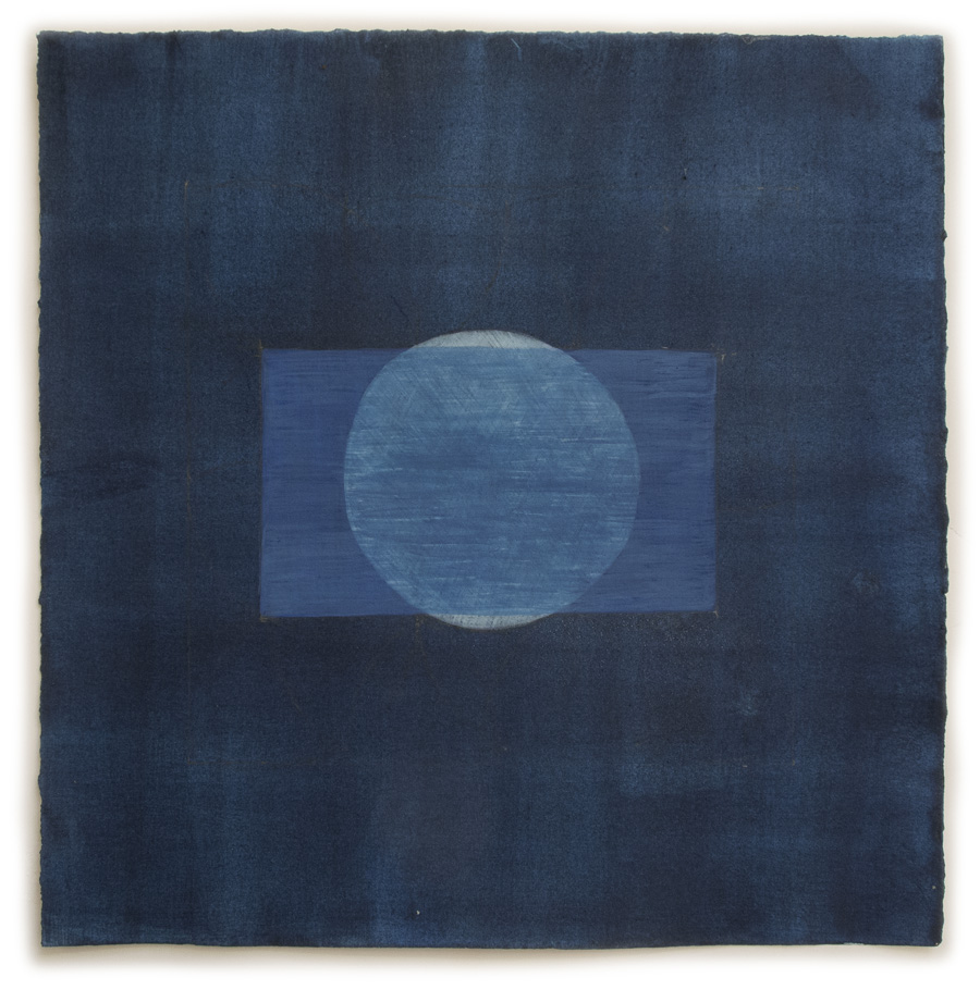
#31, egg tempera and graphite on hand-toned paper, 15 x 15 in.
One of the things I love about working on this series of drawings is seeing how color can evoke such different moods and feelings. When I am preparing paper for drawings I deliberately choose a range of hue and value so as to have a variety of color as a foundation and a challenge. To prepare the paper for #31 I painted many layers of Milori blue until it became a deep midnight color. I chose a very simple composition for it, with which I had thought to use a contrasting color, but then decided on a continuation of the theme of blue. What ended up happening was that the drawing has the feel of a Japanese indigo dyed textile, an unintended surprise.

#31 detail
I thought I'd show some detail shots in this post so as to show the surface texture and brushstrokes more clearly. With this piece of paper, because I put so many layers of pigment mixed with gelatin as a size, there is a bit of sparkle on the paper, which I assume is from the gelatin.

#32, egg tempera and graphite on hand-toned paper, 15 x 15 in.
I go from dark to bright. And here I have to say that Blogger has made a mess of the color on this piece and on #34. The detail gives a better sense of the actual color, which is lighter than it appears above. After the subdued color of #31 some intense hot colors were a fun contrast. For the design, I learned something new from a small book, Sacred Geometry: by drawing lines alongside the points of the central "flower" a 12-sided figure can be found, with six squares separated by six triangles.

#32 detail

#33, egg tempera and graphite on hand-toned paper, 15 x 15 in.
In this piece, you can see those six squares implied between the green triangular shapes. I went back to the dark and somber for the color of the paper in this drawing, mixing slate gray with some earth red to warm it.

#33 detail
I chose to use rather subdued colors for the shapes, keeping the mood quiet, and as though the colors are emerging from the dusk.

#34, egg tempera and graphite on hand-toned paper, 15 x 15 in.
I'm pretty upset with what Blogger, my blogging platform, has done to the color of this drawing; I tried changing it many times and uploaded it again and again, but it was always too intense, too yellow-green, and too dark. To see the actual color, look at the detail below, which shows a light grayish green with more intense colors playing on top of it. (I guess this difficulty goes along with the terrible weather we're having––over a foot of snow, bitter cold, roaring wind––January weather in mid March, in other words.)

#34 detail
For me, the colors and shapes of #34 have an almost floral feel to them, a delicate decorativeness. I take great pleasure in exploring the expressive qualities of color, color free from any reference to an object, in this series of drawings.
No comments:
Post a Comment