May 31, 2011

Regarding Subject Matter


Those of us who make art representing the things of this world must choose our subject matter. Why this and not that? and what does our decision mean? I've been painting agricultural landscape and implements for 25 years, which was a natural evolution from my early paintings of domestic architecture. To read more about my transition and thinking, and see some earlier work, see this blog post, "Contemporary Agriculture". In brief, all the issues around agriculture––ecological, social and historical––have been part of the content of my work for years. But as my work has gotten more abstract, more concerned with the elements of color and form and less with narrative, I sometimes wonder if I could expand the sources of my imagery from farm implements, as seen above, recently gathered from the field.


So when I was in Coney Island last week, I took some photos with the idea that they just might work as paintings for me. There is a relationship between these images because of their strong design and striking color––especially the second image which I find compelling in its weirdness––and my agricultural images. But you know what? I just don't have the emotional connection that I need in order to move ahead with them. Underlying the seeming abstraction of my farm implements is still the complex content I've thought about for years.


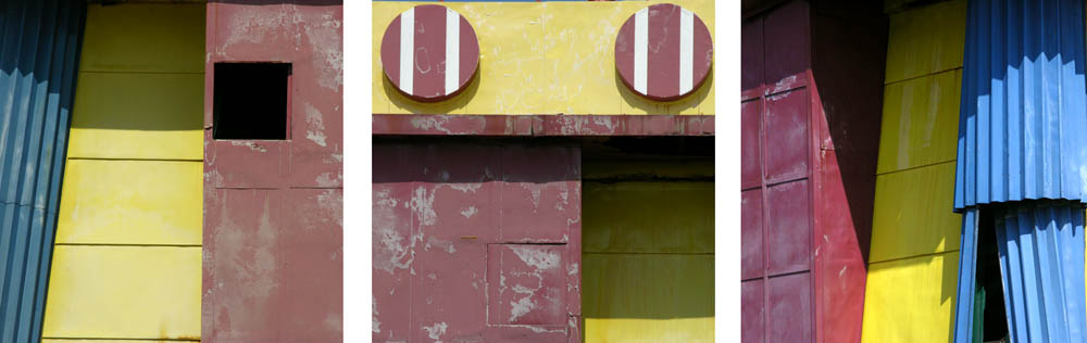
But there was an exception to this disconnect from the Coney Island subject matter and that was a series of photos I took of the base of the Parachute Jump, a ride I remember from my childhood with great fondness. I love the shapes and the primary colors of this piece of Brooklyn history; as opposed to the new rides, this one has meaning for me. I put together 3 of the images as a triptych, and even though the shapes are smaller in scale than usual in my work, I'm seriously considering a 3 panel work, each 8 x 8 inches (click on image for an enlargement). What do you think? And what about your own choice of subjects?

May 29, 2011

Wondrous Life at the New York Aquarium


There are times when I am presented with such a remarkable array of varied and beautiful life that I feel awestruck: is it possible that these colors and forms really exist? I am very grateful for the natural world around me in northern Vermont, wild and cultivated, but a visit to the New York Aquarium in Coney Island was of another order; it was full of stunned surprise and sheer aesthetic delight. The sea anemones, above, were some of my favorite creatures; though predatory, they are marvelously decorative, and as they sway in the gentle watery flow, they are hypnotic.


I realize that there are people uncomfortable with putting wild creatures on display, whether in zoos or as here in an aquarium. But the aquarium is part of the Wildlife Conservation Society and an aspect of its mission is education. How could we not be more sensitive to the plight of endangered fishes and corals after seeing them up close and realizing how beautiful and unique they are.


The three photos above are all anemones. I was quite transfixed by all these vivid creatures; the world above can seem pale and wan after visiting them.


And oh! the jellyfish, brightly glowing in the deep blue water, slowly rising and falling, trailing their long tentacles in graceful curving lines.


There are also mammals housed at the Aquarium, and here is a fur seal, an animal that is now protected after being exploited for the fur industry. And below is homo sapiens, another mammal, here working to clean the coral in the huge coral tank. Our human species has done some great things, but has also made a real mess of others, and we're not cleaning up the way we should.


May 27, 2011

The Forms and Colors of Tulips


Each fall I order a variety of tulips to plant in a row in the vegetable garden, for cutting the following spring. To my eye tulips are nice in the garden, but are elegant and beautiful when brought indoors and arranged in a vase, their form enhanced by the relationship with container and surrounding space. The tulip above is Menton, a very tall late blooming flower in shifting hues of pink and apricot. I love it when it is new, its form gently closed, a finely clothed reticent maiden.


Apricot Beauty is an early bloomer, the first tulip of spring, with a light scent. It is a much less formal flower than Menton, so here it is in a comfortable country setting.


Tulips are not always prim and proper. The parrot tulips have wavy irregular edges and open into extravagant shapes. This is Black Parrot, not actually black but a deep dark burgundy red. It is a stunning flower and exciting to watch it change shape from day to day.


These blowsy peony look-alikes are double tulips, a special treat for a peony lover like me. I don't know this variety because it was a mislabeled package; I was supposed to get my favorite Angelique, which is a very pale pink. But sometimes it's also nice to be surprised with something new.


For instance, the orange lily flowered tulips here, Ballerina, came by mistake a couple of years ago, but I loved their form and color so much that I now order them every year. The dark red tulip I've paired them with is Jan Reus.


And finally, a Rembrandt-type Flaming tulip, which is a reminder of the 17th century Dutch Tulip mania, when the most sought after tulip bulbs sold for huge sums. A virus was found to be the cause of the multi-colored flamed tulips, but breeders have now found a way to replicate their colors. They are in a pitcher on my desk, in front of a photogravure by Karl Blossfeldt, interrupted by the reflection of green nature beyond the window.

May 26, 2011

New Hooked Wool Drawings, With Some News

2011 #17, hand dyed wool and egg tempera on linen, 18 3/4 x 12 3/4 inches.


You may have noticed that I've changed the name of this body of work from "sketches" to "drawings". The word sketch implies something done quickly, without too much planning, a preliminary rendering. But these works start as thumbnail sketches, to which I add color; then I do a full sized pencil drawing of the composition, which I transfer to the linen. Because of this deliberate process, I thought the word drawing better describes these pieces while at the same time setting them off from the works that are completely hooked with wool.

In this new batch of drawings, I've done one piece that is larger than I usually work, #17 above, and one smaller, #23 at bottom. With #17 I drew an image that was long and narrow, and needed that extra size to make it work. Of course, image reproduction being as limited as it is, the piece actually looks smaller than the others online. (I'll do some new studio images soon.) One reason I thought it would be interesting to have a variety of sizes is my news: I will be having a show of these hooked wool drawings, and paintings, at Horton Gallery in Chelsea in September. I am very excited about it and hope I'll meet some of my readers at the opening.


2011 #18, hand dyed wool on linen, 12 x 16 inches.


Since I am primarily a painter whose work is based on actual things out in the world, I sometimes worry that my imagination will desert me with my abstract textiles, that I will come up empty of ideas for new work. But as I sketch out new images, one thing leads to another and more ideas come. #17 came from a doodle I was doing at my desk; I don't remember where #18 came from, but maybe I was thinking of handles.


2011 #19, hand dyed wool and egg tempera on linen, 14 1/4 x 12 1/2 inches.


2011 #20, hand dyed wool and egg tempera on linen, 17 x 13 1/4 inches.


#s 19 and 20 are inspired by Russian Suprematist painting, particularly that of Kazimir Malevich.


2011 #21, hand dyed wool and egg tempera on linen, 12 1/2 x 14 inches.


The color of this work feels to me like a fanciful take on spring, while for the composition I fit a circle inside of a semicircle inside of a square.


2011 #22, hand dyed wool and egg tempera on linen, 14 1/2 x 12 3/4 inches.


Here I was interested in how a painted circle, having no volume, would look squeezed between two lines of hooked wool. Does it question illusionism as it exists in a different space yet seems to be acted on by the green lines? or is it just overwhelmed?


2011 # 23, hand dyed wool and egg tempera on linen, 10 x 10 1/4 inches.


And finally, a small simple piece: a line with resting and floating circles. When I was cutting the linen for this group of drawings, I had a small 12 inch square piece of linen left over so I decided to use it for a very minimal composition. This in turn has made me want to do more in this size, using just hooked line and painted shape. But first, back to a group of fully hooked works...

May 24, 2011

A Coney Island of the Heart


I grew up not far from Coney Island and carry wonderful memories of times at the amusement parks, riding on the Wonder Wheel––but never in the swinging cages, much too scary!––where from on high you could get a view over the borough of Brooklyn, as you could on the now closed Parachute Jump, an exciting ride up to the top, where there would be a ..bump!.. and the parachute would open as you slowly came back to earth. After years of decline, Coney is coming back with bright new amusement parks, a baseball stadium and lots to eat.


But it's the old rides, the Wonder Wheel and The Cyclone, which along with the Parachute Jump are on the Register of Historic Places, which make my heart go thump when I look at them. It took a lot of courage for a child to ride on the Cyclone with its dramatic swoops and turns, but oh how exciting it was! I hadn't been in Coney Island in years, but last weekend there was a morning of bright sun, a welcome respite from days of rain, so I went for a walk on the broad boardwalk and enjoyed memories, and meandering through the happy varied crowds.


The colors of amusement parks are so extravagant: no subtlety, no holding back, full of flights of fancy.


But Coney Island is also a beautiful wide sand beach, used by thousands of city residents. At this time of year, before the lifeguards are on duty, the beach is a place to walk, or to contemplate from the benches at the edge of the boardwalk.


The wacky imagination of the amusements seems to have drifted over onto the beach, with a fake palm tree gracing the Brooklyn beach. I can see no reason for it to be there but sheer fun.


Steeplechase Park.––how I loved it!: the steeplechase horse ride along with all the others––was built by George Tilyou , Coney Islander born and bred. The summer at Coney Island was indeed, for many, the World.

May 23, 2011

Louise Bourgeois: Fabric into Art

Untitled, 2005, fabric, 16 1/4 x 21 1/4 inches.


One of the most beautiful, lyrical, and surprising shows I've seen recently is Louise Bourgeois: The Fabric Works at Cheim & Read Gallery, up until June 25th. Towards the end of her life, Bourgeois focused on these intimate pieces, using cloth from her closets, so they are worn and personal and a part of her life. She cut and sewed pieces of ordinary fabric into complex patterns...


Untitled, 2005, fabric, 18 1/8 x 14 1/8 inches.


or large simple shapes, bringing to my mind abstract painting of a minimalist sensibility, or even Blinky Palermo's large fabric paintings. As I was looking at the work, and feeling so touched by it, I tried to understand what made the use of fabric so different from paint. For me it is the vulnerability of fabric, its fragility that lends a special poignancy to the work. Paint is so robust in comparison. And even though a painting and one of these fabric works are both handmade, there is a metaphor in the careful stitching of piece to piece not present in paint on a surface.


Eugenie Grandet, 2009, mixed media on cloth, 2 of a suite of 16, 11 1/4 x 8 1/2 inches each.


In the small room near the gallery's entrance a suite of inventive fabric pieces represent the Balzac novel Eugenie Grandet. On what looks to me like a linen ground are artificial flowers, buttons, hooks, carefully assembled on the surface, alluding to accumulation and loss.


The Waiting Hours, 2007, fabric, suite of 12, 15 1/8 x 12 1/4 inches each.


from The Waiting Hours


The Waiting Hours shows a landscape of sea and sky gradually changing, moving from calm to turbulent, day to night. In the first piece of the suite, above, I love the varied types of cloth––flat, shiny, textured––that add richness to the simple structure.


Dawn, 2006, 3 of 12 pages of a fabric book, 12 1/4 x 9 3/4 inches each.


These are three images from a book, whose theme is circles: mostly concentric, but also receding and random. Bourgeois is so clever in her use of pattern either found or sewn.


Untitled, 2005, fabric, 20 1/2 x 27 inches.


detail of Untitled, 2005


I love the stripes of different colors and materials against the pink rectangle made of a silky looking fabric with subtle vertical striations. The bold stripes next to it are of a worn jersey fabric, soft next to the crisp silk. In the photo you can also see reflections, of me and of the works hanging across the room. I decided to use my own photos for this post rather than the gallery images (all the works can be seen at the link above) because they feel more present, more visceral to me.


Untitled, 2006, fabric and fabric collage, 11 x 18 1/4 x 2 inches.


detail of Untitled, 2006


I especially love this piece in which the quiet of an Asian-looking circle is paired with a bulbous accumulation of soft transparent forms: the body with the mind, or messy rich confusion with perfect clarity. As a painter who also works with textiles, I found this show inspiring, prodding me to think about the meaning of materials themselves.

May 22, 2011

The Scent of Apple Blossoms


When I stepped out of my car this afternoon––back from a brief trip to NYC where I saw many wondrous things, which I will share over coming days––the first thing that I noticed was the pervasive aroma of the apple trees in bloom. What a marvelous welcome home!


My trees are antique varieties that only flower and bear fruit every other year. I was happy that when I got home, there was enough sun and warmth that the pollinators were busy in the flowers, from large bumble bees


to many different types of small pollinating insects, which you can see as tiny black dots in the sky. On a nice warm day during blossom season, my senses are engaged, from the sight of the pale white-pink blooms, to their heady scent, to the sound of buzzing insects flying from flower to flower.

May 19, 2011

A Walk in the Woods: The Dance of Unfurling Ferns


Last week, when there was sun, I noticed the ferns in the woods starting their new growth. Each variety has a different pattern of stems rising and uncurling. Each is graceful, and heads nod graciously toward each other.


I couldn't help but think of dance in the bobbing and weaving forward and back, as though each emerging frond is a participant in a baroque gigue.


These plants are turning outward,


and these in.
This week, the fern fronds are opening, the brief time of rising and uncurling nearly past.

May 18, 2011

"Objectified": The Design of Everyday Things


"There is a story embedded in every object." Andrew Blauvelt, Design Curator, Walker Art Center.

While I was unpacking my new iMac recently, I marveled at the care put into the packaging: every item was presented so beautifully that unwrapping each was an aesthetic pleasure. Right after that, I watched with special interest the marvelous film Objectified, an exploration of the world of industrial design by the director Gary Hustwit, whose earlier documentary Helvetica, about the font, I also loved. The film opened with several scenes of heavy machinery, above, making plastic chairs. Everything was photographed with a wonderful eye for shape and color and space, so much so that I spent some hours doing thumbnail sketches of screen captures as ideas for my textiles.


Things we use every day, that we barely think about, have been designed by someone, with more, or less, thought.


The redesign, with a fat soft handle, of the metal potato peeler of my youth came about when designers were trying to find a handle that would be usable for someone with arthritis: "design to extremes".


Dieter Rams, a major German industrial designer, head of design for Braun for many years, has a list of ten essentials for good design, which I find very interesting to think of in relation to the objects we share our lives with:
Good design should be innovative design.
Good design should make a product useful.
Good design is aesthetic design.
Good design will make a product understandable. (so when you buy something that's hard to figure out, it's not your fault, it's not well designed [my comment].
Good design is honest.
Good design is unobtrusive.
Good design is long lived.
Good design is consistent in every detail.
Good design is environmentally friendly.
Good design is as little design as possible.


And from Andrew Blauvelt again, speaking of the Dyson vacuum cleaner:
The form of the vacuum expresses the symbolism of function.
Design is the search for form.