February 28, 2013

George Bellows's New York


River Rats, 1906, oil on canvas, 30 1/2 x 38 1/2 in. Image from Artist Portfolio Magazine.


George Bellows arrived in New York City in 1904 from Columbus, Ohio; he was a young man of twenty-two, come to study art with Robert Henri at the New York School of Art. The city he found, the city he painted, was energetic, changing, building, buzzing with people of all classes. The excitement in his early New York paintings is palpable, and I was very happy to see them at a recent exhibition of his work at the Metropolitan Museum of Art. The word that kept coming to my mind about these paintings was "muscular": the paint was broadly and confidently handled, a perfect pairing of technique and subject matter. Although I no longer live in NYC, I still consider myself a New Yorker; I still love sitting on the subway with all the different kinds of people, love walking the crowded streets; the sense of constant change is always there, even if the change is often unwelcome. So much of the city is about reinvention that I have a feeling of nostalgia for early New York City, and these paintings certainly satisfy that craving. In River Rats, groups of children have made their way down to the East River to swim; they are dwarfed by a monumental cliff, buildings rising above it. I look at that huge cliff and wonder where in the world that might have been, since there's nothing like that in Manhattan now. According to the blog Ephemeral New York, it might have been in the east 20s, the old Gashouse District, or Dutch Hill in the east 40s and 50s, where Tudor City now stands. 


Pennsylvania Excavation, 1907; oil on canvas, 33 7/8 x 44 in. 
(all images from Metropolitan Museum of Art website, unless noted.)


Bellows did several paintings of the construction of Pennsylvania Station, a huge undertaking at the time. In looking at his paintings, during a dark afternoon in snowy winter...


Pennsylvania Station Excavation, 1907-08; oil on canvas, 31 3/16 x 38 1/4 in. 
(from the Brooklyn Museum collection)


...or in the early evening, we get a sense of tremendous power being expended as smoke billows and fires burn, and as workers are dwarfed by the enterprise. The grand aboveground Penn Station, designed by McKim, Mead, and White, was, in its turn, sadly demolished in 1963.


Rain on the River, 1908; oil on canvas, 32 x 38 in. 


A view of Riverside Park, which was not completed until 1910, shows industry alongside the green of leisure spaces. Lusciously painted foreground rocks, feeling present and heavy from the artist's rich touch, overlook a white curve of path, white billowing locomotive smoke, the river greenish in the hazy distance. 


Blue Snow, The Battery, 1910; oil on canvas, 34 x 44 in. 


Bellows painted another of Manhattan's parks, The Battery at the lower end of Manhattan. Figures and trees are brief marks of dark paint against the white expanse of snow; here again, smoke rises, reminding us of the working aspects of the city. 


Beach at Coney Island, 1908; oil on canvas, 42 x 60 in. 


I grew up only a couple of miles from Coney Island, whose name still has an allure of beach and  amusements. What must Coney have been like in early days! Bellows gives us an idea: of crowds and brightly colored awnings, and romantic couples, all in glaring sun. 


Paddy Flannigan, 1908; oil on canvas, 30 1/4 x 25 in. 


The exhibition also contained some marvelous portraits, such as this one of a tough, insouciant street kid; Bellows has given Flannigan dignity and power that he likely did not possess in his life.


New York, 1911; oil on canvas, 42 x 60 in. 


New York City can still seem as busy, as teeming with people and vehicles, though not with work horses, as it did 100 years ago. Bellows's New York, though vanished, is still familiar.


February 26, 2013

A New Painting: "Facing Green"


Facing Green, egg tempera on calfskin parchment, 6 1/2 x 8 5/8 in. 


After doing three painting of still life based on cloth shapes, (here's one), I thought I'd return to my long-time subject matter of agricultural implements. I believe that I will continue to do both going forward; each subject provides enough interest in color, light, and composition, and is different enough from the other that they will continue to engage me. I like the frontality of Facing Green, the big rectangle at the right, the forms emerging from the dark.


I couldn't resist putting in that tiny square of light on the dark field––it was there in the original photo, but in a different place, and I left out a circle cut out of the green––as it echoes the big green squarish shape, so bounces the eye back and forth.


Here is a detail of the large shape, so that you can see the variation in the paint color and handling, as I try to keep the surface lively. If you click on the image to enlarge it, you'll see it even better, likely over life size. I enjoy the crisp edges and geometry of this machinery, a nice shift from the more organic shapes of cloth.


February 25, 2013

A Chickpea Stew


A favorite winter stew is this one from Deborah Madison's Vegetarian Cooking for Everyone. It has chickpeas, potatoes, tomatoes and some carrots and is quite hearty and delicious. You should see the pages of my cookbook containing chickpea recipes; they are all dirty and wavy from moisture and use and clearly show my love of chickpeas. I always cook them using the dried beans; I think that they have better flavor and texture than canned. You should be seeing green specks in the dish, from the cilantro and parsley, but I never have these in my refrigerator during winter so I do without. Madison also writes that this stew is good cold served with lemon wedges and black olives, but I've never tried it. I really should; it would make a nice pot luck contribution.


Chickpeas with Potatoes and Tomatoes

1/3 cup extra virgin olive oil
1 large onion, chopped
3 red potatoes, peeled and diced into cubes about the size of the chickpeas
2 carrots, cut into 1/2 inch rounds
1 small dried chili
2 plump garlic cloves, mashed with 1/2 teas coriander
1 cup peeled diced tomatoes (canned is fine)
3 cups chick peas cooked, or 2 15 oz cans, rinsed
salt and freshly ground pepper
1/2 cup water or chickpea broth
1/4 cup chopped cilantro
1/2 cup chopped parsley


  1. Heat the oil with the onions in a wide skillet over medium heat. Cook onions until lightly colored, stirring occasionally, about 8 minutes.
  2. Add the potatoes, carrots, chili, and garlic and cook for 5 minutes.
  3. Add the tomatoes and chick peas; add 1 teas salt and a few twists of pepper from pepper mill, and add water. Cover and simmer until potatoes are tender, 15 to 20 minutes.
  4. Taste for salt and add fresh herbs. 


February 24, 2013

New Hooked Wool Drawings


2013 #1, hand dyed wool and egg tempera on linen, 16 1/2 x 14 in. 


When I work on these hooked wool pieces, I do several at once since the actual making of them––the painting and hooking––doesn't take so much time; the designing, the transferring of images, the finishing work, eats up just as much time, so having a mini assembly line makes sense. I often try to come up with images that are different from each other, to keep my interest, as with these three: one unitary central image, one central image made of various parts, and one with elements pushed to the edges. In #1, I thought of the pink as embracing the yellow painted form. 


2013 #2, hand dyed wool and egg tempera on linen, 13 1/2 x 17 1/2 in. 


Three elements, each made differently: a line, a fully hooked shape, and a painted one; they have to exist in a balance of color and weight.


2013 #2 detail


Here's a closer look at the textured surface.


2013 #3, hand dyed wool and egg tempera on linen, 14 x 11 in. 


In this work the three shapes, like pie slices, have a feel of twirling outward from a center; each is made differently: one with paint, one with line, and the third is a fully hooked shape; greenish yellow, dark green, dark denim blue. I wish now that I'd made the piece larger so there was more space between the shapes, but it's okay as it is. I'm still enjoying making these, as an intermediate form between my fully hooked textiles and my paintings and drawings.


February 21, 2013

River Ice


 The small river in my town is running strongly under islands of ice, as late winter begins to transition to early spring.


The ice is a shelf suspended above the water.


Round-ended icicles hang in a huddled crowd. 


A small ice floe is like a miniature palace, with a columned row at its center.


Neil Welliver, Study for Snow in Hope Brook, 1990; oil on canvas, 24 x 24 in. 
image courtesy of Alexandre Gallery 


While working on the icy river photos, I began to think of painted images of ice. Neil Welliver came first to mind, with his many paintings of streams in the woods.


Caspar David Friedrich, The Sea of Ice, 1824; oil on canvas, 38 x 50 in.
image courtesy of Wikimedia

But then there are the apocalyptic visions of Friedrich and Church. Friedrich's sharp ice is a threatening, jagged pile. The painting is also known as The Wreck of Hope, referring to an arctic expedition; you can see pieces of wood caught amid the upthrust forms.


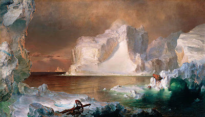
Frederic Church, The Icebergs, 1861; oil on canvas, 64 1/2 x 112 1/2 in. 
image courtesy of Wikimedia


Church's vision of icebergs has a sublime beauty, but still the threat remains as we see the broken parts of ships cast ashore. Church traveled to arctic waters near Newfoundland and Labrador to do sketches for his iceberg paintings. Our small floes of ice on our little Vermont river don't come close to the drama of the arctic, but they have their own more intimate beauty.


February 20, 2013

An Exhilarating Exhibition of Early 20th Century Abstraction


Ivan Kliun, Studies in Color, c. 1917; oil on cardboard, 11 1/4 x 8 7/6 in. 
All images courtesy of the Museum of Modern Art's excellent website


There is a glorious show at the Museum of Modern Art, one that thrilled and delighted me with its mix of beloved artists such as Malevich and Mondrian, artists new to me, and surprising work by artists I thought I knew. Titled Inventing Abstraction: 1910-1925, it brings together work from artists throughout Europe and the United States in an exciting mix of styles and mediums. I did not title this blog post with the title of the exhibition because I think that title is an unfortunate one, since abstraction has been a part of art making for thousands of years, in cultures throughout the globe; what was new was European artists using non-objective forms, with expanding explorations. Roger Denson wrote an extensive and passionate essay on this, which you can read here. There have been other critical complaints about the show, about the blinkered focus of the curator, about those artists left out––why Picasso and not Matisse?; where is Miro? asked Jed Perl; what about Hilma af Klint or George Ohr? Jerry Saltz wants to know––but the show is still a tremendous achievement, a gathering of work that delights, teaches, and inspires me. 

I decided that for this post, I would show work that of artists I didn't know at all, or surprising works by artists I thought I knew. Ivan Kliun was a Russian artist, a colleague of Kazimir Malevich; I think I can say that his series of small works on cardboard, which you can see here, were my favorite paintings not previously known to me. (The wall of Malevich paintings was pretty spectacular too [you can see it at the NY Times], as was that of Mondrian.) Each a simple shape in a single color, some cut off by the edge of the board, they were richly painted, vivid presences. Kliun believed, like Malevich, "art has ceased to be a means and has become and end in itself", a Suprematist belief. In her essay on Suprematism in the Malevich catalog, Kazimir Malevich: Suprematism, Nina Gurianova also points out that it was also "a spiritual quest". Much of the new abstraction had a mystical or spiritual component, a search for a truth behind appearances, for essential form. 


El Lissitzky, Proun 1C, 1919; oil and metal foil on plywood, 26 3/4 x 26 3/4 in. 


I love this painting by Lizzitzky, another colleague of Malevich, with its dramatically solid volumes floating in a boundless space, but also situated by forms and lines at its edges. Who would think to place a line and tiny circle at the left, a group of mysterious lines at right, forms falling from the bottom?  It creates a compelling vision of a new world. 


Vasily Kandinsky, Color Study––Squares with Concentric Rings, 1913; watercolor, gouache, and crayon on paper, 9 3/8 x 12 3/8 in. 


Kandinsky was a very important figure in early abstraction, with his paintings and his book Concerning the Spiritual in Art, in which he spoke of being part of a group of "painters, poets, musicians, dramatists, critics, all working to the same end––the expression of the soul of nature and humanity...".
This cross-disciplinary attitude is one that the exhibition emphasizes. I've never been a fan of Kandinsky's paintings, but I did love this wacky color study.


Vaslav Nijinsky, Untitled (Arcs and Segments: Lines), 1918-19; crayon and pencil on paper, 11 1/4 x 14 3/4 in. 


As a perfect example of both an artist crossing disciplinary boundaries and of depicting the spiritual, the exhibition presented drawings by great Russian dancer Nijinsky, who wrote that he based his drawings on the circle: "the complete, the perfect movement. Everything is based on it––life, art, and most certainly our art" of dance. These drawings are wonderful, very direct and simple, relating to sacred art in their forms. The Russian artists in this show, such as the four above, show that political ferment was a great leavening for artistic innovation.


Giacomo Balla, Study for Iridescent Interpenetration, 1912; 6 15/16 x 7 3/8 in. 


Balla was a member of the Italian Futurists, whose work I don't admire, partly because of their political ideology. But I loved the three watercolor color studies by Balla on view, especially this one, with its form like an unfolding spiky flower. 


Duncan Grant, Interior at Gordon Square, ca. 1914-15; collage on board, 30 1/16 x 25 1/4 in. 


Vanessa Bell, Abstract Painting, c. 1914; gouache and oil on canvas, 17 3/8 x 15 1/8 in. 


Moving to England, here are two artists, Duncan Grant and Vanessa Bell, who were later known for their representational painting, but here have experimented in more abstract form. I really like Grant's use of the collage medium; his interior seems to owe a debt to Matisse's work of the year 1914. The Bell is a luminous work: I love the placement of elements, and that very pink square at the upper right.


Wyndham Lewis, Portrait of an Englishwoman, 1913 or 1914; ink, pencil, and watercolor on paper, 
22 1/16 x 14 15/16 in. 


There was more dynamic English painting totally new to me, including this Lewis work, which has a feeling of toppling architecture...


Helen Saunders, Canon, c. 1915; pencil and gouache on paper, 14 1/2 x 11 3/4 in. 


...and this Saunders painting, also ecstatically, geometrically moving and shaking. Lewis and Saunders were part of the Vorticist group, which promoted activity, significance, essential movement. 


Marsden Hartley, Provincetown, 1916; oil on board, 24 x 10 1/16 in. 


I can see something of a relationship between the American Marsden Hartley's painting Provincetown and the two paintings above, all with a tumble of architectual-looking geometric forms. The exhibition had two of Hartley's well known Berlin paintings, but on another wall were three more simple abstractions, including this one, which I loved. The color is subtle but also very juicy, the composition moving like a teeter-totter.


Arthur Dove, Pagan Philosophy, 1913; pastel on board, 21 3/8 x 17 7/8 in. 


I love the dark, rich, mysteriousness of this Dove pastel, with its sense of moving shapes, machine-like and organic. Dove saw a show of Picasso's cubist works in NYC at Stieglitz's 291 gallery and then wrote in a notebook: "I would like to make something that is real itself, that does not remind anyone else of any other thing, and that does not have to be explained––like the letter A, for instance".  


Wladyslaw Strzeminski, Architectonic Composition (1), 1926; oil on canvas, 35 7/16 x 25 3/16 in. 


I was struck by the straightforward geometry of this painting, its gray and white color. When I read the caption about the work, it was an ah-hah moment, because Strzeminski's aim in his own form of abstraction that he called Unism was to unify figure and ground. Doing that is also my aim in a series of textiles that I call the figure/ground series, some of which you can see here. I wrote above that the works in this show inspire me: I have used this compositional idea, turned 45 degrees, for a textile I'm working on now.


Waclaw Szpakowski, From the Series B:B6, 1924; ink on tracing paper, 13 5/16 x 15 7/8 in. 


Just ink on tracing paper...but so completely engaging and fascinating. A reproduction doesn't give the quality of the deep, dark black on the fragile surface, the insistence of the lines. What you can see is the jumping optical effect. On the museum website I learned that Szpakowski made all his lines by hand, and that he felt they expressed "the underlying mathematical order of the universe".


Sophie Taeuber-Arp, Untitled (Composition with Squares, Circle, Rectangles, Triangles), 1918; 
wool needlepoint, 24 x 24 5/8 in. 


I was very excited to see this needlepoint by Taeuber-Arp, along with other textile work in the show; this especially interested me because of her use of a colored ground with needlepoint elements on top of it; it's gotten my mind going on some new ideas. She and her husband Hans Arp taught at the School of Applied Arts in Zurich where they tried to level any distinctions between fine and applied arts.

What was so marvelous about this show was the sheer range of expression, the wide variety of styles coming out of the idea to leave representation behind. There are so many thoughts to ponder, so much sheer pleasure to be had. It will be on exhibit until April 15th, so I urge you to go if you can. If not, there is an extensive website. It is helpful to start here at the checklist, to get an overview of everything in the show, which you can then explore in depth. Enjoy!


February 18, 2013

New Prints, Cardboard and Potato


High and Outside, ink on Akatosashi paper, ed. 4, 19 1/2 x 24 in. 


Even though I've decided to stay away from titling my potato prints, to allow for free responses, I still title the (fewer) cardboard prints, and I couldn't resist this title, as "inside baseball" as it is, once it occurred to me. I liked the idea of the circle floating away from the touching squares, rising a bit higher and off to the side, pulling our eye actively back and forth. When I think of a ball being pitched, it gives the image more energy (is that cheating?).


High and Outside detail


One square, turned into a diamond, with its corrugations showing, is a red companion to the circle. I love this darker hand-made Japanese paper; it has a lot of character.


Untitled 5, ink on Twinrocker paper, 14 1/2 x 14 1/2 in. 


I quite like the first three potato prints I've shown here, #s 5, 6 and 7, while for me #s 8 and 9 are more iffy. My thoughts began with squares, to which I added red triangles here....


Untitled 6, ink on Gifu Green Tea Medium paper, 11 1/4 x 12 in. 


...while here squares are made with thick lines in primary-ish colors.  


Untitled 7, ink on Sansui SH8 paper, 10 x 18 3/4 in. 


 Stacked squares separate two composite shapes, one a pinwheel-like circle, the other an empty irregular square made up of half circles.


Untitled 8, ink on Twinrocker paper, 2 panels, each 15 x 6 1/4 in. 


I kinda sorta like this, but it leaves me a bit unsatisfied in the balance between the elements.


Untitled 9, ink on Masa dosa paper, 12 x 10 in. 


I wish this piece didn't have the yellow line at the upper right (although that was the first one I printed). For me it works better without it, and is too balanced with the two yellows. But as I promised before, I'm not tossing the iffy prints, but keeping them; I'll only throw away the truly awful ones. You can chime in with any thoughts, agreeing or disagreeing with my assessments.


February 17, 2013

Home Improvement


Is a fresh coat of paint putting a bright new face on things, or covering up a multitude of sins? The way I approached my just-completed home improvement project, it's both. I decided recently (well, I've been thinking about it for at least a year, and finally bought the paint, which committed me to the project) to remove the ancient shelving paper in my pantry room and to repaint walls and shelves. I hated taking time from my various art projects, but I do see my house as an art object in itself.


The walls in my pantry––which is not quite a pantry, but also holds my sink, and is where I do food preparation––are hand-planed beaded paneling. Being in this house is like living in an American primitive antique, of 1821 vintage, not much changed from all those years ago.  


 This is a detail of the wall opposite the shelves, which I stripped of its many layers of new paint years ago, to show off the beautifully variegated old paint beneath. If I was feeling ambitious, I might have stripped the wall instead of adding a layer of new paint, but I wasn't.


Even with fresh paint, the old shelves show years of wear.


Here's the room pre-new paint....


and here it is after. I like the dark contrasting color on cupboard––which is made of nailed together boards of varied widths, from 4 to 10 inches––and shelves, and I'm very happy with how clean it all looks now...what a layer of paint can do! And, this project has gotten me to get rid of all those unnecessary things I've been collecting, so there's a nice pile for the recycling center. I can get back to work today: to dyeing wool and tearing down some prints I made last week.

*If you'd like to see more views of this room, you can go to this blog post, part of a series I did two years ago on "my old house".