August 29, 2014

Color Shifts


The woodland path is already dotted with bright, fallen color.


Looking up for its source, I see a branch of red-orange among the still-green.


The greens predominate, but they've warmed from the cool bright greens of spring and early summer.


The color show begins in early August when the Burning Bush, Euonymus compacta, is tinted red; in another month it will be a flaming crimson.


Ferns are turning gold and brown, with delicate patterns on their fronds.


The leaves and stems of loosestrife (sterile) are now as bright as its flowers were.


Fruit of the rosa rugosa show brilliantly round and glossy. All these color signs, like those of seedheads, announce the end of summer and the coming blaze of fall, before winter's white and gray.


August 27, 2014

A New Textile: "Blue Arc"


Blue Arc, hand dyed wool on linen, 25 3/4 x 12 in.


This new piece is similar in its structure to Double Diamond, a work from a couple of months ago. In each, I stitched together two panels to make the complete work––here two long rectangles––with the design moving from one to the other. In Blue Arc there is just a simple curved line, beginning in the upper part of the left rectangle and ending at the bottom right. I did quite a bit of sketching to figure out a line that seemed balanced and comfortable where it was. For color, I used a muted yellow and red, with the line a bright turquoise blue.


Blue Arc detail


At first I was going to have the line separating red and yellow areas go straight across the two panels, but then I decided to have a slight jig: the line of red begins where the blue touches the edge, and it is higher on the right with the double line of hooking. This slight offset emphasizes the quality of the line, which you can see is a lot more irregular in close-up than when stepping back to see the entire work. It's a little like seeing a confusion of brushstrokes when stepping up to a painterly painting, which resolve into an image at a distance.


August 26, 2014

Spreading Seed


Days are shortening, the crickets are loudly announcing announcing the coming end of summer, and many plants are setting seed. The precise geometry of the thistle flower becomes a fluffy mop carrying seeds off on the wind.


A dandelion-like weed also disperses its seeds by the wind, just as a dandelion does. The round seedhead has its narrow seeds at the center, attached to the light parts that catch the wind. I learned from Wikipedia that seed dispersal comes in two main forms: autochory, which is when the plant uses its own means to disperse seeds; and allochory, using external means. Using wind is a main form of allochory.


There are plants that use animals to spread their seed, such as the chokecherry, which is attractive to many kinds of wildlife who eat the berries and deposit the seeds elsewhere. If you've ever seen bear scat, it is full of seeds. 


These beautiful star-like seedpods are on the Dictamnus albus, or gas plant.


When the seeds are mature, the pods open. I'm not sure how the seeds are dispersed; it may be simple gravity, which would be an autochory means, like an apple dropping from a tree; or perhaps the seed is ejected.


The oriental poppy has a very beautiful seedhead, perfect in the clarity of its form. Its tiny seeds fall out of openings under the top of the seedhead.


The simpler geometry of mallow unfolds a five part cap to reveal the black seeds inside.


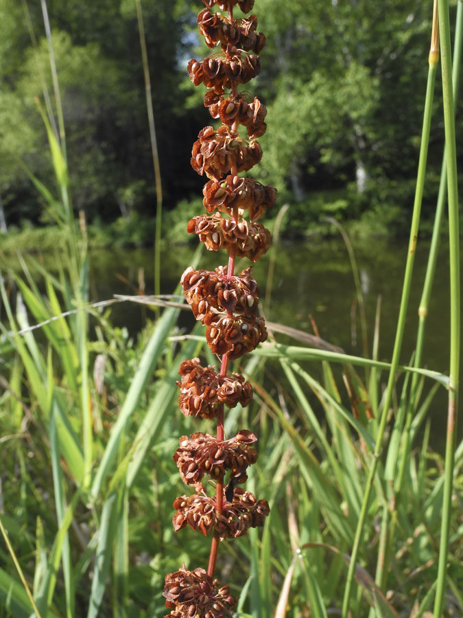
Wild sorrel develops a tall tower of seeds gathered in tiers, richly red and elegant.


Queen Anne's Lace does a curious thing when its seeds develop: the flattened flower curls up into a cup shape, with the reddish seeds inside. I never knew why this happened, but while doing a little research for this post, the invaluable Wikipedia told me that when dried, the umbels detach from the plant and roll along with the wind, like the "tumbling tumbleweed". This is a tiny sample of the many  way seeds develop and disperse, allowing species to survive and to spread.


August 24, 2014

Two New Drawings


#39, egg tempera and graphite on hand-toned paper, 15 x 15 in.


During my last drawing session, while preparing the toned paper I tried something different: instead of mixing color in a bowl, I layered color directly on the paper. This led to some interesting effects, so I tried it again with these two drawings. (I did two other works which were complete flops.) For this piece I began with a cool green––I think it was Viridian, but since I don't keep notes, not wanting to repeat myself, I'm not sure––then layered it with a red earth color to warm it. As you can see, the red is a little stronger at the bottom of the sheet. 


#39 detail


My original sketch for this drawing had two small diamonds between the large ones, but I thought I'd use transparency, overlapping three diamond shapes. I began with the pink diamonds overlapping the blue, but the color was so dominant that the blue got lost; when I painted another layer of blue over the pink, I felt that the drawing's balance was improved.


#40, egg tempera and graphite on hand-toned paper, 15 x 15 in.


This drawing was very difficult to photograph: the paper is toned with layers of a dark red and a pigment called Iron Glimmer. It actually does sparkle when you look at it from different angles. I wanted a muted color effect, with the colors and values fairly close together, almost like seeing color at dusk, before it fades into a general darkness. One reason I love doing these drawings is being able to explore color independently of depicting an object, as I do in my paintings.


August 20, 2014

A Matter of Taste


Criticism would perhaps be simplified if, before setting forth an opinion, one avowed one's tastes; for every work of art contains within itself a particular quality stemming from the person of the artist, which, quite apart from execution, charms us or irritates us. Hence only those works which satisfy both our temperaments and our minds arouse our unqualified admiratiion. The failure to make this fundamental distinction is a great cause of injustice.
––Preface to Dernieres Chansons by Louis Bouilhet

Louis Bouilhet was a great friend of Gustave Flaubert. Mario Vargas Llosa opens his marvelous book, The Perpetual Orgy: Flaubert and Madame Bovary, with this quotation as a way of beginning a conversation on why he has been so in love with Emma Bovary, and the book she inhabits. The title of Vargas Llosa's book comes from an 1858 letter by Flaubert: 
The one way of tolerating existence is to lose oneself in literature as in a perpetual orgy. 
It's the question of taste that I began thinking about after reading the Bouilhet quote. Wouldn't it be interesting if, after the critic's name, there was a short statement (ah-hah! a critic's statement; how about that along with the constantly demanded artist's statement?) setting out their ideas of what makes good art: cutting edge; traditional; political; formal; especially interested in gay/women's/outsider etc art. Vargas Llosa sets out very clearly what his likes are in literature, and why Madame Bovary satisfies them so abundantly. So I thought I should try to articulate my taste in painting; why is it that I love certain artists and loathe others? The following is a brief description, though I must state beforehand that categories are not hard and fast; sometimes I like something that surprises me because I shouldn't. 


Fra Angelico, The Decapitation of Saints Cosmas and Damian, ca 1440-42; tempera on panel; 14 11/16 x 18 1/8 inches.


I love the paintings of the early Renaissance, the 14th and 15th centuries. I believe that I am essentially a classicist. On its classicism page, Wikipedia describes it as "formal and restrained". Even though the story Fra Angelico depicts is one of horror, the clarity and balance of the forms and composition allow us to enter the picture and move through it calmly; like life, the painting contains both beauty and cruelty.


Matthias Grünewald, Visit of St. Anthony to St. Paul and Temptation of St. Anthony, c.1515
image courtesy Wikiart


Is expressionism the oppositie of classicism? If so, it makes perfect sense that I can't stand the work of Grünewald, a German Renaissance painter. It is overwrought to my eye, excessive in its writhing forms and copious details. Then why do I love Brueghel? I believe it's because his form and composition are essentially classical in nature; though crowded, his paintings are clearly ordered.


Caspar David Friedrich, Wanderer Above the Sea of Fog, 1818
image courtesy Wikipedia


Then we come to Romanticism, which I generally despise. In my work I want to take a backseat to the thing described, not to call attention to myself as the maker. I want to see the world plain, without the heightened emotions that are called for with a romantic attitude. But here I'll be a little confusing, because I do like the work of Friedrich, although he is certainly a romantic. It is because the form and space in his paintings are clear and defined and the emotion isn't overdone. A painting like Wanderer is a little schmaltzy, but not over the top....


Philipp Otto Runge, The Morning, 1808
image courtesy Wikipedia


...while this Runge is most positively so, as corny as it gets. Not quite a fair comparison, because this painting is so silly, but other romantics "irritate" me.


Samuel Palmer, Garden in Shoreham, 1820s or early 1830s; opaque watercolor and gouache, 
11 x 8 1/2 in.


William Blake, Albion Rose, 1794-5
image courtesy Wikipedia


Samuel Palmer was a student/acolyte of William Blake. I adore Palmer's work and can't bear to look at Blake's. Palmer's small paintings of the area around Shoreham show a great love for a place, an attentive approach to his subjects. Blake is a great romantic, and his grandiose visions are completely foreign to my temperament.


Franz Kline, Mahoning, 1956; oil and paper collage on canvas, 80 x 100 in.


When it comes to the Abstract Expressionists, why do I not discard the entire bunch? why do I love de Kooning, Kline, Pollock, Newman, Mitchell? It's because the "expressionism" in the catch-all name does not mean that the work is full of excessive emotion. The brush may move with energy, but there is structure guiding it. I remember going to a Franz Kline retrospective at the Whitney many years ago and being startled to see small studies for large paintings that were exactly the same composition; the paintings were carefully planned, not frenzied expressions.


Clyfford Still, Untitled, 1951-52
image courtesy SFMOMA


Here is where taste becomes unreasoning: though Still's paintings seem to have much in common with those I mentioned above as loving, I really hate his paintings. To me they are overlarge canvases covered with mush, with no reason for being other than the artist's ego. If I try to be rational about why I dislike his work so much, I would have to say that it has to do with the romantic aspects of it, untempered by a structural rationality, or any sense of humility.

So, if I were a critic, I think you now might have a sense of my likes and dislikes, though again I'll state that my opinions are not fixed. I do have a sensibility, which I believe we all have, that colors how we look at art. I imagine you can come up with your own categories of love and hate, as much as we all try to be open and welcoming to all art.


August 19, 2014

A New Painting: "Blue Verticals"


Blue Verticals, egg tempera on calfskin parchment, 8 1/4 x 6 1/8 in.


What is it about Cobalt blue that is so appealing? is it because it is close to the color of a bright sky, so our association with it is positive? Or maybe for you it is not; it could be sad, like "The Blues", or feeling blue. It is curious to me that such melancholic emotions would be given the name of such a lovely color. It may be because it's the coolest of colors on the spectrum; both green and purple have some warmth added to the blue: yellow and red. I might be thinking about this because the vertical forms in this composition remind me of figures; the central rectangle is like a person squeezed into a line or in a crowd. The metaphoric readings of my paintings generally stay in the back of my mind; this painting has pushed them forward.


Blue Verticals detail


August 17, 2014

Indian Pipe: A Strange and Ghostly Plant


July 11


Last month I spotted some odd white forms on the forest floor. I thought that they might be eggs of some sort, but when I touched their smooth surfaces, I could feel that they were stuck to the ground, not moveable as you would expect eggs to be. I turned to my friend Susan Sawyer, a naturalist on the staff of the Four Winds Nature Institute to solve the mystery. She guessed that they might be the beginnings of Indian Pipe, a plant lacking in chlorophyll.


July 23


Sure enough, as the weeks went by, it became clear that these were indeed the Indian pipe plant.


July 31


As they raised themselves further above ground, their shapes became familiar to me: a stem, with a few white leaves ending in a drooping white flower. The plants are white because they lack the energy-making chlorophyll, so instead they are parasites, like fungi, and their hosts are fungi.


August 5


It is very startling to come across these white flowers, the only white, except for the occasional pale mushroom, in an environment of brown and green. They are graceful, and seem so incredibly vulnerable.


August 10


Indian pipe seems too strange to be like other flowers, having stamens and pistil, but one day I happened to see a bumblebee in the woods, going from one flower to another. This prompted me to take a look inside, and sure enough, those flowering parts were there. I learned from the Indian pipe link above that the plant, pollinated by the bumblebees, will later form seeds. A flowering plant, ordinary and wondrous.


August 13, 2014

The Story of the Toothbrush at the Museum of Everyday Life


I have a vague memory that as a child I had a toothbrush like one of these, with an animal charmingly perched on its handle or case. How wonderful to have this called to mind, something I would never have thought of, as we rarely think about ordinary items in everyday use. The Museum of Everyday Life remedies this situation by looking at a different object each summer and exploring its history and culture. This year it's "Toothbrush From Twig to Bristle in all its Expedient Beauty". Last year's subject was the pencil, which I wrote about here. The museum had exhibits on the safety pin and the match. In the lively introduction to the show––you can read the entire essay at the museum link above––the curators point out:
Arguably one of the most basic and intimate of human tools, we place the toothbrush actually inside our bodies daily.....This object grooms and massages and maintains in good working order the parts of the mouth that articulate our desires and dreams, the key to our agency.
....we also remember that the rise of the toothbrush and ritual toothbrushing was born and grew hand-in-hand with the ascendancy of refined sugar in the modern diets of rich and imperialist nations. 
That sugar is part of the story relates this exhibition to the recent one by Kara Walker, "A Subtlety, or the Marvelous Sugar Baby", an installation at the Domino Sugar Factory in Brooklyn.


This miswak, or chew stick, is a devotional object in the Islamic world. Made from the Salvadora persica tree, it is effective as a toothbrush and related to the earliest known teeth cleaning artifacts, such as Babylonian chew sticks from 3500 BCE. A hadith (teaching) of the Prophet Muhammad concerning the miswak states:
Make a regular practice of Miswak for verily it is the purification for the mouth and a means of the pleasure of the Lord.
The first bristle toothbrush, I learned, was invented by the Chinese during the Tang Dynasty (619-907). They probably used the hairs of the cold-climate hog inserted into a bone or bamboo handle.


These are bone handles from early 19th century toothbrushes that were found in a dump in Scotland. It turns out that it took many centuries for the bristle toothbrush to arrive in Europe; previously people cleaned their teeth with rags. The invention is credited to William Gaddis, who in the year 1780, while in jail because of a dispute, came up with the idea of sticking bristles into holes drilled in a bone. The company that William Addis founded still exists: Wisdom Toothbrush.


This is the first US patent for a toothbrush, filed by H.N. Wadsworth.


Anything to get us kids to brush....those animals up above, books about cleanliness, a toothbrush handle in the shape of a bulbous cartoon character....


....and lines of drum majorettes proudly holding toothbrushes instead of batons.


Toothbrush handles came in all sorts of shapes, from a hand grasping the handle....


....to a clear naked woman....


....to a red stocking that held a small tube of bubble gum toothpaste. There was even a toothbrush handle in the shape of a penis.


Toothbrushes traveled in lipstick cases.


And unfortunately, toothbrushes had their terrible side: they could be racist....


....and they could be transformed into a bladed weapon, called a shiv, in prisons.


But here, an unknown woman proudly and happily holds up her toothbrush in a photo taken in post war France. She later married the American soldier who took the picture and moved to the US with him. Perhaps to her, the toothbrush symbolized the return to normal life, to routine and to cleanliness, and to peace.


August 11, 2014

A New Painting: "T-Square"


T-Square, egg tempera on calfskin parchment, 9 x 9 in.


My last painting was all about Curves, but this newest work is all straight lines, except for the curve of shadow on the central rectangle. This frontal image––close to symmetrical but not quite––of receding planes is rather austere with its horizontal, vertical, and diagonal lines.


T-Square detail


Some light-hearted color, pink and green, counter the solemn mood.


I've been thinking about how my paintings have changed over the past few years, changes that might not be evident in online photos, so here are four works to illustrate the shift. The two above are from 2011, the two below are my most recent. My paintings have gotten gradually larger, with a larger internal scale, by which I mean larger forms and less small detail. The painting on the upper left, Yellow Tilt, is close to the size I'm working with now, but you can see that there's a lot more going on in it. With the blue painting, Plus Minus, the composition is pared down, but the size is a lot smaller at 5 x 6 inches than my current work. It's a subtle change, but to me it feels like an important one. I am aiming for drama within simplicity and intimacy.