Showing posts with label contemporary art. Show all posts

November 12, 2021

Thomas Nozkowski's Distinct and Personal Vision


Thomas Nozkowski, who sadly died in 2019, made paintings like no one else's, and each painting was an exploration of color and form totally its own. A recent show at Pace Gallery, "The Last Paintings", presented 15 paintings, done in the last few years of his life. They are insistently modest in size, but not in feeling or painterly ambition. Each work measures 22 x 28 inches, and all are oil on linen stretched on a panel. There's been a great deal of excellent writing on this show and on Nozkowski's body of work, including two beautiful tributes from people who knew him: by the artist Tom McGlynn in the Brooklyn Rail, and the writer John Yau in Hyperallergic. The New York Times published a laudatory, informative article, with lots of studio photos. I don't feel that I have anything insightful to add, but I wanted to join the chorus of praise for this beautiful and moving show.


In the painting above, with its interlocking masses of organic shapes, blues alongside greens, I think of a landscape, perhaps turned on its side, but the bright promise of these forms is belied by the subtle blacks behind them, peopled by rounded forms rising out of the dark, like ghosts. Nozkowski's handling of paint is masterly in its myriad approaches: in this painting clear, crisp, opaque forms backed by vertical transparencies, all in perfect pitch. Of course, photographs flatten the complexities of the paint. (If you click on the image you'll see it in more detail.)


Floating colored circles are seen through transparent, undulating shapes, like things seen under water. The image seems airy and lyrical, but the stark white circles, some partially overlapped, startle in their contrast. I can be tempted to try to discern the source of Nozkowski's images, since all come from out in the real world––perhaps landscape or film or literature––but ultimately it's not important that we know. In a terrific interview with the artist in Art News in 2016, he explains his painting ideas and approaches at length. One thing he said about sources: 

Well, here’s the thing, once you say you’re using sources and you have content, people think that’s the end of the story—that’s what it’s about. But of course you know absolutely nothing...


To illustrate that knowing nothing, a story: I recently commented on a friend's abstract painting online, writing that I found it very poignant. It turned out that it was inspired by seeing an echocardiogram of his elderly father's heart. Of course I could never have guessed that source, but was moved by the painting without knowing. The quality of the form told its story. 


A viaduct of colors crosses black and white terrain, connecting shapes recalling water and land. I love the way the solid mass of blue, a stable element, contrasts with the jazzy goings on––disparate yet connected––in the black and white center of the painting.


Here is another painting in which the center is a total surprise in its radical difference from what surrounds it. I'm in awe of how Nozkowski came up with these ideas, and with the techniques to pull them off. Strongly colored shapes, outlined in pale yellow, border, on two sides, a busy field of red and yellow.


The area of actively criss-crossing yellow lines on red creates, for me, an atmospheric effect, a shimmering in light, that sits behind the "window" of the foreground shapes. It is like a bright spring morning.


Irregular colored shapes float gently––or are they broken pieces falling?––above a cool gray ground, which is composed of many small adjoining and overlapping shapes. The foreground shapes are primarily soft greens, but then there's that insistent red square and the orange shape alongside it. The red square demands attention, as if to say that things aren't as you expect them to be; that there's always a surprise in store. 


Another surprise is that there is a gray shape that overlaps the corner of the orange one. Even though the grays are painted delicately, transparently, here one breaks its polite place in space and moves forward. This is such a great twist, one that upends certainties. 

Seeing Thomas Nozkowski's last paintings was an exhilarating experience. With his vivid painterly imagination he presents to us wide-ranging, glorious human possibilities. 


October 31, 2021

John Chamberlain: Material and Meaning


I've recently been having very interesting conversations about the meaning that is embedded in an artwork: are we to see abstract work as a composition consisting of shape, color, space, light, or is there content in addition to the formal concerns of the work? John Chamberlain is an interesting artist to think of in this context. I wrote about the marvelous retrospective at the Guggenheim Museum in 2012, where I saw the sculpture as purely about color and shape, and surprising moments of juxtaposition and detail. Seeing a stunning show of Chamberlain's sculpture currently at Gagosian Gallery has prodded me to think about what it means that he used industrial scrap metal and parts of cars in his sculpture. 

In the work above––I'm sorry not to have titles and dates, but some galleries have taken to not having check lists, or even reproducing the work on their websites, which is very frustrating––a curved red clamshell shape sits atop crumpled blue forms, almost like an open mouth. Are we to think of a figure? 


This very large sculpture of compressed and varied forms, one side primarily blues, another yellows, made me think of a landscape in its multitudinous parts and its complexity. It also feels like a raucous free jazz composition, form piled upon form, sometimes discordant, in other parts fluid. 


I couldn't help but see a crowd of moving figures, as though on a busy sidewalk. This is such a dynamic piece, and it reminded me of Philip Guston's painting Monument, a scrum of legs and feet. 


This is a stunningly dramatic piece, with smooth thin forms reaching high, fluid rounded shapes nestled one against the other. But all these observations of mine are about image, what the whole of the sculpture brings to mind. 


As here, with another monumental piece that looks to me like an animated creature, rustling as it moves. Chamberlain's magical expertise with folding, crushing, and welding sometimes lets us forget that this is metal that he's working with, and not malleable clay or cloth.  


Yet there is metal's rigidity and sharp edges, its shiny surfaces, its shapes that are sometimes clearly part of an automobile's body.


In this detail of the other side of the sculpture pictured above, Chamberlain has included parts of a car that are clearly elements of a bumper, smoothly protruding; they could be from a 1951 Ford coupe. Does this clear reference to the origin of Chamberlain's materials indicate that some of the meaning of his work lies in industrial automobile manufacture? is there a critique of American addiction to cars and the open road? or a paean to American know-how and design, as with the American Precisionists of the early 20th century? 

I would answer "no", for the most part. Of course I have to acknowledge the source of Chamberlain's materials, but for me that does not determine the meaning of the work, which I find in responding to its form. I don't know if he was attracted to scrap metal because of its origins, or because of the way it behaved and looked when made into a sculpture. Chamberlain himself, in speaking of the meaning of his work said:
"Even if I knew, I could only know what I thought it meant."
We artists cannot determine what meaning observers find in our work. What we prefer people to see is not always what they will see. For me, looking at a non-objective work is a rich experience, noting the way form and color interact, the quietude or dynamism of a composition. I find meaning in these things, and a deep emotional satisfaction. In recent years I've had two extraordinary experiences standing in front of a painting, paintings which caused me to weep at their beauty and depth of feeling. One was at the National Gallery in London: 


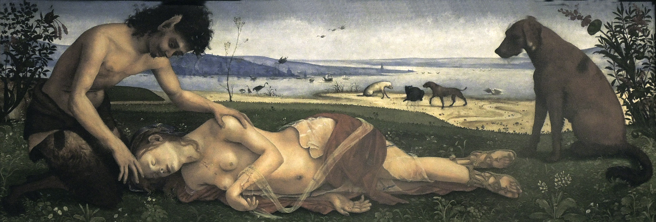
Piero di Cosimo, Satyr Mourning a Nymph, ca. 1495


I wrote about this remarkably tender painting here. Not only is the narrative touching, but the form and structure of the work are in perfect harmony with its story.

The other was a Mondrian in the collection of the Hartford Atheneum:

Piet Mondrian, Composition in Blue and White, 1935


The simplicity and perfection of this painting struck me so strongly. In a photo image it appears much more flatly painted than it does in person. My point in showing these two paintings, so different in subject and separated by centuries, is that response to a work does not have to be tied to its subject; meaning can reside in narrative, and it also can be found in pure form. To be honest, I was surprised at my unbidden spell of weeping in front of the Mondrian, but it proves to me that a reductive work of art can be as important to me as one of representation and narrative; form in itself carries meaning. 


July 1, 2021

At the Met: Abstraction, Modest and Monumental


Piet Mondrian, Composition, 1921


One of the great joys of wandering the galleries at the Metropolitan Museum of Art is seeing art that spans centuries. There is Egyptian sculpture from 2,000 B.C., through and up to contemporary art of the 20th and 21st centuries; this range of style and content and culture and meaning opens my mind. Oh, I admit there are areas of art that I don't think I'll ever like––Italian 16th century mannerism, for instance––but I admire most everything; that certainly includes modern and contemporary abstract painting. I loved seeing this small––19.5 inch square––painting by Mondrian in the Modern and Contemporary galleries. It has great presence in its simple structure of rectangles divided by heavy black lines. What's especially interesting about this painting, which is early in Mondrian's exploration of Neo-Plasticism, is that the color is mixed, as different from that in his later work, when he used only primary colors. 


Leon Polk Smith, Accent Black, 1949


Leon Polk Smith's geometry is more lively than that in the Mondrian. The diagonal placement of rectangles and squares emphasize movement; the composition is then stabilized by the black at the bottom, holding the earth-red shapes in place. 
 

Carmen Herrera, Iberic, 1949


With Carmen Herrera's Iberic, I see yet another approach to geometry, using curves and points and shapes of different sizes. The composition is anchored by the slightly squashed divided circle at the center, held up by a thick line of horizontal black that angles into a vertical and meets orange. The color is both somber––black, and dark red, with deep orange––but also hot, in the warmth of red and orange. For me, Iberic is quite playful in its rhythmic shapes. 


Joan Snyder, Smashed Strokes Hope, 1971


After seeing the three paintings above, I walked into galleries that contained paintings which had been part of the exhibition "Epic Abstraction". The three following paintings are certainly epic in their size, and they are all "painterly". To be clear,  I am not equating size with quality; it is simply a different characteristic. Joan Snyder's 6 x 12 foot canvas is covered with joyous paint; I see it in that spirit because of its color, like an explosive spring garden, and in the exuberant paint handling. There is open space, as in a Chinese landscape, and my eye follows paths across the canvas.


Joan Snyder, Smashed Strokes Hope, detail


The paths are created by paint that is slathered, wiped. dripped; it is thick and thin; put on with brushes? hands? palette knife? The variety of marks, their physicality, adds energy to the painting; the brushwork lends such immediacy that it feels as though it's still in the process of being made.


Joan Mitchell, La Vie en Rose, 1979


Joan Mitchell creates an atmospheric landscape-like space across the four panels of this large painting. The upper area of the panels are gently violet-tinged; they contrast with the aggressive, agitated marks below. Because the painting is divided into four parts, with no continuity between them, it reads as a narrative, with four events unfolding over time; each panel has a slightly different emotional register, but all are passionate. 


Joan Mitchell, La Vie en Rose, detail


In this detail we can see much more complexity than when looking at a small image of the entire painting. Blacks and blues are layered over ochers and pinks, The brush jabs and sweeps, and the paint drips; there are thickets of strokes, evoking trees and brush. La Vie en Rose is an immersive experience, as though being within Mitchell's sense of space.


Willem de Kooning, Easter Monday, 1956


Ah, de Kooning! Even though I've seen many of his paintings over the years––including this one, and the great retrospective at MoMA in 2011-12––I stood transfixed in front of Easter Monday during my recent visit to the Met. I felt that I was exploring an actual physical space, complex and shallowly layered. Although the painting appears frenzied––on the Met's website they cite critic Thomas Hess, who likened this group of paintings to "abstract urban landscapes," and "Easter Monday does seem to reference the whirling pace and gritty detritus of the modern city"––its structure is solid and balanced. 


Willem de Kooning, Easter Monday, detail


As with the two paintings above, it's impossible to get a true sense of the physicality of paint in a photograph, but if you enlarge the images by clicking on them, you'll get a better idea. In this detail we can see an transfer from a newspaper pressed onto the canvas. As explained on the MoMA website: "De Kooning often used newspaper in his painting process. He pressed it against the surface of his canvases to keep the paint wet." This adds an unexpected element to the painting, which is at odds, in a fascinating way, with its abstraction. 


Willem de Kooning, Easter Monday, detail


Willem de Kooning, Easter Monday, detail


The brushstrokes are edgy, yet luscious. When I think of de Kooning's process, it brings to mind a quote of his in an interview with the critic Harold Rosenberg, about the uncertainty of making art, and I believe this to be true no matter the style or medium of the artwork: 
De Kooning: If you yourself made a sphere, you could never know if it was one. That fascinates me. Nobody ever will know it. It cannot be proven, so long as you avoid instruments. If I made a sphere and asked you, 'Is it a sphere' you would answer, 'How should I know?' I could insist that it looks like a perfect sphere. But if you looked at it, after awhile you would say, 'I think it's a bit flat over here.' That's what fascinates me––to make something I can never be sure of, and no one else can either. I will never know, and no one else will ever know.
Rosenberg: You believe that's the way art is?
De Kooning: That's the way art is.


April 13, 2021

Artists and Critics


Honoré Daumier, "Well, if you look very closely you might ending finding some quality; the color seems to be good."


In Jean Frémon's marvelous little book, The Paradoxes of Robert Ryman, he writes almost apologetically about his role as a writer on art:

All of us who write on art or artists have an extreme presumptuousness. We hold forth on the ins and outs, means and ends, and in reality we know nothing; nothing of what it is to truly take, on the end of a brush, the color from a palette and put it on a panel. We dissect thoughts while the painter searches for the form. Thought is within it and cannot be formulated in words. The thought of a painting is not discursive. It matters to the greatest degree and at the same time is on no consequence. It is everything, but it is nothing. It is there. In any case. Before and after. The only thing that matters is the form that it takes here and now: a little bit of white pigment taken up the this palette, on the end of a brush, and set down on that surface. 
In this modest declaration, Frémon shows himself to be a most sensitive and thoughtful writer. He has so many insightful things to say in this book that go beyond referencing just Ryman, such as:
Miro, Rothko, Ryman....deepened their thought in order to enlarge our understanding of the work of art, and our perception of the world. They do it not as historians or as sociologists but as artists; the proposition that they advance is not along the lines of semiotic analysis or chemical experiment; it is an object, an unexpected object, even if all the steps of its production have been carefully prepared, an object with no other purpose than itself, made to be seen, simple, and whose mystery holds us attentive, whose mystery touches us. 
 
This quality, obviousness and mystery, is what one speaks of the least when one speaks of a painting, because it is that whereof one cannot speaki. Thus, it is necessary to fall silent. Wittgenstein would say, Fall silent and look.
Frémon has not fallen silent, for which I am grateful because he's a wonderful writer. Artists cannot fall totally silent either, not about their own work or that of others. I've long believed that it is a good thing to be somewhat articulate about one's own work, to think about it as clearly as possible, as it allows us to move forward intelligently. But as the maker of the work, we can't ever have a new eye to see it in a different way.

Many years ago I was at a lecture given by Lucy Lippard, and one thing that she said has stayed with me because it is so important: she believed that the role of the critic was to be a "sympathetic observer". The critic can look at the art object and find connections, explore meanings of both form and content,  respond in an open and intelligent way to what they are seeing; this enlarges our understanding.  Over my long career I've been lucky to have had many reviews in which the writer was certainly sympathetic, and observant, pointing things out in my work that I hadn't thought of. Having the physical object of a painting translated into poetic prose is a delight and a gift. I did once get a nasty negative review, almost 40 years ago, and in the NY Times. I was a young artist and it crushed me (I did get other laudatory reviews in that paper). I now wonder what the point was of writing something so mean spirited? I don't read these kinds of blistering reviews any more, or perhaps I'm just not aware of them. It seems to me that writers on art have adopted Lippard's credo and  have provided us with a rich and informative range of texts, and the arts are definitely better for it. 


June 20, 2016

In the Cuban Vanguard: Three Women Artists


Amelia Pelaez (1896-1968), Tray with Fruit, 1941; oil on canvas in original frame, 28 x 35 in.


It is wonderful when a gallery offers us the opportunity to see work that is unfamiliar, from a country or culture generally overlooked. Galerie Lelong, in their exhibition (until June 25) Constructivist Dialogs in the Cuban Vanguard: Amelia Pelaez, Lolo Soldevilla, & Zilia Sanchez does just that. The show presents the work of three women who worked in modernist styles, each different, and each engaging. They were all supported by the Lyceum women's club gallery in Havana. Pelaez, the earliest of these three artists, worked with cubist ideas (she studied in Paris in the early 1930s) but her vivid sense of color, the heat and rhythm coming from Tray with Fruit, is culturally Cuban.


Amelia Palaez, Untitled, 1959; gouache on paper, 22 x 30 in.


Intense color shines from behind a lattice of black lines in the painting above, an image thought to derive from Cuba's mediopuntos, colonial period stained glass windows.


Amelia Pelaez, Untitled, 1952; hand painted ceramic, 5.1 inches high.


This delightful piece with its lively lines is a painting in three dimensions.


Loló Soldevilla (1901-1971), Stabile, 1954; metal and wood, 16 x 19 x 3.5 in.


Soldevilla's work seems much more tied to European constructivism in its geometric forms than that of the more image-oriented Pelaez. She too spent time in Paris, in the early 1950s. Stabile has five elements in balance: the solid squares atop verticals, the open circles rolling on horizontals; the piece does not move, yet appears fluid; it bounces.


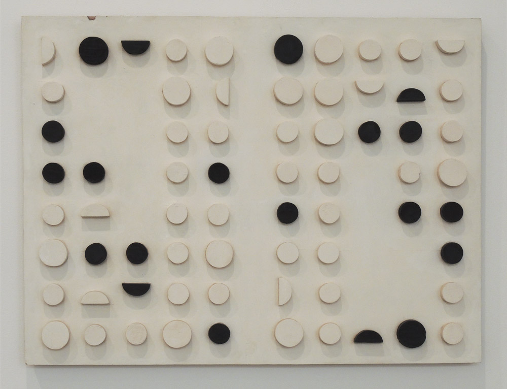
Loló Soldevilla, Astral Dream, 1957; mixed media on wood with wooden components,
30 1/2 x 39 1/2 x 1 1/4 in.


Looking at this relief is like looking at the night sky, trying to find patterns within the random shapes and colors.


Loló Soldevilla, Untitled (Construction), 1954; painted wood, 15 x 22 x 2 1/2 in.


I like that the regularity of this piece is disrupted by the roughness of the cut circles and background.


Loló Soldevilla, Untitled, 1954; collage on paper, 11 x 9 in.


Soldevilla also made some beautiful small collages, of geometric forms that are slightly offbeat.....


Loló Soldevilla, both: Untitled, 1954; collage on paper, 9 x 11 in


....or more pure. The bright colors bring a lighthearted lilt to the work.


Zilia Sanchez, Amazons, 1993; acrylic on stretched canvas, 71 x 72 x 12 in.


Zilia Sanchez's sculptural paintings are wild and sexy and sensual; their sedate blues and whites keep them grounded in cool abstraction.


Zilia Sanchez, Moon V, c. 1973; acrylic on stretched canvas, 74 3/4 x 79 1/2 x 10 in.


Swelling forms, interlocking....


Zilia Sanchez, Erotic Topology (of the Amazons series), 1968; acrylic on stretched canvas,
41 x 56 x 12 in.


....or simply protruding....


Zilia Sanchez, White Moon, 1984/89; acrylic on stretched canvas, 23 3/4 x 19 x 4 3/4 in.


....create poetic metaphors of the body, and of longing. All three of these artists––of different periods and education and even places of residence (Sanchez left Cuba in 1962)––came from a Cuban sensibility, but one also connected to widespread artistic thought; with these elements they each created an exciting body of work that I was very happy to see.


June 7, 2016

Marcia Hafif's Witty Minimalism


 Installation view of the exhibition "Marcia Hafif: The Italian Paintings, 1961-1969" 


This exhibition buoyed my spirits, even on a day of seeing several great shows. I loved the off-beat humor of these paintings, their play with associations of the body and organic geometry. Hafif takes a minimal format of two or three colors, and in many of the paintings just two shapes, and what emerges is an unexpected image.This series of works were completed when Marcia Hafif (b. 1929) was living in Rome, and they haven't been shown in the US before; lucky us that Fergus McCaffrey has mounted this lively show. 


128, September 1966; acrylic on canvas; 78 3/4 x 78 3/4 in.


A strong central "figure" in violet is surrounded and pushed inward by a strong warm yellow, complementary colors which create an edgy tension. The two shapes argue with each other as to which is dominant, though in this painting, the purple seems to win.


161, October 1967; acrylic on canvas, 55 1/8 x 55 1/8 in.


 In the press release for the show, Hafif mentions that this painting of the hill shape is the most important to her of the series. She speaks of trying to equalize the figure/ground relationship:
In painting this shape, I used two competing colors, attempting to avoid figure on ground, to equalize the two spaces, but the hill remained dominant....I was placing a positive shape in order to create another positive shape by default, balancing the shapes and balancing the color so that no one prevailed.
The shape is a hill or a breast or a nose or....


157, October 1967; acrylic on canvas; 23 5/8 x 23 5/8 in.


I think that 157 is more successful in this figure/ground balance. Being around farms a lot, I keep seeing a cow's teats, but they are interlocked with the soft upward fingers. For me, this is a very amusing painting.


165, October 1967; acrylic on canvas; 23 5/8 x 23 5/8 in.
168, November 1967; acrylic on canvas, 55 1/8 x 55 1/8 in.


Here are two variations on a double dip curve, both very sexy and definitely flip-flopping in their dominant shapes.


72, March 1965; acrylic on canvas; 55 1/8 x 55 1/8 in.
73, March 1965; acrylic on canvas; 55 1/8 x 55 1/8 in.


These two paintings, of an earlier date than the ones above, have a more sedate organic geometry. They reminded me a bit of Paul Feeley's work. I especially like the push of forms in 73; they have strong presence against the shape created between them.


58, 59, 60, 61, 62, 63, (Mirror, Mirror I-VI), November 1964; acrylic on canvas; suite of 6, each 19 3/4 x 19 3/4 in.


This series uses a more pure geometry: of circles, partial circles, and rectangles. Pictorial tensions come from circles being squeezed between rectangles....all except the final painting, where the violet circle floats on the red ground, attached gently to its neighboring rectangle.


60 detail


Looking closely at the paintings, we can see the meticulous care with which they are made. One color is painted more thinly––in this case the violet–––while the red is painted more thickly. This results in subtly different textures for each color.


45 (Nearer), May 1964; acrylic on canvas, 66 7/8 x 78 3/4 in.


The idea for this painting is so simple––circles and bars––yet these elements move and shift spacially, making me wonder what I'm looking at.


15, March 1963; lacquer on canvas; 15 3/4 x 23 5/8 in.
13, February 1963; lacquer on canvas; 15 3/4 x 23 5/8 in.


Lastly, here are three paintings that I think of as "game board" paintings.....


22, April 1963; lacquer on canvas; 17 3/4 x 17 3/4 in.


.....with circles placed on a patterned surface. Over these few years in Rome Hafif created an impressive body of work, using a minimalist vocabulary while alluding to things in the world. Her later paintings, which you can see on her excellent website, are sensuously minimal and nearly monochromatic. I loved seeing these Italian paintings, a quirky prelude to the more austere work to follow.