Showing posts with label egg tempera. Show all posts

August 24, 2021

Questions I Ask Myself While Painting


When we work at tasks––cooking, cleaning, gardening, repairing––I imagine that all of us ask ourselves questions, whether consciously or not. Do I add more salt? where should I put this new plant? how can I fix this cupboard door with its loose hinge? will wood putty work? When I'm in the process of painting, which I've been doing for about 50 years (yikes!) I don't usually pay attention to the questions asked, decisions made; although they are constant, I don't focus clearly on them. Painting became like walking, where I don't have to ponder each muscle movement in order to go forward. 

But then, a painting ago, the questions became loud and clear in my head; I noticed them. The questions were about process, about the step by step making of a painting, and not anything philosophical: not why am I doing this at all, not what I'm trying to say. Just process. I imagine every artist has their own particular questions. A first question for me is the palette and which color pastes are to be laid out in the small cups: do I need Cadmium orange? which yellow should I use, Cad yellow medium or light? should I mix the greens I'll need? if so, which blues will come in handy? Ultramarine deep? Cobalt blue deep, or light or standard? maybe a green? Why oh why didn't I order more Chrome oxide green? Should I use some Phthalo green? if so, warm or cool? 


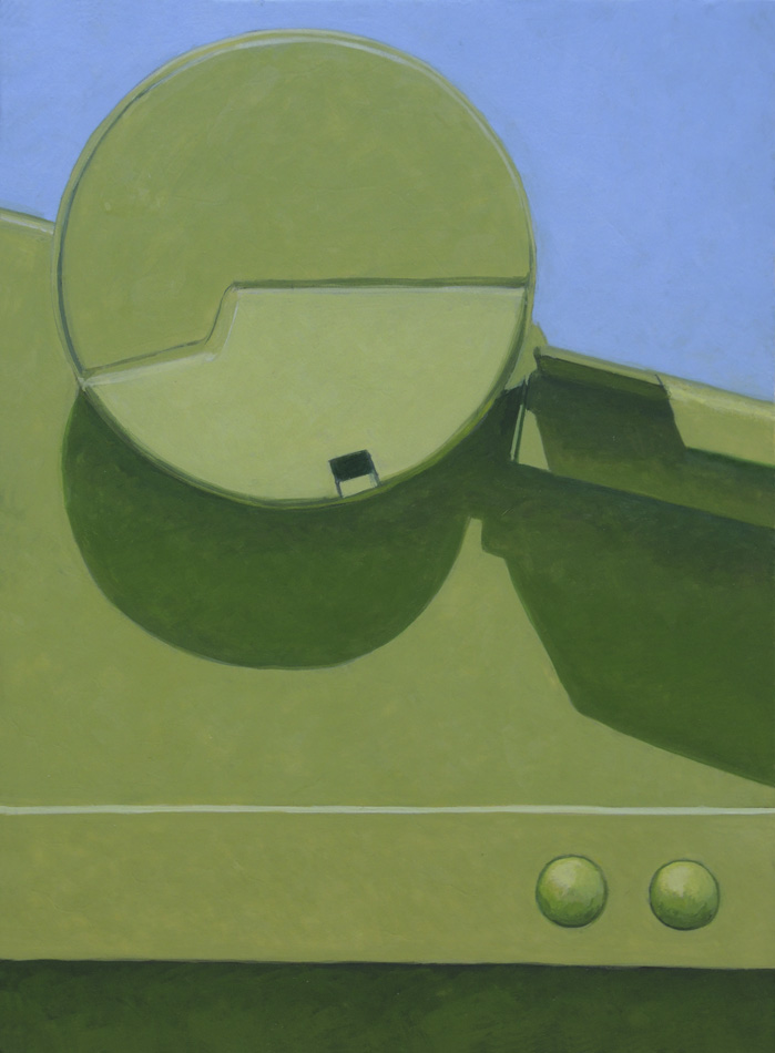
I use photographic sources for my work, so there are often decisions to be made as to how faithfully to follow the image. For this painting one large question was: what color do I paint the lower right corner? The source was green grass, which would not do at all. The warm brown you see sketched in above was many colors before it got to that one. Should it be dark green? blue? a warm earth red? maybe more yellow in that? lighter? darker? Each questioned color was tried and wiped off, to start anew. Should the color have transparency? or be more opaque? I actually thought this: should the color be dead or alive? I think my question meant how intense should the color be? should it recede, or pop, or be on the same plane as the shapes above? 


There are always questions about the composition: will I move the diagonals so that they touch the corners? what about that dark edge: put it in or leave it out? Should I widen the left rectangle? Where should I place the red circle? centered, or higher? And the biggest question: do I leave the arm coming from the left side of the red disk? And the protruding brown cylinder: is it be seen from above, as in the source image, or straight on? 


Here is a detail of that part of the painting, finished, with the questions answered.


Colors chosen bring up a litany of questions, for every color in every painting. Many years ago, when I was a student at Skowhegan, our rallying cry was "Hue! Value! Intensity!", the three qualities of color. Getting these greens––in shadow and light––to work required many layers of color answering how warm? how cool? how light? how dark? how intense do I want the color to be? which blue or green or yellow will give the hue I want? will the shadow color be more or less transparent? will adding white kill the color, or would yellow work? which yellow? maybe I should add lemon yellow to my palette? And the touch, or facture: do I want it to show a subtle painterliness or a more opaque surface? Will the green rectangle on the left be lighter, warmer than the triangular green? How about the lights? how warm, how light? One of the great qualities of egg tempera is its translucency, which allows for color mixing while layering paint. And after each layer, each new color: does it sit properly in space? does it carry enough light?  
 

Red Disk, 2021, egg tempera on calfskin parchment, 7 5/8 x 8 5/8 in.


A final question: do I include a photo of the finished painting in this blog post? 

As I thought about why my list of questions moved to the foreground of my mind, I remembered that I'd recently read a wonderful poem by John Yau, "Fifty for Richard Nonas", the sculptor, which consisted of a long list of questions, questions that are enlightening, thoughtful, demanding, confounding, compelling, essential. I love this::
What is invisible inside this place you are filling with carbon dioxide? What besides air, light, and memories? 
(click to enlarge)


June 2, 2016

A New Painting Diptych: "Yellow Light"


Yellow Light, egg tempera on calfskin parchment; 2 panels, each 7 1/2 x 7 1/2 in.


I think of this painting, made up of two panels, as having an off-beat rhythm: the wide yellow curves seem to be of a piece, but they are not continuous; there's a jump, a missing piece, an unexplained relationship between them. Diagonals are repeated in highlights, but they are made of an angled shape in one panel and a line of circles in the other. This continuation/variation is part of what fascinates me about multiple panel paintings; the break between the two images creates a narrative jump, a space for conjecture, a bit of uncertainty. The large pale yellow triangular shape at the left anchors the composition as other shapes swoop off.


Yellow Light detail


The volumetric curve of a black form on the left panel....


Yellow Light detail


....is echoed by a flat curved yellow shape on the right. Repetition and change create a complex space.


May 17, 2016

A New Painting: "Hook"


Hook, egg tempera on calfskin parchment, 5 7/8 x 9 in.


A simple composition of horizontal and vertical rectangles is thrown for a loop with the addition of a curved form. I use that idiomatic expression deliberately, since the hook shape lets the mind wander into metaphor.


Hook detail

May 2, 2016

A New Painting: "Hidden Bolt"


Hidden Bolt, egg tempera on calfskin parchment, 6 1/2 x 8 1/4 in.


I love shapes: their juxtapositions, their color, the way one balances or is in tension with another. Their taut, precise edges excite me; the light flowing over them carries an added drama. I am offering a defense of painting that is not painterly, not "expressive", not about the figure or narrative events, but is restrained and is focused on the formal elements of painting. I am writing this now because while this painting was in progress I felt a passion for its shapes, a delight and an exhilaration that reminded me why I continue with this subject matter. 


Hidden Bolt detail


And, there are metaphors within the most straightforward of images.
I paint, after all, for myself; if others like what I do that is a wonderful bonus.


March 28, 2016

A New Painting: "Large and Small Circles"


I've finished the last (on the right) of a group of four vertical paintings. Each painting has slightly different dimensions, but their overall similarity of mood makes me think of them together.


Large and Small Circles, egg tempera on calfskin parchment, 9 1/2 x 7 in.


This painting is the only one with a second color having some dominance. The painting on the left in the group photo, Angled Bar, also has a blue color at the upper right, but it is closer in hue to the main color. In this new painting, I was drawn to the large split circle; we can see that its bottom portion is bent upward, catching more light. This adds a bit of the unexpected to the image.


Large and Small Circles detail


Then there's that little rectangular hole, asking for attention.


Large and Small Circles detail


The large circle is made up of flat planes, but the smaller ones below are rounded. The two of them side by side, with their volume, gives them enough visual presence to keep my eye moving back and forth across the surface of the painting.


March 15, 2016

A New Painting: "Scoop"


Scoop, egg tempera on calfskin parchment, 9 x 6 3/4 in.


Most paintings go fairly smoothly for me in their process, with the usual challenges and adjustments and reworkings; but occasionally it's as though I hit a wall, as though I don't know anything about color and light and paint. This image was one of those tough ones, on which I worked for hours, repainting sections over and over, wiping off, repainting. I simply couldn't get the color right: the yellows were dark and dead and the sense of light nonexistent; bits of dust were settling in the paint, causing it to lift off. After struggling with the painting for 2 or 3 days, I realized the only thing to do was to wipe it all off and start again. The struggle is never without value because I learn something, if only what not to do. When I started the painting again, I used more color in the shadows and made them lighter in value. Yellow is a trickster: how to make darks of such a light color? How cool or warm should shadows be? 


Scoop detail


I made the shadows cool at their edges, shifting to warm for the bounced reflected lights. I'm working on a green painting now, and I can definitely say that green is a piece of cake compared to yellow.


February 25, 2016

A New Painting: "Angled Bar"


Angled Bar, egg tempera on calfskin parchment, 8 7/8 x 6 1/2 in.


I feel as though I put umpteen layers of paint on this piece, trying to get to a color that worked: I wanted it somewhat dark in value, but at the same time intense in color. Because it's a cool blue-green, it wasn't easy. I often had to go back to a much lighter color, then layer a darker one over it in order to achieve the intensity I wanted. Then there was the triangle of another color at the upper right: it went through many iterations, from a darker hue of the main color, to an almost black, like the shadow at the lower left, to different blues. I settled on a blue that had a green cast to it. The black shape adds another element that balances the deep dark below it. I painted that dark using layers of color––ultramarine blue, phthalo green, quindo red––and because egg tempera is translucent, the layering of colors can result in a near black, a color that is deeper than a straight black would be. This painting is the second in a group of four vertical images that are primarily one color. You can see the first one, Tall Red, here.


Angled Bar detail


February 13, 2016

A New Painting: "Tall Red"


Tall Red, egg tempera on calfskin parchment, 9 1/4 x 6 1/2 in.


Red is a difficult color because it is both dark and intense: go too light in the lights and it becomes pink; go too dark in the shadows and it loses life; it's quite a balancing act. On top of that, for me red is incredibly tricky to photograph. I hope all my paintings look better in person than in an online image, but with red images I'm sure that they do because subtlety is lost in a photo. This painting is the first in a group of four vertical images that are primarily one color. I like the big empty middle––empty except for light and shadow––a tall cylinder flanked by buttresses and topped by circular disks. 


Tall Red detail


February 1, 2016

New Hooked Wool Drawings


2016 #1, hand dyed wool and egg tempera on linen, 17 1/2 x 15 1/2 in.


Sometimes when I make a new group of hooked wool drawings I am interested in having a similar theme in all four pieces; at other times, as with these works, I aim for variety. In #1 there's an illusionistic painted form circling a solidly hooked rectangle.


2016 #2, hand dyed wool and egg tempera on linen, 15 x 12 in.


Paint and wool describe shapes and a dividing line.


2016 #3, hand dyed wool and egg tempera on linen, 12 1/2 x 23 1/2 in.


The solidity of hooked wool shapes surround a thin painted one; but that pale yellow arc has been accorded some presence by the shapes around it.


2016 #4, hand dyed wool and egg tempera on linen, 18 x 15 in. 


Two outlined shapes wobble atop a painted one. These pieces are a balancing act: of color and shape, and the weights of forms painted or in the low relief of wool loops.


January 26, 2016

A New Painting: "Yellow/Green Diptych


Yellow/Green Diptych, egg tempera on calfskin parchment, 2 panels each 8 3/4 x 6 1/2 in. 


I like diptychs and other multi panel works: form and color leap from panel to panel, creating a more complex relationship than in a single panel; it is a kind of conversation. I've done many multi-panel textile works, but not so many paintings, which are, for me, more difficult to compose. I did one diptych last year, which you can see here, and one the year before, here. My previous diptychs were horizontal, and I thought I'd try something quite different with this painting, having the two panels aligned vertically. (In the transfer from actual painting to photograph, the space between panels, which was 3/4 inch, appears too wide.) I like the way the large green planes jump from one panel to the next, and have opposite diagonal directions. 


Yellow/Green Diptych detail panel 1


There is a curve in the top panel....


Yellow/Green Diptych detail panel 2


....and several repeating ones on the bottom. These curves also introduce more color. This work was a challenge for me, and I'm not quite sure it's a success, but I intend to keep trying multi-panel paintings.


January 20, 2016

Adventures with Clay: A Steep Learning Curve


Egyptian Curves, porcelain with egg tempera paint, 9 1/4 x 7 1/2 in.


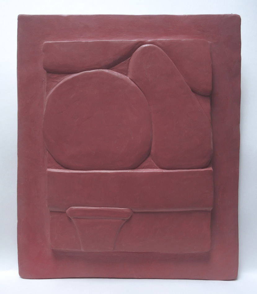
I have learned so incredibly much since I last posted about my first attempts with clay reliefs about six weeks ago. I've been working hard, I might even say obsessively, nose to grindstone, on my clay projects. It's been a long time since I've cursed as much while making art; it's so easy to make mistakes: drop a tool and make a hole, cut off an important bit of form, ruin a perfectly good line, etc. If it wasn't for the helpful advice of my sculptor friends––Sam Thurston and Harry Roseman––and the knowledge and generosity of my ceramicist friend, Deborah Jurist, who has fired this work for me, I would still be messing about with air dried clay. And if it wasn't for the brilliant exhibition of Middle Kingdom Egyptian art at the Met, I wouldn't have begun working with clay in the first place. 

I'm beginning this post with my most recent piece, and the one I think is most successful so far. I puttered with abstract imagery, as in Reliefs 8 and 9 below, but it wasn't until I copied details from Egyptian relief carvings that I began to get an idea of where I was going. First of all, I found out that carving the clay would work better for me that what I had been doing: layering thin slabs. 


Egyptian Curves detail


 Looking carefully at the detail of an Egyptian headdress, I tried to copy the subtle plane changes, and the sensitive curves and lines. Doing this gave me a three dimensional vocabulary, something this two dimensional artist sorely needed.


Egyptian Offerings, 1st version


Then there was the issue of color. I didn't want to leave the pieces white, as beautiful as that is; I love color too much. I wanted to use paint, so as not to have to fire the work again, and also to have more control. There was a problem with the porosity of the clay: at its full firing temperature, it was too vitrified to accept egg tempera; the paint didn't stick. Deborah tried placing the pieces in a cooler part of the kiln, so they would be a bit under-fired, therefore more porous, and that helped a lot. Then there was my decision on how to use the paint: transparently or more opaquely. Decisions, decisions, lots and lots of figuring things out. My first attempt on Egyptian Offerings was using transparent paint; I put a second layer and didn't like that at all: too much showing of every little imperfection on the surface; that's all you noticed, instead of the form.


Egyptian Offerings, porcelain with egg tempera paint, 10 x 8 1/16 in.


So I took a deep breath and went back at it with thicker paint, using several layers, as I do with my paintings on parchment....and....it made me happy. I made the surrounding "frame" a slightly different color than the image panel, as I did with Egyptian Curves. That was another set of decisions: whether to have the frame at all, whether to make it the very same color as the image. For me, the image panel looked kind of naked without a surround, and right now I like the slight color variation, though I might not do that all the time. 


Egyptian Offerings detail


One of the great pleasures for me in doing these reliefs is playing with line and edge, and paying attention to the way one form meets another. There are infinite variations in these aspects of three dimensional drawing.


Relief 8, porcelain with egg tempera paint, 9 3/8 x 7 1/2 in.


Relief 9, porcelain with egg tempera paint, 9 1/4 x 8 1/2 in.


The two pieces above were made using slabs, which I found hard to keep smooth and flat. I originally thought I'd make only abstract images, like these two, but since doing the Egyptian pieces I realize I can also use imagery from my machinery files. Relief 8 was done with transparent paint, and 9 with thicker paint. I used a wider framing panel in Relief 9 wanting to see if it was more effective, but I don't think it is, so I'm sticking with a frame that's a bit more than an inch wide. Although sometimes I've felt like a dumbbell while working with clay, it is deeply satisfying, and I look forward to seeing where it will take me.


January 7, 2016

A New Painting: "Black Form"


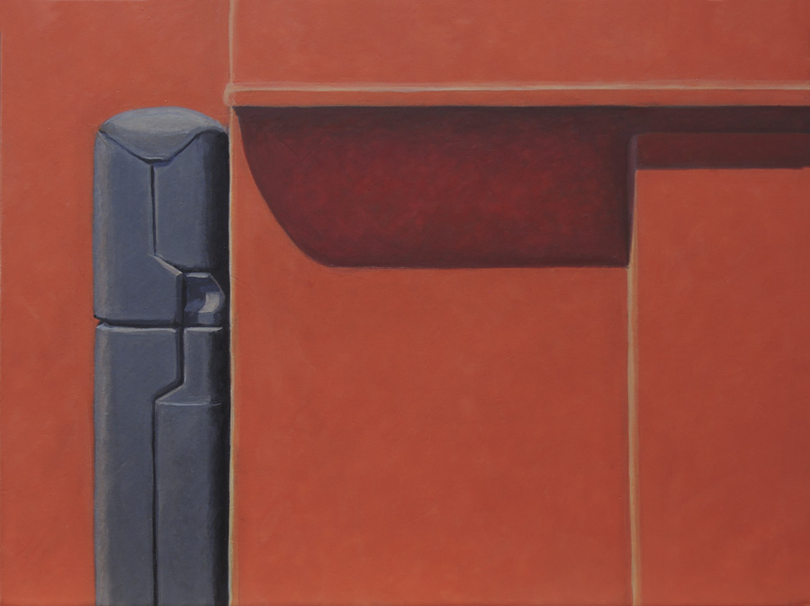
Black Form, 2015, egg tempera on calfskin parchment, 6 3/4 x 9 in. 


This is a simple frontal painting, with very few elements: red planes, shadowed, and a long black form. The drama is in the shadow and in the black that so strongly contrasts with the bright red. I have a story about painting that red, which clearly illustrates Josef Albers' Interaction of Color. I worked away on the red shapes––the shadow colors were just sketched in––painting them several times trying to get a color that worked. The red continued to look dull, without any light in it. Frustrated, I was about to try yet again when I thought....hmm, I'd better paint the shadow first, before repainting yet again. When I got that shadow done, with its cool darks and some bright reflected light, the reds suddenly popped, got bright, looked like they were lit by sun. Color only exists in relationship, and every once in a while a painting gives you a strong reminder of that fact.


Black Form detail


The only small details in the painting are those on the black form: lines that describe indentations and overlaps, plus a small curve. These small incidents engage the eye and play off against the big simple red shapes.


December 26, 2015

A New Painting: "Black Curve"


Black Curve, egg tempera on calfskin parchment, 6 3/4 x 8 in.


Some of the compositions for my paintings stick quite closely to the source image, but with others, such as Black Curve, I make changes. For this painting, I simplified shapes and eliminated unnecessary details. There had been white text in the black shape at the upper left, and below the big black curve were complex arrangements of small dark shapes; there was no yellow under there at all. Because what most interested me about this image was the black curve crossing the yellow one, I extended the yellow under the black curve and invented a shadow echoing the curve above it. All paintings, even those based on actual things, have to work as abstractions. 


Black Curve detail

November 30, 2015

New Hooked Wool Drawings


2015 #16, hand dyed wool and egg tempera on linen, 15 x 12 in.


While working on the designs for this new group of hooked wool drawings, I tried to make each one different in compositional ideas. I don't always do this; sometimes I make a group of related works, such as these based on line; or these, which work as a set. Here, instead, I have a variety of shapes and color, from a composition engaging the entire picture plane....


2015 #17, hand dyed wool and egg tempera on linen, 17 1/2 x 17 in.


....to one that is square and centered....


2015 #18, hand dyed wool and egg tempera on linen, 17 3/8 x 16 1/2 in. 


....to shapes which climb the surface, grabbing hold of a small circle....


2015 #19, hand dyed wool and egg tempera on linen, 19 1/2 x 15 in.


...and finally a split rectangle filled with a circle and smaller rectangle. I did have some funny problems with two of these, with what I described as un-mindfulness to a friend. I was sitting and happily working on 2015 #19, hooking the dark red semi-circle, when I realized, after more than an hour of work, that I was hooking the wool on the wrong side of the circle! There was no salvaging it, so I had to re-cut and re-draw and re-paint the piece of linen. My other mistake was with 2015 #17: I didn't pay attention to how much wool I had in the orange color of the lines; I thought there was enough, but it wasn't even close. So, I hooked a darker color for the large hooked shape (I tend to use my wool leftovers for these pieces, of which I have large piles) but it looked awful. So I had to dye a piece of wool in order to finish; I deliberately made it a lighter color, which worked a lot better than the darker one. Sometimes the work goes smoothly, and other times there are bumps in the road; sometimes the work isn't even salvageable, but happily, in this case, with some do-overs, it all worked out.


November 23, 2015

A New Painting: "Pointed Arch"


Pointed Arch, egg tempera on calfskin parchment, 7 1/2 x 10 in. 


I had to giggle when I began this painting: the shapes were so humorous to me with the outstretched "arms". I begin my paintings quite loosely, in a very painterly fashion, and make them more precise as I work; I thought the tightening up of form would bring more gravity to the image, but it still seems funny to me (though maybe not to you). Which is fine; I like humor in art. The title, Pointed Arch, continues the silliness, because of course this isn't an arch since it's supported at its center.


Pointed Arch detail


Here's a detail of the little lozenge shape that caps the arch, probably hiding the bolt holding the cylindrical parts together.


Pointed Arch detail


I deliberately softened the top edge of the light gray form, so it would settle into the blue; this is different from the sharp dark green edge, which pops that form forward. Although this image is very simple, it is always a balancing act to pull a painting together.


November 18, 2015

A New Boxed Paintings: "Grays"


Grays, cover and box contents; egg tempera on calfskin parchment, 3 x 5 1/4 x 3/4 in. 


I've just completed another in my series of boxed paintings: small boxes made out of parchment, containing a dozen very small paintings. I paint the boxes based on a color or shape theme, such as Reds, Squares, Black and White, etc. For this piece I mixed grays, all from color, none from black or gray pigments, resulting in grayish-blues, grayish-browns, grayish-greens: a great range of hues.  


Grays, cover and inside


The cover is light in value, and the inside dark. Both have overlapping shapes and leave some parchment bare of paint.


Grays, paintings, side 1, ca. 1 1/4  x 1 1/4 in.


Grays, paintings, side 2


Because the parchment is translucent, after working on one side of the little painting, I hold it up to the light to work on the other side, in order for them to relate to each other. Sometimes it even seems as though the reverse side has an active part in the composition, such as in the second from the left on the top row. That green square is all that's painted on that side; the horizontal rectangle below it is painted on the other side. It's a challenge, a pleasurable one, to come up with a range of compositional ideas to fill the box.