Showing posts with label printmaking. Show all posts

January 9, 2017

At the Met: The Power of Simple Form


Shell Ring ,(Yua), Abelam people, Papua New Guinea, 19th - early 20th century


What is it about beautiful objects that is so compelling? Often, when I have some time to wander the galleries of the Metropolitan Museum of Art, I find myself looking at things, at artifacts and ancient sculpture; I visit old friends and discover new ones. I don't quite know why these often take precedence over spending time in the painting galleries; perhaps it's the satisfaction of seeing three dimensional things I can imagine running my hands over; perhaps it's their mystery. On my most recent trip I looked through the galleries of the Arts of Africa, Oceania, and the Americas and saw a few objects of stunning simplicity, where the purity of form spoke very strongly.  The shell ring, made from the shell of a giant clam, is a form of wealth for the Abelam, and also a part of ceremonial life. The irregularities of the surface play against the perfection of its curving form.


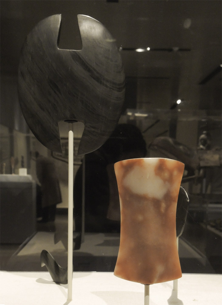
Bannerstones, archaic Illinois and Ohio, 3rd - 2nd millenium B.C.E. 


These ancient carved stones were used as spear weights. I love seeing very old utilitarian objects that were crafted with exquisite care, each one an aesthetic object. The fact that thousands of years ago different peoples around the world sought beauty touches me deeply.


Lidded Bowl, Marquesas Islands, 'Enana peoples, late 18th - early 19th century.


The simple shape of this bowl is described as bird-shaped in the Met's wall label. I hadn't recognized that, but I did respond to its graceful curves, which end in a stylized human head.


I'm not sure what this object is because I photographed the incorrect wall label; I'd thought it was a fishing float from the Solomon Islands. But whatever it is, the dark irregular sphere and its elegant decoration are wondrous.


Shield, Australian aboriginal artist, mid to late 19th century


I love both the extended oval form of this shield and its geometric decoration that pushes against the curved edges. The central horizontal band of red creates a break in the rhythm, a sophisticated syncopation.


Egyptian ointment jars and pots for makeup, 1800-1500 BC


The Egyptian jars and the two porcelain works below are objects that I photographed on previous visits to the Met, but which fit in with the theme of clear and simple form, form which I find so pleasurable. I look at Egyptian works often, especially Egyptian reliefs, which inspired me to begin my series of relief sculpture.


Chinese Qing dynasty porcelain, late 17th - early 18th century


On the Met's second floor, in cases to the left of the grand staircase, are many elegant Chinese porcelains, beautiful in color and in shape. I love these pieces, not the highly decorated vases, but the ones that are mainly a single color––white or yellow, or oxblood–––on a pure form.


Moon Jar, Korea, second half 18th century; porcelain, 15 1/4 x 13 in.


There is a gallery dedicated to Korean art in the Asian wing at the Met, with intriguing objects on view, especially ceramics. The Moon Jar with its gently swelling form and delicate coloration is a favorite of mine.


Barnett Newman, Untitled Etching #1, 1969; etching and aquatint, 23 3/8 x 14 11/16 in.


After admiring the objects from the Americas and Oceania, I felt that the pure, simple form of this Barnett Newman etching had an increased resonance and weight. It's not only a modernist abstraction, but it is also an heir to a millennial-old tradition of art's fundamental aspect, pointing to a quality of transcendence. The clearing away of extraneous detail and of narrative, the focus on the essential, gives to all these works a sense of the extraordinary, the magical, and shows the power of art to elevate and enlarge us.
 

October 21, 2015

Käthe Kollwitz's Krieg (War): The Power of Images


Frontal Self Portrait, 1922-23; woodcut


The horrors of war are unfortunately ever present; Käthe Kollwitz's images of the emotional and physical ravages of WW I could represent many wars, and they are harrowing. A large group of Kollwitz's drawings and prints associated with her series of seven prints––Krieg (War)––is now on view at the Davis Museum of Wellesley College, and I was very lucky to have had the opportunity to see them. I had previously seen one or two, and many in reproduction, but standing in front of actual drawings and prints on the theme of war was very moving. You can see from her self portrait that she has an uncompromising vision.


Pensive Woman, 1920; lithograph


Pensive Woman is a heart rending image, so simple yet speaking so clearly of hopelessness. The evening before seeing this show I watched the Netflix film Beasts of No Nation, an overwhelmingly horrifying view of war in an unnamed African nation, and the child soldiers forced into that war. Still shaky from that experience, the Kollwitz works struck me even harder than they might have otherwise.


The Widow, 1918; soft-ground etching with hand additions in graphite, charcoal, and brush and gray wash.


The slightly open mouth, the sunken eyes, the large open hands, all express grief; that expression is heightened by the depth of black of the widow's dress.


Three states of The Parents, 1922-23; woodcut


Kollwitz's youngest son was killed at the beginning of WWI, in 1917, on a battlefield in Flanders. A few years later her grief became art: two parents supporting each other in their mourning. The exhibition was interesting in that it presents various states of the final prints for the series, plus drawings. They are a worthy companion to Goya's Disasters of War.


Trial proof for a discarded version of The Parents, 1922-23; woodcut


I love this deep deep dark version of this image. In her diary she noted that "pain is very dark".


 The Parents, 1922, Plate 3 from Krieg; woodcut


However, the version Kollwitz chose for the series was more open, though still powerful.


Mothers Protecting Their Children, 1918; charcoal on laid paper.


Another strong theme was mothers trying to protect their children. In this drawing the composition is spread outwards.....


The Mothers, 1921; india ink and opaque white watercolor.


.....but we can see how Kollwitz intensified the image by having the women huddle together, trying to form an impenetrable mass.


The Mothers, Plate 6 from Krieg, 1922; woodcut


In the final woodcut, the whites highlight the fearful faces, the enclosing hands.


The Widow II, Plate 5 from Krieg, 1921-22; woodcut


This is the most awful image of all....


The Survivors, 1922-23; charcoal on laid paper.


....and for the survivors, pain and grief, though with a steadfast will to survive. Why oh why do we do this to ourselves over and over and over again?


August 17, 2015

New Prints: Cardboard and Collage/Potato


Red Squares, ink on Sekishu natural paper; image size 12 x 12, paper size 22 x 22 in., ed. 4. 


Recently, for my cardboard prints, I've worked with very simple compositions using a single color. (See my previous two cardboard prints here). Within a 12 inch square are 2 larger and two smaller squares; the solid color of the smaller squares balances the larger squares made up of lines. After I'd printed it and was looking at a proof hanging on the wall, I noticed that there was an optical shift going on, with the squares bouncing forward and back. Another inadvertent element: the top of the linear square at the right has a rolling dip, a subtle curve down and up, which I didn't notice until the plate was printed. I like it: for me the irregularity adds some amusement and some energy to the outline.


Untitled 80, ink on Nishinouchi paper, 16 x 14 1/4 in. 


I had prepared several collaged sheets for this day of printing, but Untitled 80 is pure potato print, the only one I did that day.


Untitled 81, ink and pasted paper on Masa dosa paper, 16 x 14 in.


I am intrigued by the textural and shape relationships between the painted, pasted paper and the shapes made by a potato print stamp. In Untitled 81 the triangle and rectangle are pasted paper that had been painted with egg tempera; the lines connecting them are made with a potato print.


Untitled 82, ink and pasted paper on Izumo Mitsumata paper, 10 x 10 in.


When I began doing Book Paintings (see the post about them here), I thought it would be fun to try some new papers, so I ordered a few, sight unseen, from the fabulous NY Central Art Supply paper catalog. This beautiful hand made mitsumata paper, which I bought in several colors, turned out to be too heavy for my books, so I will use it for potato prints. The piece above has a collaged vertical blue rectangle with small shapes added with potato print.


Untitled 83, ink and pasted paper on Izumo Mitsumata paper, 12 x 16 in.


The yellow translucent paper pasted onto the mitsumata is a hand made gampi, a paper that I found too smooth and fine for books, so it will serve another purpose. A small stamped square holds the composition in place.


Untitled 84, ink and pasted paper on Akatosashi paper, 2 panels each 19 1/4 x 7 in.


Rectangles of pasted paper and stamped squares converse with each other across a small divide.


Untitled 84 detail


Here is a detail to get to give a better sense of the textures. The two papers pasted on the darker one are a Sekishu natural, and Gifu green tea medium. Much of the time I paint the papers I use for collage, but in this case their actual color worked well on the darker Akatosashi.


Untitled 85, ink and pasted paper on Izumo Mitsumata paper, 16 x 12 in.


Another print on the shimmery mitsumata, three long rectangles––one pasted, two printed–––move diagonally up the surface of the paper. I photograph these prints in a raking light so as to show the surface textures and irregularities; in other lights they don't appear as strongly, but for me they are part of the character of this work.


April 26, 2015

Blinky Palermo: An Expansive Minimalism


Installation view of the exhibition "Palermo: Works 1973 - 1976" at David Zwirner Gallery. 
(the exhibition has ended)


I have a passionate love for all the work of Blinky Palermo (1943-1977), the German artist who took the name of an American gangster/fight promoter and lived a short and very productive life. I use the word passionate deliberately, as it implies a highly emotional, almost irrational response. It's difficult to describe clearly why Palermo's work moves me and makes me happy to be in its presence, as I was at the recent show at Zwirner, link above. I suppose I can start with minimalism, pared down, mainly geometric painting, which I love, and which has influenced much of my work the past few years. I'd have to include Palermo's work within the frame of minimalism, but he throws a curve ball into the mix. Looking at the long black line on the left wall, I see that it has some weight and presence, but it's not quite a sculpture.


Untitled, 1973, detail; oil on canvas over wood, 3 1/2 x 88 3/8 x 1 9/16 in.


It is, rather, a long narrow, irregular painting, pointed on both ends so as to push into the space around it, animating the wall. The surface isn't polished and smooth, but bumpy and somewhat misshapen. I find this imperfection very touching, and the emotion is heightened for me by the ordinariness of this object placed on the wall: it is a line, and a hand-formed object, inviting metaphor.


Wooster Street, 1975; acrylic on aluminum in 2 parts, 22 1/2 x 41 5/16 overall. 


There were two of Palermo's metal paintings in the show. The thin metal surfaces of the paintings gives them a lightness on the wall despite their strong presence and moves them outside the familiar oil-on-canvas tradition.


Wooster Street detail


The care with which white paint was laid over the darker color, making subtle stripes, belies the idea that the artist might have been a sloppy thinker.


Untitled, 1973; primer, oil, fabric, and wood; 98 7/8 x 26 3/8 x 3 5/8 in. 


Palermo called his hybrid works of painting in three dimensions "objects". They are painting amplified. In the piece above, a dirty red-orange supports gray and bright blue on a tall, thin rectangle. At the bottom another orange rectangle is layered. It is very difficult to achieve balance with such a tall shape, but this work feels achingly perfect to me.


White Wing, 1974-75; protective wood paint and mixed media on wood with acrylic on aluminum, 119 7/8 x 35 1/16 x 1 15/16 in. overall. 


A simple black line and and a white parallelogram washed with a stripe of pale color: a combination offering numerous metaphors. White Wing is dramatic in its actual presence, being 10 feet tall, engaging a sweep of wall. You can see its scale in the first installation photo above.


White Wing detail


The tall black shape isn't a simple flat line, but a slightly volumetric wood form, roughened and marked by paint and staples. What appears from a distance as a clean, crisp form is instead worn and speaks of time and the hand.  


Object with Spirit Level, 1969-1973; rustproof paint, muslin, found level, and press board; 
21 3/8 x 53 1/2 x 1 3/4 in.


This work is quite witty, I think. Two implied vertical rectangles bookend a horizontal one, and on top is a spirit level, painted the same way as the board beneath. I had never realized that a level was also called a spirit level; to me it implies some kind of magic. In this case, the level is missing the liquid and its bubbles, so it cannot measure its straightness on the wall; it is an abstraction, with references.


Untitled, ca. 1974; oil on wood, 9 11/16 x 22 3/16 x 3/4 in.


With a plain shape on the wall, a triangle....


Wood Parallelogram, 1974; varnished wood, 35 9/16 x 22 1/4 x 2 in.


....or a parallelogram, is where the mystery of my deep response to Palermo's work comes most to the fore. There seems to be no reason for me to be so moved by a shape on a wall, but I am. It is as though I am being asked to see the basis of life, its essential form, turned into something poetic; a transmutation of matter.


II-1 and II-2, 1974; pencil on paper in 2 parts; 72 1/4 x 93 3/4 and 72 1/4 x 147 7/8 in.


In the same room as the Wood Parallelogram were six drawings, most in two parts, that seemed completely empty sheets of paper at first glance. Like a group of Ad Reinhardt paintings shown in this space in 2013, it took attention and time to see what Palermo had done. Like the Reinhardt's, they are impossible to photograph.


II-1 detail


On each sheet of white paper, a surface rich enough to look as though it was painted or gessoed, is one or more finely and crisply drawn parallelograms. They very subtly create a tension between them, a movement across the expanses of empty space. They anchor the space, but with such a light touch that they are almost illusory. They are beauty, hard to grasp.


4 Prototypen, 1970; four color screenprints, each 23 5/8 x 23 5/8 in.


I very clearly remember the first work by Blinky Palermo that I saw: it was the four prints above, and it was at a gallery on the north side of 57th street, sometime in the mid 80s I think. I remember being thunderstruck by this group of prints with their offbeat geometric forms. It was love at first sight, and this was when I was painting precise landscape paintings. It was a treat to see them again, in a show of Palermo prints at Carolina Nitsch Project Room.


Five Miniatures, 1972; suite of five color stencil prints on handmade paper; each 15 3/4 x 10 5/8 in.


In the print show were several suites of miniature prints, which showed another aspect of Palermo's sensitivity to form and color, and his ability to work at different sizes and with different materials. His drawings, which I wrote about here (another show at Zwirner), show another aspect of his marvelous sensibility.


I love these small images, their inventiveness and simplicity; their color and form. There is grace in all Palermo's work, a fluid ease with materials, a mysterious rightness that touches my heart and enlarges my spirit.

March 30, 2015

At the Met: Robert Motherwell's Lyricism


From Lyric Suite, 1965; ink on paper, 11 x 9 in.


Freely brushed inks spread across paper with fresh abandon, a color haloing a darker one; circles that might have been accidents mark a path, add a loose geometry to fat flowing lines.


From Lyric Suite


In 1965, Robert Motherwell bought 1000 sheets of Japanese paper; 600 drawings were the result of his brushing colored inks on unsized paper. He wrote (my information from the Metropolitan Museum of Art's wall labels):
Each picture would change before my eyes. The pictures literally continued to paint themselves as the ink spread in collaboration with the paper. 
A selection of this series, named after Alban Berg's Lyric Suite––a string quartet that Motherwell listened to in his studio––is currently on view at the Met. It's wonderful to see the variations of form, to get a sense of the immediacy of these works.


From Lyric Suite


According to the Met: "Motherwell worked quickly and without conscious control, executing between ten and fifty drawings a session." I can readily imagine how thrilling it was to work in this manner, to wonder how a mark, a splash will transform into an image.


From Lyric Suite


There is so much life in these drawings; they don't stay still politely, but have a continuing pulsing energy. The drawings remind me of the looser forms of Asian calligraphy, which require many years of study in order to have the knowledge to use free brushwork.


From Lyric Suite


I had never thought much of Motherwell's work, since all I knew of it were the Elegies to the Spanish Republic, a series of works whose forms I found leaden and repetitive. Then last year I saw a couple of later paintings from the Open series, and realized that I didn't know the artist at all; I loved those works. The mezzotints below are from that series. They are minimal, but have an expansive space, beautifully brushed color, and inherent light.


From Lyric Suite


I see a similar sensibility in the Lyric Suite drawings and the Open series, with their forms inhabiting large spaces, floating within them. There is a great respect for the ground plane and its strong presence; the artist's entry into it is as collaboration, not dominance.  


Mezzotint in Crimson, 1969; mezzotint, plate: 8 11/16 x 5 13/16, sheet: 25 1/8 x 19 15/16 in.


The exhibit included several other works in different mediums by Motherwell, including mezzotints using the form of his Open series. I have read a couple of different origin stories for this series, which he began in 1967. One is that it came from a chance arrangement of one small vertical canvas leaning against a larger one. Another, from MoMA, is that it was "responding to the impulse in European and American visual arts to regard painting as a window". But that goes against the general idea of the "integrity of the picture plane".


Mezzontint in Indigo detail, 1968; mezzotint, plate: 8 13/16 x 5 13/16 in..


To me the works are existential: the open rectangle a human structure, existing in boundless space. The intervention of geometry is delicate, unassertive, but insistently present; the field, though dark, is luminous. I find them very moving.


Gauloises Bleues, 1968; aquatint and collage, plate: 9 3/4 x 5 1/4, sheet: 22 x 14 5/16 in.


Motherwell was also a master of collage, and I have regretted missing recent shows of this work. This small piece shows a perfect balancing of large and small shapes, and color. There's a narrative to the work, too, since we realize that the sky blue wrapper is from a cigarette package. 


Untitled, 1973; pasted papers and lithograph on paper. 


A later collage makes reference to Motherwell's Elegy series, as rounded forms are bound between vertical lines; protected? imprisoned? The two ovoids have more buoyancy than the black shapes of his Elegies; they feel human, even musical. Their colors––green and white––have hope within them, and the irregular pink bars have some warmth. It is such a pleasure to newly discover an artist I'd long dismissed; thanks to the Met for this nice little show, on the 100th anniversary of Motherwell's birth.