July 31, 2015

Jean Painlevé's Magical Worlds Under the Sea


From Sea Urchins, 1954


There is so much life on this earth that we humans are hardly aware of; it is too small, or out of sight on high mountains or under the sea, or simply unnoticed. I have a favorite Henry David Thoreau quote:
Many an object is not seen, though it falls within the range of our visual ray, because it does not come within the range of our intellectual ray, i.e., we are not looking for it. So, in the largest sense, we find only the world we look for.
Happily, there are people of great curiosity and vision who help us expand our known worlds through their large intellectual ray, such as the scientist filmmaker Jean Painlevé (1902-1989). Over a period of decades, from the 1920s to the 1980s, he made more than 200 scientific films, and is best known for his short films on sea life. I have to thank the artist Michael Brennan for alerting me to this artist, for I have to call him an artist along with a scientist: it is very clear that the aesthetic quality of his work was supremely important to him. It is the aesthetic quality of his films, the visual inventiveness, the sheer beauty, the marvelous scores, from classical to jazz to modern, that makes them special to me.


Sea Urchins


I remember sitting in an elementary school classroom watching film strips or short educational films, but I'm sure we never saw anything as gorgeous as those of Painlevé. Even when he is the scientist––his films are full of complex and detailed information. I should also warn potential viewers that some of them show dissections––and shows us the insides of a sea urchin, it is a beautiful object, mysteriously dangling in a dark space.


From Hyas and Stenorhynchus: marine crustaceans, 1927


A selection of Painlevé's films, some made with his partner Genevieve Hamon, are available from Netflix, published by The Criterion Collection in a set called "Science is Fiction" (you can see a clip from The Love Life of the Octopus at the link). In the film above, tiny crustaceans, only an inch and a half long and decorated with algae, dance to the music of Chopin.


From How Some Jellyfish are Born, 1950


To film these tiny creatures, only 1-2 mm long (that's less than a tenth of an inch!) some seaweed was placed in a very small aquarium, with the camera magnifying them.


How Some Jellyfish are Born


We see so much more than with the eye....and who discovered these animals, and how?...We can see those bulbous extremities, which turn out to have hundreds of poisonous cells to paralyze their even tinier victims/food source. As the tentacles wave about in the film, all I can see is loveliness, but life is not so simple.


Two stills from Sea Ballerinas (Brittle Stars and Feather Stars), 1956


 In this lovely 13 minute film, with a score by Pierre Conté, starfish are seen moving like elegant ballerinas. We are also shown the brilliantly patterned undersides of some brittle stars, which the narration describes as like oriental rugs.


Sea Ballerinas (Brittle Stars and Feather Stars)


The feathered tiny stalks on the arms of the Feather stars are for breathing and for gathering microscopic food particles. We are told that "They look like strange incantations in motion". There are many moments of visual and verbal poetry in these films.


Sea Ballerinas (Brittle Stars and Feather Stars)


There's also a lot of humor. Painlevé presents us with the conductor Galathea, a species of squat lobster, who sure looks like he's conducting this floating feather of a star fish.


From The Sea Horse, 1933


One of the most wondrous creatures to inhabit our planet is this fish....yes, it's a fish....whose upper body is the shape of a horse. I wonder how this evolutionary quirk happened.


The Sea Horse


It turns out that the most fascinating fact about this fish is not its shape, but its reproductive strategy. It is the male of the species, seen above, that gestates the young in a pouch in his body; the female deposits her eggs there, he fertilizes them and carries them until birth. In the screen shot above, he is in labor, and you can see the tiny seahorses that have emerged from his pouch. This little animal shows us that gender roles don't have to be fixed as we humans know them.


From The Vampire, 1945


This brief 9 minute film shocked me; it was so different in tone from all the others I'd watched: it began with "strange and terrifying" creatures, diseases spread by insects, and some scenes from Murnau's film Nosferatu; the inspiration for the vampire coming from animals in nature. Creepy creepy creepy. Then we're introduced to the South American vampire bat. Horrifying. It wasn't until I read the interesting essay by Scott McDonald on the Criterion site that I learned the film, made just after the war, was a political statement, expressing a hatred of the Nazis; Painlevé had to spend years in hiding during the occupation of France.


From Acera, Or The Witches' Dance, 1972


These short films are mostly about wonder, and beauty, and for me the most lusciously gorgeous of all was Acera, about a small sea mollusk. These rounded creatures are dramatically organic forms in a dark universe.


Acera, Or The Witches' Dance 


The become monumental.


Acera, Or The Witches' Dance


They are also the most elegantly lovely dancers as they float; a "fold of skin forms a cloak around its body, allowing it to move and swim". Delightful lilting music accompanies the buoyant dancers, who bound up and float down to attract a mate. You can't imagine from a still image how wonderful these mollusks are, how beautifully they are filmed; it is a project of sheer joy. And a project to show that sexuality isn't fixed, since these creatures can be male or female, or both at the same time. Life is a wonder, and much richer and more varied than we imagine.


July 29, 2015

A Delicious Middle Eastern Mashed Zucchini Salad


In the spring and early summer, I love eating salads of mixed lettuces and arugula, but once it turns to full summer, I turn to various salads made with vegetables: green beans, beets (a Middle Eastern recipe here), tomatoes (of course!), potatoes (recipes for two potato salads, Italian and Middle Eastern here), carrots, salads of beans with vegetables (a recipe for a salad of black beans and peppers here). A zucchini salad that I enjoy making, because of its wonderfully spicy flavor, is this one from Claudia Roden's The New Book of Middle Eastern Food, a great cookbook. I picked my first zucchini from the garden to today, and in their honor, made this salad for lunch. It's quite simple to prepare: just boil the zucchini, mash it, and add the other ingredients.

Claudia Roden says this serves 4-6, but that's only if you have tiny portions. I think it's good for 2 or 3 servings. Of course it would be easy to double the recipe.

1 lb zucchini
juice of 1/2 lemon, or more
3 Tbs olive oil
1/2 to 1 teas harissa. I don't have this ingredient, so added a bit of cayenne to the salad. You can add it according to your taste.
salt to taste
1 or 2 cloves of garlic, crushed
1/2 teas ground coriander
1/2 teas caraway seeds

  • Cut off ends of zucchini and cut into large pieces. Boil in water for 10 or 15 minutes until very soft.
  • Drain and mash in a colander so extra water will be pressed out.
  • Beat the rest of the ingredients together and mix with zucchini in a bowl. (I just added them directly.)
  • Serve cold, and enjoy.


July 28, 2015

A New Textile: "One Two Three"


One Two Three, hand dyed wool on linen; 3 panels, each 8 x 8 in. 


This piece has a very simple premise: work with the shapes created by one, two, and three lines on a square. Instead of using different colors to delineate the shapes, I cut the tops of the loops of wool to create an effect of low relief.


One Two Three detail


The adjoining shapes are hooked in different directions; the loops in this piece are vertical, the cut shapes are hooked horizontally. I used this pattern to create some unity in the three parts.


Panel 1


For the color, I used the same dye, in three different values.


Panel 2


An interesting quality of these acid dyes is that the hue often looks different with the value shift. One two three also describes the increasing density of color.


Panel 3


Each panel is weighted with a shape of high loops on the left, in order to create a balanced rhythm. This triptych is a simple idea that had some layered thought involved in its making.


July 22, 2015

At the Hood: The Elegant Shapes of African Weapons


Knife, Democratic Republic of Congo


It is strange to admire objects of war and violence as aesthetic objects, but when they are as beautifully formed as the works in The Art of Weapons at the Hood Museum of Art, it becomes too easy to separate artistry from use. On view are highlights from the museum's extensive holdings, which were collected during the late 19th to early 20th century, the age of colonization, which brings up other moral questions. But....I'd like to simply admire the fine craftsmanship and elegant design of these works. The knife above, with its sweeping curve punctuated by open circles, is a study in motion (but as I say that I see it sweeping through the air towards its destination); there is an interesting contrast between the fine blade and the rounded handle.


Fang or Kota people, Gabon, Bird-headed ceremonial knife.
Photographed from museum catalog, essay by Ugochukwu-Smooth Nzewi, Curator of African Art


This is a marvelous abstraction of a bird, its huge beak becoming a blade. From the exhibition catalog, I learned that ceremonial knives were used "in ritual and ceremonial contexts, such as rites of passage that involved circumcision, and as a protective charm against anti-social forces".


Knife, Democratic Republic of Congo

The swelling form of this blade contrasted with the wire-wrapped wooden handle is very beautiful. The darker shape at the center creates a repeated rhythm.


Kuba people, Democratic Republic of Congo, Ceremonial Knife. 
Photographed from museum catalog.


This ceremonial knife is known as an ikula. It would have been worn on the right hip by free men in Kuba society, denoting high rank. Reading about this knife in the catalog, I was amazed to find out that the complex wooden handle is inlaid with wire to form the patterns. This is craftsmanship of a very high order.


Knife


This is an unusual shape, with metal blade perfectly integrated with its wooden handle.


Bwaka or Gobu people, Democratic Republic of Congo, Throwing knife.
Photographed from museum catalog.


This is quite a brutal weapon when thrown at a foe; its complex form added to its deadliness. Throwing knives were highly valued, "used as currency for commerce and as a symbol of political office or social status".


Iron spear, Sudan


I look at this spear and have a deep sense of satisfaction: the shape seems to me to be perfect in its proportions; the relationship of height to width, the gentle swelling outlines, the central light vertical line, combine to make something that seems an essence of form.


Hippopotamus leather shield, Sudan


The exhibition also included defensive weapons, such as shields. The large leather shield above is remarkable for its pattern of bumps, which create a linear design within its long curve.


Hippopotamus leather shield detail


I don't know how these small protrusions were created, but they do make a lively and interesting surface.


Shield, Democratic Republic of Congo


This shield, with its dramatic abstract design, is made with organic fibers and wood, the fibers very intricately woven. The central black lines jump to light triangles on black, a strong formal invention. Because these weapons were not just used in war, but had other social meanings, their high quality and beauty served another purpose. From the catalog:
African weapons are emblems of authority, social rank, ritual commemorations, royalty, strength, identity, divine power, life, and death.

July 20, 2015

Two New Book Paintings: Not Rejects After All?


Book 6, cover; egg tempera on Shikibu Gampi paper, 5 1/8 x 5 1/2 in.


Sometimes it's a good idea to keep works we're not sure of instead of immediately trashing them. I made these two new book paintings a couple of months ago, didn't like them then, and stuck them in a folder out of sight; I suppose I didn't throw them away because I wasn't quite sure how intensely I disliked them. Last week I attempted a new book painting which truly was a failure, so I took these out to look at again, and I thought "hmmm....these aren't so bad".


Book 6, pp. 2, 3


With Book 6 it was the paper I was unsure of, since I liked the painting. I thought it was too smooth and too tissue-papery. Shikibu gampi is a handmade paper from Echizen Prefecture in Japan (I bought it at NY Central Art Supply) by master papermaker Futoshi Umedo.


Book 6, pp. 4, 5


When I looked at it again, I appreciated the paper's delicacy and lustrous quality, and didn't mind the wrinkling around each painted shape.


Book 6, pp. 6, 7


At only 13 gr, it is very translucent, which is perfect for having the paintings on each page interact with the ones before and after, so the entire book becomes a composition.


Book 6, back cover


Of course, without actually handling the book, my online friends are not able to understand what my doubts were and if I'm right to remove it from the dust heap.


Book 7, egg tempera on Sekishu natural paper, 5 x 5 in.


My doubts about Book 7 were of a different nature: I thought it was too busy, had too many elements. My previous five book paintings were more spare (you can see them at this link), so this made me uncomfortable.


Book 7, pp. 2, 3


As I looked at it again, I thought "well, why not more complex?".


Book 7, pp. 4, 5


Lines, curved and straight, of many colors, interact with each other.


Book 7, pp. 6, 7


Where I'd before seen a bothersome overactivity, now I saw just a different approach to composing.


Book 7, back cover


At the end, a simple square finishes the painting. I don't know how you, my readers, will respond to these previously-thought failures, but I have come to accept them. And it's a lesson to me to hang on to my marginal works until I can look at them with fresh eyes.


July 16, 2015

At the Hood: American Landscapes


Thomas Doughty, Rowing on a Mountain Lake, ca. 1835; oil on canvas.


On my recent visit to the Hood Museum of Art, I enjoyed looking at the American landscape paintings in their permanent collection. Many of them depicted the local New Hampshire landscape, or that of New England. America––that vast "virgin" land, unpeopled in the eyes of the European settlers, close to God in its awe inspiring grandeur––was a great subject for many artists. Before the 19th century, landscape was so low in the academic hierarchy that many artists painted them only as backdrops to a story or moral tale. With romanticism and the concept of the sublime, landscape came into its own. A small painting like that of Thomas Doughty showed grandeur of mountain peaks, the fear in the blasted tree, the smallness of the human floating within this space and light.


Sanford Gifford, Mount Mansfield, 1859; oil on canvas


In this very large canvas, Gifford sweeps us out into a deep space that is softened by the hazy light of late afternoon. It is a perfect painterly definition of the Sublime: "the quality of greatness, whether physical, moral, intellectual, metaphysical, aesthetic, spiritual, or artistic. The term especially refers to a greatness beyond all possibility of calculation, measurement, or imitation."


Mount Mansfield detail


The figures standing on top of the mountain emphasize the overwhelming size of the landscape. They are there as observers for us, so we can also imagine ourselves in that place, having what must be a transcendent experience. 


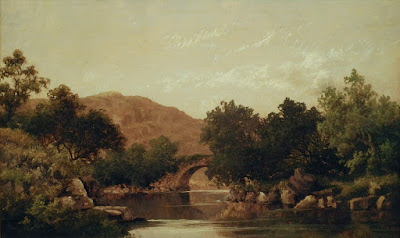
Robert Seldon Duncanson, The Stone Bridge, 1851; oil on canvas.


Not all landscapes from this time were romantic in feeling. This modest painting by Duncanson, the first African American artist to have international recognition, is a more straightforward depiction of a particular spot. This is an attentive, poetic image, one that does not inspire awe, but a charming peacefulness.


Attributed to William Hart, Tannery in the Catskills, ca. early 1850s; oil on canvas


Tannery in the Catskills goes another step towards realism, with the contrast of mountain with the deforested landscape and industrial building.


Tannery in the Catskills detail


 It is a look at the new world of the Industrial Revolution.


George Inness, In the Gloaming, 1893; oil on canvas.


Inness brings us back to a romantic view of the landscape, with trees and grasses softened by golden light. The romantic and the naturalistic are two approaches to landscape that are still with us today. It has even been suggested that the paintings of Mark Rothko are in a sense descendants of the romantic American landscape.


William Merritt Chase, The Lone Fisherman, 1890s; oil on panel


It's fascinating to see that this vigorous and color-rich painting was made around the same time as the Inness above. It has such a feeling of the modern in its dramatic shift of space and its lively brushwork.


Rockwell Kent, A New England Landscape, 1903; oil on canvas.


Rockwell Kent's landscape is much more subdued in color than the Chase, but it has a similar modern compositional structure, with our eye hopping from rock to rock in the empty foreground, then back to the mass of dark trees, and on to a streak of light crossing the field, and the distant view.


Abbott Thayer, Below Mount Monadnock, ca. 1913; oil on panel.


Below Mount Monadnock is a very small painting, darkly mysterious, with trees almost undifferentiated, while the mountains in the distance have a crisp clarity. That contrast is beautifully compelling.


Marguerite Zorach, Mountain Stream, ca. 1917; oil on canvas.


Lastly, a refreshingly lively modernist painting by Zorach. You can almost feel the water spilling down over the dense rocks, whose forms are clear and heavy. Beyond the stream's energy is a soft wash of trees. It's interesting to think about this tradition of landscape and to see how it is still strong today (see for instance, my recent posts on Alex Katz and Cecily Brown); landscape is rich with image and with metaphor.