Showing posts with label ruminations. Show all posts

October 31, 2021

John Chamberlain: Material and Meaning


I've recently been having very interesting conversations about the meaning that is embedded in an artwork: are we to see abstract work as a composition consisting of shape, color, space, light, or is there content in addition to the formal concerns of the work? John Chamberlain is an interesting artist to think of in this context. I wrote about the marvelous retrospective at the Guggenheim Museum in 2012, where I saw the sculpture as purely about color and shape, and surprising moments of juxtaposition and detail. Seeing a stunning show of Chamberlain's sculpture currently at Gagosian Gallery has prodded me to think about what it means that he used industrial scrap metal and parts of cars in his sculpture. 

In the work above––I'm sorry not to have titles and dates, but some galleries have taken to not having check lists, or even reproducing the work on their websites, which is very frustrating––a curved red clamshell shape sits atop crumpled blue forms, almost like an open mouth. Are we to think of a figure? 


This very large sculpture of compressed and varied forms, one side primarily blues, another yellows, made me think of a landscape in its multitudinous parts and its complexity. It also feels like a raucous free jazz composition, form piled upon form, sometimes discordant, in other parts fluid. 


I couldn't help but see a crowd of moving figures, as though on a busy sidewalk. This is such a dynamic piece, and it reminded me of Philip Guston's painting Monument, a scrum of legs and feet. 


This is a stunningly dramatic piece, with smooth thin forms reaching high, fluid rounded shapes nestled one against the other. But all these observations of mine are about image, what the whole of the sculpture brings to mind. 


As here, with another monumental piece that looks to me like an animated creature, rustling as it moves. Chamberlain's magical expertise with folding, crushing, and welding sometimes lets us forget that this is metal that he's working with, and not malleable clay or cloth.  


Yet there is metal's rigidity and sharp edges, its shiny surfaces, its shapes that are sometimes clearly part of an automobile's body.


In this detail of the other side of the sculpture pictured above, Chamberlain has included parts of a car that are clearly elements of a bumper, smoothly protruding; they could be from a 1951 Ford coupe. Does this clear reference to the origin of Chamberlain's materials indicate that some of the meaning of his work lies in industrial automobile manufacture? is there a critique of American addiction to cars and the open road? or a paean to American know-how and design, as with the American Precisionists of the early 20th century? 

I would answer "no", for the most part. Of course I have to acknowledge the source of Chamberlain's materials, but for me that does not determine the meaning of the work, which I find in responding to its form. I don't know if he was attracted to scrap metal because of its origins, or because of the way it behaved and looked when made into a sculpture. Chamberlain himself, in speaking of the meaning of his work said:
"Even if I knew, I could only know what I thought it meant."
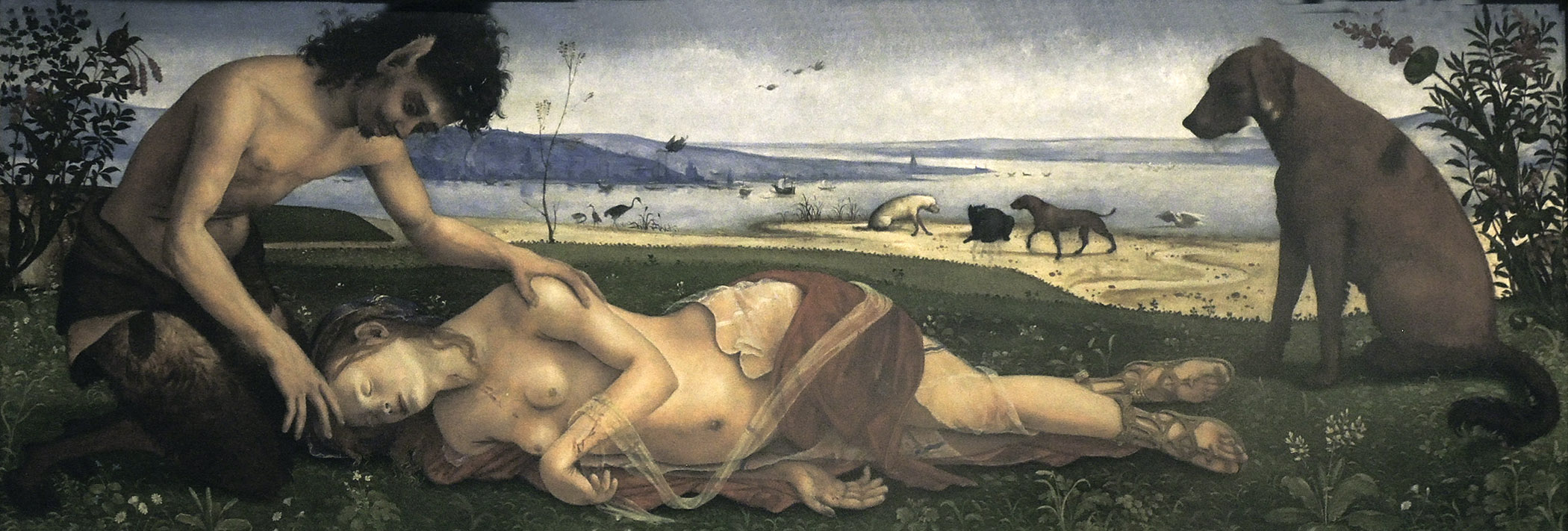
We artists cannot determine what meaning observers find in our work. What we prefer people to see is not always what they will see. For me, looking at a non-objective work is a rich experience, noting the way form and color interact, the quietude or dynamism of a composition. I find meaning in these things, and a deep emotional satisfaction. In recent years I've had two extraordinary experiences standing in front of a painting, paintings which caused me to weep at their beauty and depth of feeling. One was at the National Gallery in London: 


Piero di Cosimo, Satyr Mourning a Nymph, ca. 1495


I wrote about this remarkably tender painting here. Not only is the narrative touching, but the form and structure of the work are in perfect harmony with its story.

The other was a Mondrian in the collection of the Hartford Atheneum:

Piet Mondrian, Composition in Blue and White, 1935


The simplicity and perfection of this painting struck me so strongly. In a photo image it appears much more flatly painted than it does in person. My point in showing these two paintings, so different in subject and separated by centuries, is that response to a work does not have to be tied to its subject; meaning can reside in narrative, and it also can be found in pure form. To be honest, I was surprised at my unbidden spell of weeping in front of the Mondrian, but it proves to me that a reductive work of art can be as important to me as one of representation and narrative; form in itself carries meaning. 


August 24, 2021

Questions I Ask Myself While Painting


When we work at tasks––cooking, cleaning, gardening, repairing––I imagine that all of us ask ourselves questions, whether consciously or not. Do I add more salt? where should I put this new plant? how can I fix this cupboard door with its loose hinge? will wood putty work? When I'm in the process of painting, which I've been doing for about 50 years (yikes!) I don't usually pay attention to the questions asked, decisions made; although they are constant, I don't focus clearly on them. Painting became like walking, where I don't have to ponder each muscle movement in order to go forward. 

But then, a painting ago, the questions became loud and clear in my head; I noticed them. The questions were about process, about the step by step making of a painting, and not anything philosophical: not why am I doing this at all, not what I'm trying to say. Just process. I imagine every artist has their own particular questions. A first question for me is the palette and which color pastes are to be laid out in the small cups: do I need Cadmium orange? which yellow should I use, Cad yellow medium or light? should I mix the greens I'll need? if so, which blues will come in handy? Ultramarine deep? Cobalt blue deep, or light or standard? maybe a green? Why oh why didn't I order more Chrome oxide green? Should I use some Phthalo green? if so, warm or cool? 


I use photographic sources for my work, so there are often decisions to be made as to how faithfully to follow the image. For this painting one large question was: what color do I paint the lower right corner? The source was green grass, which would not do at all. The warm brown you see sketched in above was many colors before it got to that one. Should it be dark green? blue? a warm earth red? maybe more yellow in that? lighter? darker? Each questioned color was tried and wiped off, to start anew. Should the color have transparency? or be more opaque? I actually thought this: should the color be dead or alive? I think my question meant how intense should the color be? should it recede, or pop, or be on the same plane as the shapes above? 


There are always questions about the composition: will I move the diagonals so that they touch the corners? what about that dark edge: put it in or leave it out? Should I widen the left rectangle? Where should I place the red circle? centered, or higher? And the biggest question: do I leave the arm coming from the left side of the red disk? And the protruding brown cylinder: is it be seen from above, as in the source image, or straight on? 


Here is a detail of that part of the painting, finished, with the questions answered.


Colors chosen bring up a litany of questions, for every color in every painting. Many years ago, when I was a student at Skowhegan, our rallying cry was "Hue! Value! Intensity!", the three qualities of color. Getting these greens––in shadow and light––to work required many layers of color answering how warm? how cool? how light? how dark? how intense do I want the color to be? which blue or green or yellow will give the hue I want? will the shadow color be more or less transparent? will adding white kill the color, or would yellow work? which yellow? maybe I should add lemon yellow to my palette? And the touch, or facture: do I want it to show a subtle painterliness or a more opaque surface? Will the green rectangle on the left be lighter, warmer than the triangular green? How about the lights? how warm, how light? One of the great qualities of egg tempera is its translucency, which allows for color mixing while layering paint. And after each layer, each new color: does it sit properly in space? does it carry enough light?  
 

Red Disk, 2021, egg tempera on calfskin parchment, 7 5/8 x 8 5/8 in.


A final question: do I include a photo of the finished painting in this blog post? 

As I thought about why my list of questions moved to the foreground of my mind, I remembered that I'd recently read a wonderful poem by John Yau, "Fifty for Richard Nonas", the sculptor, which consisted of a long list of questions, questions that are enlightening, thoughtful, demanding, confounding, compelling, essential. I love this::
What is invisible inside this place you are filling with carbon dioxide? What besides air, light, and memories? 
(click to enlarge)


July 19, 2021

Borders, Boundaries


I walk across a small field in full sunlight. The light touches leaves and grasses, shifting with the breezes; it sparkles on the tall, thin grasses and glows on leafy surfaces. There is a trodden path through the growth, but the 4 foot tall flowering grasses still brush against my skin, with a slightly scratchy feeling. (I'd like to use the word raspy, incorrectly, as I think of a wood rasp, with its small holes, tickling away the edges of a wood panel.) Ahead of me I see the dark edge of the woods.


When I cross that border from bright fields to shadowed woods it is as though I am in a different body, one that is cooler, cradled, limited in sight. From a horizontal world, open and expansive, I enter one that is vertical, where I look up to treetops and down to the ground. I often think of the words of Robert Frost, which come to me unbidden: 

The woods are lovely, dark and deep

This line is from his poem "Stopping by Woods on a Snowy Evening". In it he speaks of that most unforgiving of borders, that between life and death, in saying

But I have promises to keep, 

And miles to go before I sleep,

And miles to go before I sleep.


In the woods are many stone walls, walls that used to be the borders between property owners, separating long-gone open fields. A few days ago I noticed the red boundary marker for the southwest corner of my property; I hadn't paid attention to these boundaries for years. 


Many of the walls have fallen apart; stones are no longer piled one atop the other in an orderly fashion; trees grow through them. The hard labor of transporting and placing large rocks and huge boulders is undone.  Another Frost poem, "Mending Wall", has a phrase that echoes through my head:
Something there is that doesn't love a wall
The poem is a wonderfully wrought, simply put questioning on the necessity of walls, because even though his neighbor insists
Good fences make good neighbors
Frost wonders why a wall is needed between an orchard and a pine woods. And we can now take that questioning out into the larger world. 


The curved line of metal is all that remains of a gate that stood in the southeastern corner of my field, a forlorn reminder of the futility of fixed boundaries.

May 6, 2021

The Shapes of Things


Sometimes it happens that an ordinary object lying about the house will nudge me to open my eyes and notice things I hadn't seen before. "Seen" is the wrong word: I saw them, but they failed to impress on my conscious mind as something especially beautiful. As Henry Miller put it: 

The moment one gives close attention to anything, even a blade of grass, it becomes a mysterious, awesome, indescribably magnificent world in itself.

This old lap table was leaning against a wall, waiting to be put away, when I saw that lovely curve against the straight line of the outer wall, and the simple elegance of the rounded legs; and the circle, on a piece of wood that looks like it dropped from its original position, giving a sense of time passed. 


I then photographed some legs on old pieces of furniture, as on this dresser. The front legs are complex and inventive in form, curving in and out, in gentle and sharp lines. You can see a glimpse of the rear leg, which is much simpler in design. 


The repetitive pattern of the legs of my bedside table remind me of nothing more than of Brancusi's Endless Column, in miniature: 


An old fan with rubber blades has grace and elegance in its design.

Lest you think that it's only old objects that attract my interest, here are two functional forms attached to the outside of my house that I find quite beautiful in their shapes and lines:


This metal box has an appearance of a torso, with heavy rounded legs.


A fluid line of copper tubing enhances a circular form whose copper screws echo the color of the curved pipe. 


And of course, there are the contemporary machines that provide subject matter for my paintings, drawings, and relief sculpture. In agricultural equipment I find a wealth of unusual shapes, with surprising relationships of color, line, volume, and light. When I go out to look for motifs, it is like a treasure hunt, full of unforseen results. I would like to share John Cage's quote about the woods, because it resonates for me in my trips to farms:
One shouldn't go to the woods looking for something, but rather to see what is there.

April 13, 2021

Artists and Critics


Honoré Daumier, "Well, if you look very closely you might ending finding some quality; the color seems to be good."


In Jean Frémon's marvelous little book, The Paradoxes of Robert Ryman, he writes almost apologetically about his role as a writer on art:

All of us who write on art or artists have an extreme presumptuousness. We hold forth on the ins and outs, means and ends, and in reality we know nothing; nothing of what it is to truly take, on the end of a brush, the color from a palette and put it on a panel. We dissect thoughts while the painter searches for the form. Thought is within it and cannot be formulated in words. The thought of a painting is not discursive. It matters to the greatest degree and at the same time is on no consequence. It is everything, but it is nothing. It is there. In any case. Before and after. The only thing that matters is the form that it takes here and now: a little bit of white pigment taken up the this palette, on the end of a brush, and set down on that surface. 
In this modest declaration, Frémon shows himself to be a most sensitive and thoughtful writer. He has so many insightful things to say in this book that go beyond referencing just Ryman, such as:
Miro, Rothko, Ryman....deepened their thought in order to enlarge our understanding of the work of art, and our perception of the world. They do it not as historians or as sociologists but as artists; the proposition that they advance is not along the lines of semiotic analysis or chemical experiment; it is an object, an unexpected object, even if all the steps of its production have been carefully prepared, an object with no other purpose than itself, made to be seen, simple, and whose mystery holds us attentive, whose mystery touches us. 
 
This quality, obviousness and mystery, is what one speaks of the least when one speaks of a painting, because it is that whereof one cannot speaki. Thus, it is necessary to fall silent. Wittgenstein would say, Fall silent and look.
Frémon has not fallen silent, for which I am grateful because he's a wonderful writer. Artists cannot fall totally silent either, not about their own work or that of others. I've long believed that it is a good thing to be somewhat articulate about one's own work, to think about it as clearly as possible, as it allows us to move forward intelligently. But as the maker of the work, we can't ever have a new eye to see it in a different way.

Many years ago I was at a lecture given by Lucy Lippard, and one thing that she said has stayed with me because it is so important: she believed that the role of the critic was to be a "sympathetic observer". The critic can look at the art object and find connections, explore meanings of both form and content,  respond in an open and intelligent way to what they are seeing; this enlarges our understanding.  Over my long career I've been lucky to have had many reviews in which the writer was certainly sympathetic, and observant, pointing things out in my work that I hadn't thought of. Having the physical object of a painting translated into poetic prose is a delight and a gift. I did once get a nasty negative review, almost 40 years ago, and in the NY Times. I was a young artist and it crushed me (I did get other laudatory reviews in that paper). I now wonder what the point was of writing something so mean spirited? I don't read these kinds of blistering reviews any more, or perhaps I'm just not aware of them. It seems to me that writers on art have adopted Lippard's credo and  have provided us with a rich and informative range of texts, and the arts are definitely better for it. 


April 6, 2021

Regret: Bertrand Tavernier's "A Sunday in the Country"


On a lovely Sunday morning in 1912, the elderly artist Monsieur Ladmiral prepares for a visit from his son and family. We see that M. Ladmiral must be a successful painter: his house in a country setting near Paris is large and beautiful, his studio situated in the garden is spacious and elegant. It is evident from the paintings hanging in the house and studio that he is a very traditional painter, conservative in style; the upheavals in art of the late 19th century passed him by. 

The sense of life not being fully lived pervades this poignant film. Ladmiral's reserved middle-aged son Gonzague visits regularly, bringing his straight-laced wife and three children. At one point Gonzague wonders if he should have pursued painting when he was young; but perhaps he wouldn't be as good as his father, or, he would compete with him. Ladmiral also seems a bit disappointed in his son, a feeling that is thrown into vivid contrast with the unexpected arrival, via motor car, of his beloved daughter Irene. We can see that he adores her brilliant free spirit, her unconventionality, her need to liven things up. She is the only one whose opinion about his work he seeks, and fears. In the studio, she disparages a painting in process on the easel as yet another "corner of the studio" painting; how dull, how ordinary.

. 

Pierre-Auguste Renoir, Dance at the Moulin de la Galette, 1876

Then she whisks her beloved father away in the motor, to a café near a river, where there is dancing. For me this scene is the heart of the film, where Tavernier calls up the spirit of Renoir. And here is where father and daughter have a candid talk about his work. Irene says to him, pointing to the dancers, "That's what you should have painted". His response is beautifully thoughtful, and relevant, I believe, to choices all artists make: 

I painted the way I was taught. I believed my teachers: to respect the traditional rules, maybe a bit too much. I saw originality in others' work. Cézanne's major exhibition in '96 or '97 was interesting, but I thought "Where can that lead me", like van Gogh's work. I'd singled him out. I spent a summer painting in Arles. Perhaps I lacked courage. Some years ago, I considered changing my style. I thought about it seriously, but it hurt your mother that I was still groping at that age. I'd just been decorated; our future was assured. If I'd imitated what was original in other painters––Monet, Caillebotte, Renoir––I'd have been even less original. I'd have lost my own special melody; at least it was mine. I painted as I felt, with honesty. If I didn't achieve more, I at least glimpsed what I could have done. 

Then he recounts his dream about Moses, who saw the Promised Land, so could die without regret. Irene listens to his passionate, yet hesitant words with attentive love. 


When all his guests have gone, M. Ladmiral sits alone in the studio. Although his talk with Irene made it sound as though he had no regrets, the expression on his face––he is sensitively portrayed by Louis Ducreux––reveals uncertainty. He removes the unfinished painting of the studio corner from the easel and turns it against the wall. He places a smaller blank canvas on the easel, which he turns so he can look at it from the studio couch. The camera lingers on his hands, moving as though seeking answers. This scene was so touching, even heartbreaking. Although he spoke of having no regrets, he seems full of self-doubt.

I loved this about A Sunday in the Country: it wasn't only sensitive to family relations, but also astute in its portrayal of an artist's questioning of their work. I wonder if artists reading this have felt that. I certainly have: that sudden crushing sense of bewilderment, the "what am I doing?", the ground sliding out from under my feet. We go on, as best as we know how. 


March 27, 2021

A Renewal


It's been several years since I've posted on this blog, but some reading I've been doing lately has got me thinking that I might enjoy writing again. It's early spring here in northern Vermont, the ice is receding from the edges of the pond, green leaves are visible under the shallow pond water: a time to start afresh. 

The poems of Alberto Caeiro, a heteronym of Fernando Pessoa are making me aware again of the value of looking closely at the world around me: 
The astonishing reality of things
Is my daily discovery.
Each thing is what it is,
And it's hard to explain to someone how much joy this gives me,
And how much that joy suffices me. 
And
In my gaze, everything is clear as a sunflower,
I'm in the habit of going for walks along the roads,
Looking to the right and to the left,
And now and then looking back...
And what I see at each moment Is something I've never seen before,
And I'm very good at that...
I know how to feel the profound astonishment 
A child would feel if, on being born, 
He realized that he truly had been born...
I feel newborn with every moment
To the complete newness of the world...

Caeiro asks us to look, to truly see, with no preconceptions, no thought. I've also been reading several modernist French writers, such as Jean Frémon, Pierre Reverdy, Franck André Jamme, and Philippe Jaccottet whose prose styles are inspiring. It is Jaccottet's Seedtime, selections from his notebooks, that also made me think about making notebook-like entries in my blog, along with photographs. Although the blog is titled Studio and Garden, I don't think I'll post my artwork here, but will leave that to Facebook and Instagram. But I do hope to write about art that I see in museums and galleries, once I'm back to visiting those wonderful, much-missed places.


In the woods, the mosses have been refreshed by yesterday's rain, and their intense greens can't be matched in the natural world. Their shapes vary, from tiny tree-like forms to soft cushiony shapes, some that make resting on a moss-covered rock inviting. 


In the first entry in Jaccottet's Seedtime, he urges us towards a "complete forgetting": 
Attachment to the self renders life more opaque. One moment of complete forgetting and all the screens, one behind the other, become transparent so that you can perceive clarity to its very depths, as far as the eye can see, and at the same time everything becomes weightless. Thus does the soul truly become a bird. 


September 14, 2016

On Presence in Art

Piero della Francesca, Saint Augustine, 1454-69; oil and tempera on panel, 53 1/3 x 26 1/6 in.
images courtesy of the Frick Collection website 


Three years ago there was a remarkable exhibition at the Frick Collection, Piero della Francesca in America. At the time, I wrote about this painting of Saint Augustine:
Standing in front of this painting of Saint Augustine, in the Oval Room at the Frick Collection, was like being in the presence of a powerful soul, one who looks past the immediacy of dailiness to an inward essence of life and faith.


Seated Luohan, ca. 1000, Yixian, Hebei Province, China. Earthenware with 3 color glaze, 41 inches high.


The quality of character in the Piero––a direct severity and inner calm––was similar to that of the sculpture of a Buddhist holy man.


Kazimir Malevich, Suprematist Painting: Black Rectangle, Blue Triangle, 1915, oil on canvas, 
22 1/2 x 26 1/8 in.


How do I describe presence when it doesn't apply solely to figurative art? Malevich's simple abstract paintings go beyond a design with two shapes on a plane; there's a sense of physical weight, and emotional depth. They are two shapes that express a reality beyond the shadows in Plato's cave.


Ellsworth Kelly, Black Relief III, 2010; Oil on canvas, two joined panels; 75 1/4 x 65 3/8 inches.


I feel similarly about Ellsworth Kelly's work. A sweep of black on a white rectangle, beautifully balanced, moves out towards us as though inhabiting the space before it, not satisfied to settle onto the wall. Here also, shapes become essences.


Richard Serra, Every Which Way, 2015; weatherproof steel, 16 slabs, overall 11 ft x 53 ft 6 in x 21 ft. 


Richard Serra's sculptural drama and its huge size can't help but having tremendous presence. This work in particular was very strong, with the slabs standing like personages, and silent witnesses to our tragic events.


Catherine Murphy, Polka Dotted Dress, 2009; oil on canvas, 52 x 52 in.


Of contemporary representational painters, I think that Catherine Murphy's work most clearly embodies an idea of presence, where common objects become much more than themselves, transcending their particularities and becoming dense with meaning.

I am thinking about this quality now because I realize that as I work on my paintings (see recent paintings here), I push them from a fluid, painterly beginning to a solid and clear form, form with a sense of weight that I hope leads to presence. The precision in my paintings and sculpture (see recent relief sculpture here) is not aiming to be photographically "realistic" but to get at the essential, the tangible, to conjure an image that speaks emphatically. This is a quality that I don't believe exists in my textiles (see here and here), which are objects rather than presences. Presence does not define good art; it's just one element that might or might not be a part of the work. So, readers, what do you think about this quality? is it something you think about or believe is important, or maybe not?


June 26, 2016

A Hiatus....


I began writing this blog on August 1, 2009, so it will soon be 7 years old. It was quite different when I began, with many brief posts each week, but as time went on I wrote longer posts which were more thoughtfully (I hope) developed. It's been a pleasure sharing my ideas about art and books and films and nature with you, dear readers, but now I need a break. Of course, if I want to write about something from time to time, I will do so, but I have to get away from feeling obligated to write. Even writing about my own work sometimes bores me...enough already! According to Blogger, I've written 1,459 posts, and they're all accessible. You can look through them by the labels listed at the right side of the online blog––such as art history, recipes, reading and writing, ruminations––(for email subscribers, click on "Studio and Garden" at the top of the page to get to the web version); you can also put search terms in the box at the top of the page, or simply click through to older posts. I have an active presence on Facebook, posting nature and art images almost daily, so you can follow me there. I will continue to show my new work on Facebook, and you can see albums of earlier work too.

Thank you so much for your kind interest; it's been fun, and I may be back at any time.....

March 21, 2016

The Emotional Resonance of Color


Henri Matisse, Memories of Oceania


Soon there came to me, like a revelation, the love of materials for their own sake....I felt growing within me a passion for color.
Henri Matisse, quoted in The Unknown Matisse by Hilary Spurling. 

It is impossible to stand in front of one of Matisse's late cut-outs and not have a powerful response to the color, color which carries within it feelings of openness and joy, and pulsing energy. The marriage of shape and color seems a perfect one, but it is the color which most entrances.


Matisse, Maquette for Jazz


Matisse spoke of a childhood memory of illumined color that I can picture in my mind; I imagine that it stayed with him as a kind of magic:
The second shop window was the best: twelve tubular glass bottles, drawn up in battle order on a stand and filled to the brim with colours whose very names made me feel proud. They were, in order, pale chrome yellow, dark chrome yellow, cadmium, cobalt blue, ultramarine, Prussian blue, milori green, English green, rose madder, Austrian vermilion, Turkey red and pure carmine. 

Josef Albers, Color Study, Platinum


Josef Albers' life work in painting and in teaching was centered in the relationships of colors:
In visual perception a color is almost never seen as it really is
––as it physically is.
This fact makes color the most relative medium in art.
Albers, Interaction of Color
Regarding color memory he wrote:
If one says "Red" (the name of a color)
and there are 50 people listening,
it can be expected that there will be 50 reds in their minds.
And one can be sure that all these reds will be very different.

Albers, Study for Homage to the Square, Night Shades


Those different colors in our minds also come along with different feelings. Looking at the two Albers studies above, the moods they evoke are of bright day and of evening. Albers himself, in using the title Night Shades, understood how dark hues, close in value, remind us of the time of day when color and form are subdued and sink into near formlessness. Does that make us sad, or nostalgic, or touched with another feeling? As in thinking of red, we each will bring our own response.


Lyubov Popova, Painterly Architectonic


I love that Popova, in the era of Russian constructivism, chose red and pink for a two of her paintings of 1917; the high seriousness of this revolutionary period in art is tickled with the unconventional color choices.


Mary Heilmann, Garden of Allah, 1986


Intense candy colors vibrate and glow against their surrounding black. Heilmann's color surprises and brings forth physical sensations––a juiciness in the mouth, a brightness in the eye––and a memory of neon emerging from the warm dark.


Golu, The Lover Prepares to Depart


The artists in this post are ones I often turn to when I'm looking for color ideas for my own work. Indian painters have a rich sense of color relationships. Colors are pure and direct and can show mystery and opulence and sensuality....


Early Master at Mandi Court, Gopis Pleading with Krishna


....or a lovely delicacy. The pale minty greens are a delight as contrasted with the dark greens and the warm-colored flesh of the poor Gopis whose clothes were stolen by Krishna.


Osservanza Master, Saint Anthony


Beautiful grays describe the desert of Saint Anthony, but his halo repeats the vividness of the evening sky and the distant church; those bright colors are of the shining spirit.

Goethe, in his Theory of Colors, ascribed emotional attributes to color, such as for green: "The eye experiences a distinctly grateful impression from this color." Brainpickings has assembled several quotes. We can read Goethe and see if we agree with his assessments, or if we think it is too simplistic to assign a feeling to a color.


Leftover wool from textiles 


I've been thinking a lot recently about how color affects us. My choice of colors for my textiles is often based on what kind of mood I want to evoke; the same composition using red and black would have a very different effect in pink and green. When I sit at my work table staring at a just-fired, pure white porcelain relief sculpture, I have to figure out what color to paint it. The form may ask me for a certain color, or the feeling I want to achieve may demand a certain color, but it's not at all obvious. (You can see two painted reliefs at this link.) The world of color is complex and wide and deep, and exhilarating.